Though the market technically hammered out a gain last week (with the Dow Jones Industrial Average even managing to reach a record high above 22,000), it was an ugly, grinding effort, with stocks still struggling to get traction. Indeed, while the Dow was edging higher, the all-important NASDAQ Composite was struggling to hold its ground, and is currently at risk of breaking under a minor support level.
 In other words, this thing could still go either way.
We'll look at the good, the bad and the ugly below, after examining last week's and this week's economic news. July's employment picture ended up being even prettier than anticipated.
Economic Data
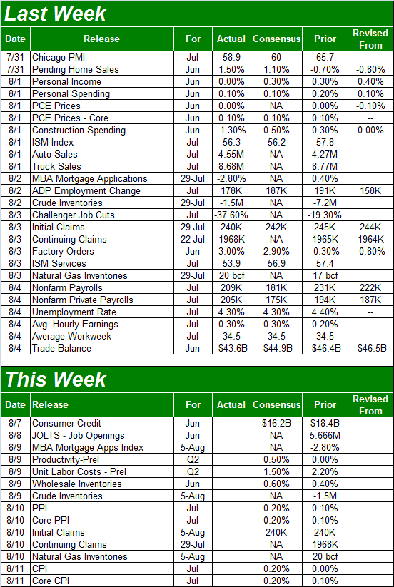
There was plenty of economic news to sift through last week; we'll have to limit ourselves to the highlights, beginning with the one that got the ball rolling. That's Tuesday's reports of auto sales in the United States.
In short, not only were they bad, they were worse than expected. In fact, the year-over-year decline of 5.6% was the worst decline we've seen in years, marking it the thirteenth month in the past seventeen year-over-year sales of cars turned negative. Perhaps worse, it was the first time in years sales of pickup trucks turned negative. Trucks had been the savior of the automaking industry for a long while now.
Auto Sales (Monthly) Charts

Source: Thomson Reuters Eikon
We also got both of July's ISM readings last week. Though both remained above 50, both also fell short of estimates, and both fell under June's levels. One bad month doesn't spell doom, but a couple more disappointing months is a problem.
ISM (Services and Manufacturing) Index Charts

Source: Thomson Reuters Eikon
The highlight, of course, was last week's unemployment report for July. Economists felt it would be good, and they were right. In fact, they still underestimated how well the job market would improve last month. The final tally? The 209,000 new jobs added in July was enough to whittle the unemployment rate down to a multi-year low of 4.3%.
Unemployment Rates and Job-Growth Charts
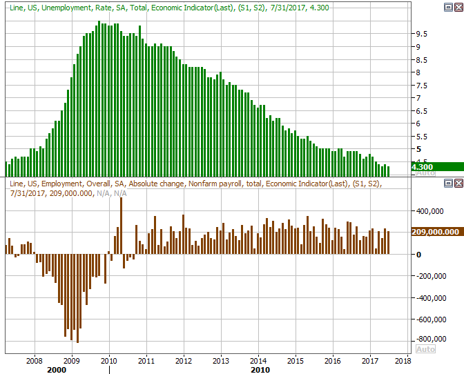
Source: Thomson Reuters Eikon
July's jobs report wasn't just the result of some fortuitous math either -- people are making more money and working more hours, and more people are working than have in a long, long time. We covered the matter in more detail at the website.
Everything else is on the grid.
Economic Calendar
Source: Briefing.com
There's a little less on the economic dance card this week, but there is one biggie worth previewing... last month's inflation data. Producer inflation numbers will be out on Thursday, and consumer inflation data will be posted on Friday.
Both were on the rise earlier in the year, but the Federal Reserve was successful in quelling inflation with only modest lifts in interest rates (the chatter alone was enough). Economists think we'll see a little perk-up in inflation rates this time around, though bear in mind those pros overshot in June.
Producer and Consumer Inflation Rate (Annualized) Charts
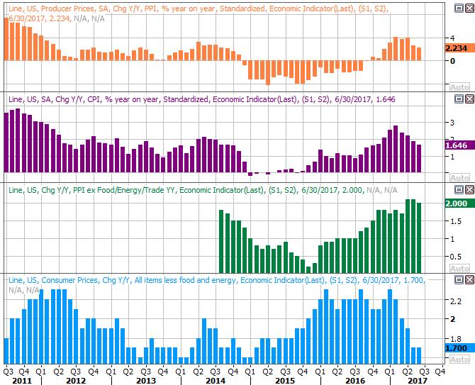
Source: Thomson Reuters Eikon
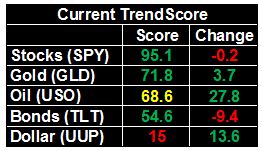
Assuming nothing changes, the Fed has time and room to hold off on its next rate hike. The odds say the next one won't materialize until March.
Index Analysis
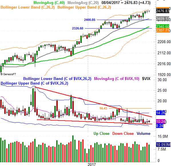
Technically speaking, the uptrend may not have been measurable last week in that the S&P 500 (nor the NASDAQ Composite) didn't make another new high, But, it's not like the market broke down either.
That said, one noteworthy curiosity emerged last week... while the Dow reached and new record high and the S&P 500 mostly treaded water, the NASDAQ actually logged a small loss. It's troubling simply because the composite tends to lead the market, higher and lower. Even more interesting is that even though we saw a few red flags start to wave, investors aren't worried. Indeed, they're even less worried as of last week than they were the week before despite the fact that a headwind appears to be forming.
Let's just start with the S&P 500's daily chart, though for no particular reason. It's on this chart we can see the well-contained sideways drift that didn't break under the 20-day moving average line. It's also here we can see the VIX remains oddly, uncomfortably low.
S&P 500 Daily Chart

Source: TradeNavigator
Not so for the daily chart of the NASDAQ Composite. It started to test its 20-day moving average line in the middle of last week, and never managed to push up and off of it as a support level.
NASDAQ Composite Daily Chart
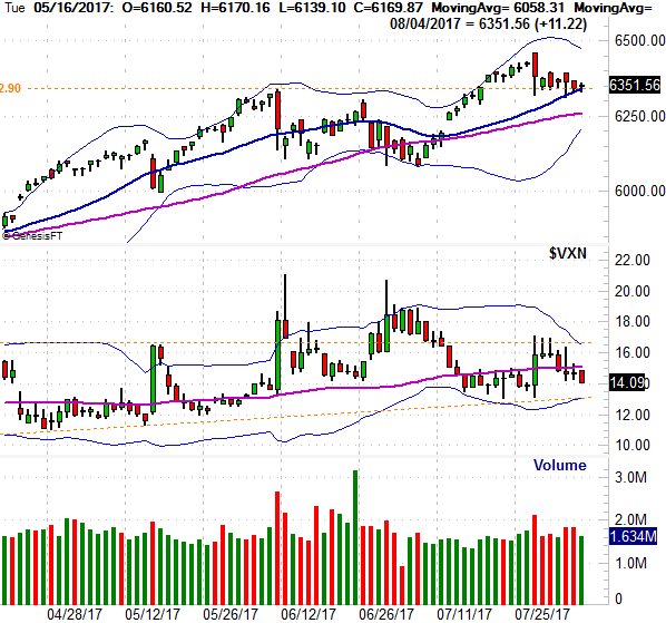
Source: TradeNavigator
Strangely enough, the NASDAQ's Volatility Index (VXN) not only didn't move higher in conjunction with the slight lull from the composite, it actually drifted lower.... suggesting traders aren't worried at all about a pullback... though maybe they should be. The VXN is nearing a major support level made up of its lower Bollinger band as well as straight-line support (orange, dashed) that extends back for a few months. It should be tough for the VXN to break under that level, at 13.15. In fact, it would be surprising of the VXN doesn't push up and off of that floor. That's going to work against the market, perhaps dragging the NASDAQ below its 20-day moving average line.
On that note, notice there's not a lot of technical support below the 20-day moving average line. The 50-day moving average line (purple) and the lower 20-day Bollinger band currently at 6206 -- which is rising fast -- could all be broken with one decisive blow against the market.
Taking a step back and looking at a weekly chart of the NASDAQ Composite better explains why we're concerned, though why we also have to concede the momentum isn't something you want to dismiss. Perhaps more than anything though, the weekly chart of the composite shows us why we're relatively concerned about what might happen IF things start to unravel.
In short, the weekly chart of the VXN makes it clear it's getting squeezed into a converging wedge pattern that's going to have to be broken sooner than later. It's also from this view we can see that -- again, IF -- the NASDAQ breaks under its key nearby moving average lines, there's not another floor until the 5830 area... where the 200-day moving average line (green) is and where the lower Bollinger band soon will be.
NASDAQ Composite Weekly Chart
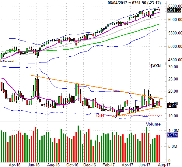
Source: TradeNavigator
Here's the weekly chart of the S&P 500, just for good measure... though it essentially tells the same story. A small pullback could become a big one in a hurry, if the key floors are broken and the VIX finally breaks above the upper edge of its wedge pattern (framed in red).
S&P 500 Weekly Chart
Source: TradeNavigator
This all remains a 50/50 prospect.... a coin toss. Don't dig in too deep either way,