Weekly Market Outlook - If At First You Don't Succeed...
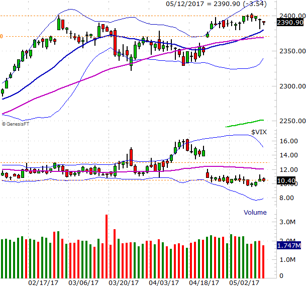
Stocks took their shot at a breakout last week, but when push came to shove, the bears ended up doing more of the shoving. Though the S&P 500 teased us with a break above the February high of 2401 by moving to a high of 2404 on Tuesday, it was only a headfake... and not a very convincing one at that. Friday's close of 2390.90 translated into a loss of 0.35% for the week.
 And yet, it's not as if the market is certainly doomed here. All the indices remain within striking distance of a breakout to new record-highs (and the NASDAQ actually did make its highest ever weekly closed on Friday, at 6121.23). We still have to look at everything objectively, acknowledging that there's more bullish undertow than not.
We'll take that objective look below, right after a review of last week's and this week's key economic numbers.
Economic Data
Last week was pretty busy in terms of economic news, though there were only two data sets of any real interest to us... April's inflation data, and last month's retail sales.
The party started on Thursday with last month's producer inflation rates. They were up on a month-to-month basis, and more than expected. On the more important annualized basis, the nation's factories and plants are also not paying significantly higher costs. Producer inflation is now 3.8% overall, and even not factoring in food and energy pricing, wholesale inflation now stands at 2.1%.
Consumers didn't feel quite the same pinch. Though they too say prices rise last month, they only saw core as well as overall inflation rise 0.2%, falling short of expectations. Nevertheless, consumer inflation now stands at 2.2%, and is still 1.9% on an annualized basis.
Producer and Consumer Inflation (Annualized) Charts
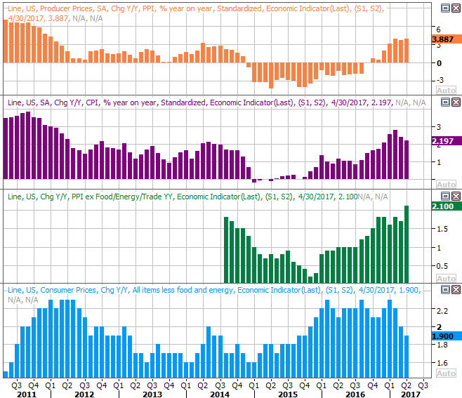
Source: Thomson Reuters
The other biggie from last week was April's retail sales report, posted on Friday. Whether it was good or bad is largely a matter of perception. Retail spending growth was positive, though not by as much as expected. On the other hand, last month's month-to-month growth was decidedly better than the growth we'd seen during the first quarter.
Either way, the more meaningful look at retail spending is on a year-over-year basis, which is plotted on the chart below. It's still plenty healthy no matter what stratification you use. In fact, retail consumption is clearly out of its 2015 lull.
Retail Sales Growth (Annualized) Charts
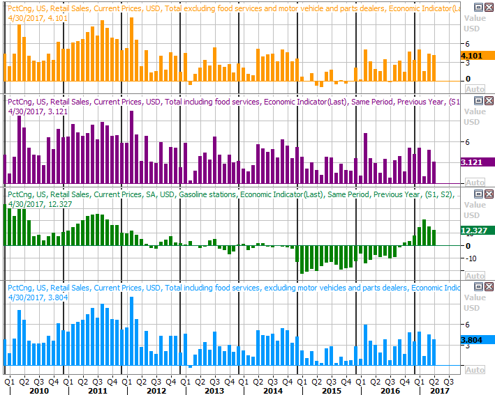
Source: Thomson Reuters
Everything else is on the grid.
Economic Calendar
Source: Briefing.com
This week isn't going to be as busy, and again, there are only a couple of items worth previewing.
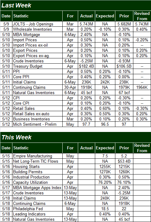
The one most everyone will be watching is Tuesday's housing starts and building permits. Though often doubted, the home-construction market continues to grow, even with not perfect consistency. The pros expect that growth to continue at a modest pace for April as well.
Housing Starts and Building Permits Charts
Source: Thomson Reuters
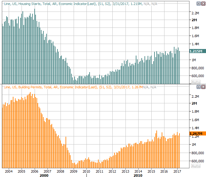
The other big item is one that will go mostly ignored... last month's industrial production and capacity utilization. It's important simply because this data coincides quite well with corporate earnings, and to a respectable degree coincides with the stock market.
As the chart below shows, both retreated in 2015, and though both have hammered away at shallow rebound since then, things clearly perked up in March. Economists are expecting mild improvement from both again for April. If for some reason we manage to top those estimates, it will serve as a pretty good sign that the Trump effect has put the economic engine into a higher gear. Even a mere meet of forecasts wouldn't be bad though.
Industrial Productivity and Capacity Utilization Charts
Source: Thomson Reuters
Index Analysis
Though the week was a losing one for most stocks (using the S&P 500 as our proxy), it was hardly a decided loss. Thursday's intraday drubbing was mostly undone by the time the closing bell rang, and Friday's lull wasn't exactly harsh. Most important, the S&P 500 remains above its 20-day (blue) and 50-day (purple) moving average lines, and remains within reach of record highs.
S&P 500 Daily Chart
Chart created with TradeNavigator
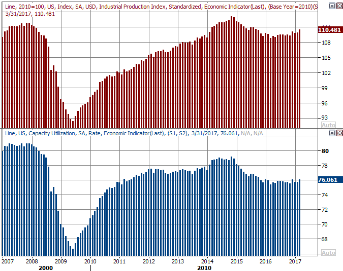
The NASDAQ Composite, on the other hand, didn't seem to have much of a problem edging its way into record high territory last week, moving above the prior peak of 6102. It wasn't a guns-a-blazin' kind of move, but progress is progress.
NASDAQ Composite Daily Chart
Chart created with TradeNavigator
It begs the question.... how come the NASDAQ could do what the S&P 500 couldn't? The answer was discussed in some detail a couple of weeks ago at the website. The largest of the tech names that drive the bulk of the performance of the composite have been doing all the NASDAQ's heavy lifting. Take out the FANG stocks and their peers, and the NASDAQ isn't performing nearly as well.
It's an interesting footnote that forces traders to digest some other concerning facts about the rally to date. Chief among those is the fact that, when all is said and done, the rally since the beginning of the year doesn't have all the participation it would ideally have if it was built on a firm foundation. The biggest, most exciting tech names are soaring, and drawing in lots of buyers. Everything else is just treading water. It will work for a while, but eventually, "everything else" is going to have to lend a bullish hand. Otherwise, the effort is going to run out of gas soon.
It's an idea we discussed in-depth at the website last week, but an updated version of the breadth/depth chart for the NYSE's stocks below tells the most recent chapter of the story. In the meantime, the number of decliners has edged up, as has bearish volume. The number of advancers has tapered off a little more, as has the amount of volume. This is what you would broadly expect to see, but in this case, it's alarming that the string of bearish breadth and depth is about to become a full-blow trend, overtaking the bullish breadth and depth that had dominates since late March. The broad undertow is changing for the worst, and a couple more days of it could push the market over the cliff, so to speak.
S&P 500 With NYSE Advancers/Decliners, Up/Down Volume Daily Chart
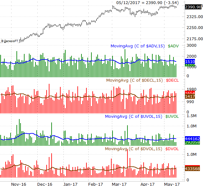
Chart created with TradeNavigator
Still, even if the bears should take hold this week, we're miles away from a confirmed downtrend.
Along with the S&P 500 daily chart below we've plotted its MACD indicator along with its PercentR line. We're close to a bearish MACD convergence, though that's not a terrifying sell signal in that it would occur above the zero line. Similarly, though the PercentR line is about to pull back under the 80 level and give us a minor red flag, until the PercentR line gets AND STAYS below the 20 threshold, the index isn't beyond salvaging.
S&P 500 Daily Chart, with PercentR and MACD Indicators
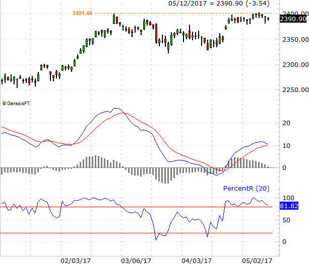
Chart created with TradeNavigator
This does leave some room for more downside from stocks. And, between the calendar and the low VIX, it's a bit challenging to believe there won't be at least a little more downside in the foreseeable future. Don't confuse a little profit-taking pullback as the beginning of a bigger corrective move though. For now, the worst-case scenario we want to entertain is the S&P 500's trip back to its lower Bollinger band, currently at 2340, but rising fast. We'll reassess then, assuming we need to. It's entirely possible the bulls rekindle this unlikely this week.... should the S&P 500 tiptoe into new-high territory.