Weekly Market Outlook - Trapped, For Better or Worse
Despite its decent start, the first trading week ended up not being a very encouraging one. All the major indices lost ground, and more than a little of it. The NASDAQ Composite now stands nearly 4.4% its 2021 closing price, and is knocking on the door of a fairly significant support level. One more rough day could break that floor, opening the flood gates as a result.
Or, perhaps traders will come back from the weekend in a more bullish mood, and stave off that setback. If a rebound is in the cards though, it better happen soon. The tone for the entire year is somewhat set in just the first few days of it.
We'll take the market's temperature below, as always. First though, let's review last week's biggest economic announcements and preview what's coming this week. Spoiler alert: December's jobs report was a disappointment. The good news is, it was so disappointing that it might force the Fed to reel in some of its recent hawkishness.
Economic Data Analysis
There wasn't a lot of economic news posted last week, but what we got was important... and not encouraging.
Take the Institute of Supply Management's key numbers as an example. The ISM Manufacturing Index fell from 61.1 to 58.7, while the ISM Services Index tumbled from 69.1 to 62.0. Granted, both pullbacks were pullbacks from extremely high -- and unsustainable -- levels. Both numbers are also still above the critical 50 level that separates growth from contraction. Both numbers fell though, and this could be the start of more prolonged moves.
ISM Index Charts
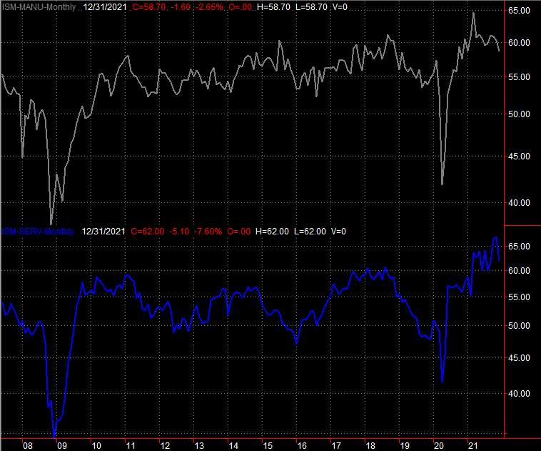
Source: Institute of Supply Management, TradeStation
The biggest news from last week, of course, was last month's jobs report. Payroll growth fell from November's adjusted 249,000 to a disappointing 199,000; economists were expecting 440,000. The unemployment rate, however, fell from 4.2% to 3.9%... within sight of the 3.5% multi-year low seen right before the pandemic took hold.
Unemployment and Payroll Growth Charts
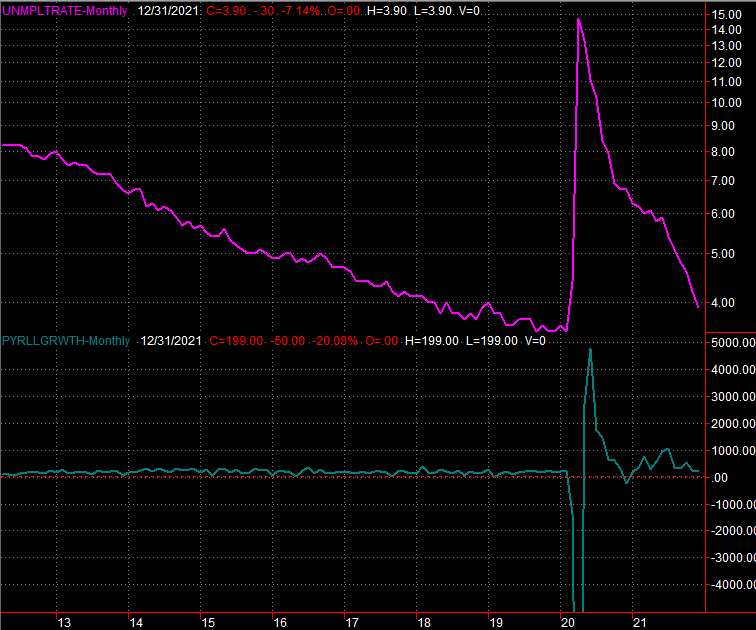
Source: Department of Labor, TradeStation
There's a good explanation for the confusing, counterintuitive figures. The unemployment rate is calculated by comparing the number of officially unemployed people by the total number of people that consider themselves eligible and willing to work, whether or not they're actually working. That figure (the divisor) grew from 162.13 million to 162.29 million, while the number of people officially unemployed (and eligible to claim unemployment benefits) fell from 6.8 million to 6.3 million. The number of actual people with jobs improved from November's 148.75 million to 148.95 million, although most of last month's unemployment rate plunge can be attributed to fortuitous math.
The only other item of interest from last week as the release of the minutes from the FOMC's most recent meeting. In short, the Fed's governors are increasingly hawkish, accelerating their plans not only to remove stimulus, but curb inflation with interest rate increases coming a bit more aggressively than they have anticipated until now.
Everything else is on the grid.
Economic Calendar
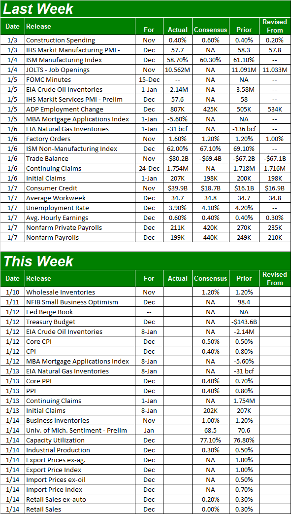
Source: Briefing.com
This week is a biggie.
The party starts with inflation. Consumer inflation figures are due on Wednesday, while producer inflation figures are coming on Thursday. Consumers aren't expected to be feeling any cost relief, and while manufacturers should see a slight easing in their costs, they're still paying relative fortunes for continuing to do business. As of the most recent look, the overall annualized inflation rate stands at 6.8%.
Inflation Charts
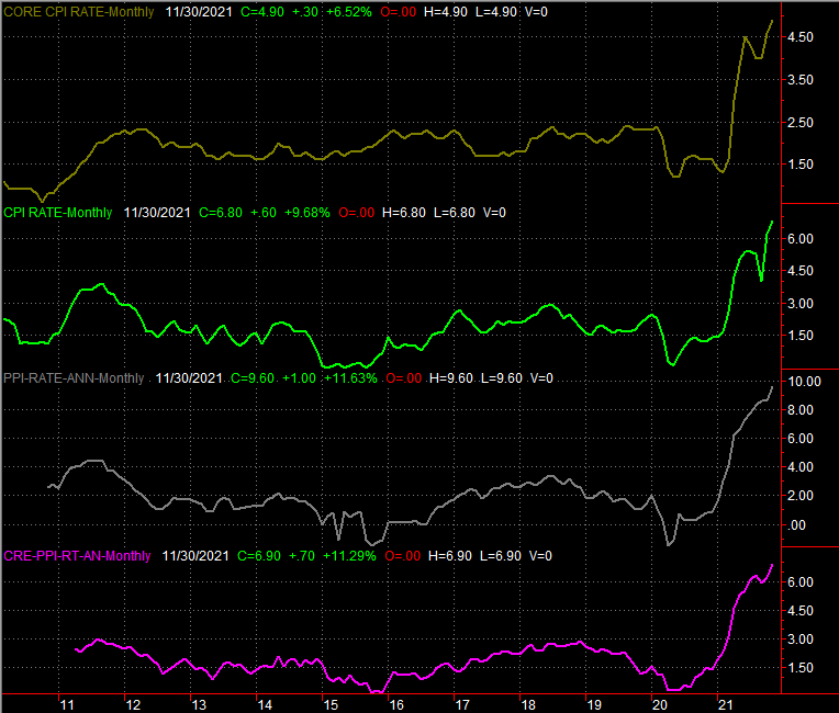
Source: Bureau of Labor Statistics, TradeStation
On Friday we'll hear from the Federal Reserve about last month's industrial output and utilization of the nation's manufacturing capacity. Both are expected to improve, albeit slightly. Both are also still in firm, impressive uptrends, which bodes well for the broad economy even if other aspects of the economy are wobbly.
Capacity Utilization and Industrial Productivity Charts
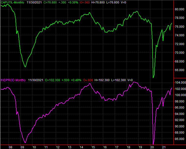
Source: Federal Reserve, TradeStation
Finally, also on Friday be on the lookout for December's retail spending levels. Forecasters aren't modeling a great deal of growth. Just bear in mind, however, that these forecasts are being compared to some very strong numbers. Any growth is going to be healthy, as it will push consumer spending deeper into record territory.
Retail Sales Charts
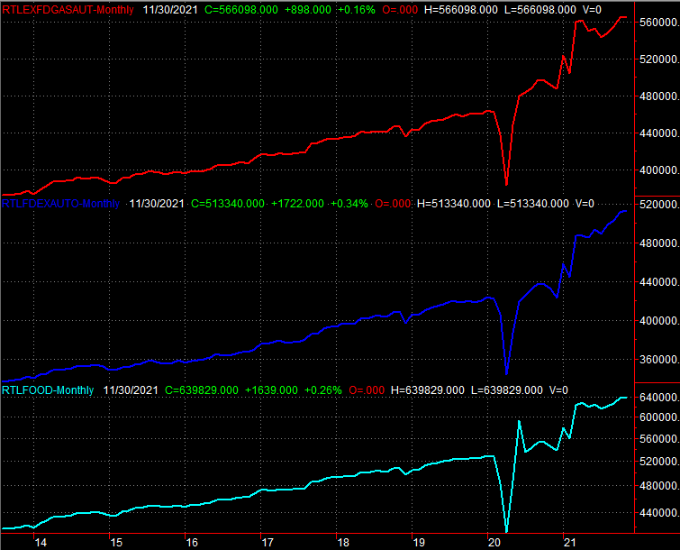
Source: Bureau of Labor Statistics, TradeStation
Stock Market Index Analysis
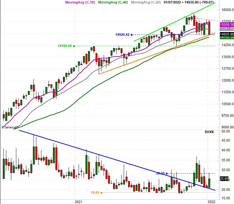
We start this week's analysis with a look at the daily chart of the NASDAQ Composite; this is where the biggest red flag is waving. Namely, although you have to squint a bit to see it on our zoomed-out chart, on Friday the composite closed below the rising support line (orange) that had been keeping the index moving higher since March. Just look for the yellow highlight.
NASDAQ Composite Daily Chart, with VXN
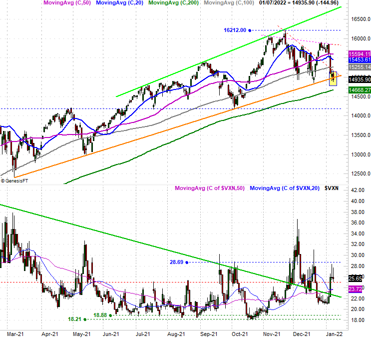
Source: TradeNavigator
It's not necessarily earth shattering. Technical floors are suggestions and guidelines, but aren't etched in stone. We know stocks will move beyond their floors and ceilings eventually. It doesn't always have to mean something. Given the current context though, this is something that too significant to simply ignore. Part of that context is the fact that the NASDAQ's most recent high -- made two weeks ago - didn't even come close to threatening the peak made in late-November.
The weekly chart below puts this is a little more perspective, although the weekly chart also suggests there's a bigger-picture, horizontal floor materializing around the 14,920.
NASDAQ Composite Weekly Chart, with VXN
Source: TradeNavigator
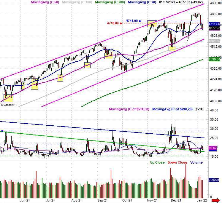
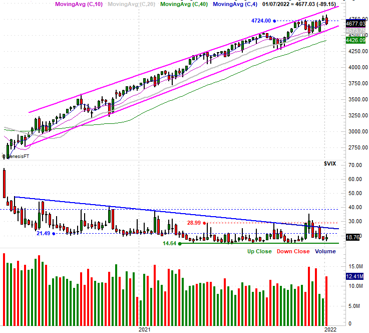
Curiously, the S&P 500 isn't quite in the same degree of trouble. The large-cap market barometer is still finding support at its 50-day moving average line (purple) at 4677, and last week's pullback was a pullback from another record high. The bigger trend is also still bullish, with the S&P 500 squarely in the middle of the two bullish channel lines (also purple) that have been steering it higher for months now. There's room for more downside before the uptrend is threatened. Namely, it would take a break under the lower of these boundaries -- now bolstered by the 100-day moving average line currently at 4561 -- before the index slips into more trouble than it can handle.
S&P 500 Daily Chart, with VIX and Volume
Source: TradeNavigator
Here's the weekly chart of the S&P 500, just for a little added context on the index's long-term trading range. It extends well back into 2020.
S&P 500 Weekly Chart, with VIX and Volume
Source: TradeNavigator
There's some explanation for the big disparity. That is, over the course of the past four trading days. Hedge funds shed more technology stocks than they have in any other four-day span in the past ten years. This works against all stocks, but disproportionally impacts the tech-heavy NASDAQ Composite.
That doesn't really change the fact, however, that it's happening, and that it happened after the composite failed to move to a record high a couple of weeks ago when the S&P 500. It's a problem simply because the NASDAQ tends to lead the market, higher as well as lower. If it's showing bigger-picture weakness, there's good reason to doubt this rally has any gas left in the tank.
And yet, as much as hedge funds may be dumping their tech stocks, it's not as if these fund managers are making big bets on a full-blown correction. Both the S&P 500's and the NASDAQ Composite's volatility indices remain below key technical ceilings that correspond with the market index's key technical floors. Until the VIX and VXN actually start to break to higher highs AMD the NASDAQ and S&P 500 break under their critical support lines, the bigger-picture uptrend remains intact.
The scenario leaves all traders watching things closely each and every day, looking for a clearer, better clue.