Weekly Market Outlook - The Recovery Effort Was Impressive, But Not Decisive
The market may have snapped back from its meltdown before that meltdown had a chance to get going. But, the bounce was less than ideal. Not only was the recovery effort on light volume, the S&P left a gap behind on Friday. That's now aching to be filled in -- with a pullback -- and there's no assurance that the strong end to last week was anything more than a dead cat bounce.
In short, stocks are still very much on the fence, with an end to the China/U.S. trade spat on the horizon, but at a time of year when the market's more likely than not to lose ground.
We'll weigh what's wrong and right about things below, as always, after a rundown of last week's economic news and a preview of this week's data. Friday's jobs report stirred up some hot debates, though there's no way of denying it was decidedly bullish. That was the bulk of reason for Friday's bounce.
Economic Data Analysis
The grand finale was a biggie to be sure, but there were plenty of other important announcements last week that merit a closer look.
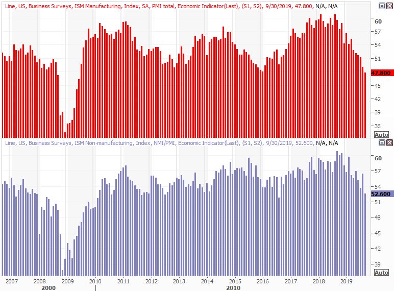
It was a big week for ISM data, with the manufacturing figure coming on Tuesday and the services index report being posted on Thursday. The former fell deeper under 50, from 49.1 to 47.8, extending a lengthy slowing streak. The latter fell from 56.4 to 52.6, but that's still above the critical 50 level. Still, it's pointed downward as well.
ISM Index Charts
Source: Thomson Reuters
These numbers have been on the fence for a while, and still are. For the record though, investors would be wise to bear in mind the ISM reports are reflective of a poll, or survey. It's possible the purchasing managers are perceiving problems or thinking something alarming is on the way whether it is or not. The survey's respondents are also self-selected, potentially skewing results.
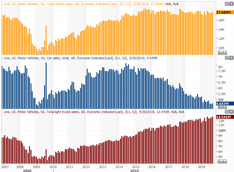
On Tuesday we also got September's automobile sales figures. They were up a little, to an annualized pace of 17.7 million, though that's more or less where they've been for four years now. Trucks are strong, but passenger cars are weak. Either way, it would be nice to see purchases at least perk up a little.
Automobile Sales Charts
Source: Thomson Reuters
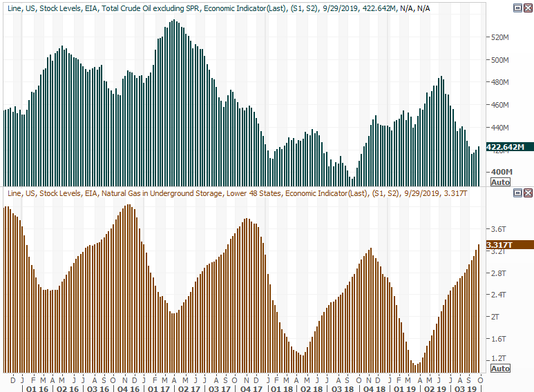
It wasn't a data set we previewed a week ago, but it's a chart worth looking at this time around anyway. For a third week in a row, stockpiles rose, quelling what was turning into a rather impressive pullback. Interestingly, the inventory depletion wasn't paired with a price increase. As such, this modest uptick may or may not be the beginning of downward price pressure.
Crude Oil, Natural Gas Inventory Charts
Source: Thomson Reuters
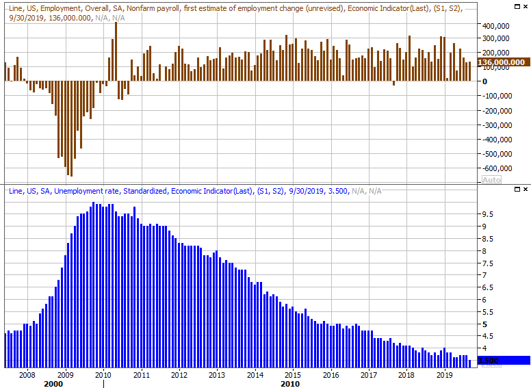
Of course, it was Friday's jobs report that gave investors the most to think about last week.
The media mostly spun it as a lackluster disappointment, as the 136,000 payrolls created last month fell short of expectations. But, that was still enough to drive the unemployment rate down from 3.7% to 3.5% ... a 50-year low.
Payroll Growth, Unemployment Rate Charts
Source: Thomson Reuters
The numbers don't quite jibe. Job-creation wasn't exactly stellar, yet we knocked a sizable chunk of the unemployment rate off. The explanation is, every other jobs-related piece of information shows incredible health; the payroll-growth figure may have been held back only because employers can't find enough workers to fill roles, no matter how solid the pay offers are. We covered the rest of this data in detail at the website.
Everything else is on the grid.
Economic Calendar
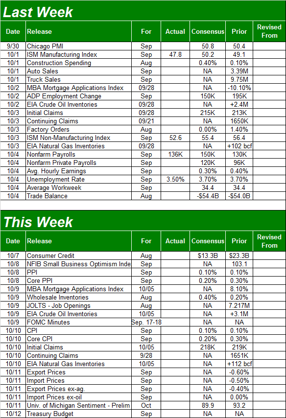
Source: Briefing.com
This week is going to be loaded with announcements, although few of them are interesting or apt to be market-moving.
The only one of serious interest is Tuesday's producer inflation figure, and them Wednesday's consumer inflation rate. Both have been tame, and economists expect those numbers to be nominal again.
Producer, Consumer Inflation Charts

Source: Thomson Reuters
Just a few months ago some economists and analysts were concerned that tepid and falling interest rates would lead into damaging inflation. That's not happened, perhaps with the exception of last month's core consumer inflation surge. Even then though, that pace of 2.39% is modest, and a statistical outlier. It's the only measure that that made an out-of-character move though, and may or may not repeat that pop again this time around.
Also take note that the minutes from the most recent FOMC meeting will be released on Wednesday. It's not a decision-making event, though investors will certainly parse the language in that report anyway.
Stock Market Index Analysis
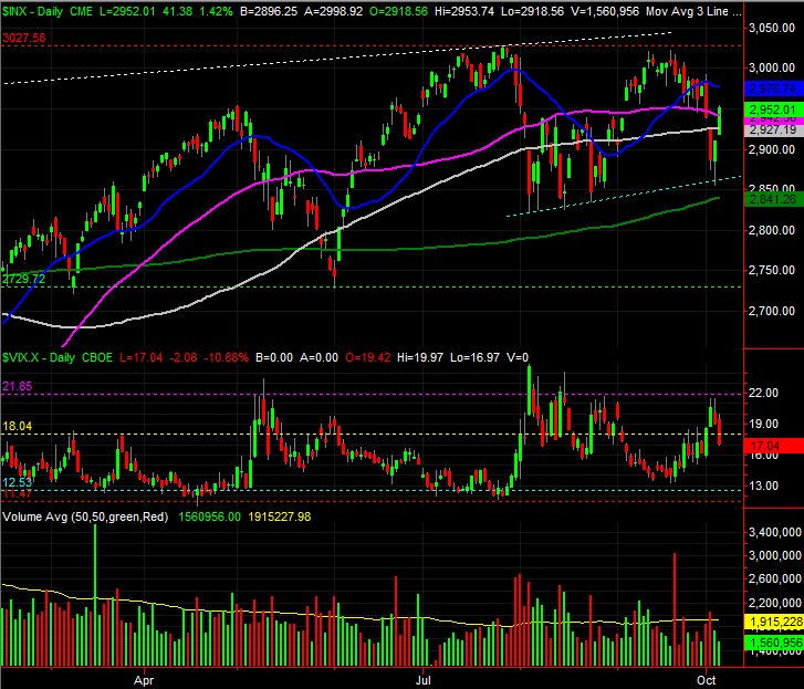
In retrospect, there was nothing particularly surprising about last week's recovery move. Yes, headlines sent the market lower early in the week and then higher beginning on Thursday. The S&P 500 was likely to turn around anyway; the headlines merely mirrored the shift in trader sentiment.
The key was the floor that connected all the daily lows from August, plotted as a blue dashed line on the daily chart below. All it took was one kiss of that technical support to spark the bounce. Also notice the VIX bumped into a fairly well established technical ceiling right around 22.0. It's marked in purple.
S&P 500 Daily Chart, with VIX, Volume
Source: TradeStation
Friday's strong move pushed the index back above the 100-day (gray) and the 50-day (purple) moving average lines... another encouraging clue.
There are still some challenges for the bulls looking to cast a perfectly bullish light on the effort though. Chief among them the lack of volume behind the rebound effort. Some of that could have had something to do with the approaching weekend, though not all of it. Also, although the S&P 500 finished strong, the market failed to make a higher high in September. It may be a subtle clue that the big rally during the first half of the year is running out of gas. The 50-day moving average line? It's now sloping downward, jibing with another MACD crossunder that's taken shape below the level where August's crossunder occurred.
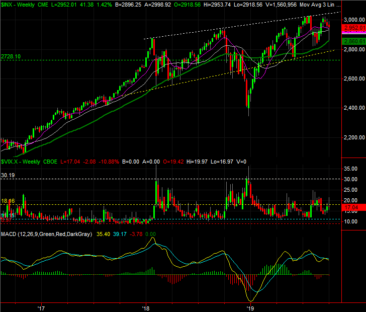
S&P 500 Weekly Chart, with VIX, Volume
Source: TradeStation
Even without the decidedly bearish momentum clues though, a visual inspection of the weekly chart indicates the momentum has been slowing since January.
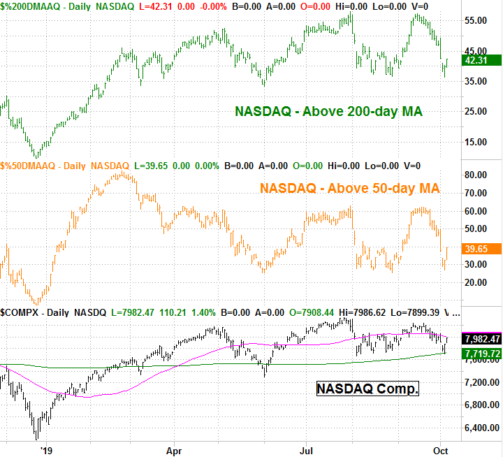
The same basic story applies to the NASDAQ Composite's daily chart, though with one added nuance -- the NASDAQ perfectly kissed its 200-day moving average line (green) at 7719.7 and then recovered on Thursday.
NASDAQ Composite Daily Chart, with VIX, Volume

Source: TradeStation
Maybe it was just a coincidence. But, the market usually doesn't dish out such near-perfect coincidences.
On that note, though on the fence, the market is even less healthy than it may seem.
Yes, the NASDAQ may be above its 200-day moving average line, which is certainly a plus for stocks. Most of the NASDAQ's stocks, however, are actually well below their 200-day average. Only 42.3% of the composite's stocks are above their 200-day lines; a few of the biggest are carrying all the weight, and then some. Even fewer -- only 39.6% -- of the NASDAQ's stocks are above their 50-day moving average.
NASDAQ Stocks Above 50, 200-day Moving Average Lines
Source: TradeStation
The S&P 500's stocks aren't in the same problematic boat; 62% of its stocks are above their 200-day moving average line. But, the NASDAQ tends to lead the market, higher and lower.
With all of that being said, the 200-day moving average line is the absolute floor here, while the S&P 500' recently-developed ceiling near 3027 is a make-or-break resistance level. Things are heading into a showdown, and the odds of a breakout appear to be about the same as the odds of a breakdown. This month's trade negotiations could finally force the bulls and/or the bears to make a more prolonged commitment.