Weekly Market Outlook - An Eleventh-Hour Effort Salvaged the Week
The market was dancing on the edge of a cliff last week, but when push came to shove, it was the bulls doing most of the shoving. Stocks ended the week heading higher, shrugging off a miserable retail sales report for April. Things just aren't quite as bad as most people -- including the professionals -- were presuming they would be. Better still, stocks found support where they needed to the most. And that wasn't even the best news of all.
We'll take a look at the details below, as always. First though, let's recap last week's barrage of economic announcements and then preview what's in store for this week.
Economic Data Analysis
Inflation in April was actually deflation, and more than expected. Core consumer prices fell 0.4% from March's prices, and factoring in fuel and food, prices fell 0.8%. Factories and production plants saw a slightly bigger dip in their input prices. Prices are still up on an annualized basis, just under 2.0%... right around the Fed's target. Still, it seems as if there's brewing pressure for deflation.
Inflation Chart
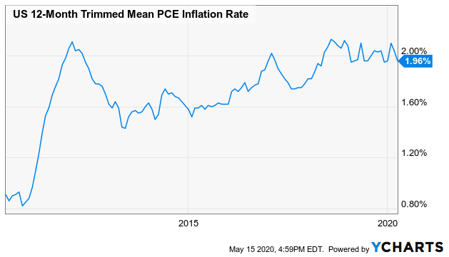
Source: YCharts
Bolstering last week's recovery from the market was word that our factories are, as a group, a little busier than expected. Capacity utilization of 64.9% topped expectations of 64.0%, though was still a sharp decline from 73.2%. Production fell 11.2% after March's 4.5% decline, though economists were calling for a 12.1% contraction.
Capacity Utilization and Industrial Production Charts

Source: YCharts
Finally, there was one particularly sore spot in terms of economic numbers posted last week. Overall retail sales slumped 16.4%, and when taking cars out of the mix (and this is even more incredible part), retail spending fell 17.2%. Both were far bigger drops than had been modeled, though in forecasters' defense, everyone's only able to take educated-but-wild guesses.
Retail Sales Growth Charts
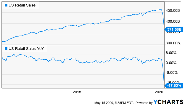
Source: YCharts
Just bear in mind that the sharp drop in retail consumption may be more the result of an inability or unwillingness rather than a lack of fiscal capacity to spend.
Everything else is on the grid.
Economic Calendar
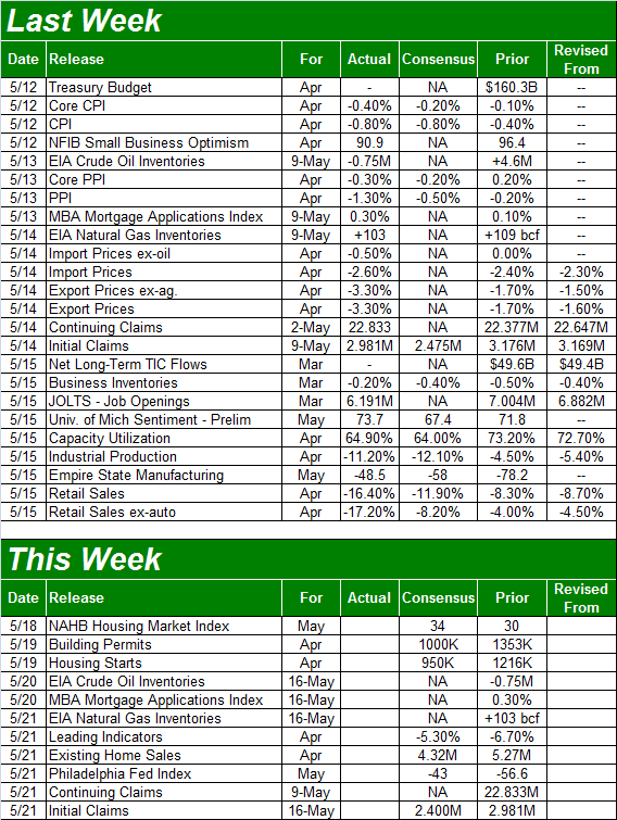
Source: Briefing.com
This week is going to be oddly tame on the economic news front, though it will be a pretty important one as far as real estate barometers go.
The party starts with Tuesday's housing starts and building permits. The pros are calling or sharp declines, but again, it's not as much a lack of ability as it is a lack of feasible opportunity. But, a rough month will still break a long-standing uptrend.
Building Permits and Housing Starts Charts

Source: YCharts
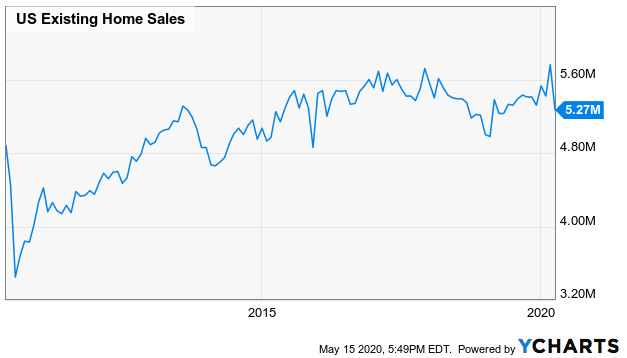
In the same vein, April's existing home sales will be posted on Thursday. They're going to fall sharply too.
Existing Home Sales Chart
Source: YCharts
Stock Market Index Analysis
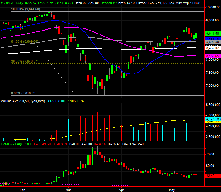
We'll kick this week's analysis off with a look at the NASDAQ Composite rather than our usual review of the S&P 500, as it's the NASDAQ that quickly confirmed where its lines in the sand are. Last week's low of 8705.25 was put in place by the 50-day moving average line (gray), but the 20-day moving average line (blue) also played a support role that led to the reversal effort.
NASDAQ Composite Daily Chart, with VXN
Source: TradeStation
You can also see that, while Tuesday's and Wednesday's selloffs were high-volume moves, there was strong volume behind Friday's bounce despite the fact that it means the buyers would have to sit on those names for a two-day stretch during which they couldn't dump those holdings. The fear of not being in the market was greater than the fear of being out of it.
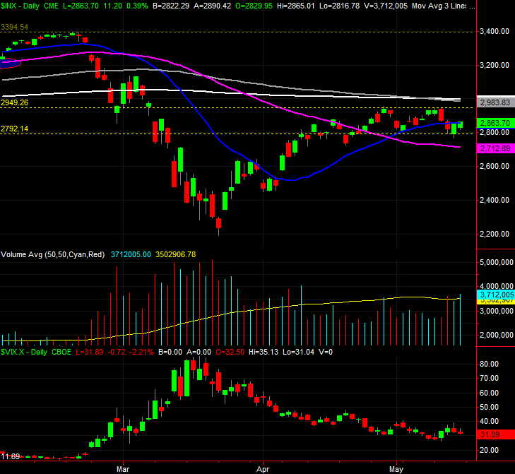
In most regards the S&P 500 didn't fare as well, although in one big way it fared even better.
The 'worse' was, the S&P 500 remains below its 200-day moving average line (white) and its 100-day moving average (gray). The previous week's low of 2792 more or less seems to have turned into technical support -- the lower of the yellow dashed lines -- and the S&P 500 even managed to close back above its 20-day moving average line (blue) by the time Friday's closing bell rang. But, it would have been better for the bulls to not slide under the 20-day moving average line in the first place.
S&P 500 Daily Chart, with VIX and Volume
Source: TradeStation
The one very encouraging aspect evident on the S&P 500's daily chart is the volume. As was the case with the NASDAQ on Friday, the participation for the S&P 500's constituents was very strong. In fact, the volume behind Friday's gain for the large cap index was the highest we've seen since April 9th. It's a fairly convincing indication that traders are increasingly convinced the foreseeable future is a brighter one than many had been expecting just a few weeks back.
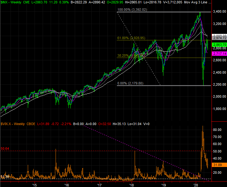
Just for a little more perspective, take a look at the weekly chart of the S&P 500. On this particular image you'll also see Fibonacci retracement lines plotted for the entire February/March selloff. These retracement lines largely explain why and how the S&P 500 is struggling to move forward even if the NASDAQ isn't. The 61.8% retracement line around 2929 is more or less where the index has peaked the last couple of weeks, and that resistance is augmented by the 100-day and 200-day moving average lines.
S&P 500 Weekly Chart, with Fibonacci Retracement Lines
Source: TradeStation
This technical resistance doesn't necessarily mean the rally has to stop here. In fact, the resistance at this point is a good thing, as it will validate any forward progress that takes shape from here, since it will prove the advance was strong enough to break through resistance. The fact that the NASDAQ has already cleared its big technical hurdles is a big clue as well, since the composite leads the market higher and lower.
Still, until the S&P 500 is actually on the other side of its current technical ceiling, traders would be wise to not dig in too deep.