Weekly Market Outlook - Stocks Are Still on the Wrong Side of the Fence
Stocks may have ended last week on a high note, but last week, stocks still logged a loss. More than that, the S&P 500 and most other indices remained below key moving average lines despite the last-minute push.
That doesn't necessarily mean the market is too far gone to stage a rebound effort here. On the other hand, that doesn't mean it's going to happen either. This is a tough time of year for the market already, and it's unlikely investors have forgotten how easily the market was up-ended a couple of different times just since the latter part of July.
We'll take a closer look at what has to happen here if the market is to recover, or what it will take to break down. Both remain distinct possibilities. First, however, let's recap last week's big economic news and preview this week's announcements.
Economic Data Analysis
A week ago we expressed concern that, given the sudden lull in producer inflation, consumer inflation would be cool as well. It made last month's rate cut not only timely, but brilliant. As it turns out though, inflation may not be nearly as contained as suggested then. Last week, consumer inflation for July rolled in higher than expected, on a core and non-core basis. 'The' inflation rate now stands at 2.2% on a core, and is on the rise again whether or not volatile energy and food prices are factored in.
Producer, Consumer Inflation Charts
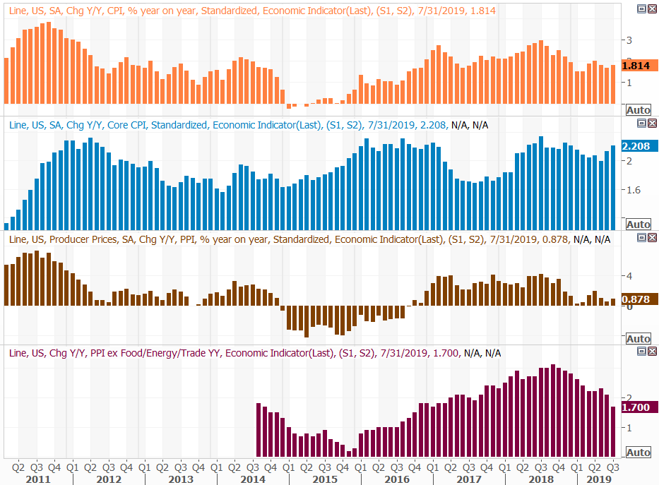
Source: Thomson Reuters
Retail sales were also strong, in step with higher inflation. Retail spending grew 1.0% month-to-month, not counting automobile sales, and was up 3.4% year-over-year.
Retail Spending Growth Charts
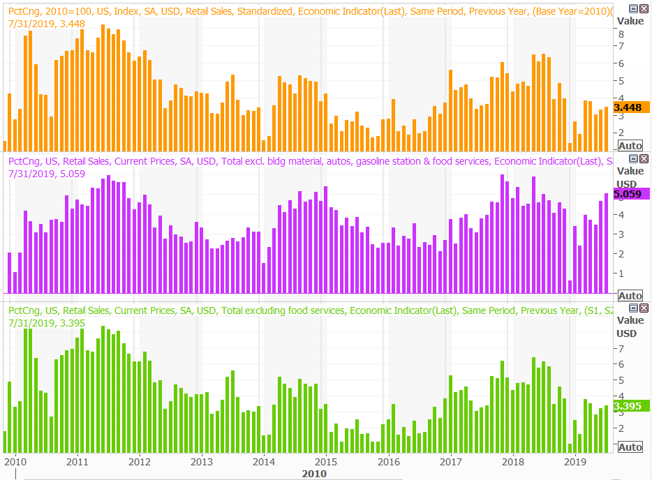
Source: Thomson Reuters
If there truly was a retail spending lull earlier in the year [it may have been a data or calculation error], it's been abated. Sales have grown a couple of consecutive months now, arguably at a time when other economic data says it shouldn't be.
One of those red flags was the surprise lull in capacity utilization and industrial productivity. Economists were more or less expecting a repeat of June's levels, but last month, each slumped. It wasn't a drastic pullback, but it may be a renewal of a downtrend that started to take shape early this year.
Industrial Productivity, Capacity Utilization Charts
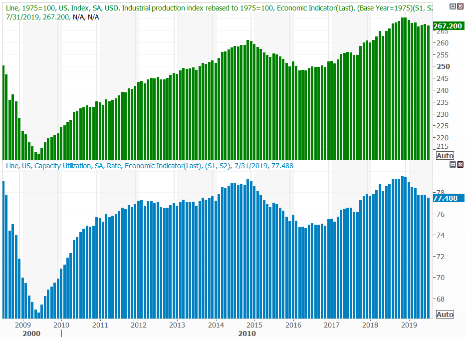
Source: Thomson Reuters
Finally, on Friday we got a better look at July's real estate data with housing starts and building permits. Starts fell, and fell short of expectations. Permits were up though, and rolled in higher than expected.
Housing Starts and Building Permits Charts

Source: Thomson Reuters
The mixed message may be the result of the timing of lower interest rates. Mortgage rates only fell last month, which is enough time to pull a permit, though not enough time to actually start new construction. That should start to materialize this month, and next. Even so, we need some help here.
Economic Calendar
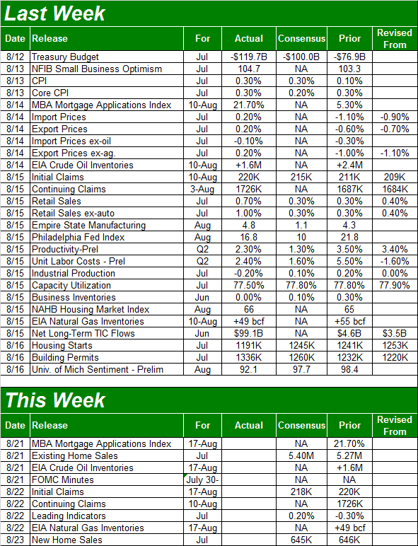
Source: Briefing.com
This week's biggies will be the release of the minutes from the FOMC meeting, and an update of the nation's home purchases.
The Fed won't be making an interest rate decision this week, to be clear. The next scheduled interest rate decision won't come until next month. Traders are betting on another quarter-point cut, though the Fed's Board of Governors have been a little more hawkish than it seemed like they might by just a couple of months back. The nature of the discussion should provide significant insight into what the voting members are thinking and seeing here.
And, July's home purchases data will round out the look at the real estate market. Remember, lower mortgage rates appear to have prompted permits for new construction. That same tide could also spur purchases of existing as well as recently-built homes now for sale. Economists aren't looking for much change from June's levels, so this is an opportunity for the economy to deliver a pleasant surprise.
New, Existing Home Sales Charts
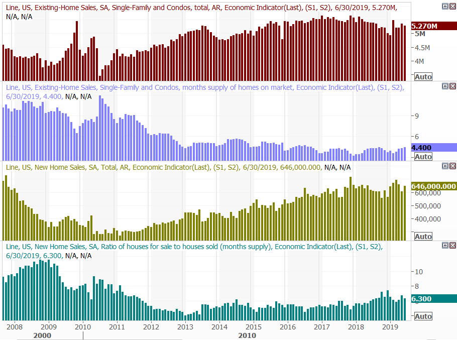
Source: Thomson Reuters
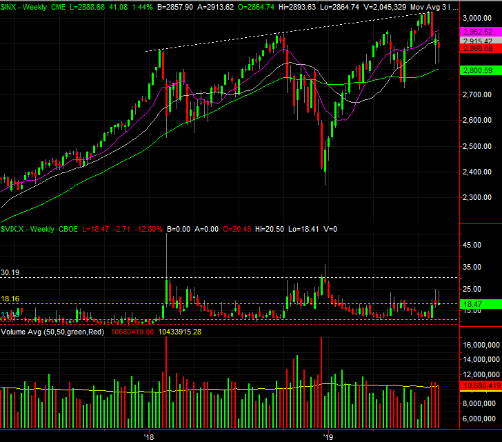
Stock Market Index Analysis
Last week we explained the market was 'messin with ya,' just to keep anyone on either side of the table from getting complacent. It was doing so by virtue of ending the week in question right in between all of its key moving average lines.
Stocks are still messin' with ya, trying to talk people into (and out of) trades. This time the S&P 500 is doing so, underneath another important moving average line, but ending last week on the rise... testing that moving average line as a ceiling. Most traders are very unsure of what lies ahead, and that's what the market (subconsciously) wants. We're not there yet, but we're closer to the point where stocks shock or jolt the masses into panic-driven action. That will bring a close to the indecision.
The only question is, what will that look like? Will it be a full-blown capitulation? We need one to be sure, even though it'll hurt at the time. Or, perhaps it will be a slow roll into a new uptrend that gradually re-inspires confidence on the way up.
In any case, a look at the actual charts is helpful, even if not conclusive.
The S&P 500 ended last week below its 100-day moving average line, plotted in gray on the daily chart below. That's the big change from last week. But, giving credit where it's due, on Tuesday, Thursday and Friday, the volume behind those gains was quite healthy. Monday's down-day volume was weak, while Wednesday's loss was made on the highest daily volume of the week. On balance though, the buyers made some noise, even if they technically lost ground.
S&P 500 Daily Chart, with VIX, Volume
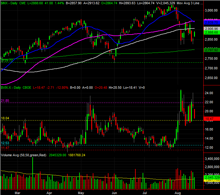
Source: TradeStation
It may or may not matter, but take note of the fact that the S&P 500 did NOT touch the green 200-day moving average line last week. Instead, notice that the index appears to be turning the 2824 area into a floor.
Zooming out to the weekly chart, as always, puts things in much-needed perspective. It's in this timeframe we can see just how modest the pullback to-date has been. The S&P 500 only fell about 6.7% from its July high to its August low, which isn't much. The early 2018 stumble was bigger, and the October/December selloff was MUCH bigger. May's selloff was about as big as the current one has been so far, which may be part of the reason it was so easy to get back into a bearish mode again so soon.
S&P 500 Weekly Chart, with VIX, Volume
Source: TradeStation
The weekly chart also points to another problem that's yet to be addressed, and was never addressed in May - the VIX never reached 'painfully scary' levels near 30 last week, or the week before. For the market to make a good, complete, blowout bottom the VIX really needs reach that level.
Ideally, the S&P 500 will find support at the 200-day moving average line (near 2800) at the same time the VIX surges. That, however, may only be wishful thinking. The index shrugged off the May break below the 200-day moving average line, but we may not be so lucky with the next test.
Same story for the NASDAQ Composite.
NASDAQ Composite Daily Chart, with VXN, Volume
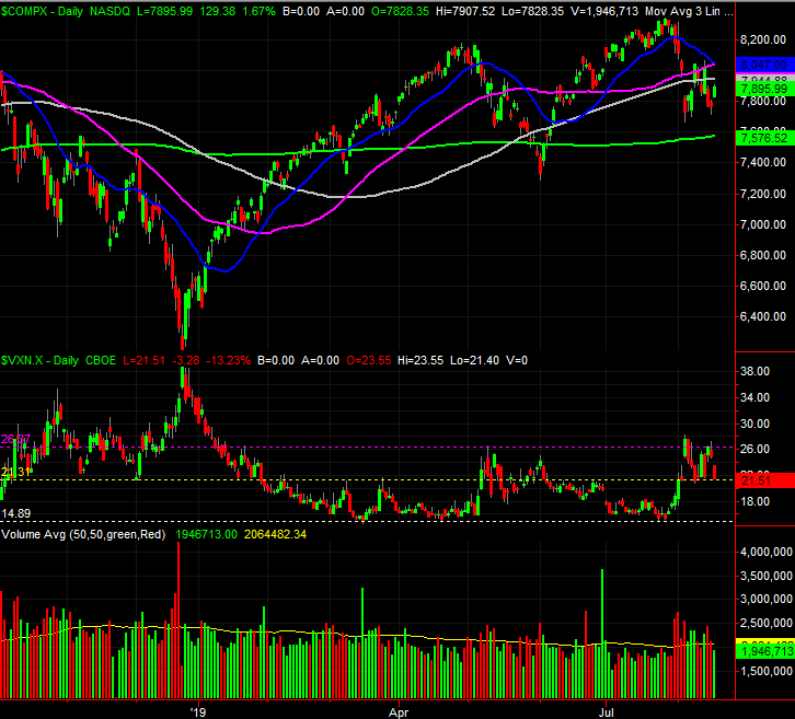
Source: TradeStation
As a reminder, this is a time of year that's lethargic for the market, at best. In some cases it's downright bearish. Rarely is it bullish. It's particularly rough patch for the third year of a presidential term (which we're in now). There would be nothing unusual about more weakness here than we've already seen.
Bear in mind there's room for the market to rise from here before revisiting key moving average lines. For the S&P 500, that's the 20-day moving average line (blue) and the 50-day moving average line (purple), both at 2940. Don't jump to conclusions about a great start to this week.