Weekly Market Outlook - Back From the Brink, But Just Barely
Once again, the market played with fire. And once again, the market managed to escape... unburned. Stocks could have certainly fared better than they did, but even a small bounce is a much-needed step back from the ledge the market was approaching just a week earlier. It's something to build on.
 Still, stocks are hardly out of the woods. A break under a major support level is still within easy reach, and a political storm continues to brew. Plus, the near-term trend is still technically a bearish one.
We'll look at the good, the bad and the ugly below, after running down last week's economic reports and previewing this week's economic announcements.
Economic Data
Last week wasn't a particularly big week in terms of economic news, but a couple of items are worth examining.
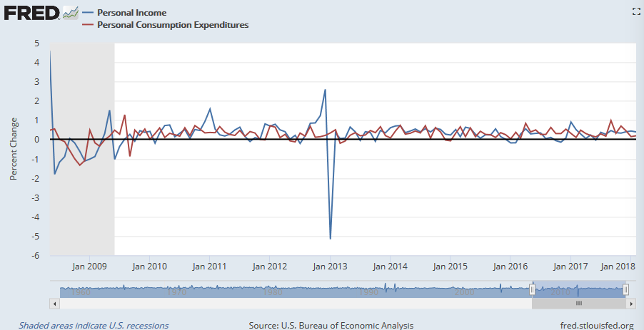
Chief among them is last month's personal income and personal spending, both of which were up as much as expected, and up for a second month. In fact, both have been trending higher for years now.
Personal Income and Personal Spending Charts
Source: St. Louis FRED
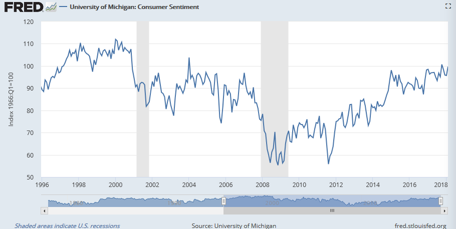
The other biggie was the third and final update of the Michigan Sentiment Index for March. It rolled in at 101.4, up a bit from February's score, and extending an erratic but clear rise since 2009.
Michigan Sentiment Index Charts
Source: St. Louis FRED
Everything else is on the grid.
Economic Calendar
Source: Briefing.com
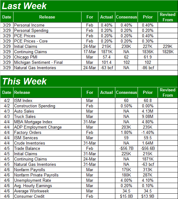
We'll see a lot more activity this week in terms of economic news, beginning with the ISM Manufacturing Index report on Monday, and Wednesday's ISM Services report. Both have been advancing nicely of late, in step with economic acceleration.
ISM Manufacturing and Services Index Charts
Source: YCharts
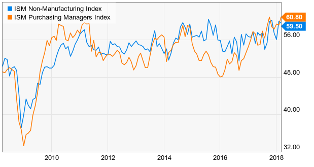
On Tuesday keep your eyes/ears open for March's auto sales data; the industry needs a victory here, after a streak of declines. Note that "peak auto" clearly happened in 2016. The surge late last year stemmed from the impact of not one but two hurricanes.
Auto Sales Charts
Source: YCharts
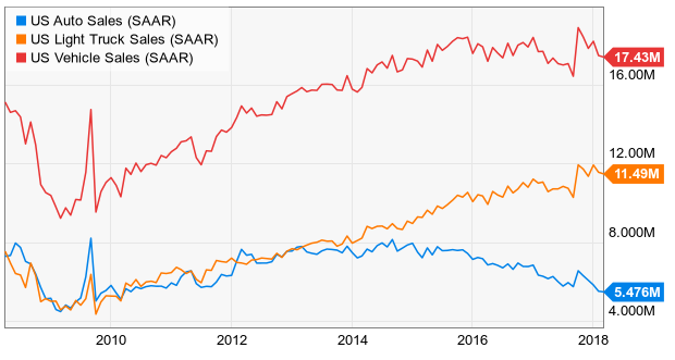
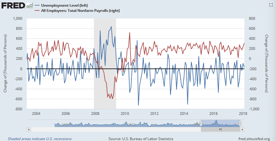
This week's biggie, of course, will be Friday's employment report for March. Experts are looking for 175,000 newly-created jobs following February's surprising surge of 313,000 new payrolls. That should be enough to move the dial on the unemployment rate from 4.1% to 4.0%, and spur yet-another bump up in wages.
Unemployment Rate Chart
Source: St. Louis FRED
Payroll Growth, Unemployment Growth Charts
Source: St. Louis FRED
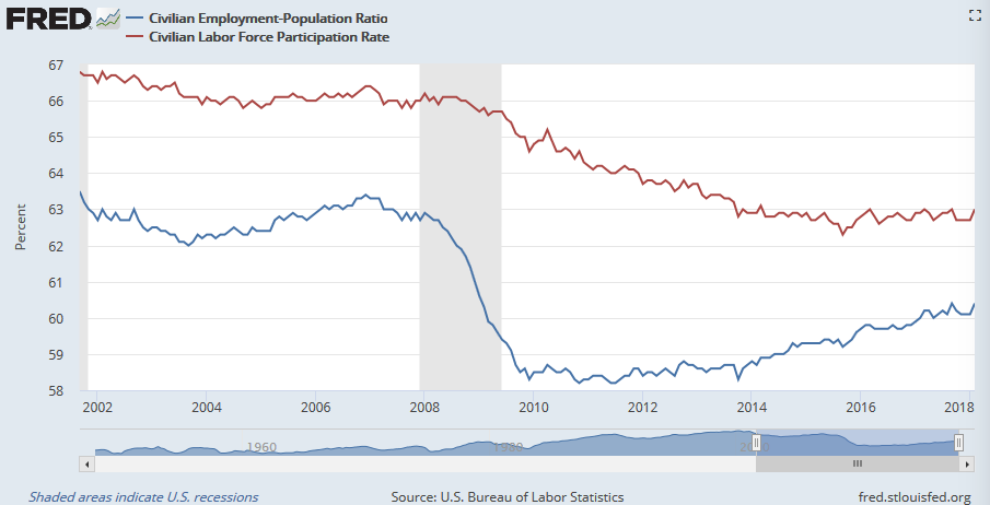
The real litmus test with Friday's jobs report may well be the employment/population ratio and the labor force participation rate. The former has been trending higher quite nicely, but the latter has been stagnant. If the labor force participation rate can finally break above 63.0%, that could be the point where earnings (though also inflation) really start to heat up.
Employment/Population and Labor Force Participation Rate Charts
Source: St. Louis FRED
Index Analysis
It could have been worse. The market started last week with a big loss, following through on the prior week's tumble. When all was said and done, the S&P 500 mustered a small gain for the week that just ended.
But, as far as rebound efforts go, it was a lackluster one. On Thursday (the last trading day of the week), the S&P 500 ended up peeling back from highs, and the modest gain we did see was on modest volume. We're still within easy reach of a more serious breakdown below a major support level.
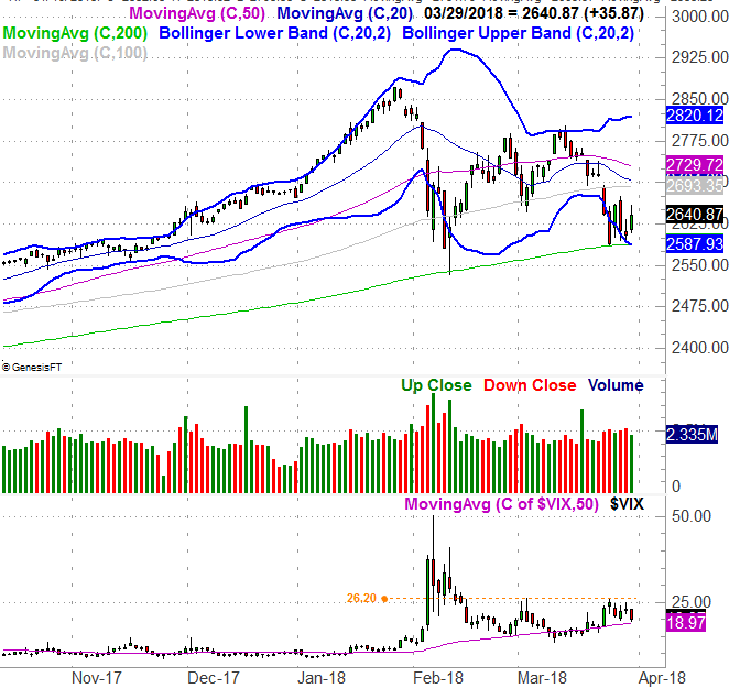
That support level, by the way, is the 200-day line... the green line on our daily chart of the S&P 500 below. The index kissed it a week prior, and managed to push up and off of it. It's hardly the beginning of a rally though.
S&P 500 Daily Chart, with VIX and Volume
Source: TradeNavigator
At the same time, notice that the S&P 500 is now under all the other key moving average lines, and two of them - the 100-day (gray) and the 20-day (blue) average lines - are about to converge. When and if they do, they'll become an even stronger ceiling. Any rally effort would have to clear that ceiling first before we can take any bullish move seriously. Anything less, and the market is only in limbo... at best.
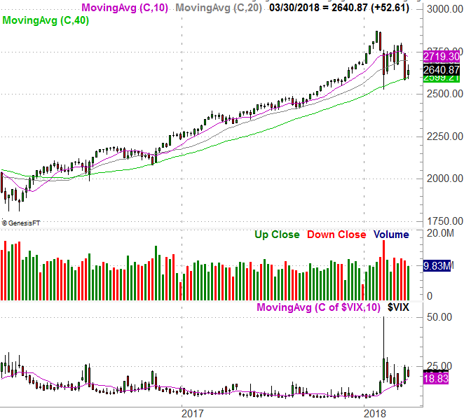
Zooming out to a weekly chart, we don't see anything new, but we do get some perspective on how and why this recent weakness developed - the early-2016-to-late-2017 advance was huge, and uninterrupted. There was a lot of pent-up profit-taking to process. Maybe there's more.
S&P 500 Weekly Chart, with VIX and Volume
Source: TradeNavigator
For a little more perspective, from its recent high to its recent low, the S&P 500 has fallen right around 10%. That size of corrective move isn't abnormal.
It's been abnormal of late, mind you, which may well mean more pullback is on the way... to make up for lost time. AS you can also see on the weekly chart though, the 200-day moving average line is the key. So is the VIX's recent ceiling at 26.20. If both are broken at the same time, look for another bearish leg. Anything less, and stocks remain on the fence.
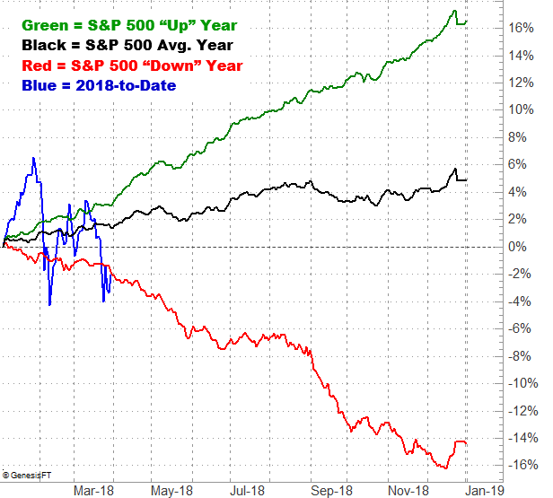
For what it's worth (which isn't much), April is usually a pretty good month for the market. The S&P 500 averages a 1.2% gain for the month. When the year starts bearishly though, the S&P 500's performance goes from bad to worse in a hurry. And, clearly this year has gotten off on the wrong foot.
S&P 500 Average Annual Performance vs. 2018 YTD
Source: TradeNavigator
It's this chart above that keeps us wary of digging in too deep into any seemingly bullish move.