500 Days Into Trump, How's the Market Doing vs. the Norm?
Back in November of 2016, headed into that year's Presidential election, and then with even more fervor following Trump's unexpected victory, the chatter about the future of the market was grim. Most of the media managed to convince most investors that his policies and style would prove problematic for the economy.
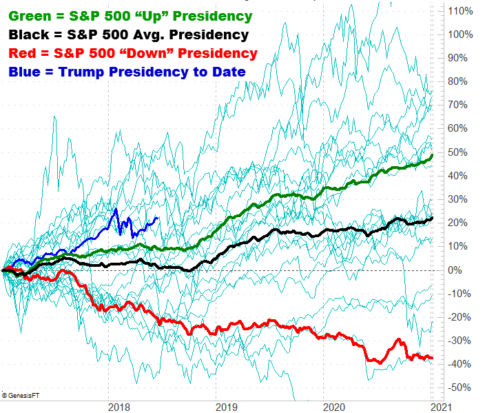
The nay-sayers were wrong. The S&P 500 has rallied 22% since President Trump's inauguration in January of 2017, and that's after the shocking rally seen in November and December of 2016. That's not just better than average, that's better than the average bullish four-year span of a Presidency (taking out the ill effects of the 'bad' or 'losing' four year spans during a particular Presidential term). On average, the market should only be up about 2% so far under Trump's tutelage, and only up 10% when only counting bull markets.
It's not the best start to a Presidency though. Some Presidents were able to get the S&P 500 up as much as 50% by this point... though they had a little help and fortuitous timing. That is to say, they started the clock with stocks down, but poised for a quick bounceback.
Either way, while the market may be ahead of its usual pace as we hit the 500-day mark with Donald Trump in the White House, the best may be yet to come.
The graphic below tells the tale. It plots the S&P 500's performance over the course of a four-year Presidency going all the way back to 1901. As you can see, the end of the second year and the first half of the third year of a Presidential term are red hot. The latter half of year-three and the fourth year are also pretty good.
We have a lot to look forward to.
The fainter, blue-green lines are a plot of every four-year Presidential term's outcome for the S&P 500 going back for more than a century. As you can see, we've experienced a little of everything. You can also see that nothing is etched in stone. A bad start can end beautifully for a President, and a good start can certainly turn into a disaster. The tendency is the tendency, however.
Still, we have to respect the reality that we're headed into a slow three-month stretch for this part of the typical Presidency.
And, with or without the Presidential cyclical impact, and focusing on the one-year calendar cycle, things are looking less-than-thrilling. The average June performance for the S&P 500 is a 0.1% loss, followed by a 0.9% gain in July. The average August is a 0.3% loser though, and for September, the S&P 500 loses an average of 0.6%. We're really fighting the averages here, and fighting them even more this year around thanks to an unusually bullish performance thus far.
It's just one piece of the puzzle, to be clear. It's still smart to look at everything, including a daily chart, to consider other meaningful clues. Between the convergence of multiple layers of information, you really can determine what lies ahead... and trade accordingly.