
Weekly Market Outlook – Stocks Are Running Out of Steam Right Where Expected

The market wasn’t able to log three winning weeks in a row, although the S&P 500 as well as the NASDAQ Composite were both briefly up for the week on Thursday. Traders are just hesitant to dive in against such an uncertain backdrop. And, who can blame them?
That being said, the market might have bumped into this headwind regardless of any tariff-related turbulence. There’s a major technical overhang immediately above, and it’s getting stronger as time marches on.
We’ll examine the matter in our usual detail below. Let’s first look at last week’s biggest economic reports, including an important one regarding interest rates. Spoiler alert: They didn’t change.
Economic Data Analysis
First things first. On Monday of last week we rounded out the look at April’s economic barometers from the Institute of Supply Management. The services index managed to edge a little higher rather than falling as expected, moving further above the pivotal 50 level with by improving from 50.8 to 51.6.
ISM Manufacturing, Services Index Charts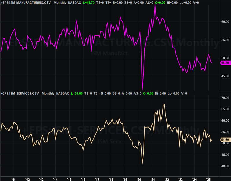
Source: Institute of Supply Management, TradeStation
That’s still not enough progress to call it a new uptrend, while the manufacturing index just suffered its second losing month in a row. But, treading water is still more net-positive than moving back into new-low territory.
This past week’s top news, of course, was the Federal Reserve’s decision to hold the Fed Funds Rate at its current target range of between 4.25% and 4.5%. The FOMC is still modeling a couple of quarter-point rate cuts this year though. It’s likely just waiting for a more certain environment, particularly as it pertains to new tariffs that could make consumers’ cost jump.
Everything else is on the grid.
Economic Data Report Calendar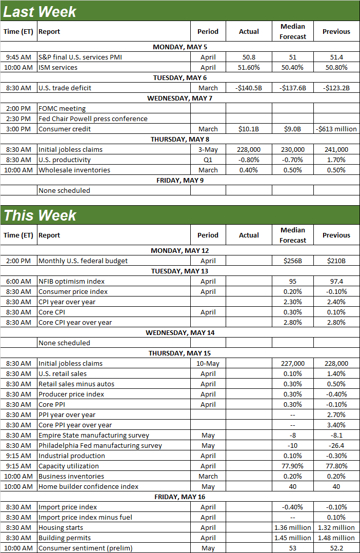
Source: Briefing.com, TradeStation
This week’s going to be much busier. The party starts in earnest on Tuesday, with the beginning of two days’ worth of inflation reports. April’s consumer inflation will be posted on Tuesday, with consumer inflation figures due on Thursday. Look for consumer inflation to hold steady at just above 2.0%, while economists believe the producer price lull seen in March will be restored to the same norm of a little more than 2% this time around.
Consumer, Producer Inflation Rate Charts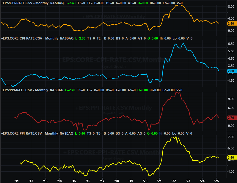
Source: Bureau of Labor Statistics, TradeStation
Clearly the bigger trend here is still sloped down for all inflation measures. The Federal Reserve does have some room to lower interest rates, particularly if inflation rates continue to cool this time around.
Retail sales will be reported on Thursday as well. You may recall they really perked up in March. Economists don’t believe that hot pace continued in April though. At least it’s not going backwards though.
Retail Sales Charts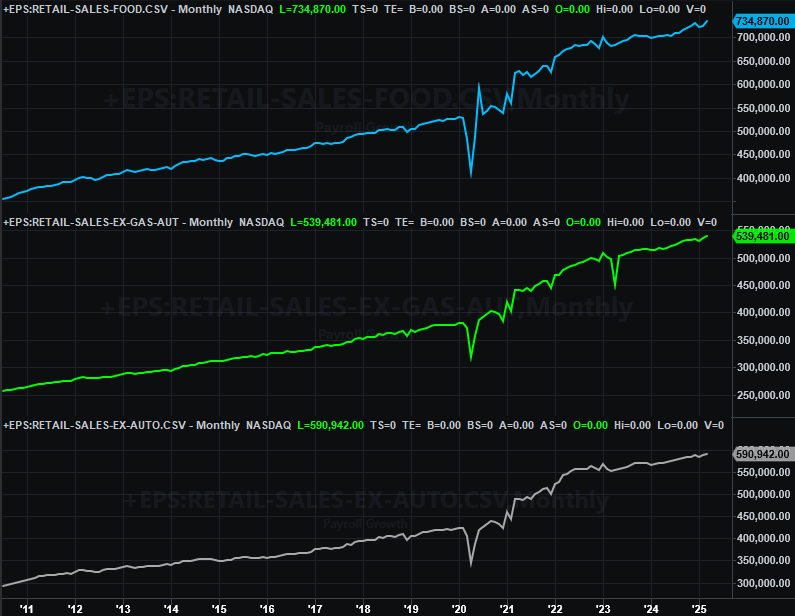
Source: Census Bureau, TradeStation
Also on Thursday we’ll hear last month’s capacity utilization and industrial production data from the Federal Reserve. Both stumbled a bit last month, threatening to end young progressive efforts (albeit it not enough to snap this budding trends yet). Forecasts say both shallow uptrends should be back on track now.
Industrial Production, Capacity Utilization Charts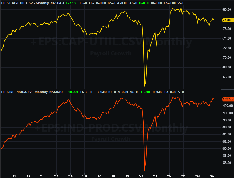
Source: Census Bureau, TradeStation
This is actually pretty encouraging data, even if not many people are talking about it… or even noticing,
Finally, on Friday look for April’s housing starts and building permits. As our chart below shows, both numbers have remained a bit erratic, but have also been range-bound at relatively uninspired levels. Economists don’t believe we’ll see any real progress this time around.
Housing Starts and Building Permits Charts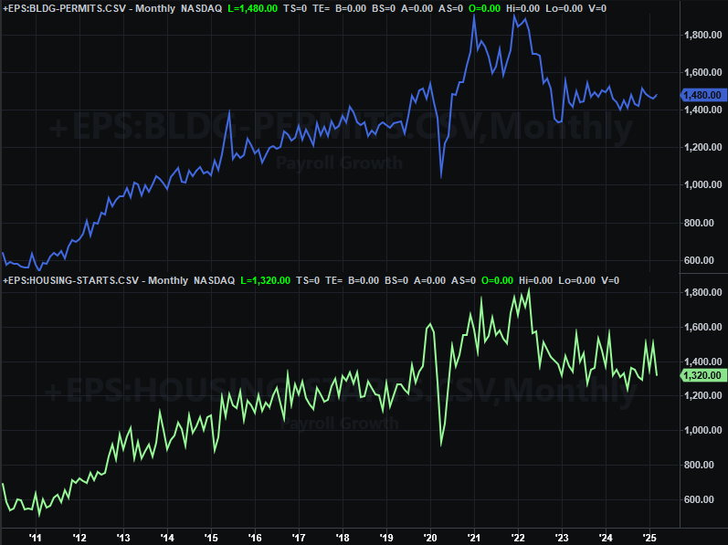
Source: Census Bureau, TradeStation
Obviously poor starts and permits is a symptom of tepid interest in home purchases… which is bad for homebuilders, but doesn’t exactly bode well for sales of existing homes either. Blame the combination of high rates and high prices. This is also a concerning barometer for the overall economy’s current condition.
Stock Market Index Analysis
This week starts with a zoomed-in view of the daily chart of the S&P 500 for one big reason. That is, we want to highlight the fact that the rally is slowing down as the index nears the 200-day moving average line (green) at 5,744… a line that’s now sloped slightly downward. It may be a hint that traders were planning/counting on an end to the effort there, so much so that they’re making it happen. This slowdown now encourages more traders to at least think about joining the bearish camp. (Also notice that the volume on the way up never really started to grow, underscoring the argument that the effort never truly had much hope of following through.)
S&P 500 Daily Chart, with VIX and Volume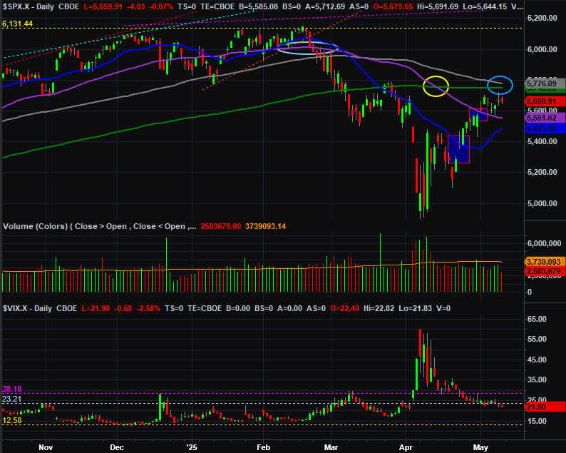
Source: TradeNavigator
The daily chart of the NASDAQ Composite looks about the same, although we’re seeing a slight improvement in volume on the way up here. Even so, this index is also entertaining second thoughts about moving above its now-falling 200-day moving average line (green) at 18,330. That line, by the way, is almost dead-even with March’s short-lived peak (white, dashed). This level may be even more important than it seems right now.
NASDAQ Composite Daily Chart, with VXN and Volume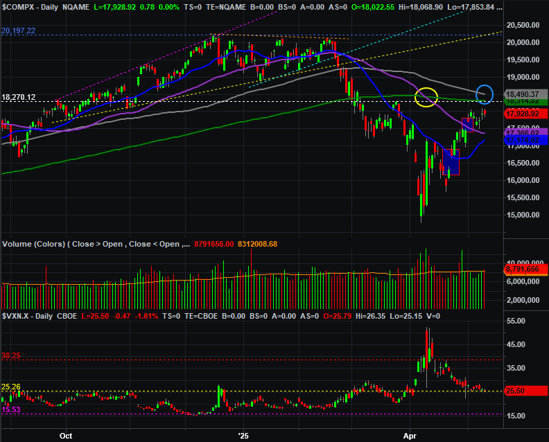
Source: TradeNavigator
You’ll have noticed the same new addition on both daily charts above. That’s the blue circle just above where both indexes ended last week. We’re only highlighting the fact that the 100-day moving average lines (gray) are both about the fall below the 200-day lines, after the 50-day moving average lines (purple) did so in April (circled in yellow). It’s a problem simply because the more confirmation traders see that the tide has taken a bearish turn, the more likely they are to not count on a rally, and bet against it instead.
In other words, it’s still entirely possible the 16% rebound from last month’s low could still be nothing but sheer volatility within a new, bigger-picture downtrend. If that’s the case, last week’s slowdown certainly makes much more sense.
There’s one potential layer of support that could fend off a rekindled pullback though… a floor that’s only materialized within the past couple of weeks. That’s the 50-day and 20-day (blue) moving average lines, the latter of which could soon cross back above the former. In many regards, the market is trapped in a proverbial no-man’s land.
Here’s the weekly chart of the S&P 500 for a bit more perspective on the recent action. As you can plainly see, everything changed in early March. Stocks were thrust into a whole new technical paradigm, and aren’t back in the bullish trading range that was so helpful throughout 2023 and 2034. It’s going to take a lot to restore that effort, just beginning with a move above the 200-day moving average line that suddenly seems like it’s going to be much tougher to hurdle.
S&P 500 Weekly Chart, with VIX and MACD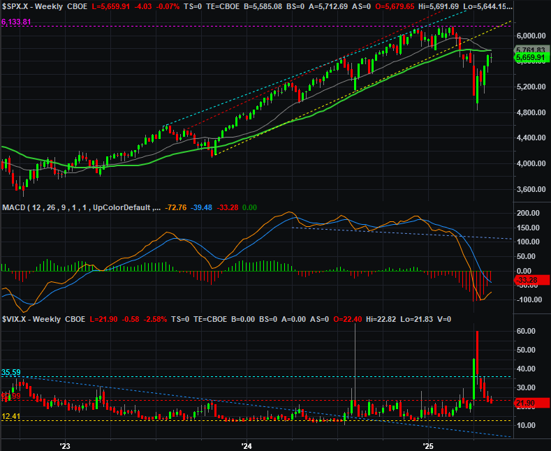
Source: TradeNavigator
No need to look at the NASDAQ Composite’s weekly chart this week… it looks about the same as the S&P 500’s, and is certainly telling the same story.
So what’s the call? The best, smart-money move to make here is doing nothing for now and just letting the market tip its hand. Just be patient. Stocks are trapped between a rock and a hard place that are actually pretty close together. Specifically, both indexes could test their 200-day lines as a ceiling and their 20/50-day moving average lines as a floor a few times over the course of the next several days. A bit of bouncing around would actually be healthy, by allowing the bulls as well as the bears to regroup and think about what they actually want to do next. Make your move once the market finally breaks out of these narrow confines of its moving average lines.