

Ouch. What started out as a tolerable weekend ended in disaster. Massive tariff-prompted plunges on Thursday and Friday dragged the S&P 500 down 9% for the five-day stretch, leaving the index 17% below its February peak. That’s a big loss made even bigger by the sheer speed of it.
And yet, there’s a bullish prospect to it. The market fell so hard last week -- and left two gaps behind as a result -- that we may be primed for a bounce. It’ll only be a dead-cat bounce to start. But, the right nudge unfurling in the right way against the right backdrop could be the beginning of a sustained advance that allows the market to sidestep a full-blown bear market.
But that’s a big “if.” Maybe the market’s going to ultimately make lower lows whether or not the bulls push back from here.
We’ll weigh those odds in a moment. Let’s first look at last week’s big economic news and then preview what’s in the pipeline for this week.
Economic Data Analysis
Not too much last week, but a couple of biggies.
The party started with a look at last month’s economic activity from the Institute of Supply Management. The manufacturing index tumbled again, sliding under the pivotal 50 mark. The services index also fell again. While it’s still above the 50 mark, it also fell to a multi-month low. Either way, this points in the wrong direction at a time when there’s no room for bad news.
ISM Services, Manufacturing Index Charts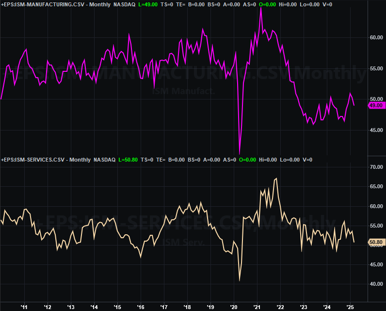
Source: Institute of Supply Management, TradeStation
The other big release was of course Friday’s jobs report. Surprisingly, the unemployment rate ticked just a bit higher to 4.2% despite slight but respectable growth (+228,000) in total payrolls. Every contributing data point -- like the size of the actual active labor force and the reported number of officially-unemployed individuals -- just moved a little bit in the right direction.
Unemployment Rate, Payroll Growth Charts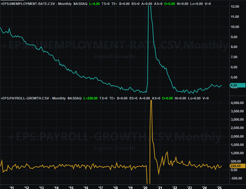
Source: Bureau of Labor Statistics, TradeStation
Just bear in mind these numbers took shape before the market really began to implode, and in particular before a large number of federal government workers were removed from their jobs.
Everything else is on the grid.
Economic Data Report Calendar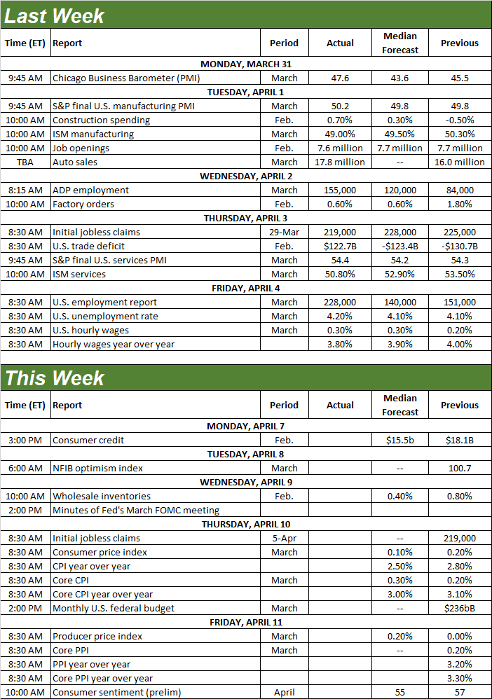
Source: Briefing.com, TradeStation
This week’s going to be a doozy, but only because of last week’s rout and the sudden, new need for help.
On Wednesday we’ll hear the minutes from March’s FOMC (Federal Reserve’s Open Market Committee) meeting, which took place before last week’s meltdown. The Fed was already leaning in an accommodative direction, and though it’s too late to change that meeting’s discussion, the FOMC is likely thinking even more dovish now. For what it’s worth, however, the market’s already now betting on three (and almost four) quarter-point rate cuts between now and October.
Whatever awaits, we’ll get at least a slightly better feel for what to expect beginning on Thursday with a report of last month’s consumer inflation. Economists are looking for more of about the same, on a core as well as a none-core basis. That being said, consumer inflation is still holding at slightly above target levels. On Friday look for producer inflation data, which is also likely to come in at about the same above-target we’ve seen for the past few months.
Consumer, Producer Inflation Rate Charts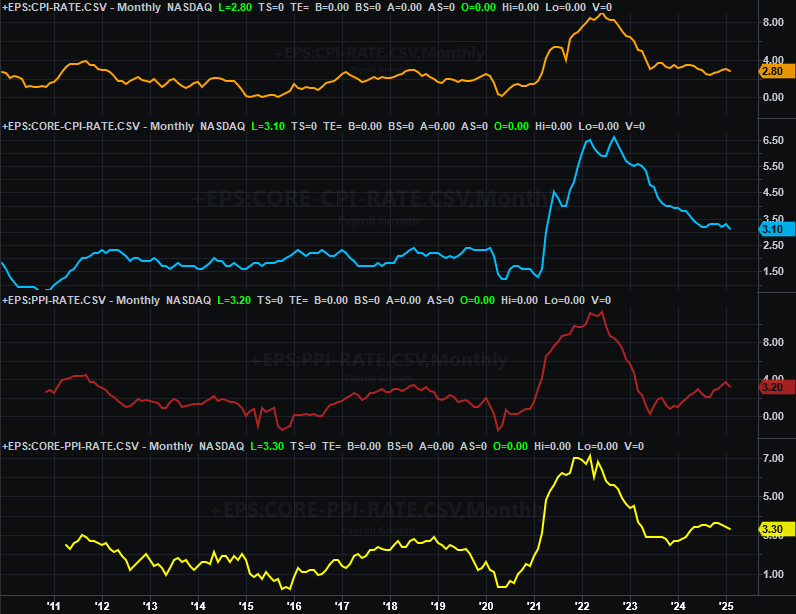
Source: Bureau of Labor Statistics, TradeStation
Stock Market Index Analysis
Is it possible? Is it possible that the Thursday and Friday of last week were so bad that we got a flushout that could be considered a true, complete, bottom-making capitulation?
Maybe.
The fact is, it’s too soon to make that claim. More than that though, not that any two capitulations are ever quite the same, we’d still prefer for any bottom-making selloff to take shape at least a little more organically, and a little less headline/panic-driven. As it stands now there’s no way of telling what most traders were thinking, or how that might change early this week.
Let’s begin with a look at the weekly chart of the S&P 500 just so we can get the proper perspective on last week’s meltdown. Take a look. Last week’s 9% tumble was the worst weekly loss since early 2020, when the COVID-19 contagion turned into a full-blown pandemic. Now down 17% from its February high, the index also fell just a bit under the 38.2% Fibonacci retracement line… the last technical line in the sand that could have been a rally point for the bulls and bottom-fishers.
S&P 500 Weekly Chart, with VIX and MACD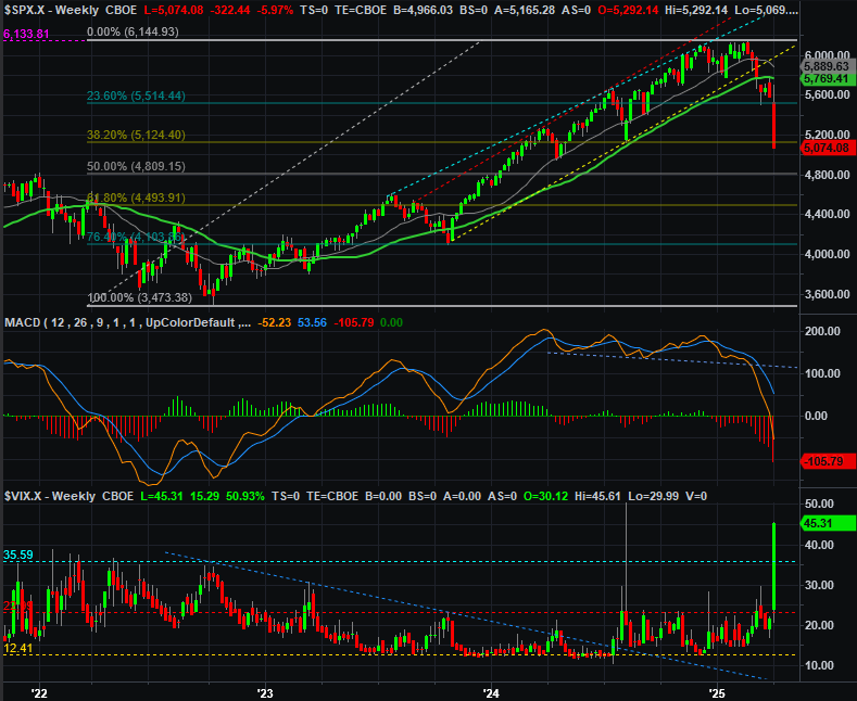
Source: TradeNavigator
That’s not the most noteworthy detail of the weekly chart above, however. Pay particular attention to the bottom portion of the chart, where you’ll find the S&P 500’s Volatility Index (VIX). As you can see, it popped to the highest weekly close in years, and almost reached its brief peak from August of last year (which was an anomalous surge, by the way).
This makes sense, of course. People aren’t just a little worried. The potential fallout from tariffs has been thinking the economy might soon collapse, and take stocks down with it.
In this vein, the weekly chart of the NASDAQ Composite and its volatility index (VXN) looks about the same. Although the composite has now obliterated the lower, rising boundary of a bullish channel that’s been steering things higher since early-2023, the NASDAQ’s VXN is also at a well-established ceiling around 40… a peak in fear. At the same time, the NASDAQ’s selloff of 22% has been so fast and so deep that some sort of bullish pushback seems inevitable.
NASDAQ Composite Weekly Chart, with VXN and MACD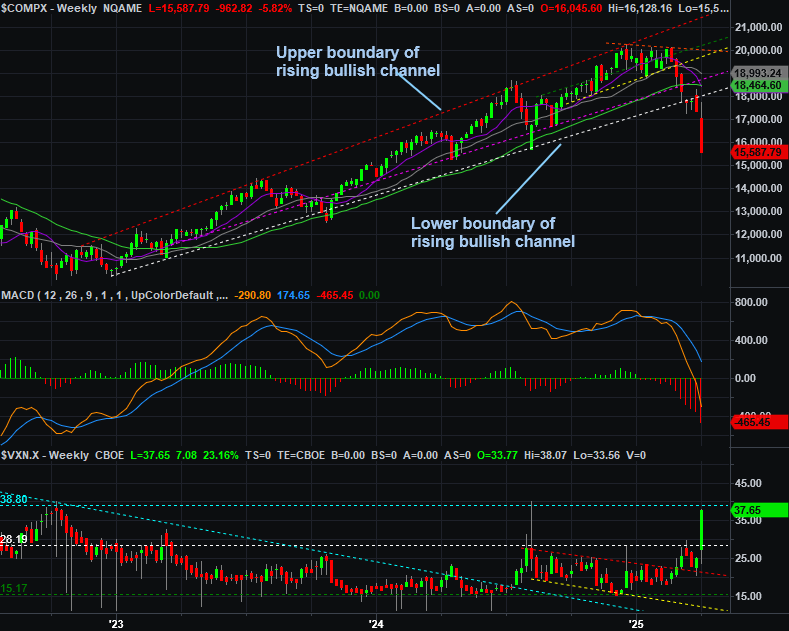
Source: TradeNavigator
But how much pushback? That’s just it. It’s impossible to say. What we do know is that there’s still a ton of newly-established technical resistance above, any and all of which could bring a quick end to the recovery effort and rekindle the selling. Headlines and perceptions will play a huge role in the ultimate outcome of that test.
Here’s the daily chart of the NASDAQ Composite. We’re mostly showing it to you to show that there’s not a whole lot of value in looking at it for clues about what’s next. There are a couple of details to draw out here, however. First, the composite itself is more or less where it bottomed in August of last year, while the VXN is now also about where it peaked at the very same time. There may be a psychological ceiling/floor at work here.
NASDAQ Composite Daily Chart, with VXN and Volume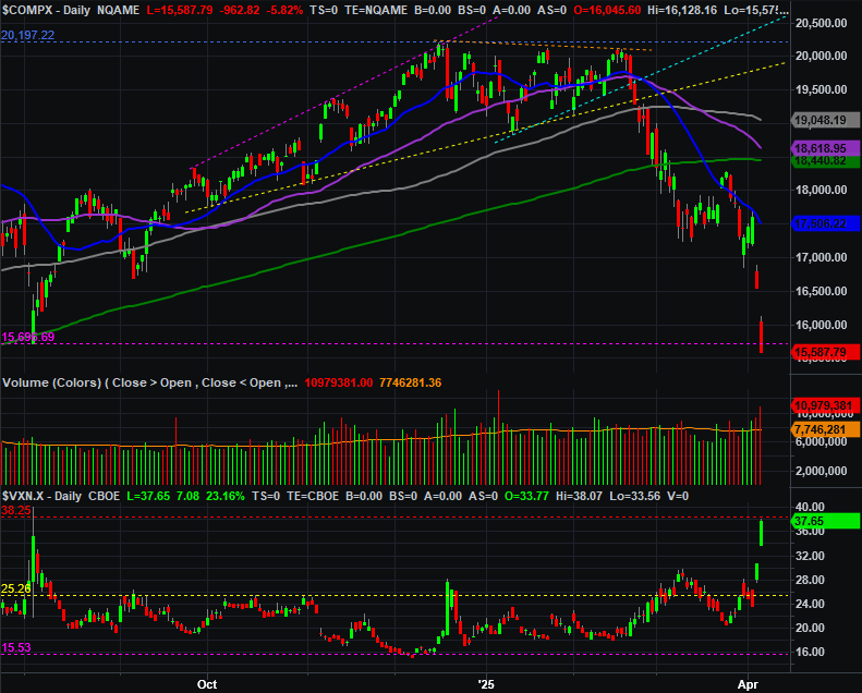
Source: TradeNavigator
The daily chart of the NASDAQ Composite also shows us that the 50-day moving average line (purple) currently at 18,619 is now on the verge of crossing under the 200-day line (green) at 18,441… a so-called “death cross” that says the tide’s taken a now-developed bearish turn. Even if the market does bounce from here, this clue of strong and sustained bearish momentum makes it easy for any recovery effort to be upended and drive stocks to even lower lows.