This "Worst Week for Stocks Since August" Was Forewarned Weeks Ago
Yikes. After a pretty darn good year and a surprisingly strong rally since early September, the market's finally hitting a headwind. In fact, if the market were to shut down the trading week right now (Wednesday), it would mark the worst seek for the S&P 500 since mid-September, forcing all the recent buyers to rethink their recent bullishness.
As much as at least a handful of bulls and newcomers would like to simply chalk this week's stumble up to a little volatility and buy-in again for yet-another bullish leg, that's probably not a good idea. See, not only are the underpinnings for more downside in place, they've been in place for far longer than most traders recognize. See, this weakness has been brewing since late last month. Most traders just chose not to see the warning signs.
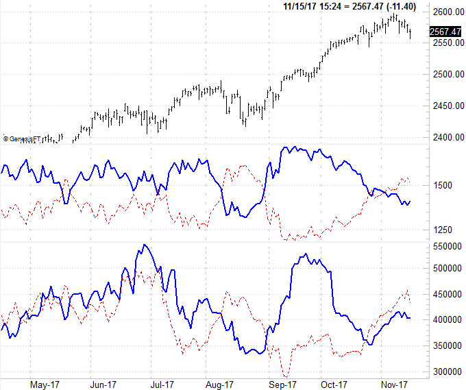
We'll revisit updated versions of our breadth and depth charts to make the point.
The short version of a long story: You can tell a lot about the true health of the market from its advancers/decliners ratio, and the amount of its volume that's bullish compared to the amount of its volume that's bearish.
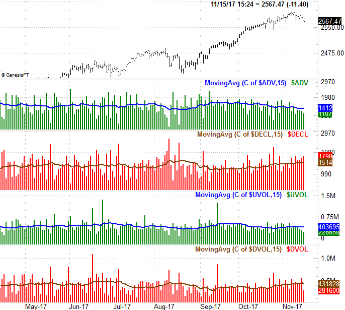
To that end, the graphic below does just that, comparing the S&P 500 to the NYSE's up volume, down volume, advancers, and decliners. Those are the vertical bars that appear as a histogram. In all four cases, we've also plotted moving average lines of that data to turn the numbers into a discernible trend. In all four cases, we could readily see that the number of advancers (ADV) has been trending lower since October, while the bullish volume (UVOL) has been lackluster for some time and turned firmly downward early this month. Conversely, the NYSE's decliners (DECL) have been trending higher since October, as has its bearish volume (DVOL). Notice that even though the advancer/decliner and volume tide turned bearish late last month, the market was still coasting higher for a few more days.
Here's a different view of the same basic trend data, but without the daily raw data. We've overlaid the advancer and decliner trend lines (solid blue and red dashed, respectively) in the middle of the chart, and the up-volume and down-volume trend lines (again, solid blue and red dashed, respectively) on the bottom portion of the graph. From this perspective we can see tide actually turned bearish sometimes between late last month and early this month, as the bearish trend lines moved above the bullish trend lines.
This approach is hardly bulletproof. It was all over the map in April, May and June, and though it technically got you back in the market in August right before a huge runup, it would have been easier not to get out at all in early August. Nevertheless, when used in conjunction with other tools, it can help you spot instances where things aren't quite as strong (or as weak) as they may seem on the surface. This approach makes for a good second opinion, confirming other clues.
While the outlook feels grim from here, it's not as if the market is over the edge just yet. The S&P 500 is still above its 50-day moving average line; it's not even made a low below last month's low yet. The VIX seems to have peaked and begun a downward stroke again as well. This market has defied the odds and the obvious clues for a while now, with traders inspired by the idea of tax reform.
All the same, to the extent the market's volume and advancer/decliner data is a guide, the undertow is already bearish, and will remain so until further notice. (Stay tuned for that "further notice.")