This Week's Weakness Isn't Actually About Fears of a Trade War
Here we go again.
On Wednesday, the market took a tumble, following through on Tuesday's weakness. Concerns about a potential global trade war got the blame. To be fair, investors likely are concerned about the prospects of such a battle. It's unlikely they're concerned enough to jump off the bullish bandwagon though; traders have been net-buyers in far more alarming circumstances.
Reality: This week's weakness was arguably foretold before this week started, not so much in what the market was doing, but what it wasn't doing.
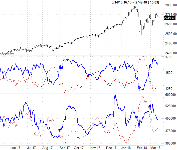
Regular BigTrends readers will, or should, recognize the chart you're about to see. It's a look at the NYSE's advancers and decliners, and the NYSE's bullish volume and bearish volume. Indeed, regular readers of BigTrends commentary may be tired of seeing these "breadth" and "depth" charts... almost as tired as we are of showing them to you. In that it's still a relevant set of data though, we'll continue to show them to you.
The short version of a long story: If a trend is to last, it needs more and more volume moving in that direction. It also needs more participants than now. In layman's terms, that means for any rally to last, we need to see "up" volume rise with it, and we at least need to see the number of advancing stocks for any given day outnumber the stocks that are falling on any given day. We use the NYSE's data on both fronts, just as a matter of convenience.
Care to guess what didn't happen in the latter half of February and then again in the early part of March? The S&P 500 was rallying at both times, but both times the effort petered out pretty quickly and turned into a lull because (and this is the good part) the number of advancing stocks started to slump a few days into each surge, and the amount of "up" volume also started to fade in both instances shortly after the ball got rolling. Conversely, the NYSE's decliners and its "down" volume started to swell again in early March, and then again this week. The lines that move from left to right, by the way, are moving average lines of each data set. We use moving average lines for each to help us spot any trends that are developing, as the daily histogram/vertical bars can sometimes be difficult to read.
Like we said, it's probably a chart you'll recognize.
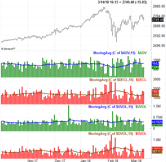
Just for kicks (and to round out our analysis), we'll go ahead and confirm that we've seen these unsupported headfakes of late... a lot. The image below tells the tale.
The graphic below offers the same basic clues as the one above, but in a different presentation. We're not showing you the raw daily data. We're just showing you the moving averages of the data -- the trend. And, we've overlaid the advancer and decliner data, to make comparisons of two. Ditto for the up-volume and down-volume trend lines. (The solid blue thick lines are the advancer and up-volume moving average lines, and the thin, dashed red lines are the decliner and down-volume trend indicators.)
The lack of follow-through on both the advancer/decliner data and the up-volume/down-volume data segments largely explain why the broad market has been so annoying of late. Just when a move gets going, breadth (advancers and decliners) and depth (up volume and down volume) reverse course.
Also note that -- and this is important as well -- that the breadth and depth trends tend to reverse just a little bit before the market itself turns around.
The only arguable "mistake" this volume and advancer/decliner analysis made was in early November. The rise in bearish volume and the rise in decliners should have kick-started a pullback, and it didn't. That clue was reversed by late November though, signaling a rally that lasted through late January. By and large though, this information gave us accurate early warnings that the move of the week wasn't built to last.
There's still a chance stocks could pull out of this funk mostly unscathed. We've not yet see the bearish trend lines overtake the bullish ones. We are pushing our luck though, with the S&P 500 putting some new pressure in key support levels with Wednesday's action. Namely, the 50-day moving average line (purple) is not being tested as a floor after the upper 20-day Bollinger band capped the rally effort in a pretty decisive fashion.
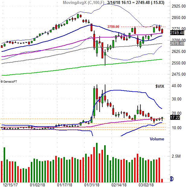
Also notice how the VIX is starting to test the waters of higher highs. Indeed, the VIX's lack of an upward thrust says this weakness isn't all that surprising... a bigger bearish clue in itself. If traders were panicked, we'd likely see a quick capitulation. As it stands right now, the VIX says investors have almost planned on a pullback. They very well could create a self-fulfilling prophecy.
We'll keep an eye on all of it for you.