Weekly Market Outlook - The S&P 500 is Hot. The NASDAQ... Not so Much.
 The market managed to end the week on a high note, reversing course from the week's initial tumble, pivoting in the middle of Wednesday's action to finish Friday 0.6% above the prior Friday's final trade. It wasn't exactly the ideal recovery move though. Volume was light on the way up - and getting lighter - and we're still just one bad headline away from being in the trouble it looked like we were in a week a half ago.
Still, momentum is momentum.
We'll weigh it all below, as always. First, however, let's run-down last week's economic news and talk about how this week's economic announcements could rock the market.
Economic Data
There was more than a little economic news unveiled last week, not a great deal of it was hard-hitting. We'll stick with the highlights, beginning with Wednesday's retail sales numbers. They were up, with or without cars. They were up, in fact, much more than expected. Consumerism not only remains strong, but is accelerating.
Retail Sales Charts
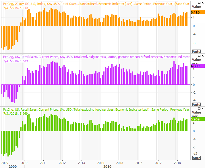
Source: Thomson Reuters
That same day we also got the Federal Reserve's capacity utilization and industrial productivity figures for July. They were also good, though not quite as good as expected. Whatever the case, the bigger trends for both remain positive, and the year-over-year comparisons prove increasingly difficult simply because we're now comparing results to previously-strong results. The trajectory is the key here, and the trajectory is bullish.
Industrial Production and Capacity Utilization Charts
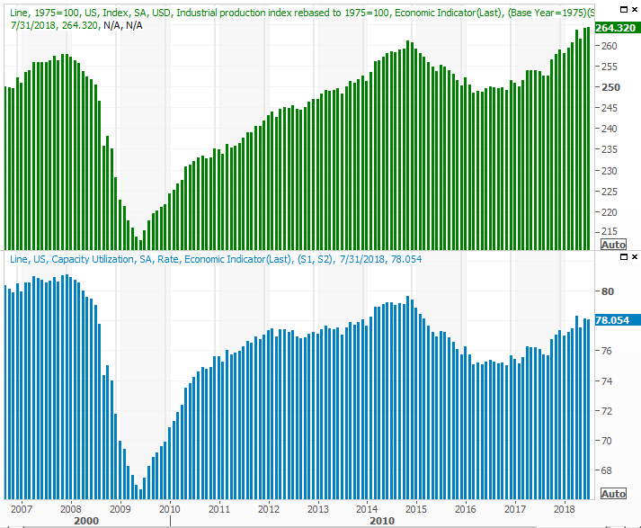
Source: Thomson Reuters
Finally, last month's housing starts and building permits were up, though in neither case were up as much as hoped. And, this is the one place where we desperately needed some new life. The pace of homebuilding has been slowing for months, but has pretty much hit a will as of three months ago.
Housing Starts and Building Permits Charts
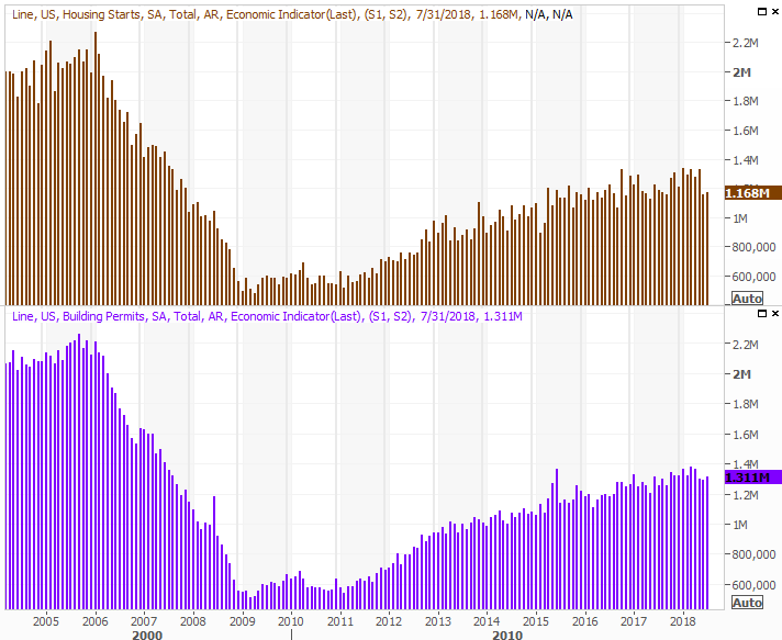
Source: Thomson Reuters
It's not necessarily the end of the world. At least part of the reason starts and permits are slow may stem from the fact that inventory levels of new and existing homes are starting to perk up... finally. Still, the whole residential real estate market is fighting a headwind.
Everything else is on the grid.
Economic Calendar
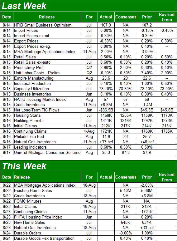
Source: Briefing.com
This week is going to be considerably less busy. In fact, the only item of interest will be last month's existing and new home sales numbers, rounding out last week's starts and permits data. The pros are looking for a slight uptick, though in light of the starts and permits data, investors may not want to bet too aggressively that purchase activity even met those tepid progress goals.
New and Existing Home Sales Charts
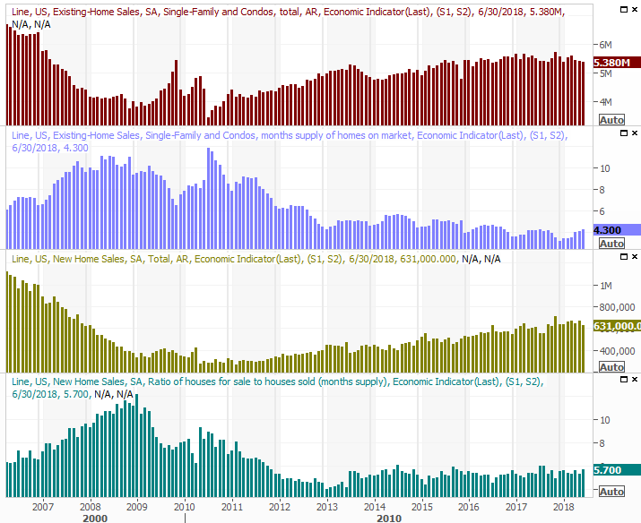
Source: Thomson Reuters
Once again though, even a little progress may not be enough to negate the fact that purchase activity is also slowing. It's also possible that the slow build of inventory isn't a good thing after all, making more homes available for purchases that had otherwise been crimped. Rather, the slow buildup of available inventory may well be a sign that purchase interest really is waning.
It would be naive to think rising interest rates aren't at least part of the equation.
Finally, on Wednesday we'll get last week's report on how much crude oil we've stockpiled. The news wouldn't be so interesting this time around had inventories not grown so rapidly last month.
Crude Oil, Natural Gas Inventory Charts
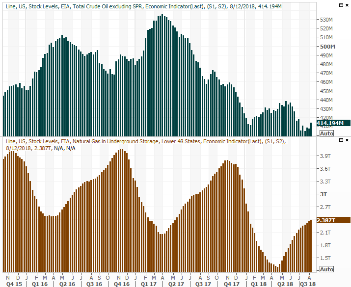
Source: Thomson Reuters
It may have been a one-week fluke. But, it may also be the beginning of a full-blown uptrend that the energy market can't really afford right now. That's especially true in light of the fact that the sharply-rising U.S. dollar is already weighing crude prices down.
Index Analysis
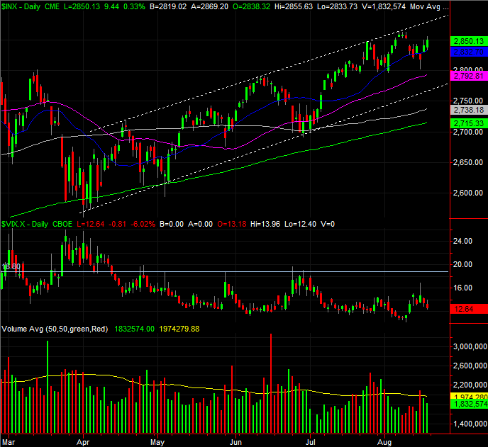
The market was ripe to follow-through on the beginning of a downside move that got started a week earlier. On Wednesday though, the doubters started to second-guess themselves. The bulls took full control on Thursday and Friday - inspired by a glimmer of hope on the tariff war front - rekindling the uptrend that's been rather firmly in place since early July.
S&P 500 Daily Chart, with VIX and Volume
Source: TradeNavigator
That doesn't necessarily mean the market will have to continue trekking higher from here. Indeed, we remain just one bad headline away from a meltdown. By that same token though, we're one headline away from heating up the rally. In the meantime the momentum is bullish, and it's generally not wise to bet against momentum.
As has been the case since April though, this is a rally that's been less-than-ideal.
Yes, a lack of bullish volume (and fading bullish volume to boot) is one of those flaws. But, that's the not eyebrow-raising aspect of the erratic bullishness here and now.
Broadly speaking, the NASDAQ leads the market... higher and lower. If the tech-heavy NASDAQ Composite is doing well, then the overall market is as well. If the NASDAQ is struggling, it's dragging the rest of the market lower with it.
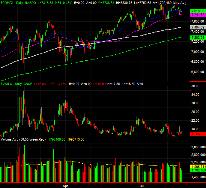
The NASDAQ isn't doing all that well right now.
The graphic below puts things in perspective. At the top, in green, is the percentage of NASDAQ-listed stocks that are above their 200-day moving averages. The orange bars in the middle mark the portion of NASDAQ names above their respective 50-day moving average lines. At the bottom, in light blue, is the NASDAQ itself, with its 50-day (purple) and 200-day (yellow) moving average lines. The NASDAQ Composite itself is well above both. But, most NASDAQ stocks are actually below their 50-day moving averages. And, most NASDAQ-listed names are almost below their 200-day moving averages.
NASDAQ Stocks Above 50, 200-day Moving Average Lines
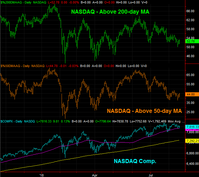
Source: TradeNavigator
It's not difficult to connect the dots. The NASDAQ looks healthy in a superficial sense, but most of its names are actually struggling, and losing ground. Only a few of the biggest, most influential names are doing more than their fair share of the heavy lifting. It works, but it's not apt to work forever. The majority of the NASDAQ's names need to be making forward progress.
To that end, a closer look at the daily chart of the NASDAQ Composite now makes more sense, for better or worse. The composite is putting a lot of pressure on its 50-day moving average line (purple, on the chart below) that the S&P 500 isn't applying to its same moving average. And, neither index has drawn a lot of volume with recently-bullish days.
NASDAQ Composite Daily Chart, with VXN and Volume
Source: TradeNavigator
If the NASDAQ breaks under its 50-day moving average line at 7742, that could be a signal of more serious selling ahead. The VXN (and the VIX, for that matter), will also need to move to highs above last week's highs if any pullback is to take hold.
In the meantime, until we clearly can't continue making the bet, we have to side with the overall momentum despite the rally's flaws. Just bear in the mind the S&P 500 still faces a ceiling... the upper edge of the rising trading range that extends back to April. It still has the potential to up-end any rally.