Weekly Market Outlook - The Rally Was Punched, But Not KO'd

Last week was a loser, but not necessarily devastating to the rebound effort. It followed one of the best single weeks for stocks in the history of the market, and the bulls deserved to take a break. They're still in position to renew the rally by virtue of making a high above the peak from two weeks ago.
Of course, that all depends on progress made -- real or perceived -- on the coronavirus front. It can still be contained with only minor damage to the economy. If it continues to grow out of control and people are out of work (or away from work) for much longer, it could cut deeper. The charts, as always, will tell us what investors expect in that regard.
We'll look at those charts below. First though, let's run down last week's economic announcements and preview this week's dance card.
Economic Data Analysis
Last week's grand finale was the look at last month's jobs report... a fairly meaningless figure, all things considered. But, there was some noteworthy data that surfaced before then.
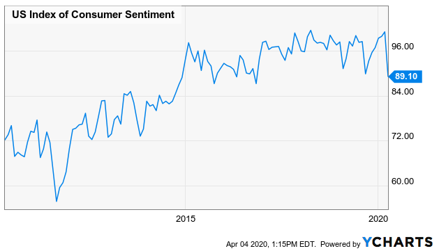
One of those data nuggets was the Conference Board's consumer confidence figure. It did fall -- no surprise there -- but not as much as expected. The pros were calling for a dip from 132.6 to 110, but it rolled in at 120. That suggests as bad as the landscape may look right now, Americans are confident we'll come through it.
We don't have a graphic of the Conference Board's data, but we do have an illustration of the similar Michigan Sentiment Index that's more or less following the same path. That is, things aren't what they were a month ago, but they're not horrendous either.
Michigan Sentiment Index Chart
Source: YCharts
We'll get the first (of three) looks at the Michigan Sentiment Index this week. Economists are calling for a sizable dip again after March's figure fell to the same degree as the Conference Board's measure did.
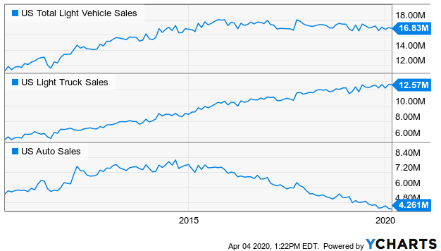
We also got last month's auto sales numbers last week. Somehow, they weren't bad. Dealers and manufacturers made some very attractive offers. Just bear in mind would-be buyers may have rushed in to buy before they knew they couldn't. Also bear in mind the auto lending market is starting to show some serious cracks.
Auto Sales Charts
Source: YCharts
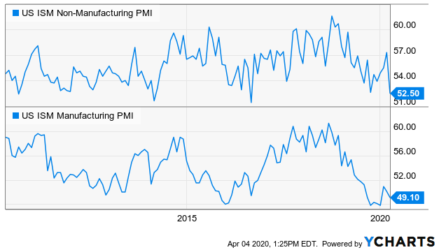
Another biggie from last week was the ISM data... services, and manufacturing. Both fell, though neither fell as much as they seemingly could have. The services index -- arguably the most vulnerable to the coronavirus outbreak -- even remains above 50.
ISM Services, Manufacturing Survey Charts
Source: YCharts
It's interesting. Some investors may be overlooking the fact that the fight against COVID-19 actually creates demand for services as well as manufactured goods.
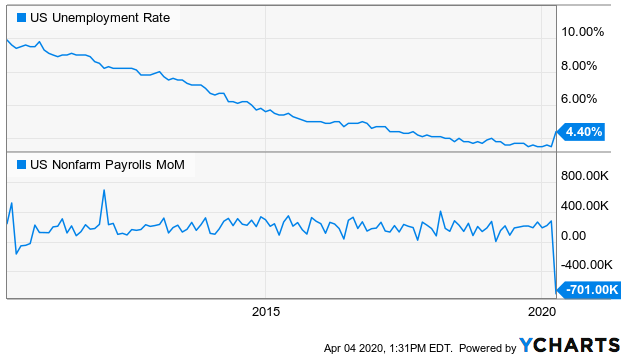
The big Kahuna, however, was March's jobs report... for whatever it's worth. We say that simply to underscore the point that the layoffs and shutdowns took shape took so quickly nobody really knew what to expect. We lost 713,000 jobs, shoving the unemployment rate up from 3.5% to 4.4%. But, there are some measures that suggest more than 4 million people actually filed for unemployment benefits.
Payroll Growth, Unemployment Rate Charts
Source: YCharts
It's also important to bear in mind that many of those people will still have jobs to return to once the coronavirus is finally contained.
Everything else is on the grid.
Economic Calendar
Source: Briefing.com
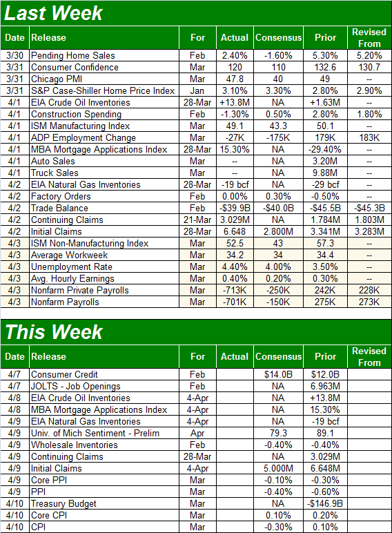
Aside from the first look at the Michigan Sentiment Index, we'll also get March's inflation figures... although that's the only other really important report we'll hear. That's probably for the best, to let investors figure out exactly where stocks and their underlying companies are. Still, economists are looking for not only tame inflation, but deflation. Just remember that any reported price slump is compared to February's adjusted rates. On e year-over-year basis, prices are still higher, suggesting consumers and companies still have some spending strength.
Inflation Rate Charts
Source: YCharts
Stock Market Index Analysis
There’s good news, and there’s bad news. The good news is, there’s more good news than bad news. And the good news is, the rebound effort is still intact despite last week’s loss. The market was coming off one of the best weeks in the history of stocks. The bulls deserved a break. Besides, most of the indices were already tangling with some technical resistance at the time. There should have been a test here.
That doesn’t mean a renewal of the rally is guaranteed here... now, or later. We’re still beholden to coronavirus headlines. But, it’s clear where the lines in the sand are.
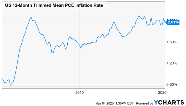
For the S&P 500, those lines are 2538 and 2643. That’s where the 20-day moving average line (blue) and the 38.2% Fibonacci retracement lines are, respectively. Both are likely/plausible technical ceilings, and both have come into play within the past few days.
S&P 500 Daily Chart, with Volume and VIX
Source: TradeStation
That’s not necessarily a bad thing. As was noted, the bulls deserved a break following the 10.2% gain the index logged the week before. Most major rallies and breakdowns don’t move in a straight line. Last week could have been a mere pause.
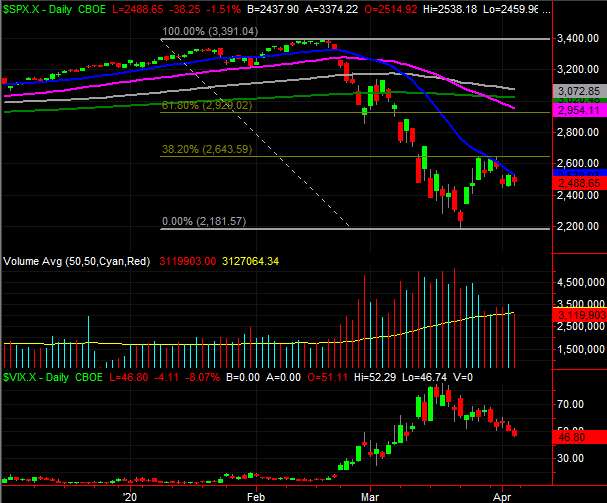
Bolstering that possibility is the lack of volume behind last week’s pullback. Granted, the volume behind the previous week’s heroic gain was also less than the selling volume behind the two disastrous weeks before that. But, at least most traders are hesitant to bail out now.
S&P 500 Weekly Chart, with Volume and VIX
Source: TradeStation
In that same vein, notice on both the weekly and the daily chart that the VIX continues to log lower lows and lower highs even if the S&P 500 isn’t mirroring the same move with higher highs and higher lows. At least fewer and fewer people are betting against the market -- or even hedging against more downside – using options.
Finally, take note of the fact that the S&P 500 finally dished out the so-called death cross the Dow Jones Industrial Average gave us a week earlier. That’s where the 50-day moving average line (purple) crossed under the 200-day moving average line (green), supposedly signaling more downside. The problem is – as we explored of the Dow a week ago – the “death cross” event assumption doesn’t hold water. More often than not, it’s a buying opportunity than a reason to sell. This may well be one of those times. (Of course, when that’s not the case, death crosses can really, really hurt.)
Everything said about the S&P 500 applies to the chart of the NASDAQ Composite, save the death cross. Most notably, the composite peaked right at a perfect 38.2% Fibonacci retracement line (7847) of the pullback suffered over the course of March.
NASDAQ Composite Daily Chart, with Volume and VXN
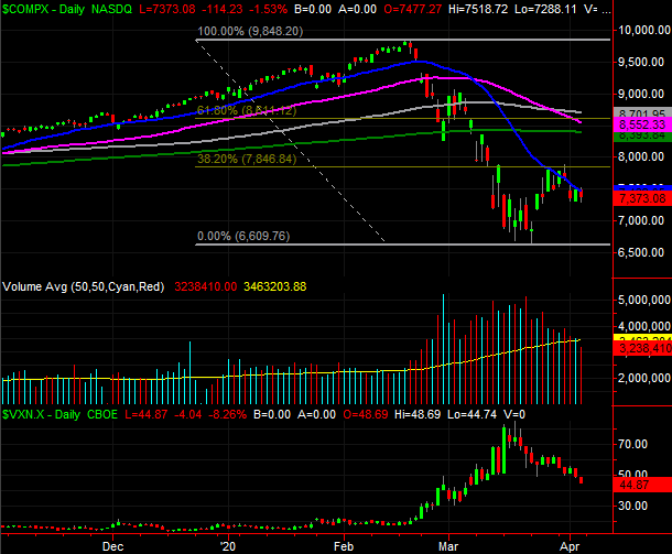
Source: TradeStation
That clearly makes this week a critical one for stocks, and especially for the bulls. The rebound effort isn’t too far gone to revive. But, another losing week could deflate budding optimism before it grows enough to get the market all the way over the hump of the highs hit two weeks ago. A failure to show some strength now could make it easier to continue the selling. Of course, confidence is now purely a function of the perception of the coronavirus contagion.