Weekly Market Outlook - The Poorly-Timed, Poorly-Balanced Rally Is Still a Rally
Stocks tacked on more gains last week, but just barely. The market's struggling with the sheer weight of months of progress, still uncertain it wants to clear the key technical resistance it began tangling with two weeks back. Traders are hesitant for good reason... a couple of good reasons, actually.
And yet, that's no reason to assume stocks can't really rekindle their long-term rally from here.
We'll explore the current situation in some detail below. First, let's look at last week's key economic announcements, which of course includes an incredibly disappointing jobs report.
Economic Data Analysis
We actually got an early glimpse of this trouble two weeks back, in the form of the third and final look at August's University of Michigan Sentiment Index - it fell quite a bit from July's levels. That stumble was confirmed last week, however, by a similar lull in the Conference Board's consumer confidence score. The figure fell from an adjusted 125.1 to 113.8. That's rough, but not as rough as the Michigan data indicating that sentiment is now at levels not seen since 2011. Yes, at 70.3, the University of Michigan Sentiment Index is lower now than it was in early 2020 when the pandemic was first starting to shake up the entire world.
Consumer Sentiment Charts
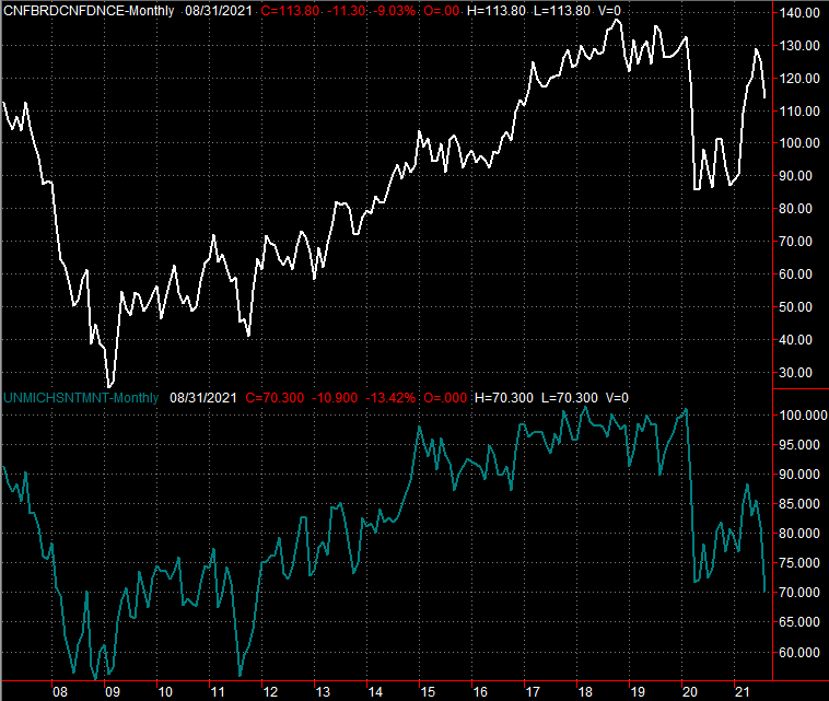
Source: University of Michigan, Conference Board, TradeStation
The Michigan figure's plunge is likely an exaggerated one. Still, this suggests consumers may actually be holding off on spending.
There's one small subset of consumers that still have to be feeling pretty good about things though.... homesellers. The S&P Case-Shiller Housing Price Index as well as the FHFA Housing Price Index both continued their race deeper into record-high territory. [Just bear in mind that these indices are based on the average sales prices of homes, and not an indication of the number of homes sold.]
Home Price Charts
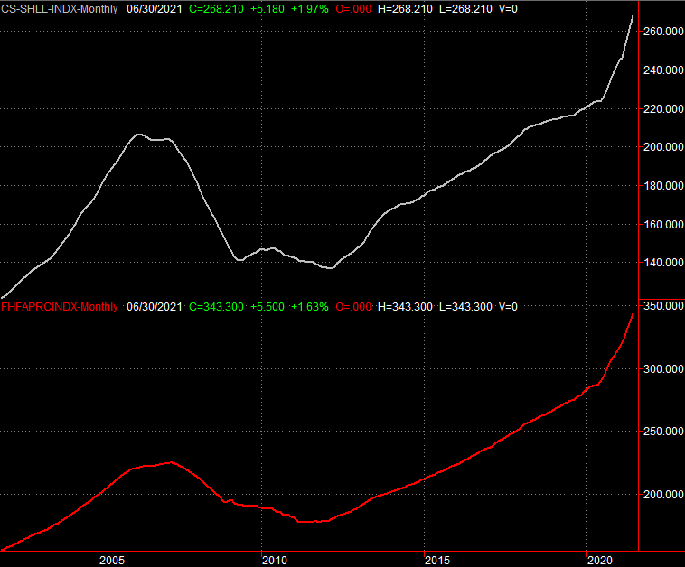
Source: Standard & Poor's, FHFA, TradeStation
And, despite the sharp plunge in consumer sentiment, the corporate employees that procure supplies and services still feel reasonably good about the current condition of the economy. The Institute of Supply Management saw its services index rise just a little bit last month, from 59.5 to 59.9, while the services index pulled back just a bit from 64.1 to 61.7. Both figures are still well above the key 50 level.
ISM Services and Manufacturing Index Charts
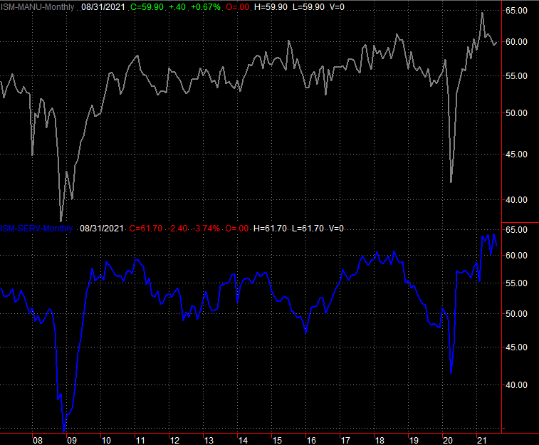
Source: Institute of Supply Management, TradeStation
Finally, the most important data unveiled last week was also the most disappointing. Rather than adding the expected 650,000 new payrolls last month, we only added 243,000... in line with the similarly-lackluster ADP employment change report earlier in the week.
Unemployment Rate and Payroll Growth Charts
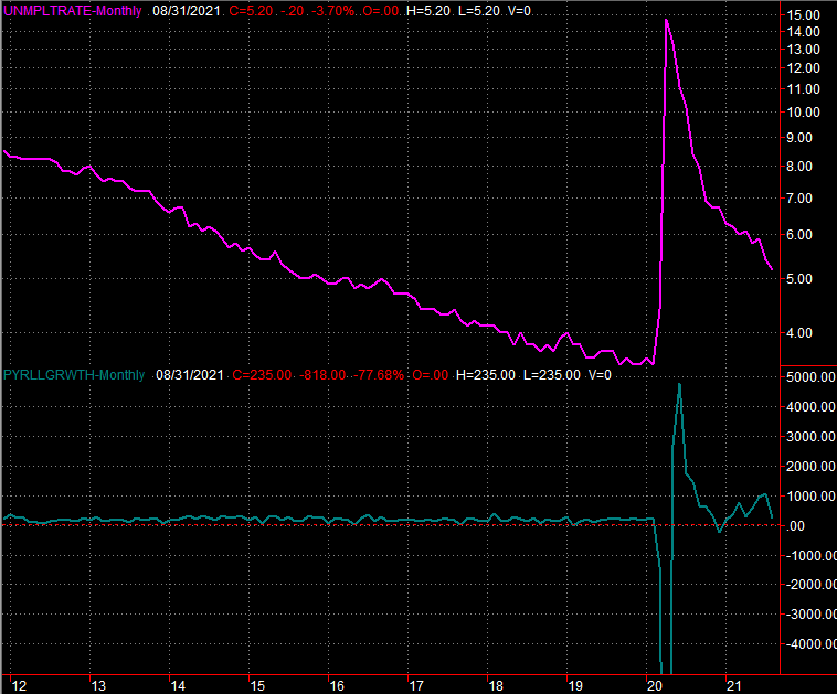
Source: Federal Reserve, TradeStation
It's worth noting that we still drove the unemployment rate down from 5.4% to the expected 5.2%, helped by the upward-revised jobs growth figure for July.
Everything else is on the grid.
Economic Calendar
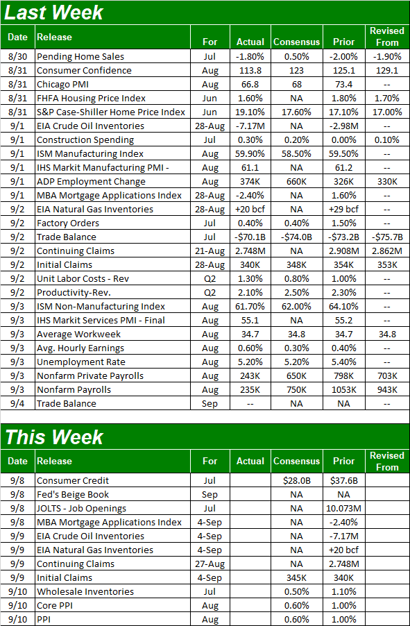
Source: Briefing.com
This holiday-shortened week is going to be pretty tame. In fact, there's only one item of any real interest in the queue, and we're only going to get half the picture this week. That's last month's producer inflation snapshot; the consumer inflation report for August isn't due until next week. Economists are looking for a lull in the brisk pace of price increases, but they're still rising rather firmly.
Annualized Inflation Rate Charts
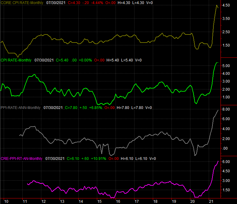
Source: Bureau of Labor Statistics, TradeStation
Stock Market Index Analysis
We'll kick this week off with a look at the weekly chart of the NASDAQ Composite, as this is by far the most noteworthy view of what's happening right now. The technical ceiling the composite had barely cleared as a of a week ago? The index put some distance between itself and the resistance (light blue) last week, by virtue of its 1.5% advance. What looked like a breakout is indeed a breakout! And, there's room to keep running.
NASDAQ Composite Weekly Chart, with VXN
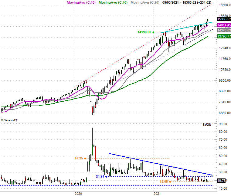
Source: TradeNavigator
Curiously though, the S&P 500 didn't quite mirror the move. Although the large cap index has traded slightly above its recent technical resistance (orange) the last couple of weeks, it would be a stretch to say it's convincingly cleared it.
S&P 500 Weekly Chart, with VIX and Volume

Source: TradeNavigator
There's something not happening on either chart, however, that arguably should be happening in step with the market's continued advance. Neither the NASDAQ's Volatility Index (VXN) or the S&P 500's Volatility Index (VIX) are moving any lower. Indeed, they've not moved lower in some time, but instead continue to hover at well-established technical floors.
It's not necessarily a red flag. While the VIX and VXN generally trend lower when stocks are trending higher, it's conceivable that stocks continue to log gains while the volatility indices simply tread water at (relatively) established support. Still, what we do know is that the ultra-low VIX and VXN somewhat limit the broad market's overall potential for upside.
Also note that the volume behind last week's gains once again was tepid. The S&P 500's low volume is marked be a fairly short volume bar at the bottom of its chart. The NASDAQ's modest bullish volume is evident on the daily chart below that lays out the exchange's daily advancers (ADVQ), decliners (DECLQ), bullish volume (UVOLQ), and bearish volume (DVOLQ). Note that despite last week's gains for the NASDAQ, there was more bearish volume than bullish volume every day of last week.
NASDAQ Composite Daily Chart, with Advancers, Decliners, Up and Down Volume
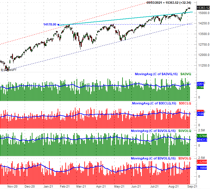
Source: TradeNavigator
Here's the daily chart of the S&P 500, for some added detail about what's going on here... particularly with the encounter at the long-term technical resistance line. The buyers are willing to test it, but not willing to push past it. The zoomed-in daily chart if the S&P 500 also hints that the VIX may be finding technical resistance at its 20-day (blue) and 50-day (purple) moving averages at the same time it's being supported at a horizontal floor at 15.8 (green, dashed).
S&P 500 Daily Chart, with VIX and Volume
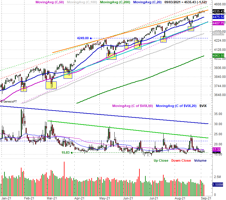
Source: TradeNavigator
It's a frustrating -- and even a bit confusing -- message. The NASDAQ is seemingly going great and has tons of room for more upside. The S&P 500 isn't, and doesn't. The whole thing makes a little more sense, however, when you drill deeper into the market's inner workings and recognize just how poorly balanced the rally (still) is.
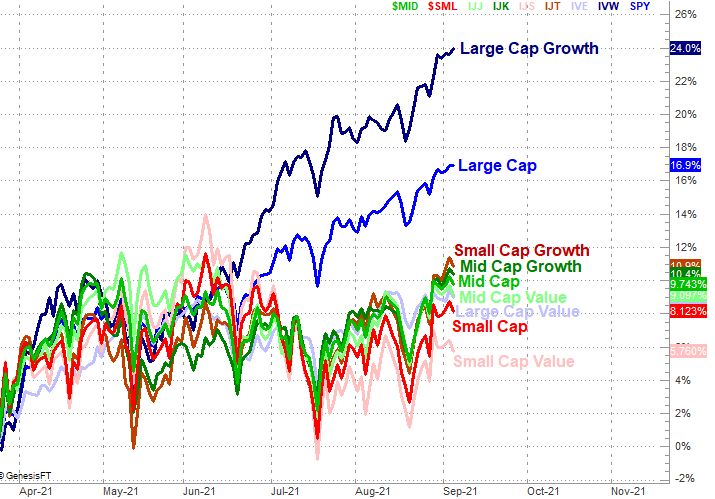
The graphic below tells the tale, plotting the performance of every major market cap and style grouping since late March... the point where large cap growth became the dominant (and almost sole) winner. Even with Friday's gains we can see it was only large cap growth that mustered a gain. Everything else was in the red.
Style, Market Cap Performance Comparison Since March 24
Source: TradeNavigator
It's a problem simply because one sliver of the market can't drag it higher forever, even when that sliver includes the most popular growth names like Amazon, Alphabet, and Facebook.
The momentum is still bullish, to be clear. We have to assume that will remain the case until it's clear we can no longer hold that assumption. It will take the VIX and VXN both breaking above their falling resistance lines at the same time both the S&P 500 and the NASDAQ break below their key technical floors to draw such a conclusion. That requirement means there's plenty of room for some rather bearish volatility that doesn't actually mean much.
Nevertheless, in that September and early October are typically tough times for the market, the fact that we're entering this period this year already so overbought, we remain quite cautious, and certainly not interested in piling into a bunch of new long trades.