Weekly Market Outlook - The Impossible Rally Lives On
 It was a less-than-ideal advance, but an advance all the same. The S&P 500 gained another 0.8% last week, to bring the gain since the late-December low to an incredible 28%. It's uncomfortably overbought, but that doesn't seem to have turned into a problem yet. Investors have largely convinced themselves a rate cut is imminent, and that it will only make stocks more attractive.
That sort of confidence, of course, can be dangerous in and of itself. To that end, there are some quantifiable hints that suggest confidence is already nearing a dangerous level, underscoring the qualitative argument.
That dangerous condition is detailed below, as always. First, however, a rundown of last week's economic news, and a preview of the potentially market-moving reports.
Economic Data Analysis
Last week's big news was the hint - a solid hint - from Fed Chairman Jerome Powell that the anticipated rate cut is all but certain to become a reality, most likely later this month with the Federal Reserve is scheduled to make such a decision.
It's a possibility that's not without its controversy. Unemployment is near record lows, and earnings are still on the rise. Inflation appears to be tame too. Or, perhaps it doesn't.
The timing couldn't have been more convenient, or more inconvenient, depending on which side of the table you're on. Either way, consumer as well as producer inflation was much stronger than anticipated. Core inflation was particularly strong, driving the annualized inflation rate up to 1.6%. That's up from May's reading (released in June) of 1.8%, though the strong uptick in 'core' means consumers are feeling a little more of a pinch than the numbers suggest. Either way, inflation is here, and perhaps accelerating.
Consumer, Producer Inflation Charts
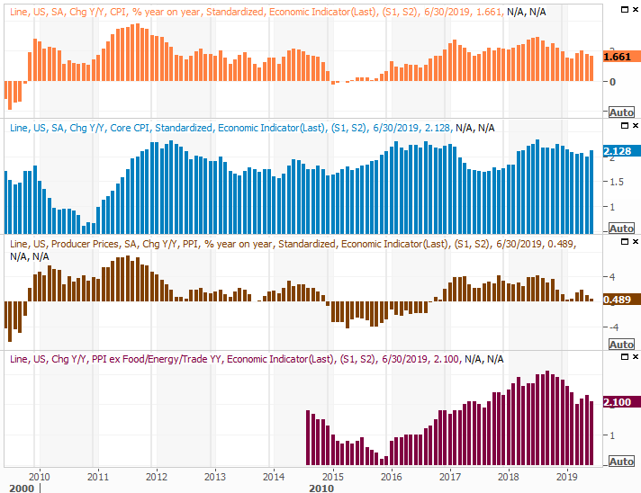
Source: Thomson Reuters
It's a concern simply because lower inflation rates will only exacerbate what appears to be an already-measurable growth in prices.
The timing could turn problematic. The FOMC may have been concerned about the lack of inflation they were seeing. It's now finally starting to take shape; the rate cut might actually let things overheat.
It's also worth mentioning that last week's oil stockpile report indicated another reduction in stored crude. That at least partially reflects a supply disruption in the Middle East and related politics, but the supply was already whittling away. Storms in the Gulf of Mexico starting this time of year will also crimp U.S. inventories. Both suggest oil prices are positioned to rise steadily for the foreseeable future.
Crude Oil, Natural Gas Stockpile Charts
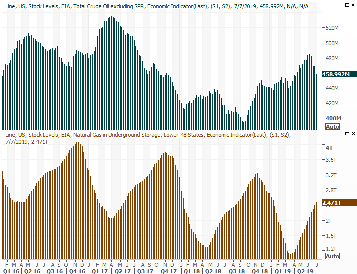
Source: Thomson Reuters
Everything else is on the grid.
Economic Calendar
Source: Briefing.com
This week is going to be busier, but not a great deal of what's coming is terribly important.
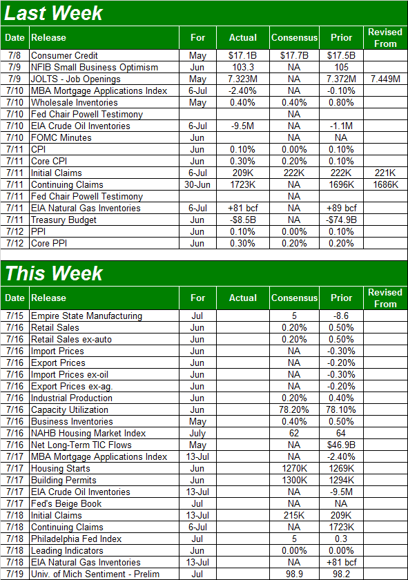
Tuesday's retail sales report is one exception - it's a monumentally important data nugget. Most investors will know most of this year's consumer spending reports have looked and felt lackluster, with May's figures showing firm signs of life. Economist don't think that surge was built to last though, as they've modeled another so-so growth figure of 0.2% (month-to-month) this time around. On an annualized basis, the growth rate is just under 3.0% no matter how you slice it.
Retail Sales Growth (YOY) Charts
Source: Thomson Reuters
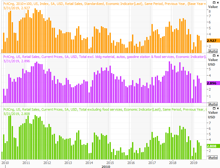
Also on Tuesday look for last month's capacity utilization and industrial productivity data from the Fed. Both were falling earlier this year, largely spurred by new tariffs but partially stymied by a legitimate economic slowdown. In May, however, both picked up again. Analysts are calling for another small step forward with both measures.
Industrial Production and Capacity Utilization Charts
Source: Thomson Reuters
This isn't highly covered data, but it should be. It's got a strong correlation with the bigger-picture direction of the market and total corporate earnings. Another month of progress is good reason to restore confidence in the economy, even if it's not enough to stave off a short-term pullback from stocks.
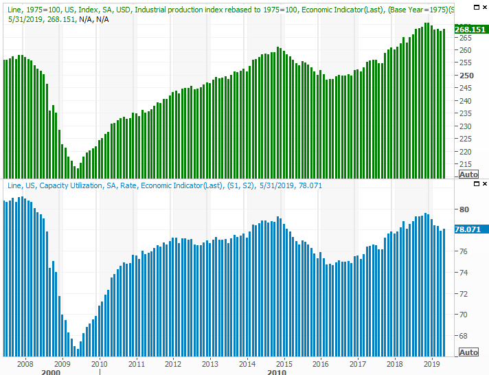
Finally, on Wednesday we'll get last month's housing starts and building permits data. The pros are calling for numbers that look more or less like May's, which isn't a bad thing. A few months back it looked as if the growth phase was going to reverse. Now it simply looks like it's leveling off.
Housing Starts and Building Permits Charts
Source: Thomson Reuters
Stock Market Index Analysis
In most cases, any sort of technically-driven look at the stock market would be best accomplished by starting with a micro view, and then backing out and putting the micro action into the context of a macro view.
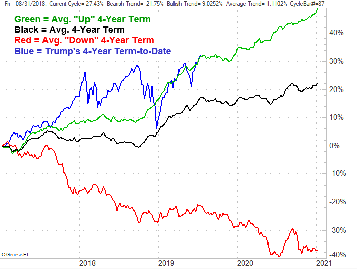
Not this time though. Right now, at the midpoint of July in the third year of a presidential term, a bigger-picture perspective makes much more sense of the micro-action.
To that end, the graphic below is a plot of the market's performance over the course of a four-year presidential term - good, bad, and the average - and where the market is on that path at this time. This year has been heroically bullish, but only because the end of last year was horrifying. But, last year's big setback was the result of an exceedingly bullish end to the first year and beginning of the second year. On balance, where we are as of the end of last week is 'about right' for bullish four-year stretches under a president.
Average Market Performance, Four-Year Presidential Term
Source: TradeNavigator
No matter how you slice it, though, it suggests trouble is ahead.
While the typical July-October span is usually just a breakeven, on average, ending with a lull that leads into an October recovery, if the presidential cycle means anything at all, the latter half of the third year of any term is poor... even when the four-year span ultimately ends in gains. The average here is a 3% slide from mid-July to early November.
It's hardly an idea that has to be etched in stone. But, it is a concerning reality at a time when the broad market is uncomfortably overextended.
To that end, zooming into the weekly chart of the S&P 500 doesn't require a great deal of scrutiny to appreciate just how unusual the past seven months have been. For those who need to quantify the qualitative though, the S&P 500 is now 8.6% above its 200-day moving average line, plotted in green. That's well above the normal degree of divergence we're historically seen.
It also can't be ignored that there's still little to no volume behind the advance since late June.
S&P 500 Weekly Chart
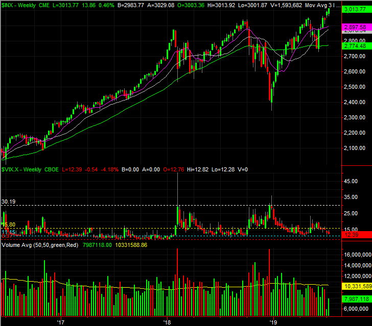
Source: TradeStation
Of all the concerns though, it's the oddly low VIX once again that gnaws at hopeful bulls.
S&P 500 Daily Chart, with VIX, Volume
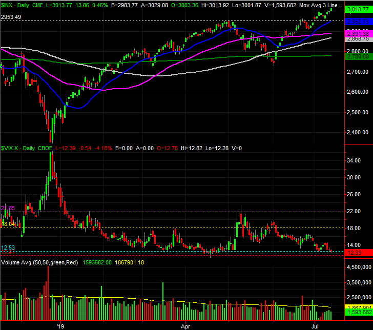
Source: TradeStation
For the record, the market can rally when the VIX is 'too low.' We saw it happen in May and Aril, and we saw it persist for the better part of 2017. It's the equivalent to playing with fire though, particularly when the S&P 500 is valued at a trailing P/E of 18.8 and a forward-looking one of 180. Stocks were more expensive on 2015 and 2016, but largely thanks to bleeding oil companies. They're more or less back to normal now, and that valuation is above the long-term norm. More than that, the argument that premium valuations are merited in a low rate environment hasn't exactly stood up to scrutiny.
None of it means a thing unless the majority of the crowd is willing to let go of the idea that the Fed is entirely unwilling to let stocks slip into trouble. It almost looked like that was going to be the case in May, but when things became alarming, the stimulus cavalry started to ride. We're still due for a pullback though... one bigger and better than the one we saw in May.
Even so, any pullback could be quelled quickly. The key moving averages are all peppered from a low of 2780 to a high of 2953, any of which would likely at least try to act as a floor.
Ironically, one particularly strong bullish thrust would likely serve as a blowoff top as well, setting the stage for a wave of profit-taking as well that would plow through any technical support offered by the moving averages.
The key is the VIX, and though not shown on any chart above, the direction of the put/call ratio trend.
Tread lightly here. The tide feels bullish, but this isn't when and where you want to start adding to long positions.