Weekly Market Outlook - The Bulls Are On a Mission... or Were Anyway
 The bulls buy on good news, and the bulls buy on bad news. The bulls even buy on no news. Maybe we should take the hint. On the flipside, we know we should expect things when we least expect them, and if we're being brutally honest, we know there's no real fundamental justification for the market moving to the record-high levels it did this past week. Besides, there's just something artificial about this rally.
Of course, it doesn't matter until it does.
We'll dissect the matter below, as always, after looking at this week and last week's economic news.
Economic Data
No doubt about last week's big news... May's unemployment data. It was a tainted success. It was a success in the sense that the unemployment rate ticked down to a multi-year record low of 4.3%. But, it was tainted in the fact that total job growth of 138,000 jobs fell short of the expected 185,000.
Unemployment Rates and Job Growth Charts
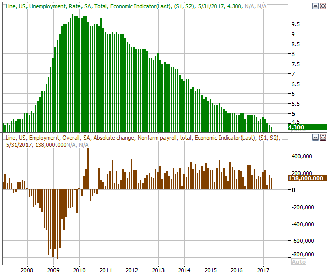
Source: Thomson Reuters
It's hardly a reason to sound the alarm bell. As we discussed in depth at the website, the number of people who VOLUNTARILY left the work force last month was up. The number of people officially unemployed and those who are unemployed (but not receiving benefits) but still want a job both fell last month. Wages were up too, and the average workweek at least didn't fall. Those are all positive developments despite the lackluster job growth.
Point being, we're pretty much at full employment, so net job growth is going to be tough to produce. The litmus test from here will be an improving quality of jobs, and what they pay.
Also last week we heard about May's automobile sales. Unfortunately, they weren't a pleasant surprise -- they were as bad as suspected. It was the fifth straight month car sales fell on a year-over-year basis, and the ninth month in the last ten.
Automobile Sales Charts
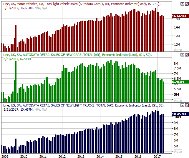
Source: Thomson Reuters
It's becoming increasingly difficult to dismiss the notion of peak auto.
Everything else is on the grid.
Economic Calendar
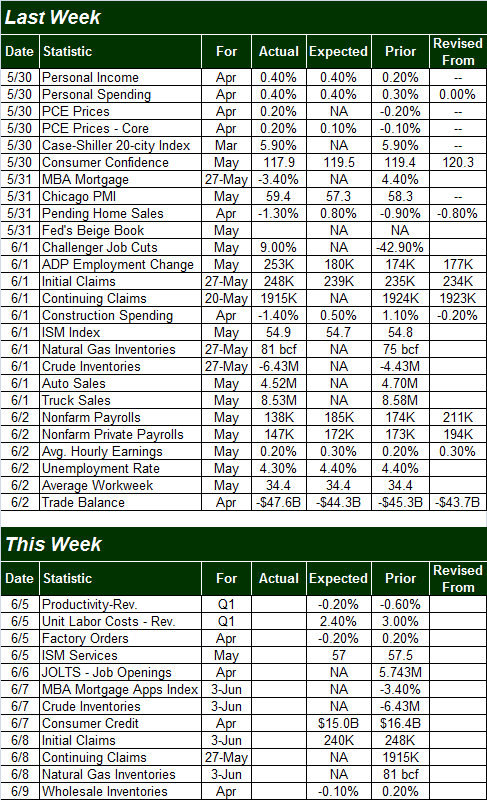
Source: Briefing.com
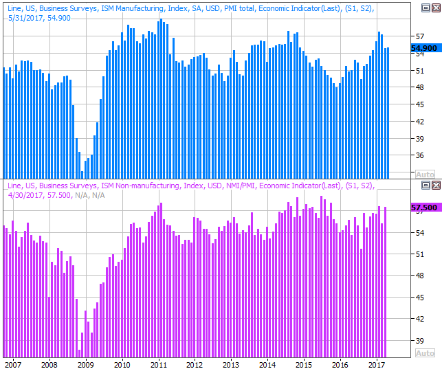
This week is going to be considerably less busy. In fact, the only item of any real interest to us is Monday's ISM Services report (though even that only tells half the story). Economists are looking for a slight ebb, though it should still be well above the key 50 mark.
ISM Services and Manufacturing Charts
Source: Thomson Reuters
We won't get the ISM manufacturing data until next week, though like its services counterpart, it too is holding steady above the all-important 50 mark.
The other possibly-noteworthy item in the lineup this week is the JOLTS -- job openings -- report coming on Tuesday, if only as potential redemption for last week's disappointing job growth report. The job openings tally has been at rather high levels of late, suggesting employers are having a tougher time recruiting workers and/or are growing. Don't read too much into the figure though, hot or not.
Index Analysis
For the second week in a row, stocks defied the odds and continued to march their way into record-high territory. It's pretty impressive, really. There's no (real) fundamental justification for stocks to be at their current valuations, and technically, they're stunningly overbought. As they say though, you can't fight the tape.
On the other hand, trading veterans know all too well that things can and will stop on a dime, particularly when complacency is as high as it is now. More on that in a moment.
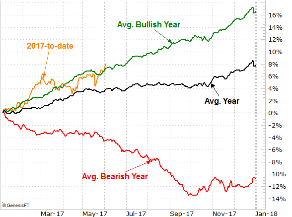
We're going to do things backwards this week, starting with the bigger-picture view and then drilling into the near-term daily chart; we want to have the right perspective before hashing out the specifics. Before we even look at the weekly chart though, we want to examine a chart we only occasionally look at... a review of where the S&P 500 year-to-date's performance stands in relation to its historical average, and where it stands in relation to its average bullish year.
The graphic below isn't a tough one to interpret. The black line in the middle is the average day-by-day performance of the SP 500 for all years, good and bad. The green line at the top is the average track for a bullish year, and the red line at the bottom is the average to-date performance in a bearish year. The orange line that isn't complete yet is where we are so far for 2017. Though we're not leaps and bounds ahead of the normal bullish year, we are ahead even the most typical bullish pace.
S&P 500 Performance Year-to-Date Comparison Chart
Chart created with TradeNavigator
We only show you this image to illustrate how unusual -- though not unheard of -- the 8% year-to-date gain is.
A look at the weekly chart only exacerbates the idea, in that on this chart we can see the S&P 500 has traveled an oddly-long distance without taking a break (suffering a healthy, normal correction). We're now up 17% since the early November low, and the biggest pullback from peak to trough during that time was the 3% dip from early March to mid-April. You don't have to look very far back on the chart to realize how rare this kind of move is.
S&P 500 Weekly Chart
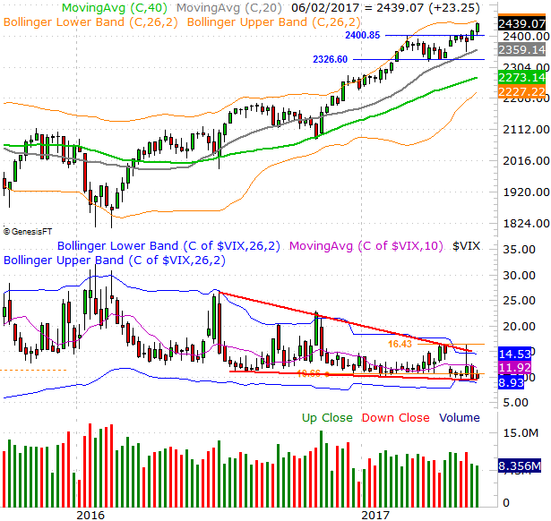
Chart created with TradeNavigator
There's something else that's perhaps even more alarming on the weekly chart... the fact that the VIX is not only at multi-year lows, but at the bottom of a descending wedge pattern that's been developing for months.
We've talked about it before but it merits a closer look now - when complacency/confidence gets this low, it's dangerous. In this particular case the converging wedge pattern has the potential to compress the VIX to a point where it just explodes higher, breaking above key technical ceilings peppered all around the 14.5 area. Once that resistance breaks, odds are good the broad market will also break down. It's certainly overdue for a correction.
The question is, when? The daily chart may partially help answer the question.
Actually, the daily chart has been so erratic of late it's tough to get a bead on where things are going. The break above 2404 is technically bullish, but we also broke to new highs back in February and that didn't go anywhere. Throw in the fact that the index has bumped into its upper Bollinger band as of late last week, and the stage is certainly set for a pullback. The question is, will the actors take the stage?
S&P 500 Daily Chart
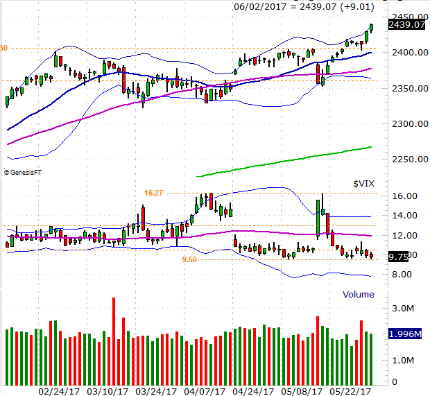
Chart created with TradeNavigator
We have to assume the trend in place will continue until we have clear evidence it won't. That doesn't mean the market can't pull back some in the meantime. Indeed, the S&P 500 could slide all the way to a convergence of support around 2360 and still technically be in an uptrend. It's what happens at that level -- should it be tested -- that will determine if we finally make that overdue correction. It may well end up being a buying opportunity. After all, while the S&P 500 is above its year-to-date average, it's NOT ahead of its average bullish year.
Whatever the case, we continue to feel it's the VIX that will end up making or breaking this market. Should the VIX push through its ceiling at 16.3 rather than meet resistance there, that could bring about the awaited correction. Anything else, and we just can't assume this overbought market won't become more overbought.
Make no mistake either way though - none of this has anything to do with the market's fundamentals or uber-low interest rates. We're still on track for at least two if not three more rate hikes this year.
Fed Funds Outlook Chart
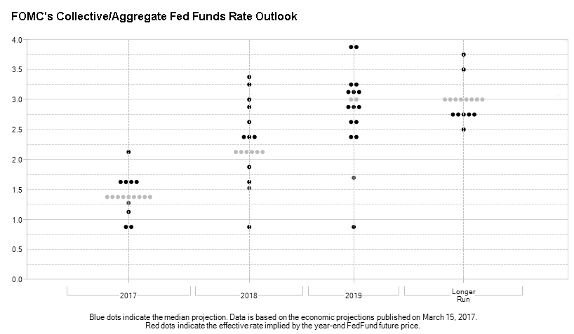
Source CME's FedWatch
This is all sentiment-driven, which is not only dangerous, but tricky.