Weekly Market Outlook - The Breakout Effort Gets Traction
 It was a September to remember for several reasons, not the least of which is the fact that the market made gains. The typical September outcome is a loss of 0.67%, but the S&P 500 managed to dish out a gain of just under 2%. Just as amazing, however, is that we've now gone nearly 11 months without a correction of more than 5%. That's the first time we've seen stocks do that since the 1950's.
The momentum is clearly exciting, and it doesn't seem like the bulls have any intention of giving up. Throw in the fact that we're now starting the usually-bullish fourth quarter, and there's even more reason to want to "jump in before you miss any more upside."
Perhaps that's the reason we should expect a pullback now? It doesn't seem like one is likely? Maybe. Then again, we can never say never.
We'll look at both sides of the coin below, right after we take a look at last week's and this week's economic news.
Economic Data
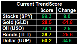
Quite a bit of economic news from last week to sift through -- let's just tackle them in order of appearance, beginning with the Case-Shiller Home Price Index. Values were up 5.8% year-over-year in July, underscoring the FHFA's home price data released the week before, which said home values grew 0.2% in July, from June's levels. Home value isn't the problem, if real estate has one. Thing is, real estate may well have a problem. Keep reading. 2
Case-Shiller and FHFA Home Price Charts
Source: Thomson Reuters Eikon
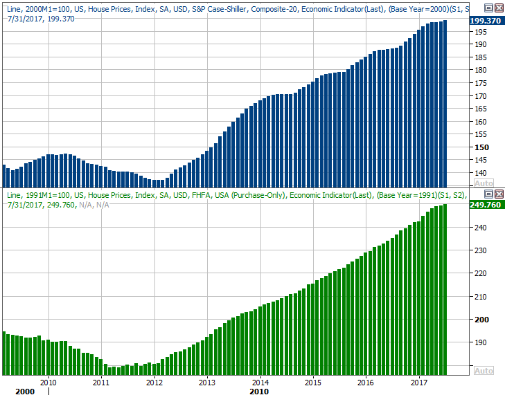
On that note, sales of new homes could have been better. The pace fell from an annualized clip of 580,000 to 560,000, missing expectations of 577,000 units. More important though, the dip extends something of a developing pullback. Perhaps more interesting than that is that we can't use a lack of inventory as an excuse. There are at least plenty of newly-built homes to choose from. People just aren't buying them.
New and Existing Home Sales, Inventory Charts
Source: Thomson Reuters Eikon
It was also a big week for consumer sentiment measures, with the Conference Board's consumer confidence unveiled on Tuesday, and with the third and final reading of Michigan Sentiment Index coming on Friday. Both fell slightly from August's readings, but both are also still in a bigger-picture uptrend. Last month's lull may have been politically driven, or the result of frustration with the aftermath of several hurricanes. Given the potential drag of both, the small lull is a relative victory.
Consumer Sentiment Charts

Source: Thomson Reuters Eikon
Finally, though we're not going to show a chart of it, know that Q2's GDP growth rate ended up at 3.1%, up from the prior estimate of 3.0% growth. Both are great readings, even if the final data is a little bit dated (as we just ended Q3). If we can maintain this pace, corporate earnings will grow nicely.
Everything else is on the grid.
Economic Calendar
Source: Briefing.com
This week won't be quite as busy, though some of the things we're hearing are hard-hitting.
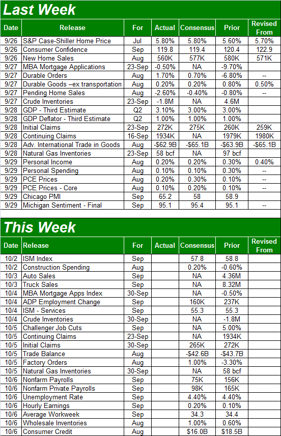
The party starts on Monday with last month's ISM Manufacturing Index, followed by the ISM Services Index on Wednesday. Both are more or less expected to roll in around August's readings, though both are also still above the all-important 50 level.
ISM Index Charts
Source: Thomson Reuters Eikon
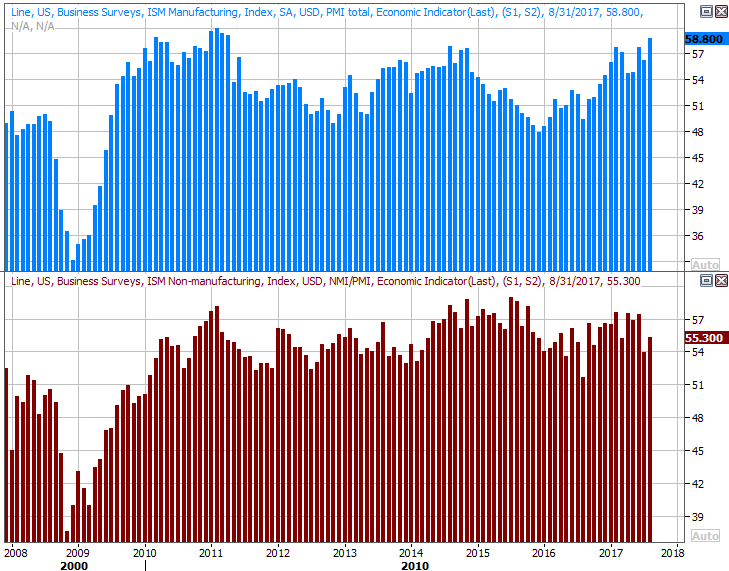
We're also going to get September's auto sales report on Tuesday. Be prepared for anything. The arrival of hurricane Harvey hurt August's numbers, and might have pushed them back into September. Or, maybe hurricane Irma got in the way again last month. Whatever's in the cards, know that auto sales were already slowing down. It remains to be seen if the damage done to vehicles by two hurricanes will lead to a mass replacement of them.
Auto Sales Charts
Source: Thomson Reuters Eikon
Finally, this week's biggest news is also the grand finale... September's employment report. Economists don't expect the unemployment rate to move from August's reading of 4.4%, but bear in mind that pretty much is full employment. Those pros do think we're going to add only 75,000 jobs though, with the drag of Irma and Harvey halting hiring -- at least for the time being.
Unemployment Rate and Job Growth Charts

Source: Thomson Reuters Eikon
The real litmus test for jobs from this point will be wage growth, so be sure to keep an eye on that data (which isn't all that well touted by the financial media).
Index Analysis
The bullish romp continues, with last week's strong finish carrying most of the indices above a key line in the sand that technically indicates a breakout thrust is underway. On the flipside, it would be understandable if you were suspicious.
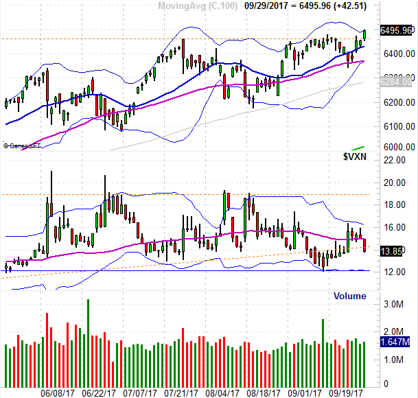
The daily chart of the S&P 500 illustrates this idea clearly. A technical ceiling (blue, dashed) that's capped the index going all the way back to early March failed to hold the bulls back come Friday.
S&P 500 Daily Chart
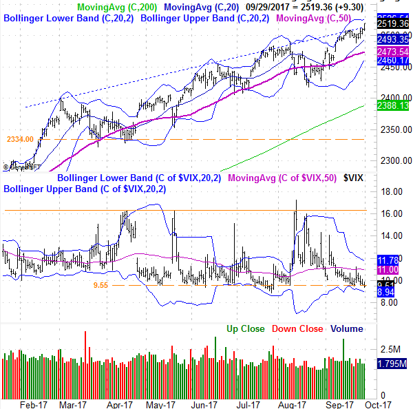
Source: TradeNavigator
Just a fluke, spurred by excitement over the potential for a very friendly tax plan overhaul? Maybe. Or, maybe not. Either way, with the VIX back to an absolute low near 9.55, this is where the bulls are going to be tested. Do they really believe the benefits of lower taxes aren't baked in already? For that matter, do the bulls really believe we'll see the proposed tax overhaul actually approved? If anything goes wrong, this could all come unraveled in a hurry...
... maybe. Bear in mind we just started the most bullish quarter of the year. The S&P 500, on average, gains 4.2% in Q4.
The weekly chart of the S&P 500 doesn't tell us anything new. But, it does put some perspective on just how long we've gone without a major (or even a minor) correction. The last big one was the October-2016 lull of 4.7% (from high to low). What we've seen in the meantime is pretty unusually, supported by sheer willpower and the fear of missing out.
S&P 500 Weekly Chart

Source: TradeNavigator
For the record, the NASDAQ Composite busted through its big technical ceiling at 6459 on Friday. Somehow this breakout move is a little more convincing than the S&P 500's was. Maybe it would be more accurate to say it's more meaningful, as the NASDAQ had been trapped in a sideway range for a while, whereas the S&P 500 hadn't. It's important simply because the NASDAQ is supposed to lead, higher or lower. Also note that the VXN isn't yet at its absolute floor, keeping the door open to at least somewhat higher highs.
NASDAQ Composite Daily Chart
Source: TradeNavigator
So what's the call? We're trend followers above all else, and all the key indications are that the trend is bullish -- as unlikely as it seems that should be. The PercentR line of the S&P 500 is decidedly above 80 right now, and the MACD lines are showing us a bullish divergence. We have to trade what is happening rather than what we think should be happening.
S&P 500 Daily Chart, with PercentR and MACD Lines
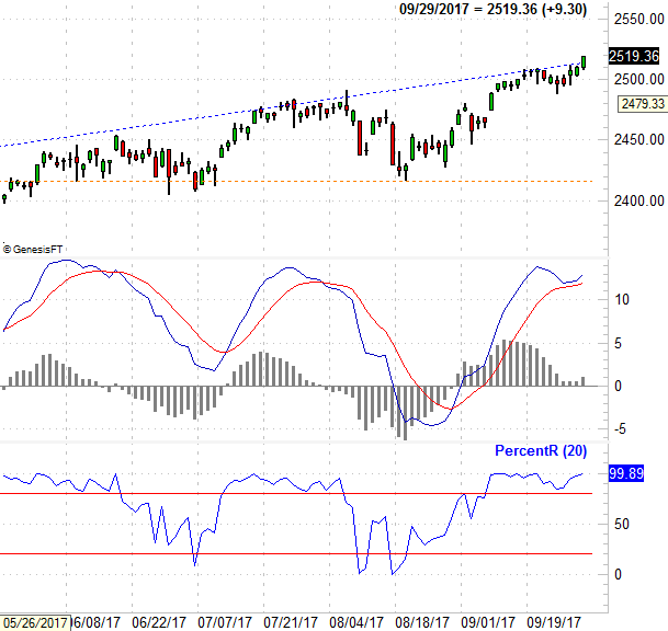
Source: TradeNavigator
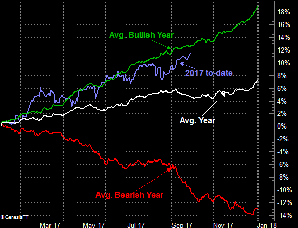
Finally, just to put your mind at ease if you're nervous that this year's gains are just too unusual to sustain, they're not. The graphic below indicates that while 2017's gain of 11.8% seems remarkable -- and it is compared to the average year -- when only counting bullish years, the S&P 500 is below its typical pace. The only thing odd about it is how long we've gone without a major stumble. Just remember we've also gone quite a while without a major forward thrust as well. There really is room for more upside.
S&P 500 Average Annual Performance Chart
Source: TradeNavigator
Just don't forget that earnings season is around the corner, and that may force one side or the other to proverbially show their cards.