Weekly Market Outlook - Stocks Are Strangely, Easily Weighed Down

Despite the strong start to last week's trading action, it wasn't meant to last. The market peeled back from Monday's move deeper into record high territory (at least as measured by daily closes), and ended the five-day span on a relatively low note.
That's not necessarily on omen of doom. Stocks were pretty overbought from the week before, having rallied nearly 11% from their late-October low. They were due a breather. In the bigger-picture sense though, the broad market continues to lose the steam that was so evident just a few months ago.
We'll take a detailed look at that slowdown below, in our review of the weekly and daily charts of key market indices. First, let's review last week's big economic news and preview what's coming this holiday-shortened week.
Economic Data Analysis
We got the good news we wanted last week, even if it didn't help the market that much.
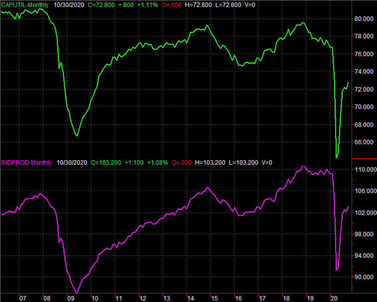
One of those news items was the Federal Reserve's look at the nation's capacity utilization and industrial productivity. Both were up in October, but up even more than expected. In fact, both are at multi-month highs, and trending higher.
Capacity Utilization and Industrial Production Charts
Source: Federal Reserve, TradeStation
As we noted last week, the trajectory here is probably more important than the absolute level.
Conversely, consumers are still doing their part... by spending. But, they're slowing their consumerism. Retail spending grew again last month, but the pace of progress fell short of expectations and slowed from September's huge surge. Of course, September's strong spending was a tough act to follow.
Retail Spending Charts

Source: Census Bureau, TradeStation
Consumers aren't just spending big at the store. They're using ultra-low interest rates as a chance to buy real estate too. October's housing starts and building permits were essentially in line with September's, but September's readings were particularly strong.
Housing Starts and Building Permits Charts
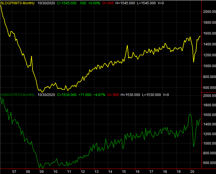
Source: Census Bureau, TradeStation
In this same vein, notice that sales of existing homes pushed to a multi-year high annualized pace of 6.85 million. We'll hear about last month's sales of new homes this week, and economist are modeling strong progress on that front too. Everything else is on the grid.
Economic Report Calendar
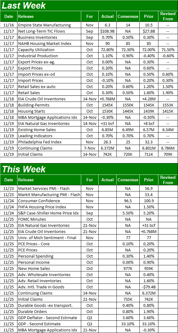
Source: Briefing.com
Aside from this week's look at new home sales, the real estate picture will be rounded out with a look at home prices. The FHFA Housing Price Index as well as the S&P Case-Shiller Home Price Index will be posted on Tuesday, and in step with real estate construction and purchase activity, prices are projected to continue their upward trek.
Home Price Index Charts
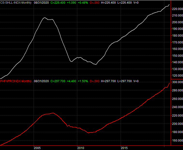
Source: Standard & Poor's, FHFA, TradeStation
It's not necessarily real estate specific, but along these lines, we'll get a feel for how consumers sat they're feeling now. The Conference Board's consumer confidence figure for November is coming on Tuesday, while the third and final look at this month's sentiment score from the University of Michigan will post on Wednesday. Both are projected to have peeled back from last month's levels. That's a concerning turn, considering neither measure has come anywhere close to reclaiming their pre-COVID levels. They may be spending like they're optimistic, but they're not truly feeling fully stoked about the foreseeable future.
Consumer Sentiment Charts
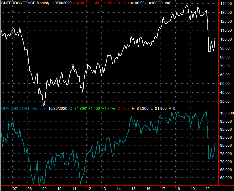
Source: University of Michigan, Conference Board, TradeStation
There's no chart of either to review, but also keep your eyes and ears open for the release of the minutes from the Federal Reserve's most recent meeting on Wednesday, as well as the second guess of Q3's GDP growth. rate. It's still expected to have improved to the tune of 33.1%, offsetting Q2's big coronavirus dip.
Stock Market Index Analysis
The previous week's huge gain left the market ripe for profit-taking. Traders acted on the opportunity.
The daily chart of the S&P 500 below tells the story. The bulls picked up where they left off the week before on Monday, pushing to another record close. They changed their mind as reality set in though. That reality is (1) it's going to take many months to produce meaningful quantities of the coronavirus vaccine, and (2) as much recovery has been made, there's still much more recovery to be achieved.
S&P 500 Daily Chart, with VIX and Volume
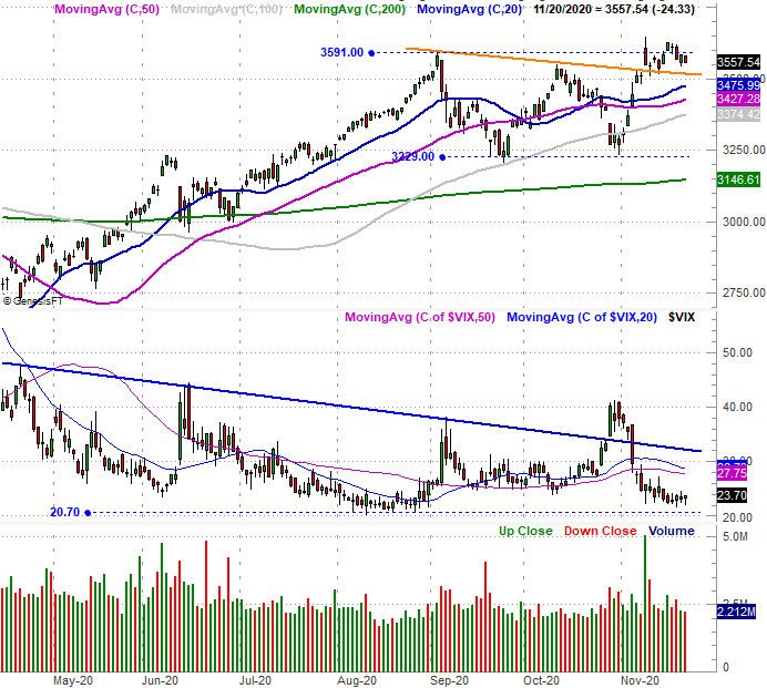
Source: TradeNavigator
Perhaps most interesting about the daily chart of the S&P 500, however, is the way the VIX is a mirror image of the S&P 500. Like the S&P 500 itself, the VIX is starting to form a U-shaped upward curl out of its sharp pullback from a move to what's more or less at an absolute low.
The weekly chart of the index puts this idea in more perspective. On the flipside, the weekly chart of the S&P 500 and the VIX also makes clear that (1) the VIX itself is ultimately range-bound, and (2) the S&P 500 has PLENTY of technical support below it to bring a quick end to any selloff. There's a thick band of support between 3374 and 3476, where the 100-day, 50-day, and 20-day moving average lines are close to converging. Then there's a horizontal floor (dashed) around 3229, where the 200-day moving average line (green) will be by the time it could be tested a technical support.
S&P 500 Weekly Chart, with VIX and Volume
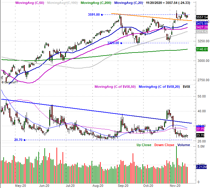
Source: TradeNavigator
The NASDAQ's chart looks similar, but in some regards is even more alarming.
Take a look at the daily chart of the composite. Namely, notice that the bigger-picture arcing action reflects a slowdown of the rally that actually started in July. Volatility since August has obscured the extent of the slowing pace since then, but look at the moving averages. Specifically, notice how the 20-day, 50-day, and 100-day moving average lines are all starting to converge. This is evidence that the advance is slowing, as the short-term trend indicators approach the next-nearest longer-term line.
NASDAQ Composite Daily Chart, with Bullish, Bearish Volume
Source: TradeNavigator
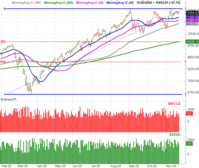
The daily as well as the weekly chart of the NASDAQ Composite shows us something else to this end... the index (unlike the S&P 500) wasn't able to make a new high last week, or even the week before. The slowdown is real, from the one index you WANT to lead the market higher.
NASDAQ Composite Weekly Chart, with VXN, and MACD
Source: TradeNavigator
The NASDAQ also better clarifies its prospective floors. Those are the 100-day moving average line (gray) and the 200-day moving average line (green). The former was a floor late last month, sparking the rebound. The 38.2% Fibonacci retracement line right around 10,000 bolsters the support potential of the 200-day moving average line, although the 200-day line would be above that level by the time the composite could pull back to that level.
The proverbial wrench in the works is the fact that we're in what's supposed to be a reliably bullish time of year. We can't suggest fighting a bullish tide should one take shape. But, the recent volatile pullbacks indicate the fact that traders tacitly know the market's overbought... and overvalued. That's going to make more progress tough to create, and choppy on the way up.