Weekly Market Outlook - Still on the Fence, But the Make-or-Break Lines Are Clear
The market may have logged a gain last week, bouncing back from the previous week's sizeable setback. But, it wasn't the sort of quality win the bulls would have liked to achieved. We still remain within sight of key technical floors. You still can't turn your back on this market for more than a moment, particularly given all the surprising economic data we've worked through of late.
We'll do our usual chart-based analysis of last week's lackluster rally, as we always. First though (and also as we also always do), let's look at some of the surprising economic numbers we heard just a few days back. For better or worse, the Fed's FOMC is probably as confused as the average investor is here.
Economic Data Analysis
The second piece of the ISM data for September was as encouraging as the first. Two weeks ago we learned the Institute of Supply Management's manufacturing index edged upward to one of the best readings we've seen in quite some time. Last week, the services version of the ISM's key indexes also improved, from 61.7 to 61.9. Any reading above 50 is considered positive, and we're still well above that make-or-break line.
ISM Manufacturing and Services Index Charts
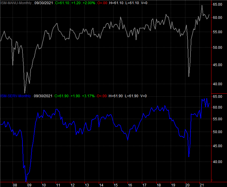
Source: Institute of Supply Management, TradeStation
The only other item of interest from last week was a big one... and a disappointing one. Despite a fairly encouraging job growth report from ADP earlier in the week, the Department of Labor came in with a notably different assessment. It says we only added 194,000 new jobs in September, versus expectations of 450,000.
Payroll Growth and Unemployment Rate Charts
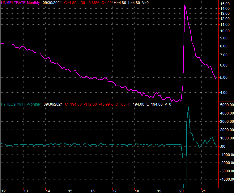
Source: Department of Labor, TradeStation
That was still enough to drive the unemployment rate down from 5.2% to 4.8%. Just bear in mind that August's payroll growth figure was revised higher by a fairly significant degree. Still, the overall jobs picture from last month is more negative than positive. Everything else is on the grid.
Economic Calendar
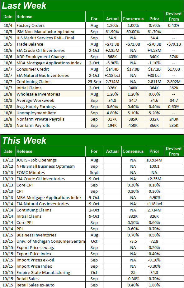
Source: Briefing.com
This week is going to be a big one even if not a busy one, and you can't afford to miss any of the key reports when they're posted. We're going to be getting a slew of data, each piece of which is something the Fed will have to consider as it weighs what to do with interest rates. In fact, although the minutes from the Federal Reserve's Open Market Committee are due on Wednesday, they're already going to be obsolete. [Nevertheless, look for changes to the Fed's language from the previous meeting's minutes.]
First and foremost, this is a big week for an updated look at the inflation picture. On Wednesday, look for last month's consumer inflation data, followed by producers' and factories' input cost picture on Thursday. Both are still sky high, but don't look for relief this time around. Economists are modeling the same sort of price increases for September that we saw in August.
Consumer, Producer Inflation Charts
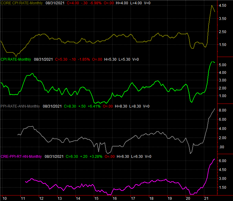
Source: Bureau of Labor Statistics, TradeStation
On Friday look for last month's retail spending data. Forecasters are calling for overall growth again, although slower than August's red-hot pace of 1.8%. Factor is car sales, and retail spending should actually fall... mostly due to a lack of inventory.
Retail Sales Charts
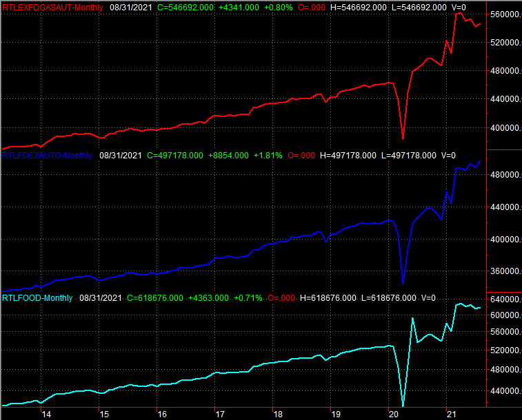
Source: Bureau of Labor Statistics, TradeStation
Despite plenty of reasons for consumers to keep their purse strings drawn closed, retail spending has actually remained a rather bright spot.
Stock Market Index Analysis
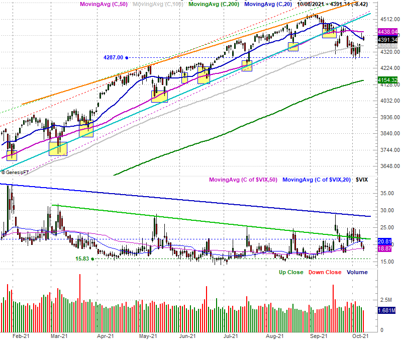
The S&P 500 never broke under the prior week's low around 4287, pushing up and off that support level instead. Similarly, the S&P 500 Volatility Index (VIX) didn't even try to break through its recent technical resistance, also peeling back to rather nominal levels. It looks like just-another routine recovery... the kind we've seen with all the other lulls since early last year. Take a quick look at the daily chart.
S&P 500 Daily Chart, with VIX and Volume
Source: TradeNavigator
Don't be too quick to jump to this superficial conclusion, however.
Take a closer, longer look at the daily chart of the S&P 500 below. Notice the index did NOT crawl back above the 50-day moving average line (purple), nor did it end the week above the 20-day moving average line (blue) as of Friday's close. Stocks are still on the defensive here, and still within easy reach of major technical support. One or two (or maybe three) bad days could still turn into big-time trouble. And, with Thursday's opening bullish gap still ready to be closed, we're kicking things off this week facing an uphill battle.
The daily chart of the NASDAQ Composite looks pretty similar, if not identical. The index didn't move back above its 20-day or 50-day moving averages, and also remains within easy reach of a couple of key support levels. The VXN is also still very near a key technical ceiling (red) currently at 27.8.
NASDAQ Composite Daily Chart, with VXN
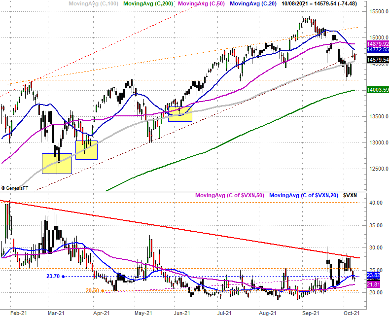
Source: TradeNavigator
Here's the weekly chart of the S&P 500, just for a little added perspective. It doesn't show us anything new, but it does put into context just how much things have changed -- for the worse -- over the course of the past three weeks. This weekly chart also makes it quite clear just how big of a deal the VIX's falling resistance line is. A move under it could prove to be catastrophic for stocks, but traders are doing everything they can to prevent that from happening.
S&P 500 Weekly Chart, with VIX
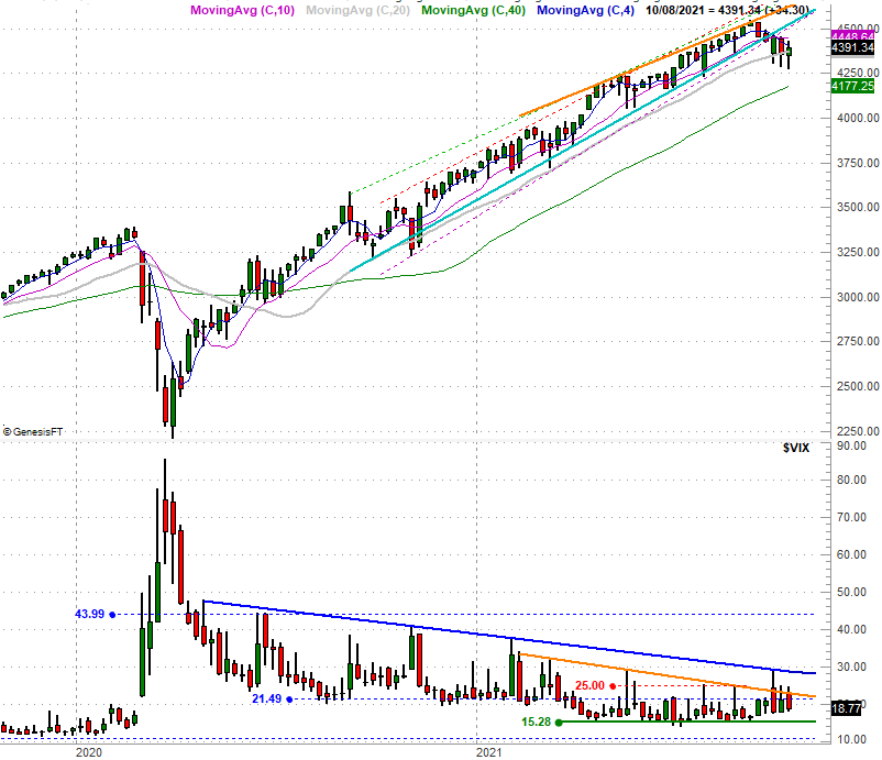
Source: TradeNavigator
With all of that being said, it would be time well spent to take a look at a chart we rarely consider... the Russell 2000 Small Cap Index.
We mentioned a few days ago in a commentary posted at the website that while "the market" was seemingly in a selloff, the bulk of that selloff was being dished out by large cap growth stocks. Small cap stocks and value stocks (and small cap value stocks in particular) were actually inching their way higher despite the bearish environment. In fact, it's possible that small can and value names were moving upward specifically because large cap growth names were retreating, with investors looking for more reliable alternatives.
That premise is still a distinct possibility. But, we've not exactly seen small caps as a group kick-start a real rally. They're just as close to a breakdown, in fact, as a breakout. The good news is, it's crystal clear where the Russell 2000's make-or-break lines are. It's trapped within two converging wedge patterns. One of these sets of boundaries is plotted with red lines on the daily chart below, while the other upper and lower boundaries are plotted in blue. The index remains perfectly stuck in the middle of both trading ranges, and as was noted, could just as easily be flung out of these confines in a downward direction as it could be in a bullish direction.
Russell 2000 Daily Chart, with Volume
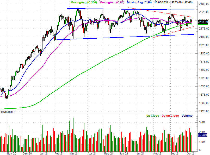
Source: TradeNavigator
We only point it out so you can add the chart's markings to your list of clues that just might tell us what's really happening with the broad market, and its individual pieces. Just be prepared for the possibility that, like a couple of weeks ago, large caps and small caps may end up moving on opposite directions, with one pullback fueling the other's rally.
It's all in the straight-line support and resistance, which is clearer now than it typically is.