
 Ripe for profit-taking at what's usually a lethargic time of year anyway, stocks suffered a setback last week. While not an earth-shattering pullback, the weakness does set the stage for more downside as the end of July nears and August approaches.
Still, the sellers have yet to even drag the key indices under the first of several technical floors. The VIX isn't cooperating with the bearish effort either.
We'll take a detailed look at the situation below, as always, after painting a picture with the broad brush strokes of economic numbers. Last week was a major mixed bag on that front.
Economic Data Analysis
As was noted, June's economic news reported last week painted a confusing picture. Some was good, and some wasn't.
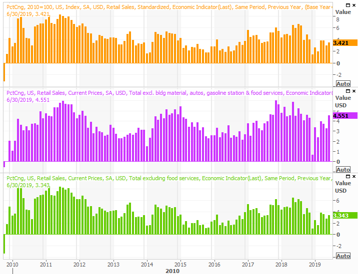
The earliest news was decidedly good. Tuesday's look at June's retail spending was better than expected, with consumer spending growing 0.4% with or without cars. On an annualized basis the growth rate now stands at more than 3.0% no matter how it's stratified, and appears to be growing again.
Retail Sales Growth (YOY) Charts
Source: Thomson Reuters
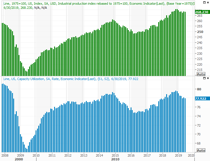
That very same day, however, we saw a new red flag start to wave. June's industrial productivity and capacity utilization both fell, rather than rise as expected. It was only a small setback, but a setback nonetheless at a time when these particular data points couldn't afford a setback.
Industrial Production and Capacity Utilization Charts
Source: Thomson Reuters
It's too soon to assume the worst. It takes two or three months to decidedly make or break a trend for this data. But, the lull does deflate hopes given the rebound effort that seemingly started to take shape in May.
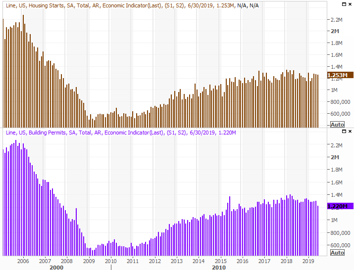
Finally, housing starts and building permits were also down for June, and also fell short of expectations. Starts fell to 1.25 million, annualized, while permits fell to a multi-month low pace of 1.22 million.
Housing Starts and Building Permits Charts
Source: Thomson Reuters
It's not necessarily a bulletproof hint of economic trouble. It's entirely possible the homebuilding industry is held back by nothing more than fear. It's also arguable that the total addressable market of new home buyers has been fully satisfied for the time being, given more than ten years of economic growth. Whatever the case, however, it's anything but an encouraging data nugget.
Everything else is on the grid.
Economic Calendar
Source: Briefing.com
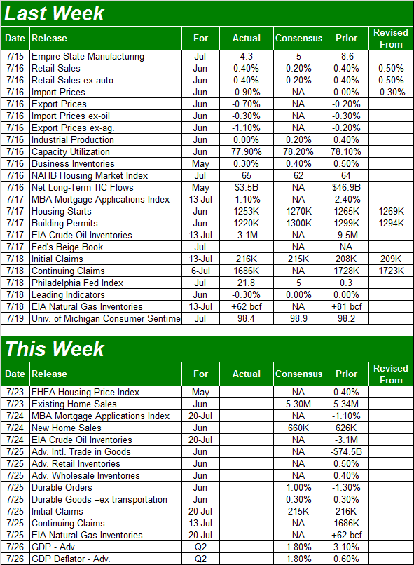
The true health of the real estate market will be completed this week, starting on Tuesday with a look at the FHFA Housing Price Index. It's continued to rise, and likely will do so for May. In fact, the FHFA version of this barometer has continued at its pace from as far back as 2012. On the other hand, the Case-Shiller index - which only looks at more metropolitan areas - has shown us a slowing of that pace. Any growth is good, but faster growth is better,
Home Price Index Charts
Source: Thomson Reuters
The Case-Shiller Index report for May will be posted sometime next week.
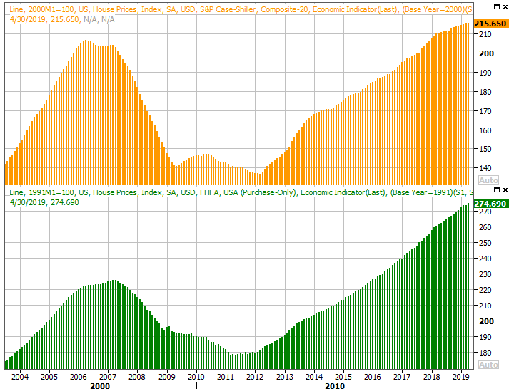
Also this week look for reports on sales of existing homes (Tuesday) and sales of new houses (Wednesday). The former should be more or less in line with May's reading, though somehow economists are looking for a solid upswing in new-home purchases. Specifically, they expect May's pace of 626,000 to race to 660,000 for June.
It's possible we could see these two figures diverge. They've been moving in opposite directions, or at least not moving in tandem, for the past five months. In both cases though, the outlooks essentially call for a reversal of the trends at hand... which is why they're suspicious predictions.
New, Existing Home Sales Charts
Source: Thomson Reuters
Also note the revival of inventories of new homes, which may be part of the reason builders have been making few starts and asking for fewer permits.
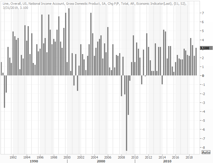
Finally, on Friday we'll get our first look at Q2's GDP growth rate. This certainly has the potential to move the market. There's little doubt the economy slowed from Q1's pace of 3.1%, but the question is, how much? Pros are saying the first quarter's GDP slowed to only 1.8%. Of course, that slowdown may or may not already be priced into stocks.
GDP Growth Rate Charts
Source: Thomson Reuters
Stock Market Index Analysis
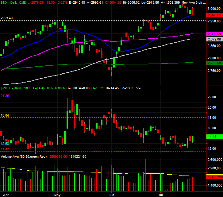
Perhaps the one thing worse than a loss on any given day is a daily loss that started out as a win and then turned into a loss. It confirms that bullish conviction is weak, and can even deflate would-be optimism.
That's what took shape on Friday. The S&P 500 started out with a gain, following through on Thursday's rebound move. The effort faded halfway through the session though, leading to a third loss in four days. The VIX made a mirror-image move, underscoring the premise that the undertow is indeed turning bearish.
S&P 500 Daily Chart, with VIX, Volume
Source: TradeStation
There's not a whole lot of supporting evidence to that argument though... at least not yet. The S&P 500 appears to be finding good support at its 20-day moving average line (blue), and it's not like the VIX is roaring higher. The support it mustered last week is more or less what one would expect to see at an established floor. It would need to push through the ceiling near 18.0 - which doesn't mean a whole lot anymore - to really impress bearishness here, and the S&P 500's 20-day moving average line would need to fail as a floor.
Even then though, the market's got plenty of other technical floors that could easily stop any bleeding.
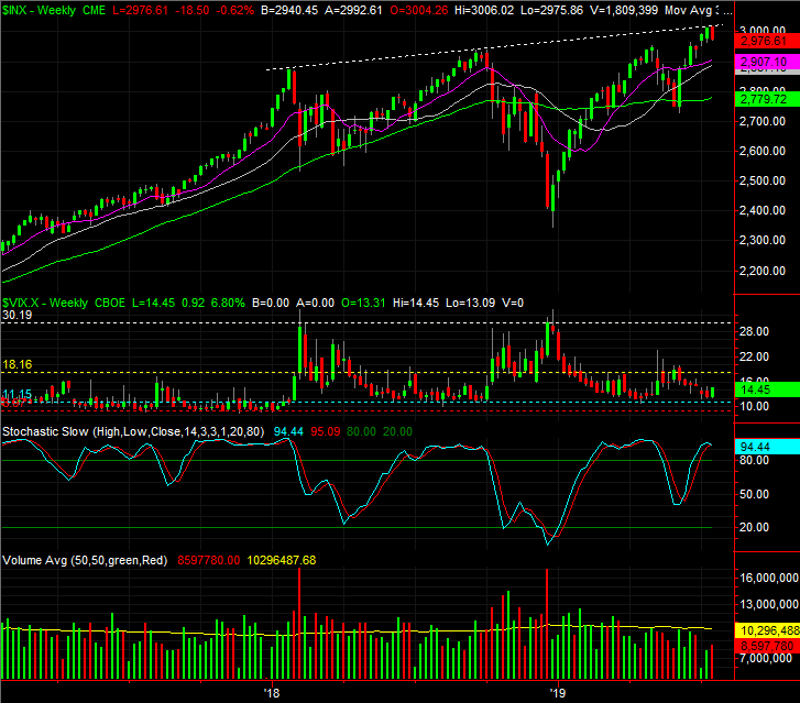
As usual, the weekly chart puts things in perspective. It also highlights that fact that the peak from Monday was given shape by an encounter with an established technical ceiling that extends back to the early 2018 high. Though seemingly arbitrary, it would be unwise to ignore the psychological impact of such developments. Clearly the majority of traders took it seriously enough to begin taking profits there.
S&P 500 Weekly Chart
Source: TradeStation
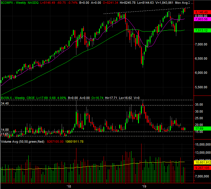
And for the record, the NASDAQ Composite's chart looks about the same as the S&P 500's, for better or worse. One noteworthy difference though... the VXN wasn't pushing higher like the VIX was, and the NASDAQ didn't close below its prior week's low. It doesn't matter a great deal in the current scenario, though.
NASDAQ Composite Weekly Chart, with VXN, Volume
Source: TradeStation
It's a situation that largely sets the stage for more frustration.
The fact of the matter is, the current condition of any of the charts doesn't tell us much. We know stocks are overbought and ripe for a pullback, but they've been in that situation before to no immediate avail. We also know that even with the technical odds saying we should expect some weakness here, the reality it, headlines and sentiment have meant so much more than any technical cues and clues of late. That can defy and override much of what 'should be' happening.
Still, what's unseen at this time is ultimately working against the market. That's the fact that the second half of the third year of a presidential term tends to be weak, and stocks are entering that phase of Trump's term already overbought. Throw in the fact that Q2's GDP growth pace fell rather dramatically and the fact that we need start lowering interest rates, and it's difficult to say that we're not at least a little bit on the defensive.
The smart-money move here is to do nothing. The broad market is on the fence. Let the masses tip their hand first. It costs little more than time to do so.