Weekly Market Outlook - It May be Ugly, But the Bulls are Holding the Line
The bulls were able to muster something of a gain on Friday after slowing the bearish train on Thursday. But, it wasn't enough to undo the damage done earlier in the week. Stocks lost a little ground last week, bringing a quick end to the prior week's healthy bullishness.
 It's not the end of the world. Indeed, it's been quite normal for the market to take one step back for every two steps it takes forward; last week was just one small step back. The overall recovery effort is still intact. Broadly speaking though, there's not a lot of "umph" behind this advance, with traders concerned about everything from valuations to an economic slowdown to political fighting in Washington D.C.
We'll show you what we mean below, after a quick run-through of last week's and this week's economic news.
Economic Data
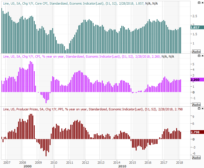
Good news... inflation is still fairly tame, all things considered. Price-hikes for consumers as well as companies were modest last month, rolling in as expected. The consumer inflation rate now stands at 2.26%, and on a core basis is 1.86%. Producer inflation is 2.8% on an annualized basis, not counting volatile food and energy input prices. Note that inflation rates are mostly edging higher.
Consumer and Producer Inflation (Annualized) Charts
Source: Thomson Reuters Eikon
There's chatter circulating that the Fed could impose 100 basis points worth of rate hikes this year, in four quarter-point installments or in three doses with one of them being a 50-basis point increase. Though the data says three rate increases are likely (with one of them possibly coming this week), the four-hike/100 basis point argument is a bit over the top.
We also got last month's retail sales data last week. It wasn't as good as expected... or was it?
On a month-to-month basis, February's consumerism fell 0.1% counting cars, but only grew 0.2% taking cars out of the equation; economists were expecting 0.4% growth.
As we've said in the past though, the headline data is misleading. The year-over-year data is far more meaningful, and on that front retail spending growth is still quite brisk.
Retail Sales Growth (Annualized) Charts
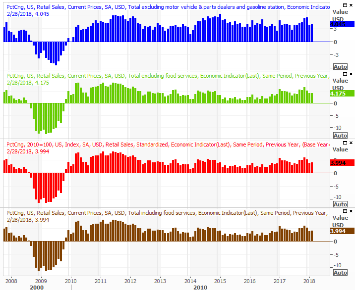
Source: Thomson Reuters Eikon
We were also not surprised to see housing starts and building permits fall just a bit in February - even more than analysts were expecting. January's readings were a little bit too strong, and the end result was slight trail-off. Though the pace of growth continues to cool, it's still growth.
Housing Starts and Building Permits Charts
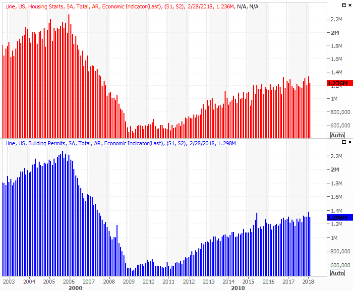
Source: Thomson Reuters Eikon
Finally, what may have been last week's most important report ended up being a great one. Capacity utilization jumped to 78.1%, versus expectations of only 77.7%, while industrial production grew 1.1% compared to expectations for 0.3% growth. The former is racing higher, and the latter is at record levels.
Capacity Utilization and Industrial Productivity Charts
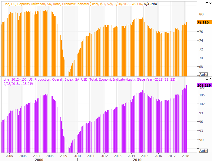
Source: Thomson Reuters Eikon
We've mentioned before that this data shows the most correlation with corporate earnings, but it bears repeating again. As long as productivity is on the rise and our output capacity is being pushed to the point of strain, investors have good reason to be excited and expect bottom line growth.
Everything else is on the grid.
Economic Calendar
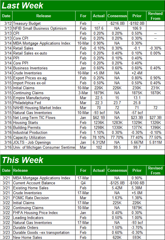
Source: Briefing.com
This week won't be quite as jam-packed. In fact, there's only one piece of information we're bothering to preview with a chart, and that's home sales. We'll hear about February's existing home sales on Wednesday, and on Friday we'll get last month's new home sales pace. Both have been trending higher despite a lack of inventory (yet bear in mind that home starts and permits above are slowing down). And, the pros are calling for another "up" month in February's data after some recent weakness.
New and Existing Home Sales Charts

Source: Thomson Reuters Eikon
Be sure to pay close attention to February's inventory levels as well.
Though there's no chart, don't forget on Wednesday the FOMC is making a decision on the country's base interest rate. Analysts and traders are saying there's a 95% chance we'll see a quarter-point increase.
Also keep your ears and eyes open on Wednesday for last week's crude oil inventory data. It's been edging higher, but not yet enough to up-end crude oil prices.
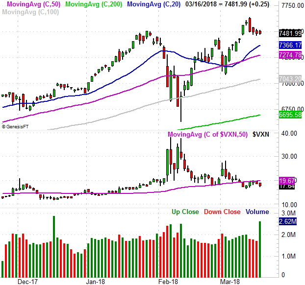
Index Analysis
We'll begin this week's analysis with a look at a weekly chart of the NASDAQ Composite, as it best explains how and why the rebound effort was at least temporarily stunted. The NASDAQ bumped in to its upper 26-week Bollinger band... the point where the composite reached an extreme relative to its recent action.
NASDAQ Weekly Chart, with VIX and Volume
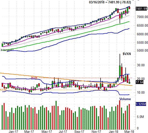
Source: TradeNavigator
Notice that the NASDAQ's Volatility INdex, the VXN, broke under its 50-day moving average line (purple) and continues to edge lower. And, it also has room to keep moving lower.
On the daily chart you can see the same basic idea, with a couple of curious details. One of them is the nature of Tuesday's big reversal bar. It was a tall bar (a an engulfing bar, to be exact) following Monday's very short doji bar. The combination indicates a major and rapid change of heart, which is a big red flag even if Friday's action wasn't horribly bearish.
NASDAQ Daily Chart, with VIX and Volume
Source: TradeNavigator
Friday's volume surge? Don't sweat it, or read too much into it. It was a triple-witching day, meaning a huge swath of monthly and quarterly equity and index options were expiring, forcing people to act on them (or watch the them expire worthless). There's no hidden, obscured hint in that volume spike.
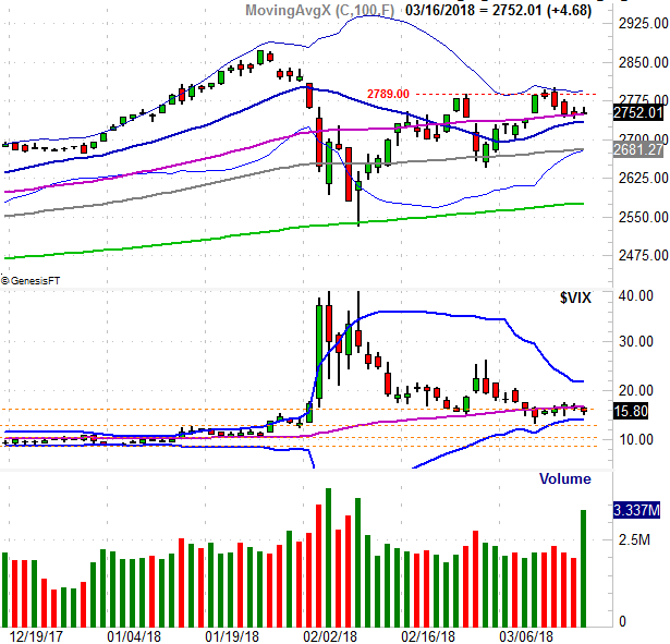
We also want to zoom into the daily chart of the S&P 500 to offer some more perspective on what's going on here; the S&P 500 is arguably a better barometer of the market, and the psychology of traders right now.
In short, investors are on the fence. The S&P 500 peeled back from its 20-day Bollinger band last week, and that peak more or less coincided with the high from late February (red, dashed). But, the index only tested its 50-day moving average line (purple) as a floor rather than breaking under it. Moreover, when taking a broad look at the whole situation, you can see the index is trapped right in the midst of an entanglement of technical lines.
S&P 500 Daily Chart, with VIX and Volume
Source: TradeNavigator
Broadly speaking, the bulls are still winning. It's an ugly win, but a win all the same. We have to respect the undertow until we clearly can't anymore.
And what it will take to really shatter the broad uptrend is a lot. Go back and look at the daily chart of the S&P 500, and you'll see most of the key technical analysis lines are below the index. The S&P 500 will have to fall under all of them to really quell the bullish sentiment that's keeping the market propped up. That includes a move under the 200-day line (green) at 2574.
If the index should pull under that long-term moving average line, that could be a problem, marking the beginning of the correction that's become more than a little overdue.
Anything less though, and we have to assume the bigger-picture strength is intact. In fact, if the S&P 500 manages to push above its upper Bollinger band currently at 2794, then we're looking for another bullish leg.