The bulls had to know they were playing with fire, with stocks up nearly 50% from March's low, yet struggling to break past June's peak. We now know the profit-takers were just waiting to sell into that pivotal breakout... a move that ended up only being a fakeout. Just when it looked like the bulls were ready for another go-around, the bears found reason to sell. In this case, unemployment claims were higher than anticipated, and the COVID-19 outbreak appears to be picking up speed again.
Still, the rally effort is technically intact.
We'll look at why below, as always. First, let's run down last week's major economic announcements and preview what's in store for this week.
Economic Data Analysis
Last week was rather light in terms of news, but we did get a couple of biggies.... particularly on the real estate front. Home sales, of new and existing houses, surged higher. Sales of new homes reached a multi-year high pace of 776,000, and sales of existing homes pushed higher to 4.72 million versus May's reading of 3.91 million.
New Home Sales Charts
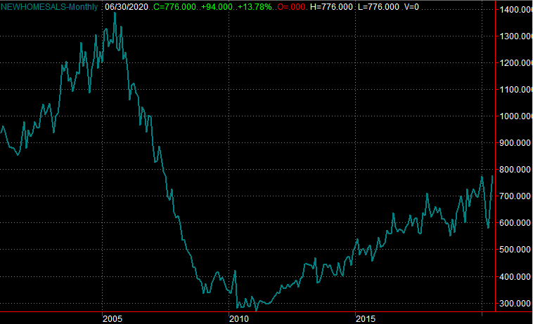
Source: Bureau of Labor Statistics, TradeStation
It's an interesting explosion of purchasing, all things considered. Buying a home at all is a logistical challenge regardless of crimped demand. Consumers found a way anyway. Some of it's likely to be the result of pent-up demand that built up when the coronavirus lockdowns were at their worst. But, sales were never terribly crimped even then. Demand is just strong right now, as people take advantage of low interest rates (and somehow are able to secure financing despite the fact that banks are tightening their purse strings).
In that vein, although it's a month behind, the FHFA Housing Price Index update reported last week showed a modest 0.3% decrease in home prices. That makes them a little more affordable, although not nearly enough to attribute the surge in purchases to sharply lower prices.
Home Price Index Charts
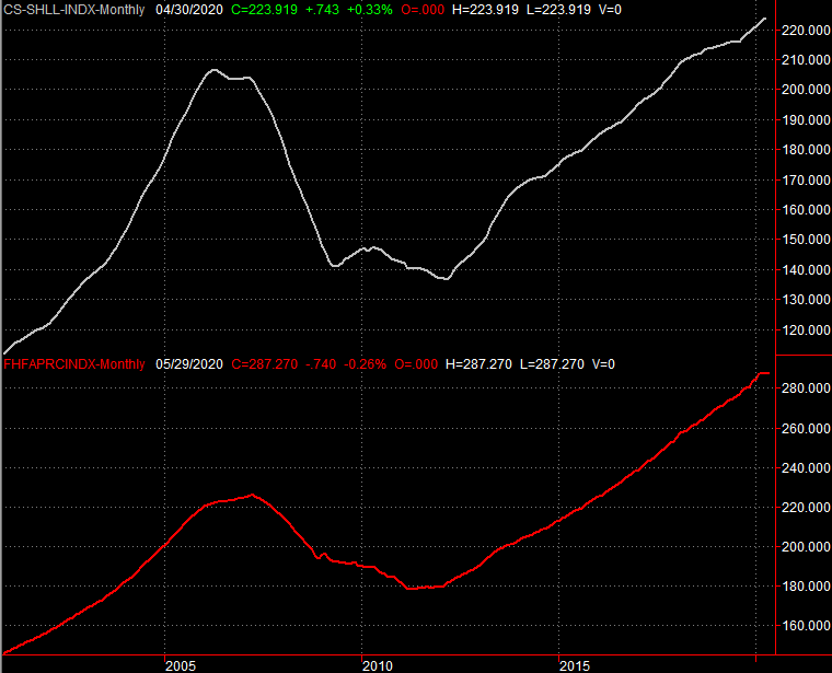
Source: Federal Reserve, TradeStation
We'll round out the look at the retail landscape this week with the Case Shiller Home Price Index for May, due on Tuesday. Analysts are expecting a 4.1% uptick in home prices, year over year, reflecting a similar increase in the FHFA's home price index despite the monthly lull.
Everything else is on the grid.
Economic Calendar
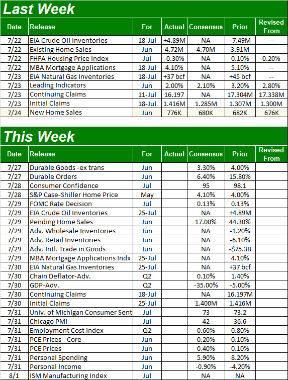
Source: Briefing.com
Aside from a final look at the real estate landscape this week, we'll also get a couple of even bigger items.
One of them is the first look at Q2's GDP growth rate. The pros are calling for a stunning 35% decrease thanks to COVID-19-related shutdowns. But, it's something of a coin toss. Economists know it will be bad, but it's difficult to guess anywhere near exactly how bad. Before that, we'll hear from the Federal Reserve's Open Market Committee. It's a scheduled opportunity to change the interest rates, but analysts don't expect things to waver. Then again, with the Fed Funds Rate at a rock-bottom low of 0.13%, there's not much room to lower it (as would be the only safe direction to push it).
It's also going to be a big week for sentiment readings. We'll get the Conference Board's updated figure on Tuesday, and the third and final look at the University of Michigan's figure on Thursday. Economists believe sentiment waned a bit from June's level, as unemployment claims and the reality of the coronavirus contagion is forcing consumers to rethink what lies ahead. This isn't the time for any hints of weakness.
Consumer Sentiment Charts
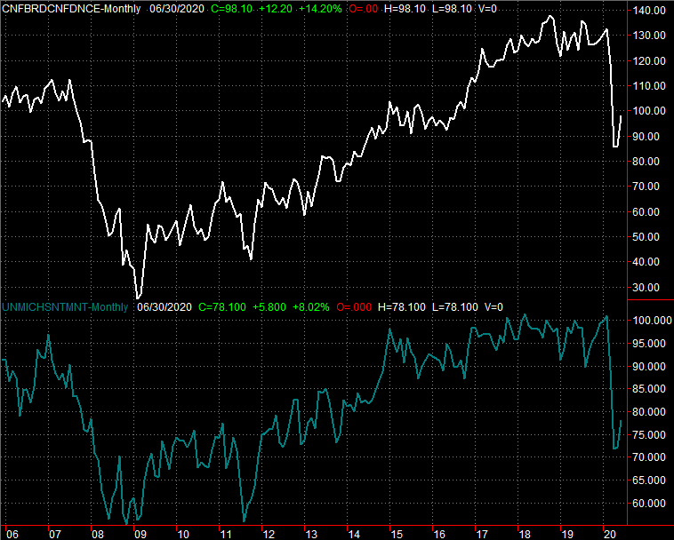
Source: Bureau of Labor Statistics, TradeStation
Lastly, look for an updated ISM Manufacturing Index figure on Friday. Things soared a month ago as factories were put back into action. It's unlikely they've stopped output in the meantime. But, it remains to be seen if they maintained the previous month's huge swell of productivity.
ISM Index Charts
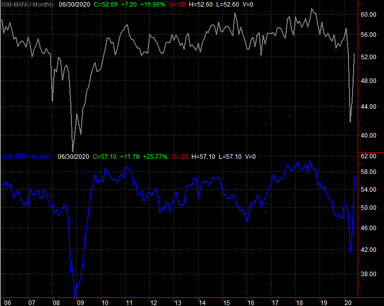
Source: Bureau of Labor Statistics, TradeStation
Stock Market Index Analysis
It's a funny world. Little about last week's market action is what it seems when one looks beyond the surface. But, first things first.
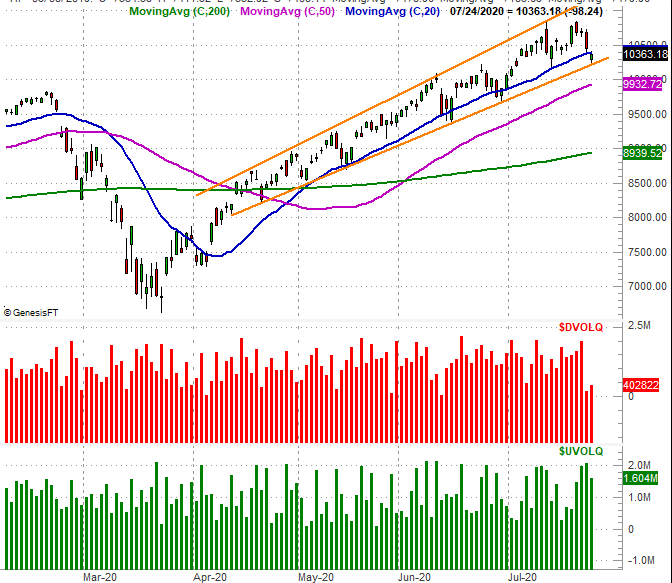
A week ago we identified what looked to be a rotation out of the bigger, riskier tech names of the NASDAQ, and into the safer blue chips of the Dow Jones Industrial Average; the S&P 500 was somewhere in between. We actually saw more of that rotation last week. Except, we can't put a lot of faith into that message.
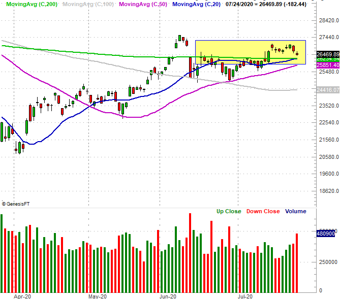
Starting with the Dow, it's encouraging to see it hold above its pivotal 20-day (blue) and 200-day (green) moving average lines despite last week's struggle. The Dow Jones Average, in fact, lost less ground than any other major index, and the 20-day moving average is on the verge of crossing above the 200-day average lines. However, Thursday's and Friday's setbacks for the Dow were on high volume. That is to say, a lot of people were dumping their "safe blue chips" despite the clear reasons to embrace safety at the time.
Dow Jones Industrial Average Daily Chart, with Volume
Source: TradeNavigator
That's in sharp contrast with the tech-heavy NASDAQ Composite, which lost a lot of ground on Friday, but didn't do so on significant volume. Indeed, the bullish volume on Friday's loss for the composite was four times as great as its bearish volume. That didn't prevent the NASDAQ from tumbling below its 20-day moving average line (blue), although that wasn't tough to do after Thursday's sizeable selloff. But, even on that day bullish volume was far greater than bearish volume somehow, and the composite remains inside the rising channel that's been guiding it higher since April (orange).
NASDAQ Composite Daily Chart, with Up and Down Volume
Source: TradeNavigator
The NASDAQ remains the most vulnerable to profit taking just due to the sheer distance between it and its 200-day moving average line (green). We can't say the index is "broken" yet though.
As for the S&P 500, it remains in the middle in every possible way. It's neither resting on a major technical support line, but isn't drawing out decidedly bullish volume. The only item of interest for the large cap index's action last week is the fact that it finally broke above its technical ceiling around 3238 (blue, dashed). Yet, it fell back under it by the time the week came to a close.
S&P 500 Daily Chart, with VIX and Volume
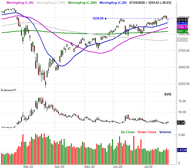
Source: TradeNavigator
Take a step back and look at the weekly chart of the S&P 500, and it starts to tell us a little more. Yes, from this vantage point we can see how far (too far?) the market has come since March's low. But, that's not the big take-away right now. Rather, notice the shape of last week's bar. It's a gravestone doji... where the open and close are both near the low for the week, well below a relatively high weekly high. This sort of bar can and often does suggest a transition from a net-bullish environment to a net-bearish one.
S&P 500 Weekly Chart, with VIX and Volume

Source: TradeNavigator
That's hardly conclusive evidence that last week was a major peak. In fact, there's a great deal of evidence from last week suggesting traders are embracing a "risk on" mindset, which would - if nothing else - entail more buying than selling. We do have to acknowledge all possibilities though, and the fact is, a pullback remains almost as possible as a continuation of the current rally.
The good news is, the NASDAQ and the Dow have already drawn their clear lines in the sand should such a pullback start to take shape. That's 10,205 and 26,255, respectively.