Weekly Market Outlook - Back Between a Rock and a Hard Place
The market may have been up on Friday, but it wasn't really enough to offset the loss booked for the whole week. Regardless, stocks remain in a proverbial no-man's land, under some key resistance lines and above a key support levels. Traders just aren't sure what to do here, struggling to figure out if an accelerated rate-hike program is a bad thing, or a sign of just how strong the economy is.
 We'll weigh it all below, as always, but first let's look at last week's and this week's economic announcements. More than usual, investors are looking at that data to make a judgment call about the market's foreseeable future.
Economic Data
Busy week last week, in terms of economic news. Let's just dive in, beginning with (more or less) order of appearance.
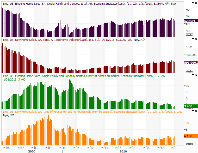
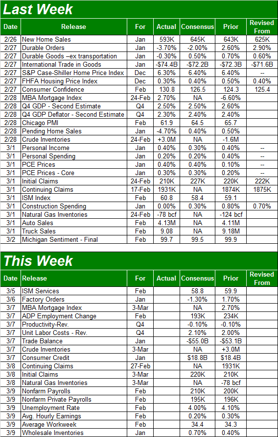
Rounding out the prior week's existing home sales numbers that were not only tepid but worse than anticipated, January's new home sales were also disappointing at a pace of 593,000. Inventories are still on the low-ish side, but we've prodded more home sales with less inventory in the recent past.
New and Existing Home Sales (Annualized) and Inventory Charts
Source: Thomson Reuters Eikon
Maybe it was the month. Maybe extremely cold weather kept buyers from looking, and maybe the seasonal adjustment didn't fully account for the usual January lull. It's unlikely interest rates soared to the point where would-be buyers changed their mind. Our fear is that this is simply an indication of a garden variety slowdown.
The good news is, the homes that are selling are selling at ever-increasing prices.
While it's December data and therefore a bit dated, both the Case-Shiller Index of home prices and the FHFA Housing Price Index edged higher at the end of last year, extending a long-standing streak.
Case-Shiller and FHFA Housing Price Index Charts
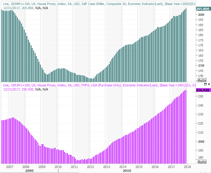
Source: Thomson Reuters Eikon
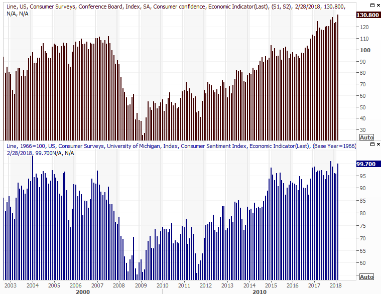
It was also a big week for consumer sentiment, with the Conference Board's score of confidence being posted on Wednesday followed by Friday's third and final reading of consumer sentiment for February. In both cases, despite a horrific start to the month for stocks, people are even more upbeat about what they see coming later this year. The Conference Board figure even hit a multi-decade high.
Consumer Sentiment Charts
Source: Thomson Reuters Eikon
As long as consumers are feeling good, they're spending money, and keeping the nation's economic engine revving.
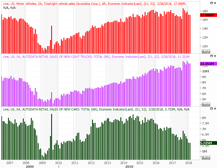
Finally, on Thursday we got last month's automobile sales data. As suspected, they were down - again - though not by as much as one might have suspected. Either way, the amazing growth of yesteryear is still in the past, with the auto-buying rush that we usually see following a nasty hurricane (or two) clearly now behind us.
Auto Sales Charts
Source: Thomson Reuters Eikon
Everything else is on the grid. Note a couple of things we didn't talk about above. Namely, the second estimate on Q4's GDP growth rate was the same 2.5% we heard a couple of weeks ago. Also note the ISM Manufacturing Index edges a little higher rather than a little lower.
Economic Calendar
Source: Briefing.com
This week will be a little less busy in terms of economic announcements, but only just a little.
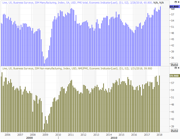
The party starts on Monday with last month's ISM Services Index score, rounding out last week's ISM Manufacturing Index report. The pros are looking for a slight dip, but they were erroneously looking for a slight dip on the manufacturing front as well. Either way, both indices remain well above the pivotal 50 level.
ISM Index (Manufacturing and Service) Charts
Source: Thomson Reuters Eikon
The party ends on Friday with a biggie... last month's employment report. We're already at or near maximum possible employment, so economists are looking for the unemployment rate to fall below its current level of 4.0%. Instead, as an indication of economic growth, analysts are looking for a 0.3% increase in hourly pay, and a similar increase in the number of hours worked. More than anything though, the 200,000 news jobs projected to have been created in February will speak volumes about the economy, assuming that target is hit.
Unemployment Rate and Payroll Growth Charts
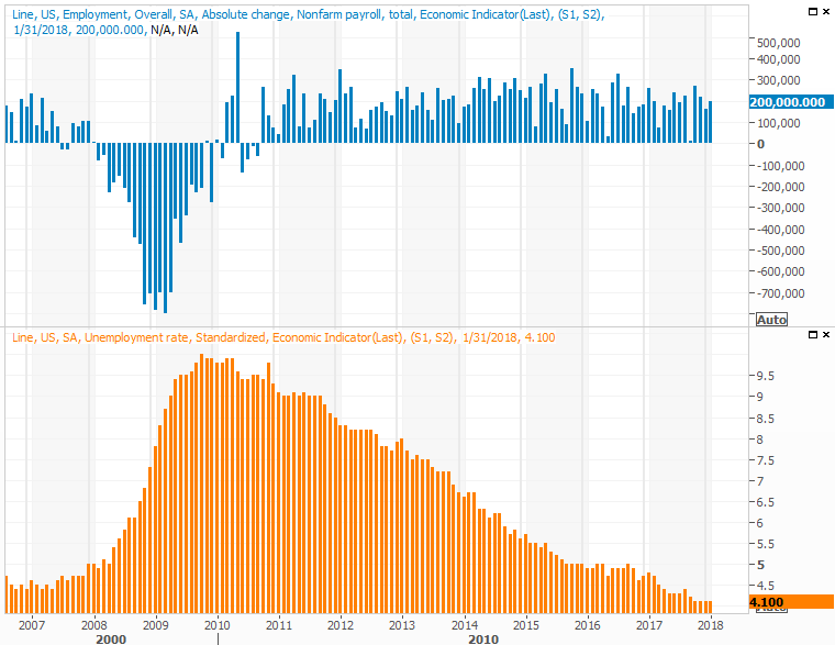
Source: Thomson Reuters Eikon
Index Analysis
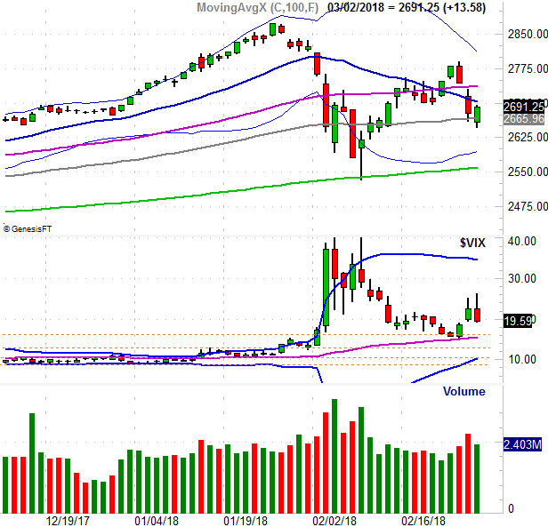
Despite Friday's rebound effort, the market is far from being back in a full bullish mode. The S&P 500 failed to crawl back above the 20-day moving average line (blue), and the volume behind the 0.51% advance was thin... much thinner than the volume we saw with Wednesday's and Thursday's selling. Take a look.
S&P 500 Daily Chart, with VIX and Volume
Source: TradeNavigator
Zooming out to a weekly chart of the S&P 500 adds some perspective on the matter. It's in this timeframe we can see something else that speaks volumes... in a bearish way. Even with Friday's gain, last week's bar was an engulfing bearish bar, meaning last week's open was above the prior week's high, and last week's close was below the prior week's low.
S&P 500 Weekly Chart, with VIX and Volume
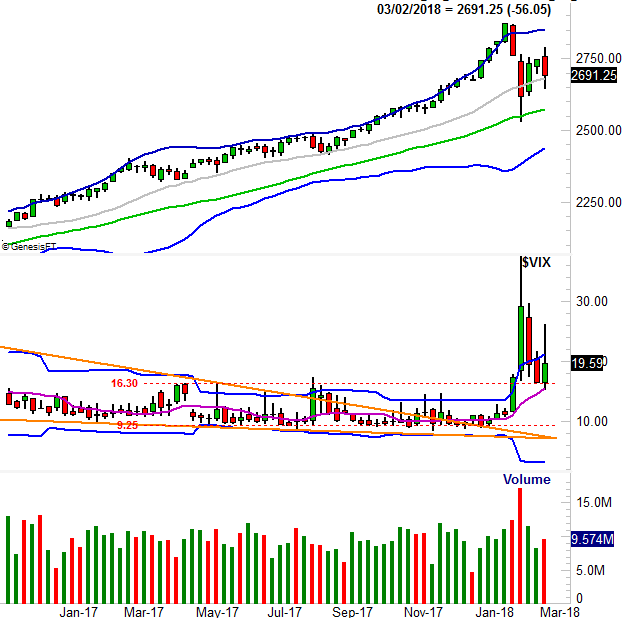
Source: TradeNavigator
The sudden and sharp change of heart marked by an engulfing bar is a concern, though will only be a concern of significance if the S&P 500 breaks under its 100-day moving average line (gray) at 2666. The index briefly traded below that marl last week, but the bulls weren't willing to let the index close below there on a weekly basis.
And of course, even a move under the 100-day line wouldn't mean nearly as much as a break below the 200-day line (green) at 2558. Until and unless the S&P 500 falls below that long-term moving average line, any more selling is just part of a garden variety correction.
For what it's worth - and this is interesting - the NASDAQ Composite's chart is still leaning a little more in a bullish direction. Namely, it bounced back above its 50-day moving average line. It matters, because the NASDAQ leads the market, for better and for worse.
NASDAQ Daily Chart, with VXN and Volume
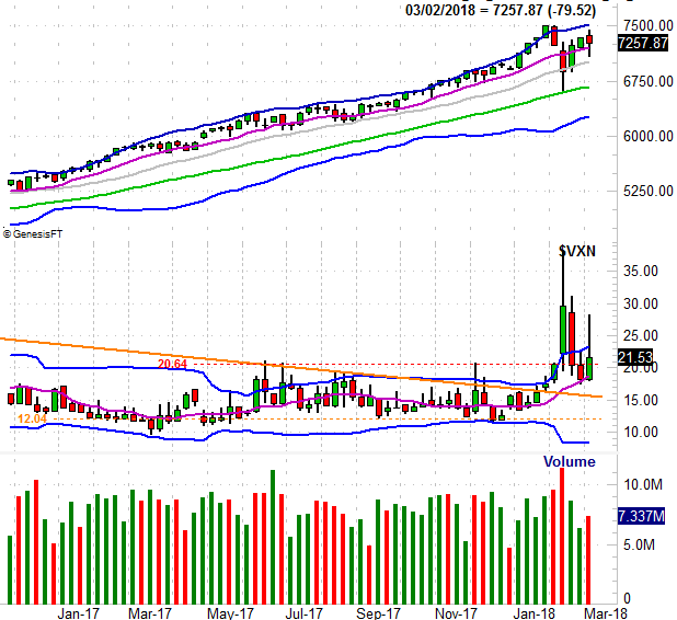
Source: TradeNavigator
Still, even the NASDAQ's stocks as a group aren't quite as bullish as it seems they are on the surface.
Take a look at the image below. Sure, the composite itself is above its 50-day line (purple) and miles above its 200-day moving average line (green). Only a few of the very biggest stocks are making the top-heavy (market-cap-weighted) composite that way though. Of all the NASDAQ-listed stocks, only 36.8% of them are above their 50-day moving average. And, only 54.4% of them are above their 200-day moving average line (orange).
NASDAQ Daily Chart, with % Above 50-day and 200-day Moving Averages
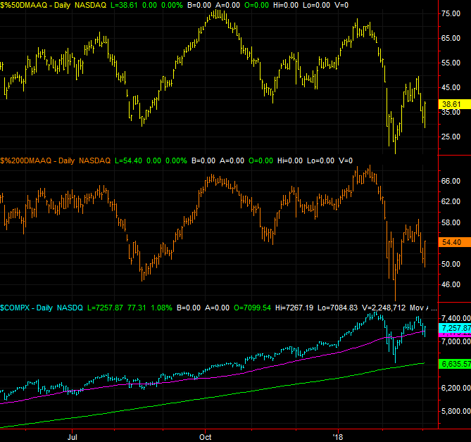
Source: TradeStation
It's a concern simply because the NASDAQ can't lean on the leadership from Apple, Microsoft, Intel and Cisco forever.
Perhaps it's nothing... just unusual circumstances. Or, perhaps it's as unhealthy as it seems. One or two tough headlines for a couple of the market's most-loved NASDAQ stocks could do more damage than you might imagine to an relatively hollow rally.
Bottom line? The market ended last week in limbo - no real surprises there. But, digest that and don't jump the gun. The market, and the S&P 500 in particular, is still trapped squarely between a rock and a hard place. Don't get antsy and jump the gun. The S&P 500 will have to move above last week's peak to constitute a breakout, and the index will have to break under the early February low to get the bearish ball rolling in earnest.