Weekly Market Outlook - Another 11th Hour Recovery

A week ago, stocks were toying with the a major meltdown. What a difference a week makes. Not only has the market backed away from the cliff's edge, it's essentially rekindled the uptrend that began way back in early November.
It remains to be seen if it will be able to follow-through on that effort. After all, valuations are stretched to the max here, and it's now September.... the month that's mostly likely to be a bad one for stocks. The trend is your friend, however. We have to assume what's in motion will remain in motion until we clearly can't afford to assume that.
Just watch your back.
We'll look at the matter in detail below (as always). But first, let's run down last week's and this week's economic news, which is providing the ultimate backdrop for the market's long-term direction.
Economic Data
Though it was the last thing we heard last week, it was also arguably the most important... August's jobs report. It wasn't as healthy as expected. We only added 156,000 new payrolls, falling short of the forecasted 183,000 new jobs. That let the unemployment rate slide a little higher, from 4.3% to 4.4%. Still, with the economy more or less at full employment, it's going to be tough to make net progress in terms of payroll gains. There's also the not-so-small matter of hurricane Harvey forcing layoffs and abandoned jobs late in the month.
Unemployment Rate and Job Growth Charts
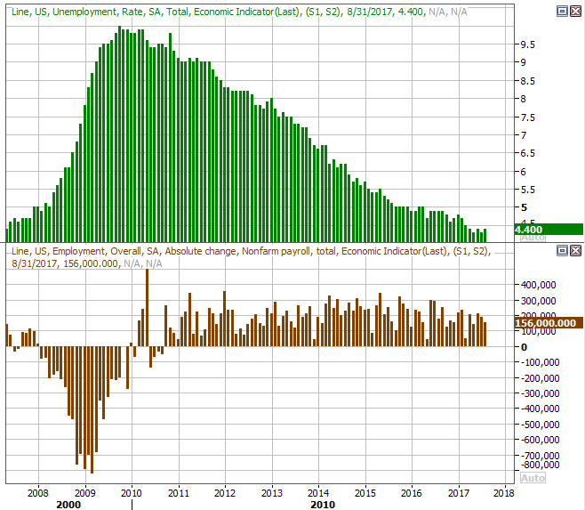
Source: Thomson Reuters Eikon
We took a much more detailed look at the jobs report at the website.
One of the other biggies from last week was the August car sales figures, though once again, Harvey may have crimped demand. Then again, the hurricane wasn't even on the radar -- literally and figuratively -- until late in the month, and it only impacted a small geographic portion of the country.
Whatever the case, car sales were actually not only down on a year-over-year basis, but fell short of expectations.
U.S. Auto Sales Charts
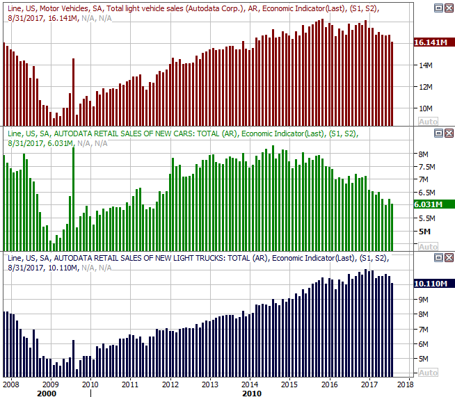
Source: Thomson Reuters Eikon
The pros think the ripple effect of Harvey will keep sales suppressed for another month, but after that, replacement vehicles for the ones ruined by flooding could actually inflate sales... though not by as much as you might expect. Estimates suggest only between 200,000 and 400,000 cars will be scrapped, and not all of them will be replaced with a new vehicle.
That said, don't forget car sales were trending lower well before last month. That undertow hasn't changed.
While it's dated data (as of June) the Case-Shiller home price index was up 5.7% as of the latest look. The FHFA Housing Price Index was up 0.1% in June too, on a month-to-month basis. Although home sales have been hit and miss of late, firm price increases says the real estate market is healthy.
Home Price Index Charts

Source: Thomson Reuters Eikon
Even so, the growth trend is prices is still clearly slowing. That's something to watch closely going forward.
Finally, though we've got no chart for it, the second (of three) estimates for Q2's GDP growth rate was upped from 2.6% to 3.0%. That's healthy, to say the least.
Everything else is on the grid.
Economic Calendar
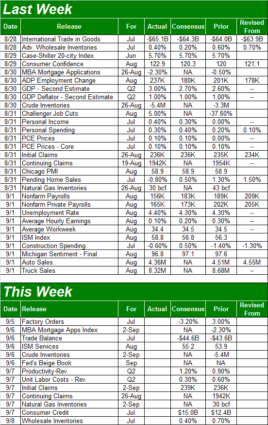
Source: Briefing.com
This week isn't going to be nearly as busy. In fact, there are only two items we're really interested in... Wednesday's ISM Services Index report ( to round out last week's ISM Manufacturing Index report for August), and the natural gas inventory report (only because Harvey is certain to affect it.
Despite Harvey, economists are expecting the ISM Services score to edge higher, from 53.9 to 55.2, reflecting a similar upward move from the ISM Manufacturing Index for the month. Both remain above the key 50 level.
ISM Index Charts
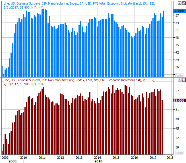
Source: Thomson Reuters Eikon
As for natural gas inventory, though crude oil stores has been dwindling for weeks now, natural gas stockpiles had been moving higher all the same... even though that advance was slowing down.
Natural Gas and Crude Oil Stockpiled Inventory Charts
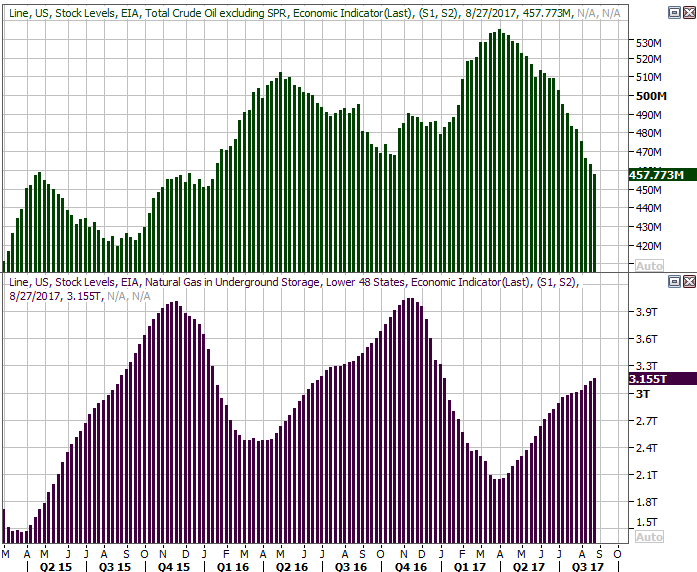
Source: Thomson Reuters Eikon
It remains to be seen how all the shutdowns of oil and gas facilities along the Gulf Coast will affect inventory levels going forward; nobody really knows. Just don't forget that oil stockpiles were shrinking fast even before Harvey became a reality.
Index Analysis
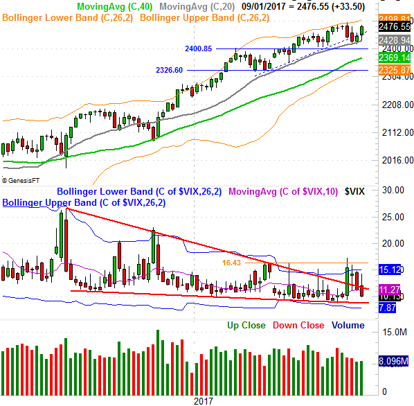
Once again when things looked the most concerning, the bulls found a way to -- or at least an excuse -- to rekindle what's now become a long-term bullish effort. Specifically, when the S&P 500 broke back under a major support level (blue, dashed on the chart below) on Tuesday morning, rather than incusing a panic-driven selloff, the buyers plowed in to carry the index back above its critical 20-day (blue) and 50-day (purple) moving average lines. The VIX correspondingly broke under its 50-day average line, opening the door to another wave of buying.
S&P 500 Daily Chart

Source: TradeNavigator
In some regards it's a bit annoying, really. Few would disagree that the market has gone a little too long without a serious correction, and of all the times of the year a pullback can unfurl, this is it. Yet, that's not in the cards... at least not yet.
All the same, keep the possibility on your radar. Though it may be more the result of timing (in front of a three-day weekend, back-to-school, and last-minute vacations), the amount of volume behind last week's gains was pretty minimal, save Thursday. This isn't necessarily a majority opinion - there was just a lack of selling interest.
On the other hand, the sellers may still be disinterested right now.
Zooming out to a weekly chart of the S&P 500 doesn't tell us much more than we already knew, though on this chart we can see the VIX's break above the upper boundary of a long-term wedge pattern (framed by orange lines) has been decidedly undone.
S&P 500 Weekly Chart
Source: TradeNavigator
The weekly chart also puts this length of this uninterrupted rally in perspective, pegging the 100-day moving average line (gray) as the ultimate support for it.
Thing is, the weekly chart of the NASDAQ Composite looks a little different than the S&P 500.... in a bullish way. That is, the NASDAQ moved to within easy striking distance of its July peak around 6461, and the VXN is about to break under the lower edge of its recent converging wedge pattern.
NASDAQ Composite Weekly Chart
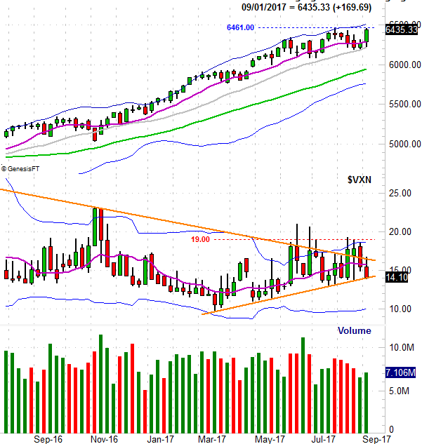
Source: TradeNavigator
Though the VXN is still "too low" for long-term comfort and like the S&P 500 the NASDAQ Composite's rally has gotten a little too long in the tooth, this does set the stage for more bullishness even though this isn't the time of the year we'd expect to see it.
Bottom line? This isn't a time when you can turn your back on the market. The undertow is at odds with the calendar, and we still suspect the calendar is ultimately going to win... particularly if President Trump's agenda continues to hit headwinds.
Should the NASDAQ break above 6461, that could and likely would spur a small rally. Don't count on it lasting too long though. As for bearishness, only a move below the S&P 500's aforementioned support level -- or either index's 100-day moving average line -- would convincingly say the overdue selloff was finally underway.