Weekly Market Outlook - 1 Step Back, 2 Steps Forward

The market continues to defy the odds, and the calendar. While it got off to a rough start last week, it finished strong, logging a record-high and record-high close on Friday. Traders just can't get enough, seeing the disappointing jobs report as a reason not to fear inflation, or rising interest rates meant to curb inflation.
Maybe these buyers are right. Nevertheless, as overbought as stocks are here, plowing into bullish trades here carries a lot of risk with commensurate reward. It's all a little too good to believe.
We'll slice and dice last week's technical action below, as always. First, let's run through last week's biggest economic reports and preview what's on the menu for this week.
Economic Data Analysis
There's no sense in postponing the number you want to know the most. Last month, the United States added 266,000 nonfarm payrolls, falling well short of the expected 1.0 million, causing the unemployment rate to rise from 6.0% to 6.1% rather than sliding lower to the forecasted 5.8%. Note that March's estimated payroll growth was also dialed back.
Unemployment Rate and Payroll Growth Charts
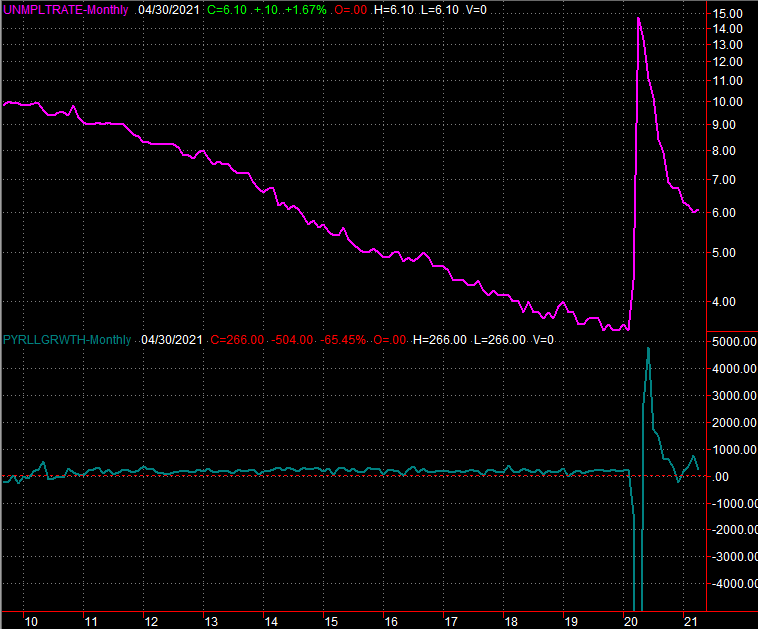
Source: Department of Labor, TradeStation
As was noted, this is a double-edged sword. We'd like to see much more progress on the jobs front, but the lackluster data gives the Federal Reserve some wiggle room before being forced to combat an overheating economy.
The employment report wasn't the only noteworthy numbers released last week, of course. We also got April's data from the Institute of Supply Management, which told us its manufacturing index fell from 64.7 to 60.7 last month. Economists were calling for a slight uptick, to 65.3. Meanwhile, the ISM's services index slipped from 63.7 to 62.7, rather than rising to the expected 65.0.
ISM Service and Manufacturing Index Charts
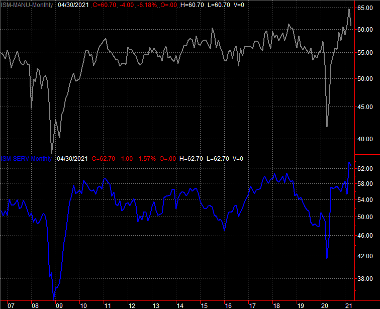
Source: Institute of Supply Management, TradeStation
Between the ISM reports and the jobs report, it's clear a bunch of people thought things were considerably better than they really are.
Everything else is on the grid.
Economic Report Calendar
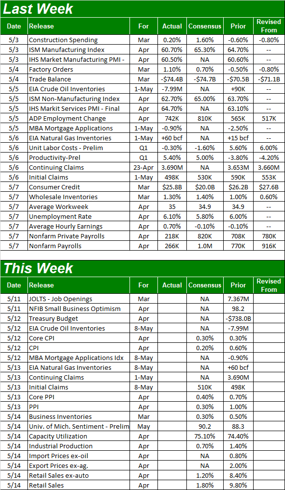
Source: Briefing.com
This week is going to be another big one, loaded with information that has the potential to move the market. Namely, we'll take a look at inflation early in the week, industrial productivity in the middle of the week, and we'll wrap up the week with a look at last month's retail spending.
As of the latest estimates, economists expect a slight cooling of March's price increases; bear in mind the pandemic started in March of last year, setting up strong year over year growth. More important, the inflation a bunch of people fear that loads of cheap dollars should be inducing isn't showing any clear signs it's taking shape yet. Hopefully the outlooks are right.
Annualized Inflation Charts
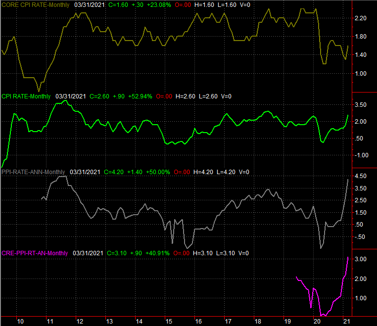
Source: Bureau of Labor Statistics, TradeStation
Given the ISM's measure of economic activity (and the disappointing jobs report), don't be surprised if the Federal Reserve's industrial productivity and capacity utilization figures peel back a bit from March's modest upticks. In retrospect we should have suspected the economy's been bumping into a headwind. Industrial output and usage of our factories clearly peaked in January.
Industrial Productivity and Capacity Utilization Charts
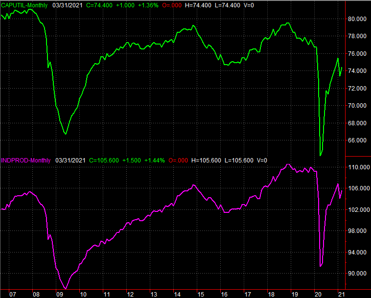
Source: Bureau of Labor Statistics, TradeStation
Finally, while our factories and manufacturing facilities may be dialing down their output, consumers continue to do their part. Spurred by stimulus check, March's retail spending soared deep into record territory a month back. That growth should slow dramatically this time around, but there's still robust growth being called for.
Retail Sales Charts
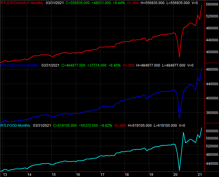
Source: Census Bureau, TradeStation
Stock Market Index Analysis
Technically, it was a win... at least for the S&P 500; the NASDAQ Composite managed to lose a little ground last week. Even so, the win was far from ideal. The S&P 500's advance was stopped at well-established resistance, and continues to face the risk of the sheer scope of its 14-month runup. As for the NASDAQ, it ended Friday with a gain, but it also ended Friday well below its highs. Perhaps most concerning of all is that the NASDAQ Composite remains within striking distance of a major support level. Falling under it could be trouble.
Let's start there... with the NASDAQ. Take a look. Namely, notice how Friday's close of 13,752 was near the low for the day, and well under that day's high of 13,823; traders were getting out of the market's biggest and most important technology names in front of the weekend. Moreover, notice that last weekend's rebound didn't even carry the composite above its 20-day moving average line (blue), and still leaves it just a few points above a convergence of technical support around 13,475... where the 100-day (gray) and 50-day (purple) moving average lines surround a straight-line support level (red, dashed) that connects all the key lows since early March (though that line extends all the way back to last March's low).
NASDAQ Composite Daily Chart, with VXN
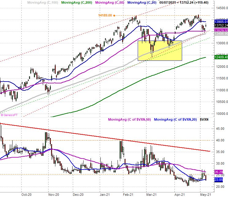
Source: TradeNavigator
Here's the composite's weekly chart, better showing how that recent technical support line was established months ago. It's also on this chart we can gauge the importance of the NASDAQ's 100-day moving average line (gray) that's reversed major pullbacks in November as well March of this year.
NASDAQ Composite Weekly Chart, with VXN

Source: TradeNavigator
The S&P 500's chart has some things in common, but is more different than alike. Namely, notice the S&P 500 is at the upper edge of a long-established trading channel (green AND red dashed lines), having pushed up and off the 20-day moving average line (blue) last week. There's always a chance of more upside despite the big gains already in the rearview mirror. But, tacking on more gains from here would push the market into uncharted waters without any sort of technical framework to guide the index.
S&P 500 Daily Chart, with VIX and Volume
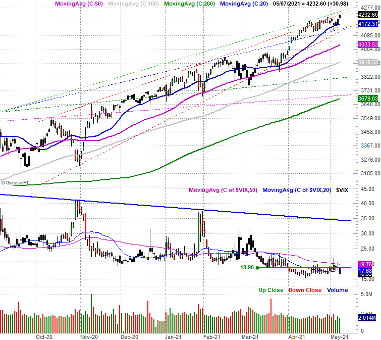
Source: TradeNavigator
Here's the weekly chart of the S&P 500. It doesn't show us much of anything new, but does put things in perspective.
S&P 500 Weekly Chart, with VIX

Source: TradeNavigator
There is a curious nuance that's becoming clearer on the weekly chart, however. The lows are getting higher at a faster rate than the highs are, resulting in a wedge shape that's about to converge around the 4300 level. In fact, these patterns are called "converging wedges." They're problematic because the nearer we get to the point of the wedge - where a stock or index runs out of room to bounce around - the closer we are to a major pivot. When the wedge is pointed upward as this one is, the pivotal break out of the converging confines tends to be in a bearish direction.
We're not there yet... obviously. In fact, stocks are still above major technical floor. The 50-day and 200-day moving averages remain the big floors to watch. They're lines that need to be watched very carefully round-the-clock here though, given the time of year and the incredible runup since last March. There's a lot of profit-taking potential pent-up.