How the Unemployment Rate Rose Despite Strong Job Growth in January
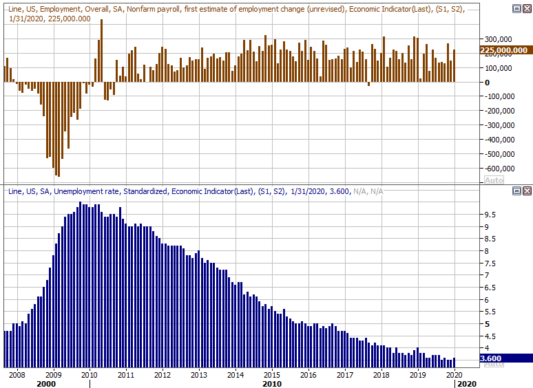
It seems counterintuitive at first. U.S. employers added another 225,000 to their ranks last month, marking the second-best reading since the middle of last year, and extending what's effectively the longest-ever streak of job additions. Yet, the unemployment rate edged a bit higher, rising from 3.5% to 3.6%. There's a simple explanation though, and it's not a discouraging one.
But, first things first.
As was noted, the United States' payroll growth was a solid 225,000 last month, perking up from a lull to 145,000 in December. More impressive is the timing; January is generally a challenging month to find employment due to weather-related matters.
To that end, the total number of people with jobs actually slipped last month, from 158.8 million to 158.7 million, while the number of people officially unemployed (receiving benefits) grew slightly from 5.75 million to 5.89 million. Meanwhile, the number of people that are unofficially unemployed (not receiving unemployment benefits) edged a little higher as well, from 4.83 million to 4.9 million.

Those numbers alone simultaneously explain and confound the most touted figures of the jobs report. The conflict lies in how the figures are calculated... and it's not done consistently.
The payroll growth figure, incredibly enough, isn't determined by comparing the number of people with a job in one particular month to the number of people with a job at the end of the previous month. Were that the case, the U.S. would have actually lost jobs in January. Rather, the payroll growth figure is largely decided by a poll or survey, though it's a poll that's usually pretty accurate. The unemployment rate, however, is based on more finite math, dividing the number of people officially unemployed by the number of people who say they're part of the workforce's labor pool whether they're working or not. The latter figure grew a little more than the number of people receiving unemployment benefits last month, leading to a slight increase in the unemployment rate.
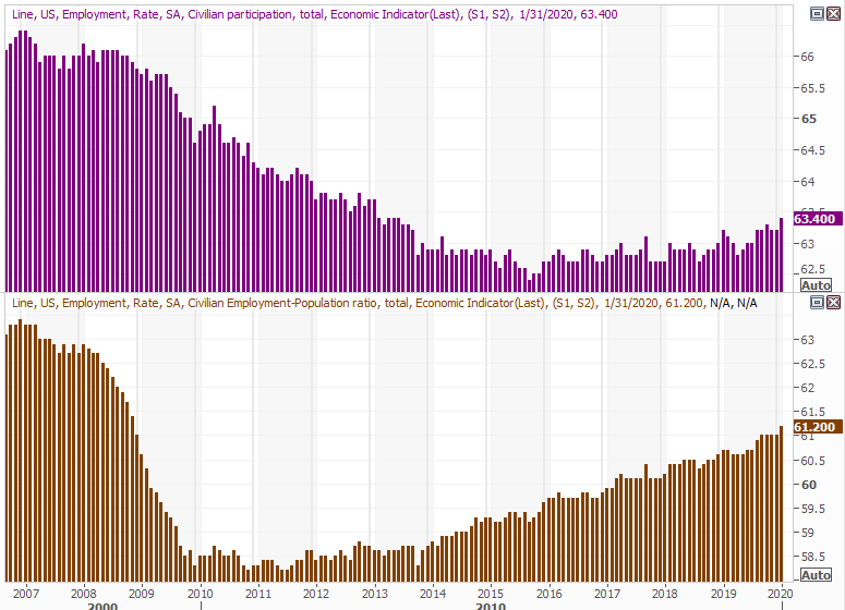
If that's confusing or frustrating because it's an inconsistent comparison of apples and oranges, don't be confused or frustrated. There's actually a more meaningful look at the data that gives us far more insight anyway. That's the number of people in the labor force with a job, and the number of people living in the United States that consider themselves to be part of the labor pool of people working or available for work. Both improved in January. As of last month, a multi-year high of 61.2% of the population is working, and a multi-year record of 63.4% of the population is in the workforce, employed or not. (That is to say, they want a job, and reasonably expect to find one.)
The sizable increase in the labor force participation rate was a key factor in the increase in the unemployment rate, though it was partially offset by the fact that most of that influx of people into the workforce found jobs waiting for them.
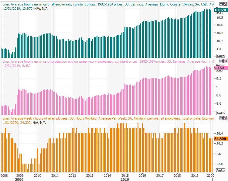
On a related note, hourly wages improved 3.1% on a year over year basis, accelerating from December's pace, and easily exceeding inflation rates. Non-managerial, hourly-rate employees are still seeing the fastest wage growth. Sequentially, that may mean average hourly pay in line with December's rates. The graphic below only shows data through December, though the tapering since September of last year is clear. January's pay data should have ended that tapering.
Ideally we would have seen the number of people with jobs grow again rather than shrink, but otherwise, this is another solid report despite the slight increase in the unemployment rate. The employment/population ration and the labor force participation rate really undid any of the damage that might have been suffered by the unemployment rate figure.