2 Things Wrong With This Recovery Effort So Far

To the average, unsuspecting trader, this week's rebound from last week's rout might look like the typical beginning of a recovery after a typical (albeit shocking) correction. It happens. And, maybe that's exactly what this will end up being. There are a couple of red flags waving, however, suggesting the bulls may not want to count their chickens before they're hatched.
Chief among those two red flags is the lack of volume we've seen on the way back up.
There's an old saying.... "follow the money." It's good advice too. People with more money to throw at an opportunity tend to have large sums of money for a reason. If they're into something. Take the lead. If they're not into something, there's a reason.
To that end, it's curious - and concerning - that the amount of bullish volume we've seen since the February 9th bottom has not only not been overwhelmingly bullish, it's been less and less bullish as the market's advanced.
The graphic below illustrates this reality. The plot on top is a chart of the S&P 500. In the middle of the chart is the market's daily "Up" volume (the darker, dimmer of the green lines) and the more-important moving average (the brighter, thicker line) of the daily up volume. At the bottom of the chart is marketwide "Down" volume for each day (the darker, dimmer red line) and the five-day moving average of that data is plotted by the thicker, brighter red line. Again, the moving average is the more important line to watch, as it points to the bigger-picture undertow for each data set in question.
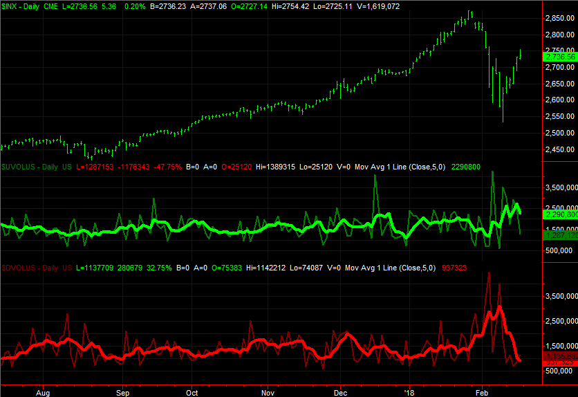
Yes, the down-volume trend is sloped downward as well, saying the sellers are no longer interested in selling. They either got out, or they're in for the long haul no matter what. And yes, the up-volume trend turned higher late last week, reversing its downward trajectory from two weeks ago. The up-volume trend line, however, has suspiciously petered out, suggesting there aren't really that many believers in the rebound effort even though it's been a good one.
This in and of itself isn't earth shattering. You'd reasonably expect some doubt to creep in after suffering the blow the market suffered a couple of weeks ago. It could take several days - if not weeks - for confidence to be fully restored. We're seeing this particular red flag start to wave in earnest, however, at the same time another one is waving.
The chart below is easy to understand. Right on cue the S&P 500 only had to kiss the 200-day moving average line (green) on the 9th to start the rebound move. But, also right on cue, the S&P 500 only had to kiss the 20-day moving average line (blue) for the rally effort to slow down... a lot.
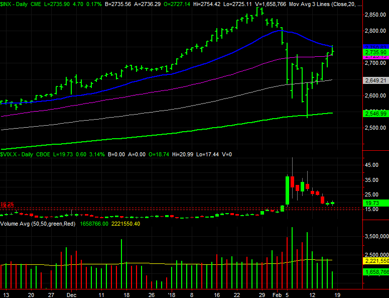
Maybe it doesn't really mean anything. We're headed into a three-day weekend, and a sheer lack of interest until trading resumes again on Tuesday could be the culprit. Or, maybe this was all just the usual dead-cat bounce, materializing in front of the next bearish leg. There certainly aren't many traders betting on a bullish leg from here, as the tepid "up" volume data made clear.
In the middle of the chart above you can see the VIX has stopped falling, and might be testing the waters of higher highs again. That's bearish. At the bottom of the chart is the S&P 500's total volume. It's clear from this perspective that the buying interest is fading on the way up.
Again, this may not mean anything. Trends have hot and cold patches, and this is where one would expect a rebound rally effort to find its first real test.
Make no mistake though. If you're blindly buying here and counting on the next several weeks to be a repeat of January's bullishness, you're taking a massive risk you don't want to take your eyes off of for even one moment.