Style and Market Cap Performances are About to Shift
With nothing more than a quick glance, it looks like the broad market is pushing and pulling on all stocks (of all sizes, in all sectors) equally, struggling to fully rekindle the rally that carried them so much higher since early November. Take a closer look though. As it turns out, there are some clear hot spots and cold spots, particularly when you break it down by market cap and style - value versus growth - categories.
But, first things first. Let's paint a picture using some broad brush strokes first, looking just at large caps, small caps, and mid caps, each in a vacuum.
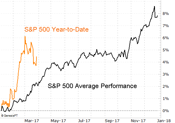
The S&P 500, in simplest terms, is still overextended and still well above where it would normally be at this point in the year.
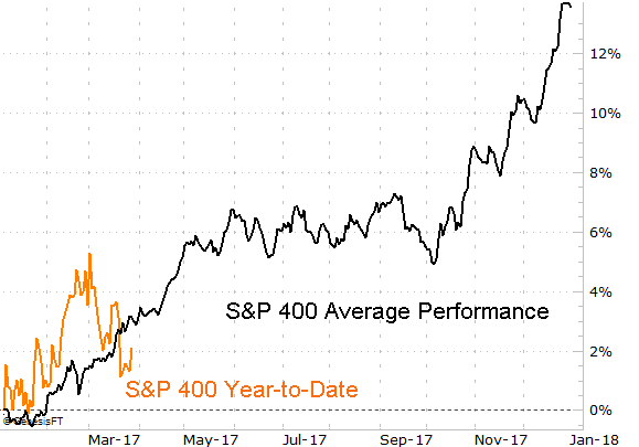
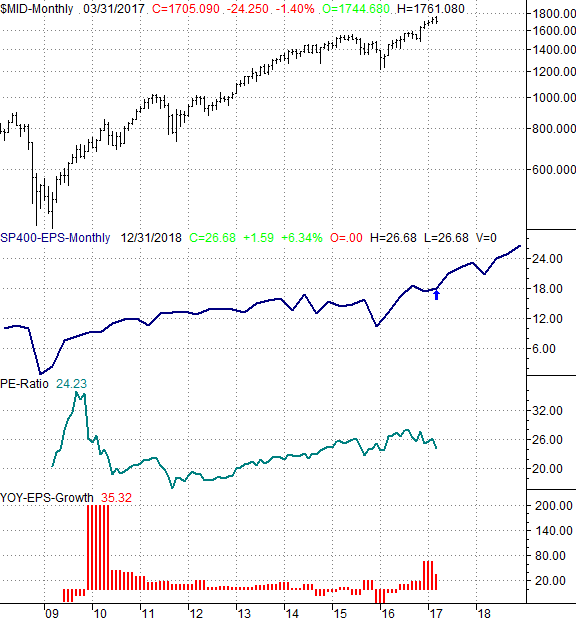
That's in contrast to where the S&P 400 Mid Cap Index is right now, versus where it would normally be.
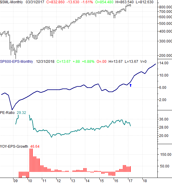
The S&P 600 Small Cap Index is even further behind its normal year-to-date performance, and is actually negative to the tune of about 1%.

The interpretation is, large caps are scary, and small caps look juicy.... if you expect all of these indices to revert to their mean. Momentum players are more apt to buy into the leader, and steer clear of the laggard. Keep reading for more on the matter.
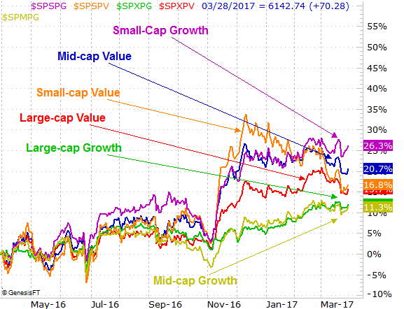
The view changes slightly when you break these three market cap groups into their respective value and growth groups... you get more detail through more stratification.
The comparative performance chart below tells the tale. It's in this timeframe we can see that value stocks have suffered the brunt of the recent weakness, and that growth stocks have held up. In fact, large cap growth and mid cap growth have done oddly well since November, reversing relative weakness they had seen prior to that.
There are a couple of different potential interpretations of this chart. The knee-jerk reaction is to trade their relative strength, meaning bet against the laggards and bet on the leaders. And, that's more or less our stance for some of these groups - we like the strength of the small cap growth names. However, we like the two big laggards -- mid cap and small cap growth -- because they're moving forward when not much else is.
[Not that it matters, but it's with this chart it becomes clear that small cap value names are dragging the S&P 600 down, while mid cap value names are responsible for most of the S&P 400's tepidness. Similarly, were it not for large cap value, the S&P 500 would be doing even better than it is.]
What's most interesting -- and perhaps a little frustrating -- is that some of this relative strength isn't well supported by the fundamentals.
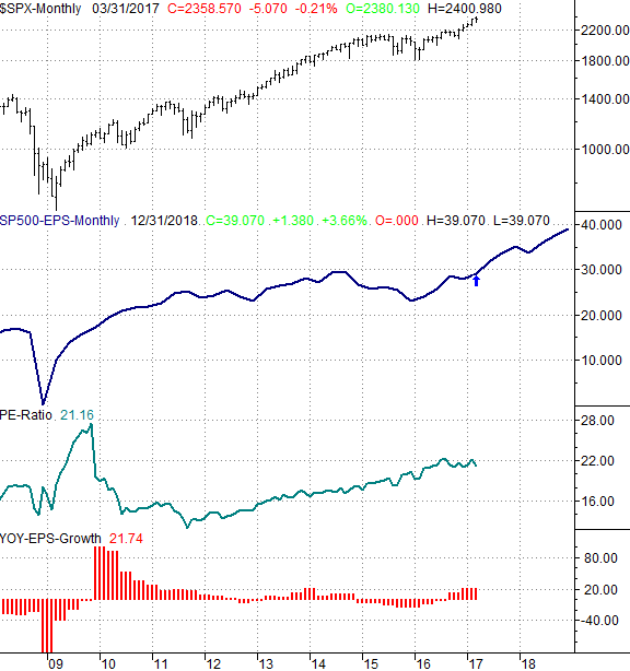
This is particularly true with the S&P 500. Like the other groups, its trailing P/E has moved a little lower since the fall of last year, though not nearly as much as the P/E ratios for the S&P 400 and the S&P 600. To its credit, the S&P 500's per-share earnings are indeed recovering from 2015's meltdown. They won't come cheap though, in light of the lack of risk large caps pose. In other words, the trailing P/E of 21.1 is a lot to pay considering the lack of true growth prospects here. These less-risky stocks should be valued lower.
That's not quite the case with the S&P 600 Small Cap Index. Though it's still more expensive with a trailing P/E of 29.3, that's not a terribly unusual P/E level, especially given its earnings growth rate and prospects (which look a lot better than the S&P 500's).
The mid caps are valued in between the other two indices, sporting a trailing P/E of 24.2, which is also relatively normal for the group. And, like the small caps, the mid caps' earnings trend is decidedly more positive than the large caps' earnings trajectory is.
As for what it all means, we're taking it all at face value. That is to say, we're favoring small caps and mid caps over large caps, and we're partial to growth over value. This is the case for any new short-term trades as well as investments; these charts and graphs all have near-term and long-term implications.
As for how things got this way in the first place, our suspicion is that the rally since the early-November election of Trump has been mostly driven by amateurs and mostly-unseasoned traders. The pros and trading veterans simply jumped on the momentum train because... hey, why not? Thing is, those amateurs tend to focus on the well-known large caps, leaving small and mid cap names behind. Where it gets interesting and compelling is, now that the pros and veterans have some profits to take, any weakness in large caps and value stocks could drive strength in mid caps, small caps and growth stocks as the market rotates out of the former groups and into those latter ones.
It's all very subtle, and won't do true day-traders a lot of good. If you're a swing trader or a true investor (or even a position trader) though, the disparities plotted above are apt to create enough of an undertow to impact the market in a measurable way.