Style and Market Cap Leadership Analysis Reveals Some Surprises
The market may be well up from its March lows, having reached record highs this past week. But, it's not been an evenly-distributed recovery...not by a long shot.
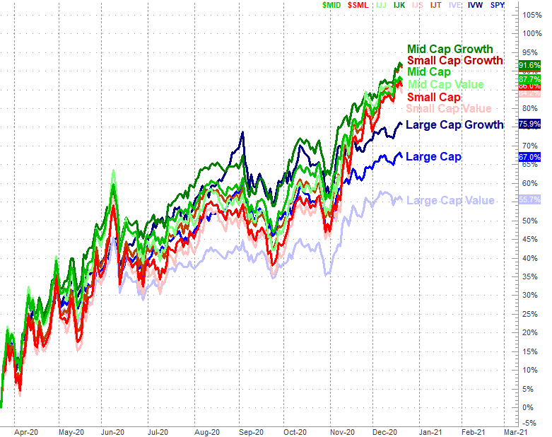
The graphic below tells the tale, comparing the performances of all the major market stratifications. Large caps, as proxied by the S&P 500 index, is up 67% from March's bottom, but large caps have lagged. Small caps and mid caps have done considerably better, gaining 88% and 86% (respectively) during the same nine-month stretch. Growth has done better than value stocks for all market caps.
And if you think small caps and mid caps are still moving forward at a strong pace while large caps are falling behind, you're not imagining things. Large caps are losing steam. Smaller names aren't.
Large caps' struggle to keep up with small and mid caps actually makes some sense, in the right context.
The next graphic below offers this context, plotting each groups' returns since February's peak...right before the COVID-19 pandemic took root in the U.S. and sparked a steep selloff. That was a rough four-week rout for large caps, but it was horrifying for small caps and mid caps. They lost much more ground. In fact, despite their leaderships since March's lows, they've still not "caught up" with their large cap counterparts.
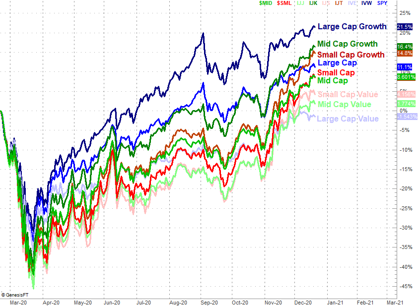
The performance comparison since February's high shows is something else about the market environment since March that was only partially hinted out on the first chart... the one comparing performances since March. That is, growth has been all the rage. Value hasn't.
That's not exactly new. Growth has outperformed value stocks - in earnest - since 2017. Nothing's really changed with the way investors reward story stocks over boring, safer value names.
As for what this all means to traders now, it pays to know which areas are being buoyed and which are being weighed down... particularly if you're into ETFs (exchange-traded funds). Be wary of assuming the past points to the future though. Everything is cyclical, and yesterday's leaders becomes tomorrow's laggards, and vice versa. The hard part is knowing when that transition is ready to take shape. It could be soon. It may be nowhere on the horizon.
There are some red flags and noteworthy nuances that are important to recognize right now though, no matter what the future may hold.
One of them is large cap value's weakness. It's been a poor performer for a while, but large cap value stocks almost appear to be in a new downtrend (having made lower lows for a couple weeks in a row now).
Another area that looks primed to keep chugging no matter what lies ahead is small cap growth's hot streak. It's raced ahead to near the front of the pack in recent weeks, and shows no sign of slowing down. Ditto for mid caps.
Never say never. Also bear in mind the market was made to throw unexpected curveballs. Any trade deserves daily monitoring, and any of the hints offered by either of the charts above should be taken with a grain of salt. And as always, interpretation is an art.
Still, no factual information is bad information. The key is simply knowing how -- or if -- to use it. Charts are odds-making tools, and these particular charts (if nothing else) help traders gain an understanding of how things are truly taking shape "under the hood," so to speak. Sometimes things are quite different than they seem on the surface.