Sector Leadership Becomes Evident as the January Rally's Dust Settles
Just like the December implosion hit all stocks rather uniformly, the bounce back from that late December low has also been distributed evenly. There was little need to do any sector-based analysis, because all sectors were soaring.
The further removed we get from the December 26th reversal though, the more we can start to see some divergence. The past week has been particularly helpful in terms of "separating the men from the boys."
Curiously, the emerging leaders and laggards aren't necessarily the ones you'd expect. Industrial stocks are on a tear -- without much help from General Electric (GE) - and technology stocks are back to their usual bullish form. Utilities stocks, meanwhile, are fading after holding up reasonably well when other sectors couldn't. And, materials and financial stocks aren't realizing the full potential both groups hinted at in January.
It's a set of trends that can get muddled in a numeric table... even a well-crafted one. The easier and more effective means of spotting the market's top sectors, and not-so-hot groups, is visually.
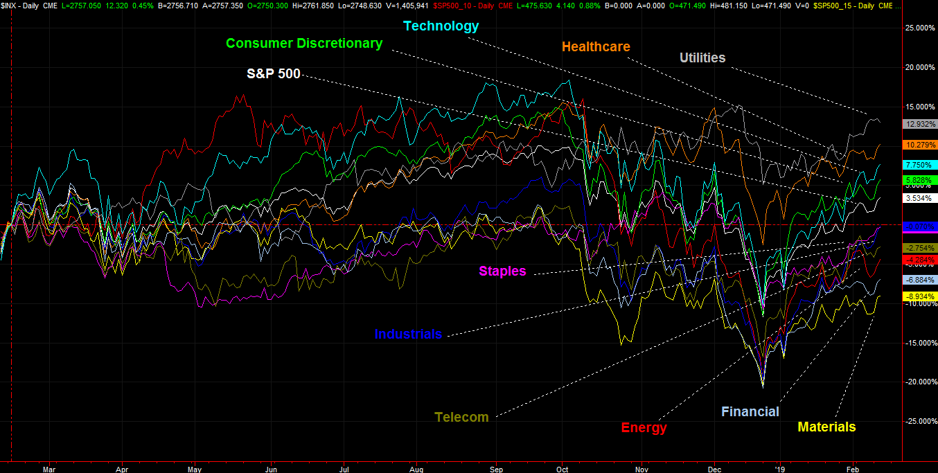
Sector Rotation Trends
The graphic below does the job, plotting the day-to-day net movement of each of Standard & Poor's ten key sectors, compared to one another. For the past 365 days (roughly 250 trading days), the S&P 500 Utility Index has mustered the best performance with a 13.3% gain. Much of that leadership, however, can be attributed to the fact that it lost the least amount of ground when the December meltdown took shape. At the bottom rung are materials stocks, down 9.3% for the past twelve months, remaining in last place as it has for the better part of the past year.
It's the names in between the extremes, however, that tend be the most interesting and compelling prospects.
Chief among those possibilities is the industrial sector, plotted in blue, and represented by the S&P 500 Industrial Sector Index. As of December 24th, it was tied for last place in terms of performance since February 13th of 2017. In the meantime, it's fought its way back to tie for fifth place. The rally since December 26th, though, is actually the market's strongest sector-based move with a 24% advance. The move is still going strong too... stronger than any other group, as a careful, visual examination of the image illustrates. The performance line of the S&P 500 Industrial Sector Index has moved above, or 'lapped,' several other sectors.
It's momentum traders should note, as more of the same looks to be in store. Though it's outperformed in recent weeks, it's still underperformed for the past few months. There's room to recapture ground that was lost last year.
The technology sector, as represented by the S&P 500 Technology Sector Index's performance plotted with a light blue line, is another hot area, though it had less ground to make up than the industrial sector did.
There are some clunkers, even if all areas are up on Wednesday. It was noted that materials and financial names petered out earlier this month, but telecom did the same. Healthcare stocks may be slowing as well.
Reality of This Sector Analysis
The relative performance for all of these sectors could change in an instant, without warning. Nothing is etched in stone. Indeed, that's the whole purpose of studying the relative performance graphic - to identify changes in each area's trend velocity. Nevertheless, once a fresh trend gets going, it tends to last a while, and a reversal of that leadership (or laggardship) is pretty clear to those traders willing to see and accept the clues.
Whatever's in store, investors should bear in mind that major, sweeping moves like December's selloff and January's rebound tend to drag all stocks lower or higher indiscriminately. The analysis only works effectively in tame to moderate market environments.