
Weekly Market Outlook – The Perfect-Sized Pullback

As was feared a week ago, the weight and scope of the market’s then-recent gains proved too much last week. Stocks lost ground. By almost all measures though, the pullback was a perfect one… not too much, but not too little, and stopping right at a major technical floor. This is exactly how the bulls were hoping the rally was going to cool off without actually breaking the bigger-picture momentum.
Now let’s see if the bulls can actually handle the gift they were given at a time when they really need to play their cards right. It won’t be easy, particularly in light of the fact that there’s still an unfilled bullish gap left behind from the big jump just a couple weeks back.
We’ll take this detailed technical look at things in a moment below. First, let’s run through last week’s big economic news and preview what’s in the lineup for this week.
Economic Data Analysis
There wasn’t actually much economic news dropped last week. In fact, the only update we got was home sales. Last month’s existing home sales were reported on Thursday -- falling just a bit and falling short of expectations -- while sales of newly-built homes grew quite a bit, and markedly more than expected. In fact, new-home sales reached a multiyear high annualized pace of 743,000 units.
New, Existing Home Sales Charts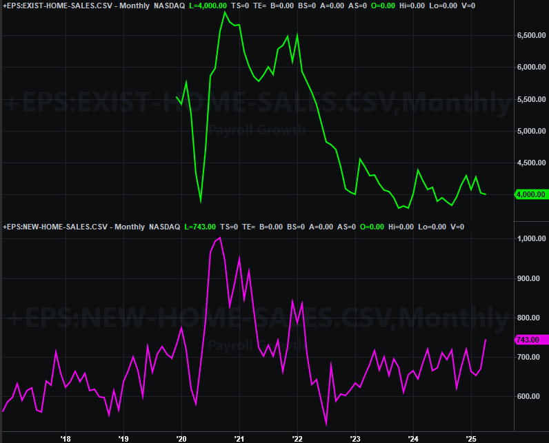
Source: Census Bureau, Natl. Assn. of Realtors, TradeStation
Just don’t get too excited for the homebuilding industry. Would-be buyers may be getting a bit desperate by being unable to find a cheaper already-built house, and were looking to take the plunge before interest rates crept any higher. As a reminder, housing starts and building permits both remain at anemic levels.
Everything else is on the grid.
Economic Data Report Calendar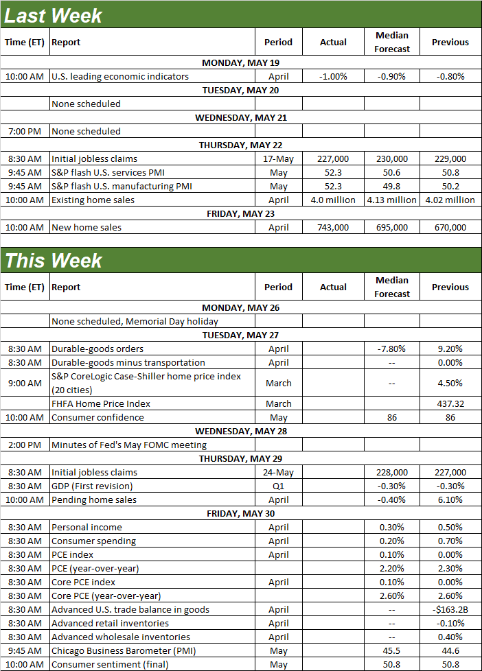
Source: Briefing.com, TradeStation
The real estate numbers will continue rolling this holiday-shortened week, with March’s FHFA Home Price Index as well as the Case-Shiller Index both slated for release on Tuesday. Look for both to continue edging higher, reflecting a lack of inventory (and therefore better pricing power for sellers) more so than massive demand… at least for existing homes. Consumers are still more likely to find a newly-built home they want.
Home Price Index Charts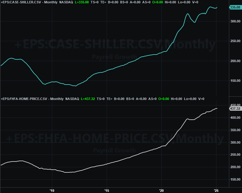
Source: Standard & Poor’s, FHFA, TradeStation
Also on Tuesday we’ll start a look at consumer sentiment that won’t be complete until Friday. The party starts with May’s consumer confidence score from the Conference Board, which should match April’s miserable number. On Friday we’ll get the third and final look at the University of Michigan’s consumer sentiment reading for May, which is likely to slide a bit lower from its April plunge.
Consumer Sentiment Charts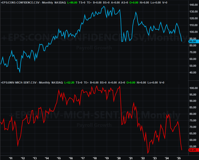
Source: Conference Board, University of Michigan, TradeStation
As we look back on these sentiment numbers, it’s arguable that people are overresponding to tariff worries, dragging these results far lower than is merited.
That being said, there are several other reports slated for later in the week that are worth noting even though we’re not charting them here. On Wednesday, for instance, we’ll get the minutes from the most recent FOMC meeting, shedding some light on the foreseeable future of interest rates. Q1’s second GDP estimate is due on Thursday.
The coming week’s news to really watch, however, is Friday’s look at April’s consumer spending and personal income, which is a key determinant of interest rates. Both are expected to have cooled from March’s heated-up readings.
For what it’s worth, the market’s currently betting there won’t be a rate cut in June, or July. It doesn’t become a higher-odds possibility until September, and even then “just barely.” These odds are subject to change, of course, largely depending on spending and income changes.
Stock Market Index Analysis
We kick things off this week with a look at the weekly chart of the S&P 500, since painting the bigger picture with broad brush strokes first will help make more sense of it all. Take a look. As feared a week ago, the market had rallied too far too fast. The much-needed cooling was measurable, but far from careening out of control – the index only fell 2.7% last week. This means a rebound and resumption of the recovery effort from April’s is anything but out of the question.
S&P 500 Weekly Chart, with VIX and MACD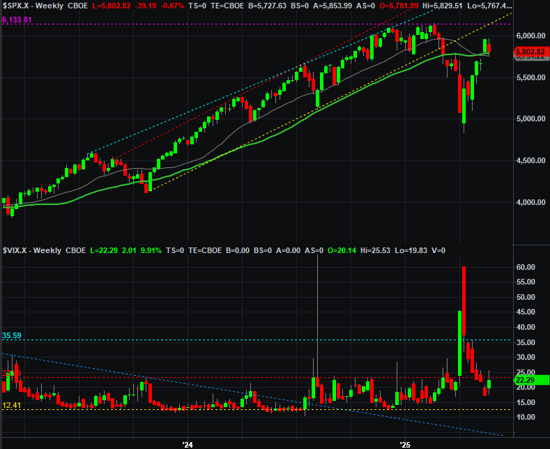
Source: TradeNavigator
Underscoring the somewhat bullish argument prospect is where the selling stopped. As the daily chart of the S&P 500 below illustrates, the selling stopped and slightly reversed right when the index tested the now-converged 100-day and 200-day moving average lines (gray and green, respectively) on Friday.
S&P 500 Daily Chart, with VIX and Volume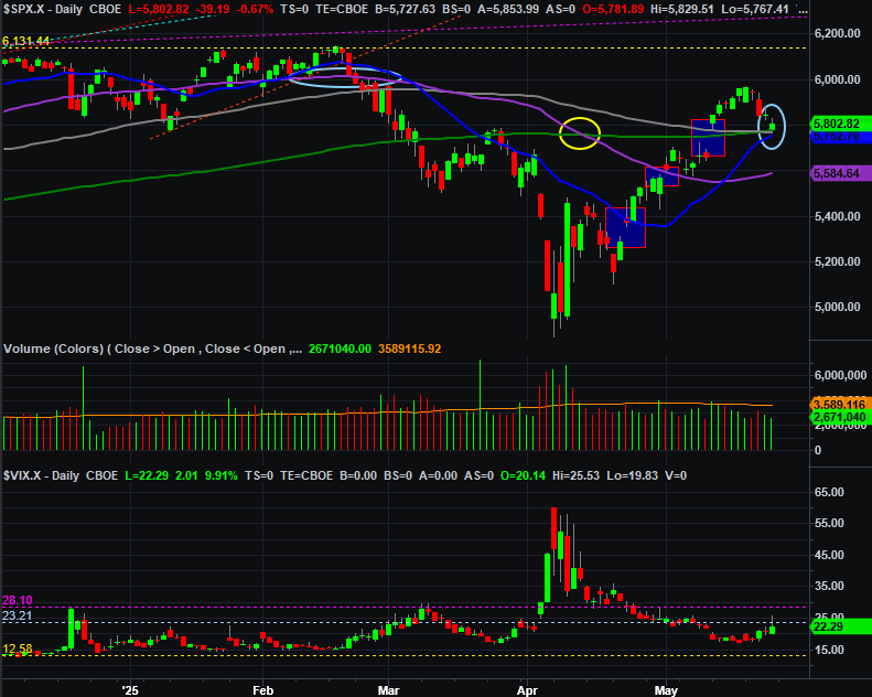
Source: TradeNavigator
Notice as well that there wasn’t much volume behind the pullback (although there wasn’t much volume on the way up either).
Don’t jump to too much of a bullish conclusion too soon. While total volume has been relatively light of late, the comparison of the NYSE’s advancers and decliners as well as the NYSE’s “up” volume and “down” volume took a clear turn back for the worse last week; a sheer lack of buyers can still allow a small number of sellers to do a lot of damage.
S&P 500 Daily Chart, with NYSE Up/Down Volume and Advancers/Decliners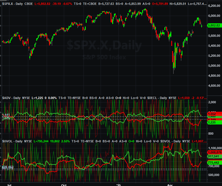
Source: TradeNavigator
These breadth and depth trends haven’t slipped into full-blown bearish territory yet, however, just as the S&P 500 itself hasn’t broken under what’s a hugely-important technical support level.
Here’s the daily chart of the NASDAQ Composite. It looks similar -- although not identical, in that it’s not quite yet testing its converged 100-day and 200-day moving average lines (gray and green) at 18,410, where the 20-day moving average (blue) has just intercepted both. One more weak day should do the trick though. Then we’ll see who’s really the most committed at this now-major technical floor.
NASDAQ Composite Daily Chart, with VXN and Volume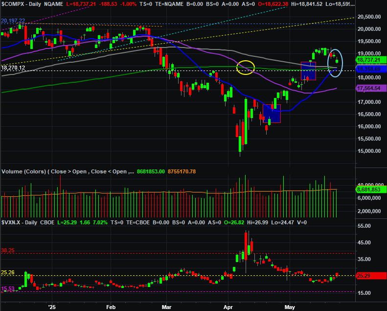
Source: TradeNavigator
In this vein, one can reasonably expect a major and more prolonged move soon… in either direction. That’s because it’s the stock market’s nature to follow periods of choppiness and limited action by periods of prolonged moves, and vice versa.
But which direction does this tendency carry the market? Both… it can work for or against stocks. We only make a point of mentioning it now because the divergence typically starts to take shape when most -- or even all -- of the key moving average lines are converged into a very narrow cluster, as is the case right now. The spring is coiled, so to speak. Now it’s just waiting to be released, sending the market measurably higher or low to create a new divergence of those moving average lines. Only time will tell which way. All we know right now is that the bulls have the advantage by being above all the moving averages, and finding support at them.
That’s a fragile advantage though, headed into a summer that’s subject to a rekindling of tough tariff talk.
Just keep your powder dry here.