Weekly Market Outlook – The Lack of a Clear Catalyst Only Makes It More Difficult to Read

Most traders had to acknowledge something like this could have happened sooner or later. But, it’s unlikely anyone saw it coming quite like this.
The “this,” of course, is Friday’s 2.65% tumble from the S&P 500, although truth be told, the meltdown actually started taking shape on Wednesday. Friday’s close was 3.1% below Tuesday’s peak, marking one of the worst days and the worst weeks in a long while.
The really weird part? There was no clear catalyst. Oh, sure – surprisingly strong payroll growth numbers pretty much block the Federal Reserve from lowering interest rates anywhere near as soon as some traders were expecting/hoping. That’s not exactly a complete shock though. That wasn’t going to happen anytime soon anyway. Rather, the way the pullback took shape seems a little bit calculated, as if traders were simply waiting for the ball to get rolling before jumping on the bearish bandwagon. And that’s actually more of a bearish omen than a knee-jerk response would have been.
But first things first. Let’s look at last week’s economic reports. Jobs numbers weren’t the only thing delivered.
Economic Data Analysis
The party started early last week, with May’s manufacturing activity report from the Institute of Supply Management being reported on Monday. It was up as expected, but up even more than expected. Ditto for the ISM’s services index update on Wednesday.
ISM Services, Manufacturing Charts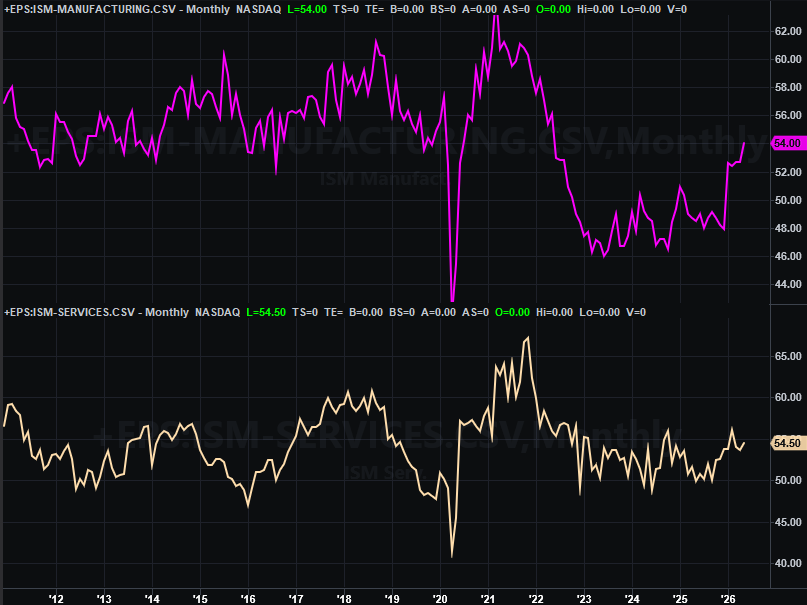
Source: Institute of Supply Management, TradeStation
If the domestic economy is under duress here, it certainly doesn’t seem like it is in this data. Perhaps the lack of access to cost-effective imports is a driver. Or, maybe not. Either way, that wouldn’t explain the ramped-up activity from the services businesses. More economic activity, however, does explain how we got so much job growth when we seemingly shouldn’t have.
In any case, in Friday we heard last month’s jobs data. It was pretty good. We added 172,000 jobs versus expectations of only 80,000, and also saw an upward revision of April’s figure. As such, the unemployment rate didn’t budge from its solid figure of 4.3%.
Payroll Growth, Unemployment Rate Charts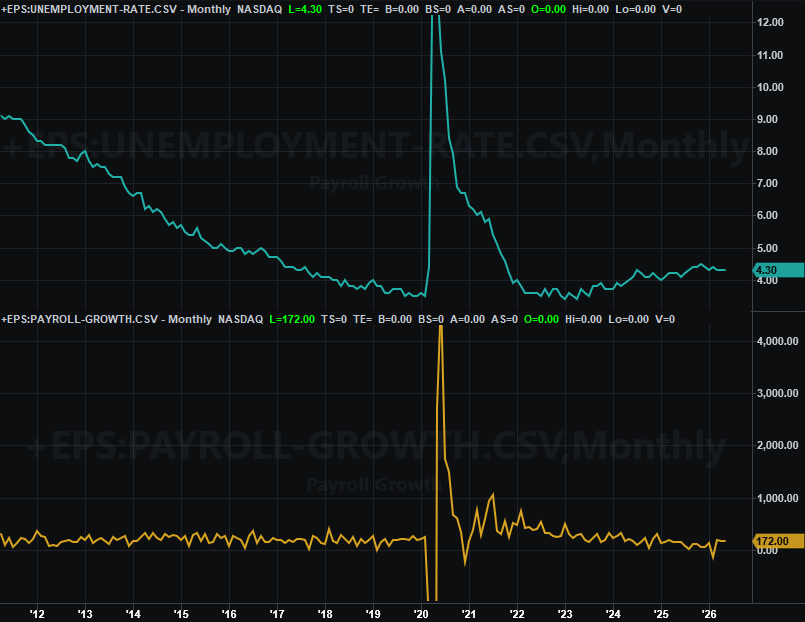
Source: Department of Labor, TradeStation
With this much progress on this one important front, it’s difficult to say the Fed feels the economy needs a kick in the pants in the form of lower interest rates.
Everything else is on the grid.
Economic Data Report Calendar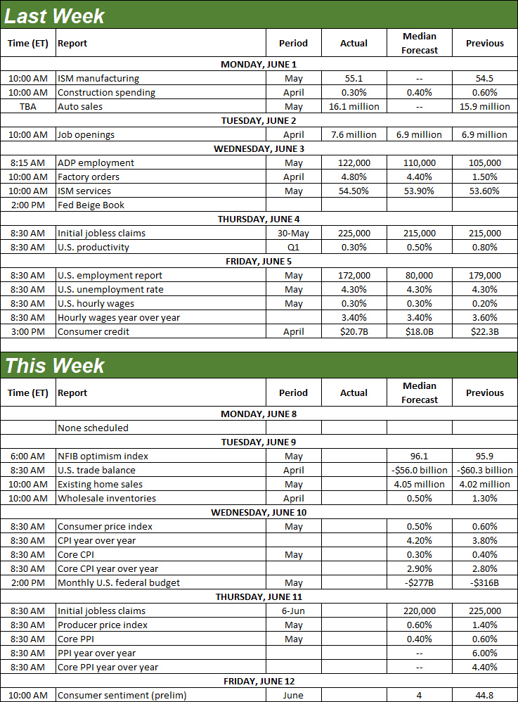
Source: Briefing.com, TradeStation
The real estate picture will start being updated and rounded out on Tuesday with last month’s existing home sales, from the National Association of Realtors. Economists are calling for a slight improvement of April’s pace, but that will still be quite low. Although home prices remain high, not many of them are actually changing hands.
New, Existing Home Sales Charts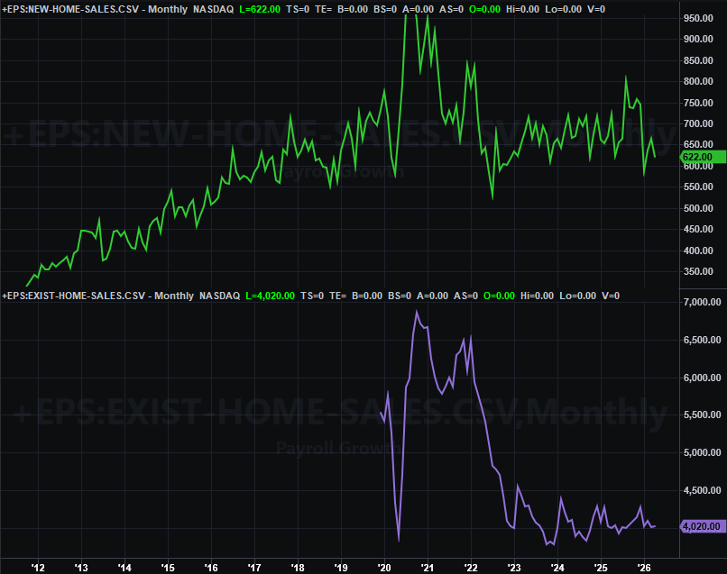
Source: National Association of Realtors, Census Bureau, TradeStation
May’s new-home sales data won’t be out for a couple more weeks, although it’s unlikely to have changed much ether.
This week’s biggest news, however, is inflation. Consumer inflation data for May will be posted in Wednesday, with producer inflation rates coming on Thursday. Forecasts suggest more of the same firm price increases… for consumers as well as producers.
Consumer, Producer Inflation Charts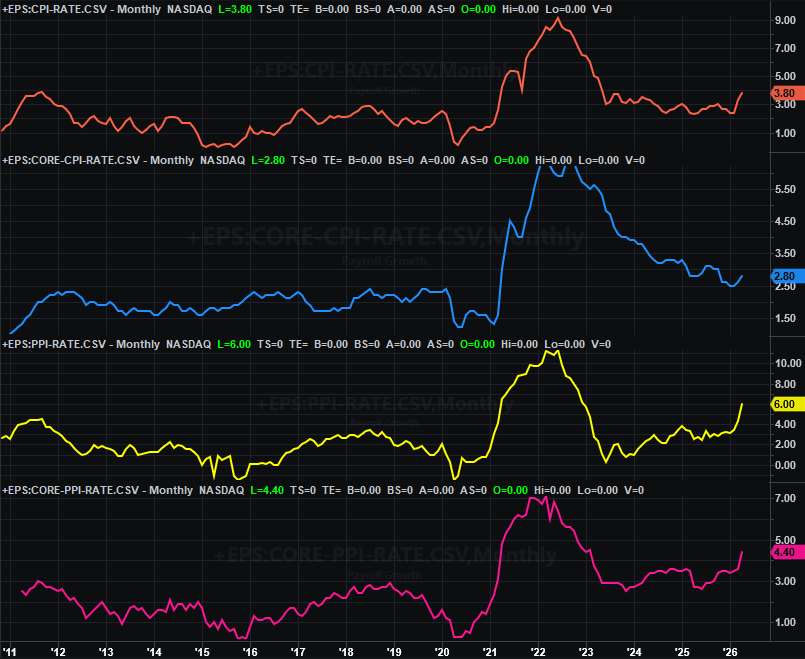
Source: Bureau of Labor Statistics, TradeStation
This will only exacerbate the Fed’s headache here. Lower interest rates can help buoy inflation, but that’s the last thing we need right now. It’s actually higher interest rates that help curb inflation, even if that means stifling economic growth. The FOMC will need to walk a very thin line very carefully here.
Stock Market Index Analysis
Boom. That’s how it happens sometimes. In fact, that’s how it usually happens when there’s no other technical context or framework for the market’s indexes to latch onto, or use as pushoff points. A rally just loses a little steam, and investors decide now’s the time to get off the bullish train.
S&P 500 Daily Chart, with Volume and VIX 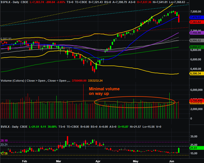
Source: TradeNavigator
The $64,000 question, of course, is whether or not Friday’s tumble is a one-off that’s already run its course?
It’s difficult to say, but probably not. While the pullback was steep enough to invite some value/bargain hunting early this week, we can’t ignore the fact that the S&P 500 is still up more than 17% just since its early April low. That’s a lot of froth left to burn off. We’ll also point out that the index broke below its 20-day moving average line (blue) at 7,489 rather than finding support at it. This will certainly make it easier to test the next technical support level below, even if there is some bullish pushback right out of the gate this week.
The weekly chart puts things in perspective, particularly in terms of getting a feel for the rhythm of the market’s ebb and flow since 2023. The S&P 500 undoubtedly reached a major technical ceiling. Just as undoubtedly, there’s lots of room for it to repeat a recent pattern and slide back quite a bit.
S&P 500 Weekly Chart, with MACD and VIX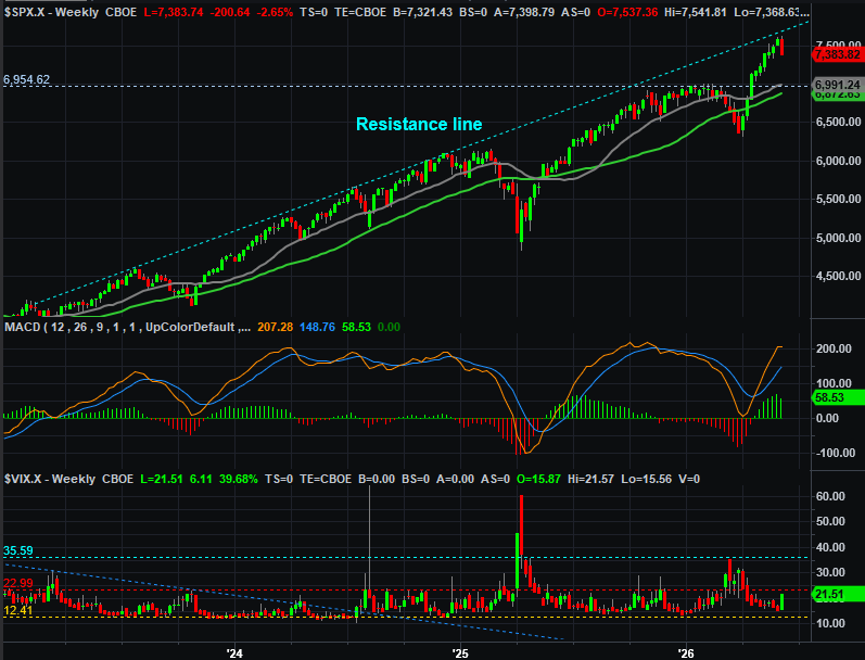
Source: TradeNavigator
And the weekly chart clarifies something else that’s bearish that’s only hinted at on the daily chart. That’s the S&P 500’s Volatility Index, or VIX. It did move measurably higher last week, but isn’t really near levels that would suggest a major bottom has been made. It needs to reach somewhere between 30 and 40 for that to happen.
Of course, the weekly chart above also reminds us that the VIX has something of a ceiling (red, dashed) right around 21 as well. The market can continue grinding higher as long as the VIX doesn’t move above that resistance… and there’s certainly not been enough technical damage done to the S&P 500 yet to rule out the possibility of a quick recovery and resumption of the current rally (albeit it a much slower pace than we’ve seen of late).
Here’s the daily chart of the NASDAQ Composite, for what it’s worth -- which isn’t much. The only thing it does is confirm that the market is in no-man’s land, or limbo, right now, between the 50-day moving average line (purple) and the 20-day moving average line (blue). We really need to see how traders respond to this past week’s action before making any major calls. This is all very suspicious in the meantime.
NASDAQ Composite Daily Chart, with Volume and VXN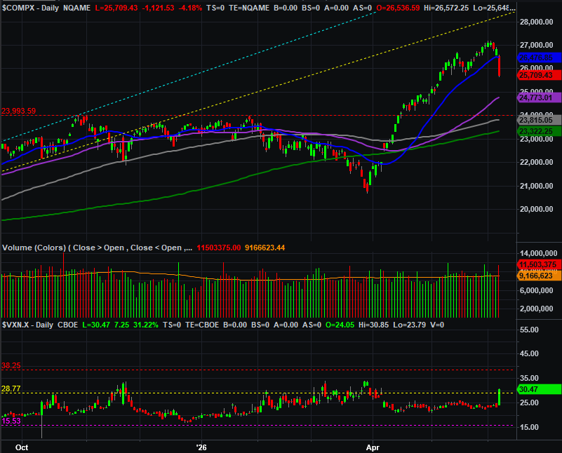
Source: TradeNavigator
If-and-when last week’s weakness turns into something more, we’ll talk downside targets then. As you might imagine though, the first floors we’ll be eying are any and all three of the moving average lines that are still below both index’s Friday closes. Although not shown on either chart, Fibonacci retracement lines will feature prominently in any such analysis, using late-March’s low as a starting baseline.
First things first though.