
Weekly Market Outlook – The Bulls Hesitated. Then the Bears Didn’t.

For most of last week the bulls gave themselves a fighting chance to rekindled the bullishness that was so robust in April and May. When push came to shove on Friday though, it was the bears doing most of the shoving. While not a catastrophic setback, it was enough of a drop to drag the indices below key support levels.
But not the most important technical floors right now.
We’ll pinpoint where those floors are in a moment. First, let’s work through last week’s biggest economic news and preview what’s on the agenda for this week. (Spoiler alert: It’s not much.)
Economic Data Analysis
Last week’s headline news was of course Tuesday’s consumer inflation figures followed by producer inflation on Wednesday. Although measurably down from May’s level, at 3.5%, the overall inflation rate remains uncomfortably above the Fed’s target. Falling gas prices are the big reason for the dip, but they’ve bounced back in the meantime.
Consumer, Producer Inflation Rate (Annualized) Charts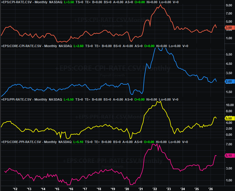
Source: Bureau of Labor Statistics, TradeStation
And these higher prices are finally taking a toll on spending. While retail sales technically improved last month, we’re seeing a clear slowdown in this growth.
Retail Sales Charts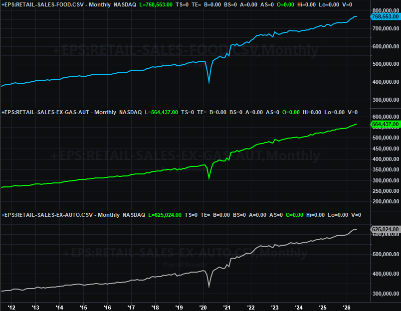
Source: Census Bureau, TradeStation
After a very rough May, it comes as no surprise that housing starts recovered in June. Just don’t read too much into it. Starts are still abnormally low, while permits edged a little lower, extending a broad, shallow downtrend that’s been in place since 2023.
Housing Starts, Building Permits Charts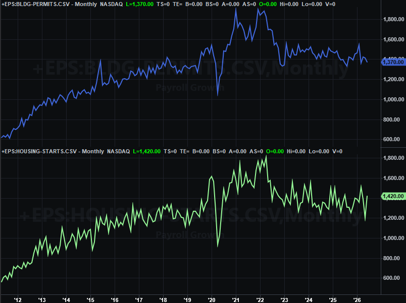
Source: Census Bureau, TradeStation
And, although the nation’s factories weren’t any less busy in June than they were in May, they weren’t any busier either.
Capacity Utilization, Industrial Production Charts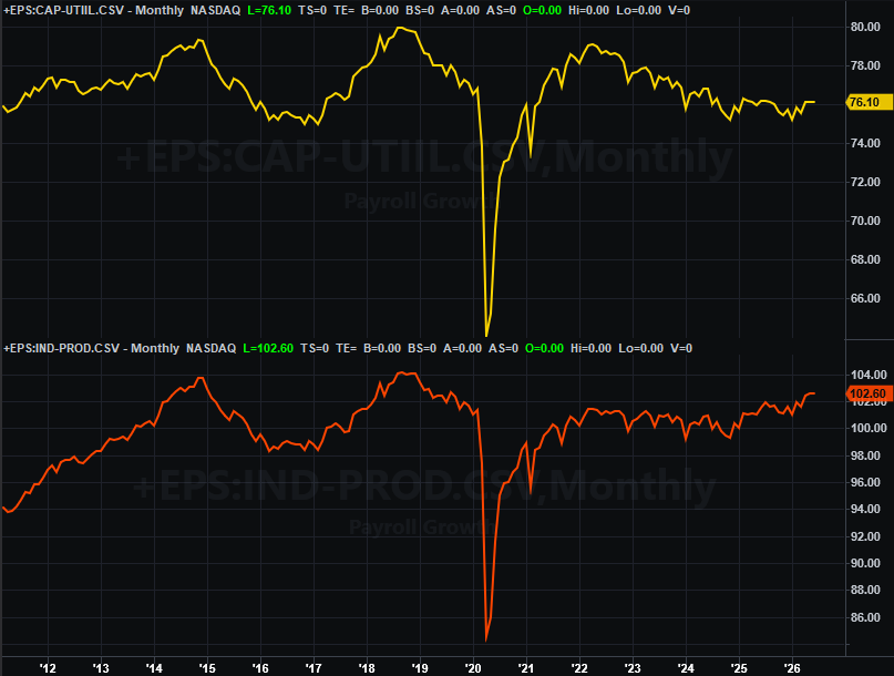
Source: Federal Reserve, TradeStation
Don’t read too much into that, however. It still looks like there’s a longer-term recovery effort being made here, which bodes well for corporate earnings.
Everything else is on the grid.
Economic Data Report Calendar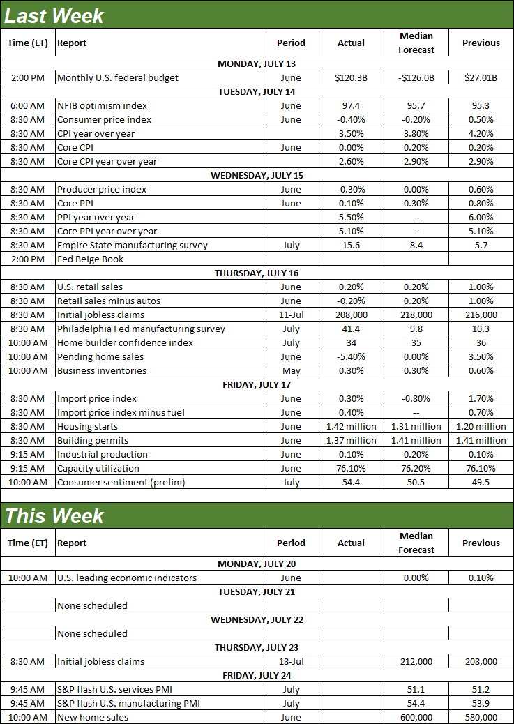
Source: Briefing.com, TradeStation
There’s really only one item of interest due this week. That’s Friday’s report on sales of new homes, from the Census Bureau. You may recall that existing home sales remained anemic in June. Forecasts say new home sales will follow suit, with only a slight increase from May’s multiyear low.
Home Sales Charts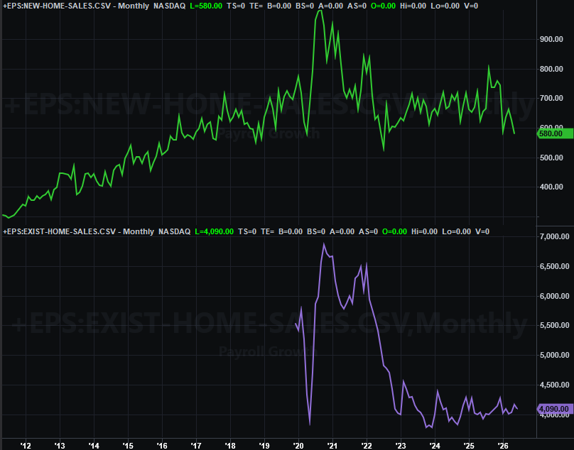
Source: National Association of Realtors, Census Bureau, TradeStation
Stock Market Index Analysis
Kind of a weird week. Stocks ended up suffering a loss, but most of that was the result of Friday’s setback. And, while both of the indexes we watch ended up closing below a couple of important lines, neither fell under their most important floors right now.
We’ll begin this week with a look at the daily chart of the NASDAQ Composite, not because it’s the most helpful (it’s the least helpful, in fact), but just to point out how little it’s telling us… just to get it out of the way. Take a look. The composite waffled on both sides of the 20-day (blue) and 50-day (purple) moving average lines without ever moving too far from either of them. That is, until Friday, when it fell right under that range-bound zone. Of course, note that it didn’t break below what’s become horizontal support at 25,000 (green, dashed).
NASDAQ Composite Daily Chart, with Volume and VXN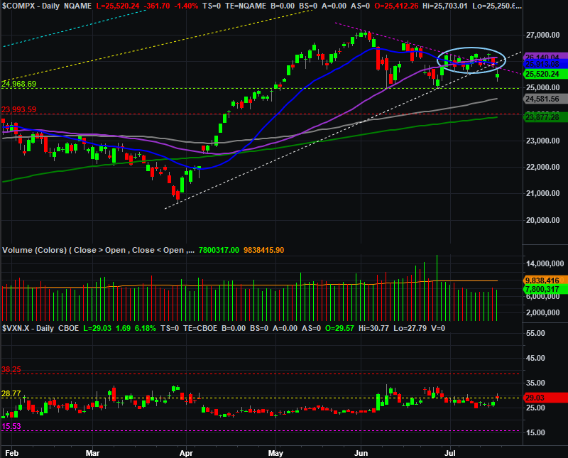
Source: TradeNavigator
Zooming out to a weekly chart of the NASDAQ Composite shows us a little more, like the fact that the index is now clearly being squeezed into the tip of a narrowing wedge pattern (closing near the lower boundary of it on Friday). Yet, the same chart also shows us we already got a bearish MACD crossunder (circled in yellow). From that perspective, we’re already in bearish mode. Somewhat bolstering that bearish case is the way the NASDAQ’s volatility index (VXN) is visibly edging higher, albeit it only slightly.
NASDAQ Composite Weekly Chart, with MACD and VXN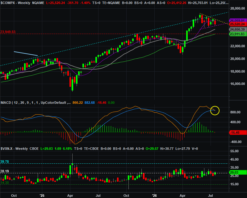
Source: TradeNavigator
The weekly chart of the S&P 500 looks similar, although not identical. It’s also testing a proven short-term floor, although this one is rising (yellow, dashed). And, the S&P 500 weekly chart is also on the verge of giving is the bearish MACD crossunder (blue circle) that the NASDAQ already has given us. This suggests momentum is tipping from bullish to bearish even if it’s not readily evident with just a look at the S&P 500’s bars alone.
S&P 500 Weekly Chart, with MACD and VIX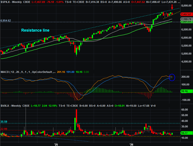
Source: TradeNavigator
It’s the daily chart of the S&P 500, however, that tells us the most, even if what it’s mostly telling us is that it’s too soon to tell us anything. Take a look. The horizontal resistance line at 7,578 (green, dashed) held long enough to eventually drive the index to a close below its 20-day (blue) and 50-day (purple) moving average lines. That’s technically bearish, although just barely.
S&P 500 Daily Chart, with Volume and VIX 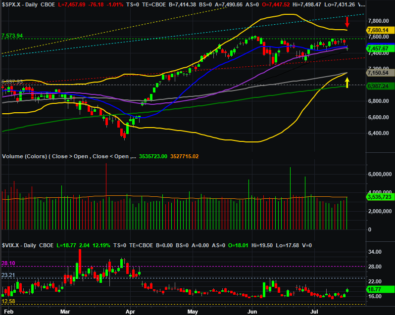
Source: TradeNavigator
More than anything though, it’s difficult to ignore how the S&P 500 is squarely in the middle of its Bollinger bands (yellow) at 7,680 (red arrow) and 7,150 (yellow arrow). These now-converging band lines are now the new support and resistance to watch. The S&P 500 could travel anywhere within this zone and not really mean much, particularly given that the 100-day moving average line (gray) at 7,150 is now converged with the lower Bollinger band. Just bear in mind they’ll change value as the index does.
As for what you should do here and now, mostly nothing. Let’s wait on the sidelines for everyone else to play their cards, and see if the market’s new boundaries will actually continue acting as boundaries, or if they end up becoming triggers for much bigger moves.