
Feeling like the market's stuck in rut, with the S&P 500 exactly where it was in mid-December, and having not been too far or above Wednesday's closing price of 2636 in the meantime? It would certainly be easy to fall asleep in this kind of environment, with stocks increasingly content to simply spin their wheels.
As they say though, expect it when you least expect it.
There's a more specific, trader-oriented way of saying it. That is, periods of high volatility are followed by periods of low volatility, and vice versa. It's difficult to quantify (though not impossible), but it would be time well spent to understand how and why we're coming to the conclusion that things are going to get real interesting, real fast.
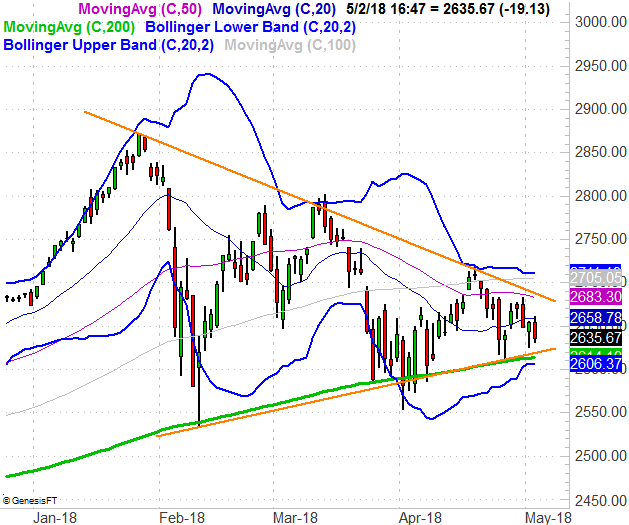
Take a look at the daily chart of the S&P 500 below. Specifically, note the two orange lines ... a support and resistance line that are converging. There's little room left to navigate within the wedge shape. Something's got to give soon, and like a coiled spring, once it's released, the market could uncoil in a hurry.
It's not just the converging wedge pattern that's dropping this hint, however.
The blue lines wrapped around the index's bars? Those are 20-day Bollinger bands, which are (more or less) designed to indicate normal and abnormal trading movement for a stock or index. If you look closely, you'll be able to see that the distance between the upper and lower bands is shrinking, adding to the "tightening" pressure we can already see materializing thanks to the orange converging wedge's upper and lower boundaries.
There's more. See all the moving average lines? They were separating/diverging until early February. Since then, however, they've all more or less been on a converging course; it's not surprising that all of these moving average lines are also trapped within the Bollinger bands, and all but one of them can be found within the upper and lower boundaries of the wedge shape.
It's a red flag simply because, as was noted, periods of high volatility are followed by periods of low volatility, and vice versa. We're now near the apex of involatility, or at the lull in potential volatility, meaning some action is brewing under the surface. We just need a trigger.
It's not an idea many traders like to embrace because it's not completely objective or mechanically cut-and-dried. The premise requires some interpretation. It also requires some faith in the idea that periods of low volatility are indeed followed by wild action. That's ok though. If successful trading could be completely quantified and mechanized without at least a little educated guessing, anybody could do it, and would be doing it.
A couple of drawbacks to chew on with the idea....
First, though we know the potential for a thrusting move out of the wedge patterns is likely to take shape soon, we don't exactly when that might happen. It should be clear when the market breaks beyond one of the orange lines or the other, but it could take a couple of days to really confirm a move is underway.
Second, we don't always know for sure which direction the chart in question will break.
In this particular case, the odds say a downside move is more likely. You can see most of the moving average lines have already thwarted upward-pointed moves. The end result is only one last moving average line - the 200-day moving average line (green) - that has a chance to keep the S&P 500 propped up. The lower Bollinger band is just below that long-term moving average line. If the index breaks below both of those levels, there's really nothing left to stave off a selloff.
It'll be interesting to see how it all shakes out. Whatever happens from here though, this is a great example of how the high-volatility/low-volatility cycle can be used by an astute trader.