History of Trading Bubbles & Oil/Natural Gas Ratio
Bubbles Come, Bubbles Go.
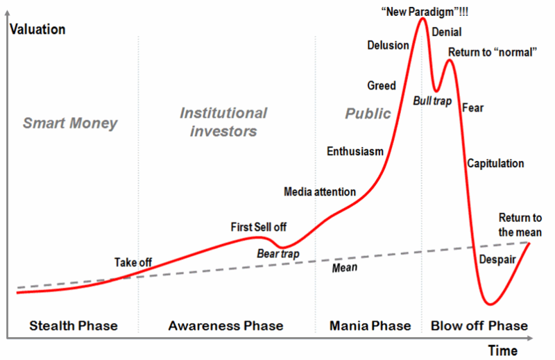
The chart below shows us the "classic bubble pattern". [BigTrends Editor's Note: You may be familar with this chart and our recent discussions of these types of 'burst bubble' patterns. But remember that bubbles don't occur in every security or index, only occasionally, and that this exact pattern does not necessarily occur at any given time -- but this type of parabolic upside pattern and breakdown has been seen multiple times in a variety of financial instruments since the 1970s].
Classic Bubble Pattern
Most money is made during the latest phases of any bubble, as price goes nearly vertical. When something goes straight up, I tend to get worried. All good things come to an end, eventually. When something goes straight down, I am looking for ways to enter the market, as bad things come to an end as well... Eventually.
Imagine you invest in an asset that has a similar pattern as the one above... When do you sell if you are in a bubble? How do you even know whether you are in a bubble or not?
The first thing I look at is sentiment. If sentiment is uberbullish, I become fearful.
If sentiment is uber Bearish, I get greedy. The second thing I look at is price action. When I see something is going straight up, I start to worry.
However, sometimes price goes up too hard, too fast. Below, I will show you a couple of examples:
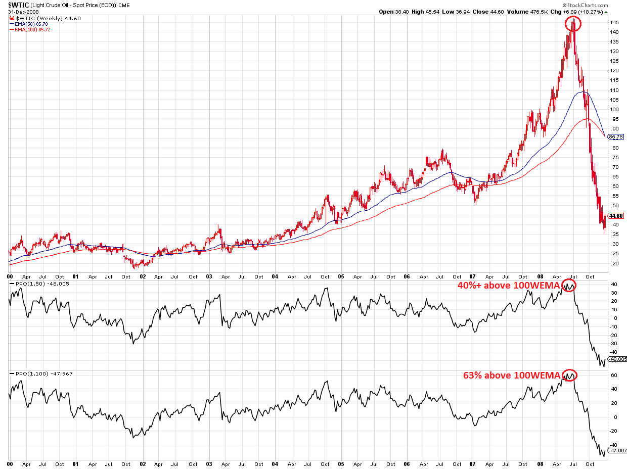
1) Oil in 2008:
- at some point, Oil was trading 40%+ above the 50 weeks EMA.
- Oil was also trading 63% above the 100 weeks EMA.
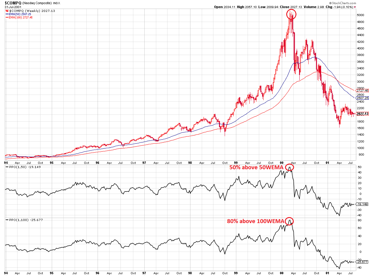
2) Nasdaq in 2000:
- at some point, the Nasdaq was trading 50%+ above the 50 weeks EMA.
- it was also trading 80% above the 100 weeks EMA.
NASDAQ Composite Weekly, 2000
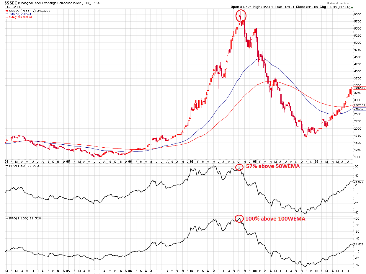
3) Chinese Shanghai index in 2007:
- at some point, the index was trading 57%+ above the 50 weeks EMA.
- it was also trading 100% above the 100 weeks EMA.
Shanghai Index Weekly, 2007
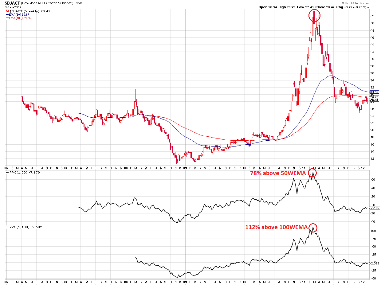
4) Cotton in 2011:
- at some point, Cotton was trading 78%+ above the 50 weeks EMA.
- it was also trading 112% above the 100 weeks EMA.
Cotton Weekly, 2011
Every bubble ended the same way: they all came back down sharply.
One bubble that is currently forming in my opinion is the relative price of Natural Gas (UNG) to the price of Oil (USO).
[BigTrends Editor's Note -- the relationship/ratio between Crude Oil & Natural Gas may have fundamental factors affecting it and is also a paired chart when compared to the single index/asset charts shown in this article -- something to keep in mind.]
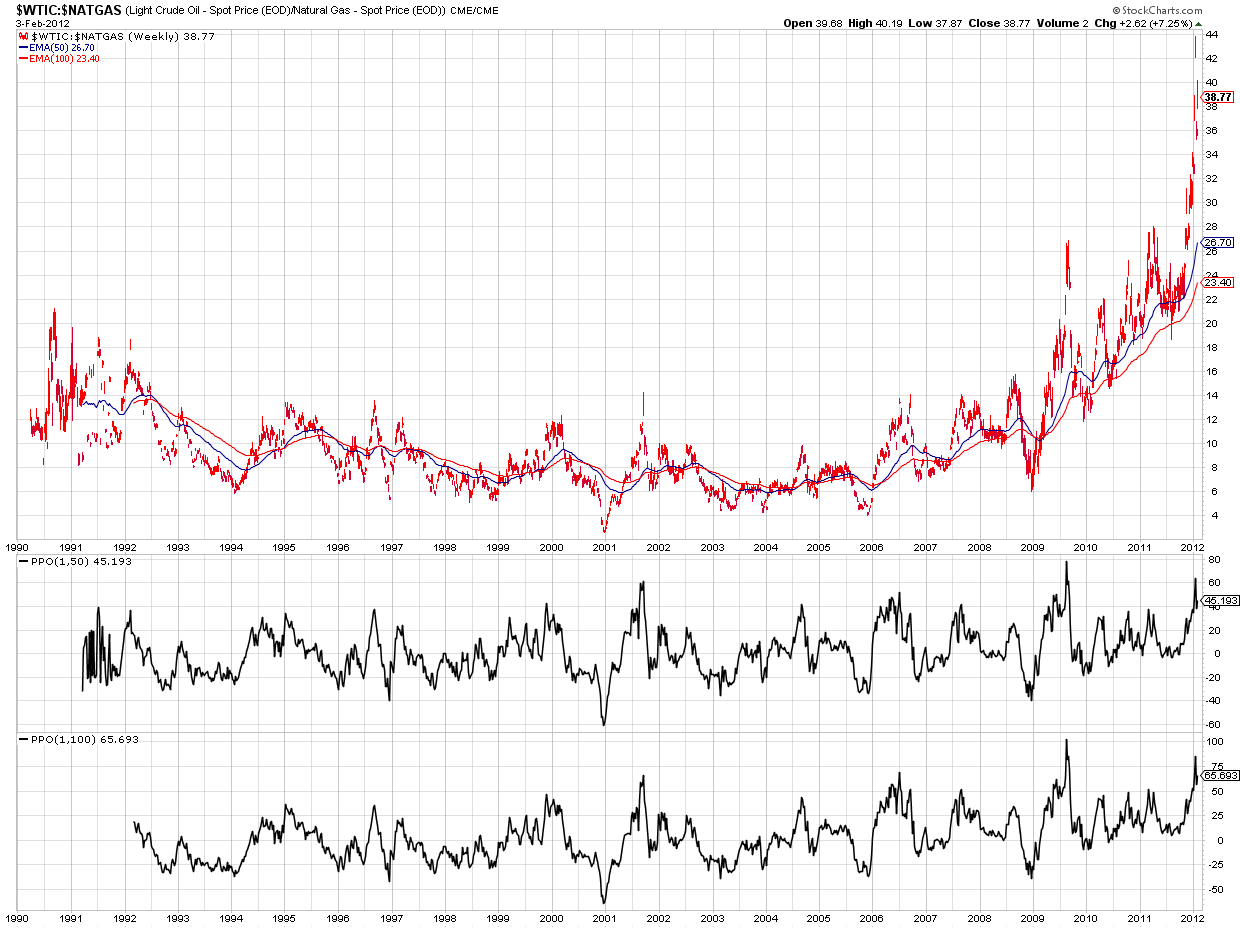
As we can see in the chart below, the ratio of Oil to Natural Gas fluctuated between roughly 6 and 14 from 1990 to 2009.
However, from then on, the ratio broke out of this range, and is now going vertical.
Recently, the ratio was trading 65% above its 50 weeks EMA and about 90% above its 100 weeks EMA.
Someday, I expect this ratio to come back down.
Crude Oil/Natural Gas Ratio Weekly Chart
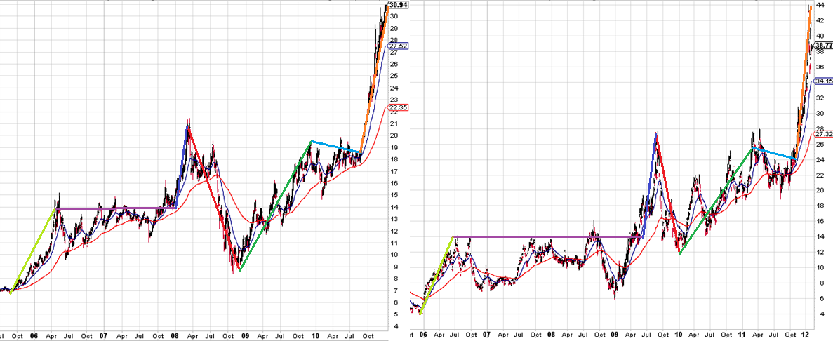
However, when we look at the charts below - where I plotted the Silver (SLV) price on the left hand side (another classic burst bubble pattern), and Oil-to-Natural Gas ratio on the right hand side - we can see very similar patterns.
Please notice that this similarity is currently at the point when silver was trading around $31.
Silver had a small pullback and then rallied all the way to almost $50, so if the similarities between the two patterns continue to hold, Natural Gas could still get a LOT cheaper compared to Oil.
That could mean:
- rising Oil Prices
- falling Gas Prices
- a mix of the two above
- rising Oil and Natural Gas prices, whereby Oil rises faster
- falling Oil and Natural Gas Prices, whereby Natural Gas falls faster.
Silver Weekly vs Oil/Gas Ratio Weekly
Courtesy of Willem Weytjens, www.profitimes.com

