This Sorta-Rebound Is Starting to Separate Sectors. It Could Be a Big Deal.

This Sorta-Rebound Is Starting to Separate Sectors. This Could Be a Big Deal.
Despite the pullback late last week, stocks are back in bulls mode, bouncing back from February's rout that bled into the first half of March.
Not every sector, however, is doing better of late. Indeed, some sectors are doing downright poorly, while other sectors' stocks remain seemingly unfazed by the recent round of turbulence. There's enough disparity, in fact, that traders would be wise to pay attention to the subtle hints being dropped here. It may have bigger-picture implications.
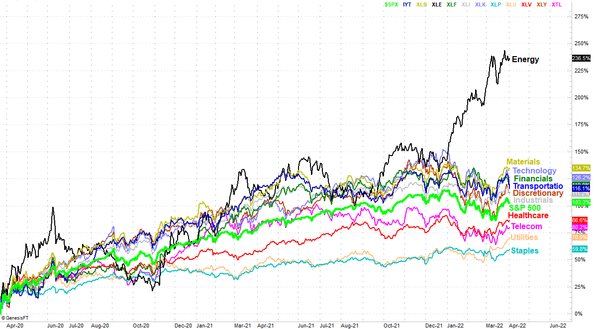
The image below speaks volumes, comparing how each sector has performed since hitting bottom in mid-April of 2020, when the pandemic-prompted pullback reversed course in a fairly permanent fashion. While it's interesting information, our only real concern is what's happened over the course of the past handful of weeks, when the broad market started to recover. It's not recovered evenly though. The previous laggards like utilities, discretionary, and healthcare are rallying much better than previous leaders like transportation, technology, and financials. [The graphic is color-coded, meaning the labels and lines themselves are matching colors. If you're color-blind though, the top-to-bottom sequence of the sector's written labels is the same top-down order of each sector's performance since March of 2020.]
This is no small matter, for a couple of reasons.
One of those reasons is, there's a clear growing preference for safer stocks like telecom, utilities, and consumer staples. These are holdings you'd expect to fall into favor when investors are fearful that the market could be close to running into turbulence that puts more speculative, growth areas like technology and consumer discretionary in jeopardy. And, we're seeing these very hints. As was noted (and is evident on the graphic), those are the sectors -- along with technology and transportation stocks -- that are suddenly retreating in a big way.
In short, we may be seeing a flight to safety that isn't readily apparent with just a quick look at the major indexes.
The other reason this is noteworthy is, if this is the shape of things to come, there's still plenty more sector rotation potential left on the table. That is to say, as well as the laggards for the past couple of years have done since early last month, there's still a huge amount of "catch up" to be done. Bullish trades from these groups could pay off, yet bearish trades from the market's leaders for the past couple of years could also at the same time be good bearish trades.
That's hardly a guarantee... just a suggestion of a possibility. It could take some time for this possibility to solidify, if that's what's in the cards at all. There will be clear clues though. Those clues will include each sector's performance line on the image above crossing above or below other sectors' performance tracks. Of course, each sector's daily technical chart will also be telling. As usual, look for crosses above or below key moving average lines. The value of this comparison chart is knowing which sectors are most primed for pullbacks or new rallies.
