In this past weekend's edition of the Weekly Market Outlook, we made a point of saying this red-hot market would only be even toying with the idea of a breakdown if and when the VIX managed to push above a major resistance line. Though we knew it would happen eventually, we didn't know when it might happen.
It happened today.
Take it with a grain of salt, mind you (we certainly did). One day doesn't make a trend, and one VIX surge isn't inherently the beginning of a pullback. Then again, all big trends start as small ones, and if the market was going to tip over, this is what the beginning of that move would look like.
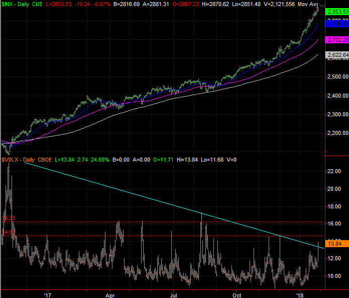
The image below is our usual weekly chart of the S&P 500 with the CBOE Volatility Index (VIX), updated through Monday's action. The falling resistance line that's kept a lid on the VIX going back to early 2016 was finally broken today.
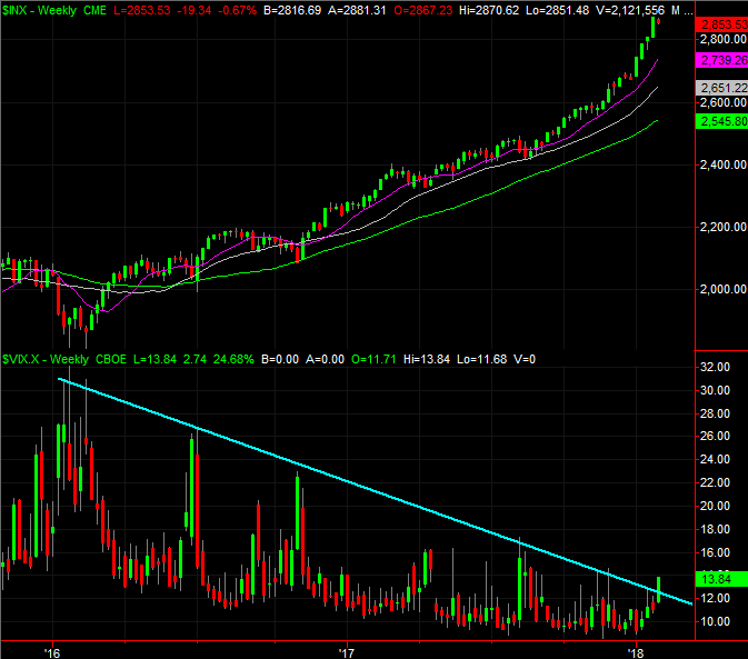
It's not the end of the world... not even close. There's a horizontal ceiling at 14.6 and then another one at 16.2, both of which have played a resistance role in recent months. They may still keep the VIX contained in the future. In the context of the current market situation though, we can't afford to ignore even the smallest signs of trouble.
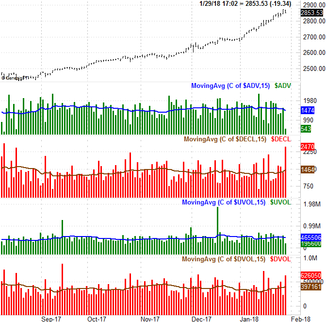
A key context here, of course, is the market's breadth and depth, which are fancy terms to describe the number of advancers and the number of decliners, and the amount of bearish volume and bullish volume. That's what the graphic below illustrates.
It's a chart we've examined before - plots of the NYSE's advancers, decliners, up volume and down volume. Those are the histogram bars. More important is each data set's moving average line overlaid each data set, which smooths out the volatile daily data into something that indicated the bigger trend. The better part of the past few months we've seen waning advancer trends and waning up-volume trends reverse at the 11th hour, and ditto for the decliner trends and the down-volume trend. This time, though, could be different. A close look at the image right now shows that the tide has been turning in a bearish direction for several days now, even as the market was reaching deeper into record-high territory.
"Could be" different... that's a key understanding here, underscoring the notion that this is all still just a preliminary possibility. It could all be undone before it's allowed to get going, with the bulls refusing to give in.
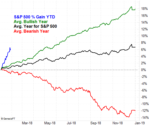
And make no mistake - this bullishness is stunningly unusual. In 2017 the S&P 500 gained 19.4% versus the usual gain of 6.7% (and the typical gain of 18.0% for a bullish year). Yet, so far in 2018 the S&P 500 has gained 6.0% versus the usual gain of 1.0% we'd see at this point in the year. Even in the usual bullish year, the index is only up about 2.0% by the end of January.
The problem is, these are all discussions we've more or less had in the recent past, to no avail. We can't actually count on these red flags going anywhere unless something is different this time around. Maybe "enough is enough" this time around. We're still nowhere near the point of no return though.
This is a story we'll keep close tabs on, and update as needed. Though we tend to side with momentum, it would be naive to think this momentum will never end. The trick is simply looking for the red flags that confirm - not just suggest - the rally has finally run out of gas.