Stocks go up over time, but this chart shows why bulls still look like idiots once in a while

By Shawn Langlois, MarketWatch
Warren Buffett once said his “favorite holding period is forever.”
Not that you would ever doubt the wisdom of the Oracle of Omaha, but here’s a simple chart from the Irrelevant Investor blog’s Michael Batnick confirming that the longer the time horizon, the better.
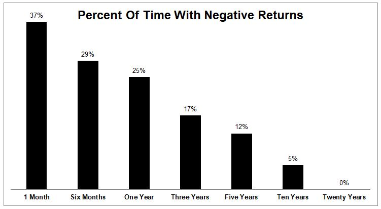
That’s right. The S&P 500 has never been down over a 20-year period, and it’s extremely rare that a 10-year stretch has delivered losses. Furthermore, monthly drops happen just over a third of the time.
“This is why it makes good sense for financial pundits to play on the bullish side,” Batnick wrote in his post. “Usually they’re right, and when they’re wrong, so is everybody else, and misery loves company.”
But there’s a catch, of course, to this rosy scenario, as you can see by this chart of painful, gut-checking declines over the years.
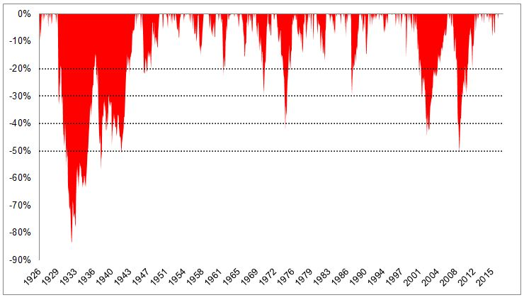
Batnick explains that this is why it also pays for headline-seeking financial pundits to take on the role of doomsayer.
“Usually they’re wrong, but when they’re right, they get to say ‘I told you so,’” he said. “They saw what few others did, and this can provide them with an open invite from the media for the rest of their career.”
He’s referring to guys like this. And this. And this. Ultimately, they’ll have their moment when this market finally fizzles. But until then, they’ll keep taking lumps.
“The fact that stocks usually go up makes permabulls look like idiots once in a while and permabears look like geniuses once in a while,” Batnick said.
From MarketWatch