Normal Correction Underway? - Weekly Market Outlook
Normal Correction Underway? - Weekly Market Outlook
One weekly loss for the market can be dismissed. Two weekly losses, however, is something to be concerned about... especially when the pullback unfurled under the circumstances from last week. Stocks were already vulnerable, but last week's tumble crossed some bearish lines that are going to be very tough to uncross.
A closer look at the technical break-down can wait, however. First, let's paint the bigger picture with a look at last week's major economic numbers.
Economic Calendar
We got a ton of economic numbers last week. We'll just stick with the highlights though. In no particular order:
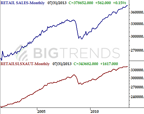
Retail sales: Though car sales were disappointing, retail spending for July actually came in better than expected. The media managed to put a bearish spin on retail sales from last month, but they actually weren't bad, reaching another record level of $378 billion ($343 billion without automobiles). The pace of growth, however, does seem to be slowing.
Retail Sales Chart
 Inflation: The current consumer inflation rate is 1.96%, while the producer price inflation rate stands at 2.1%. Both are palatable. In fact, both are healthy. However, that surge to a CPI change of 1.95% is a warning sign. Consumer inflation has soared from just 1.06% three months ago. If that price growth is a trend, we could be heading into a period of prices the Fed will have little choice but to combat.
Unemployment claims: Yes, initial claims reached a multi-year low level of 320,000 last week. The continuing claims level of 2.969 million from two weeks ago is near a multi-year low level too. It's not great progress, but it's progress.
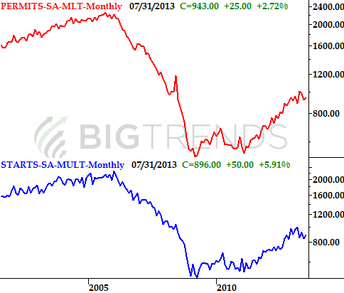
Housing starts and building permits: Though still not back in the stunningly strong trend we'd seen through the early part of this year, construction activity logged another bullish month in July, ending what was starting to look like a soft patch in the housing market. Starts totaled 896,000 last month, up from 846,000, and 943,000 building permits were issued, up from 918,000 in June. Again, the long-term growth trend hasn't been fully restored, but July's numbers point us in that direction.
Building Permits & Housing Starts Chart
Inflation: The current consumer inflation rate is 1.96%, while the producer price inflation rate stands at 2.1%. Both are palatable. In fact, both are healthy. However, that surge to a CPI change of 1.95% is a warning sign. Consumer inflation has soared from just 1.06% three months ago. If that price growth is a trend, we could be heading into a period of prices the Fed will have little choice but to combat.
Unemployment claims: Yes, initial claims reached a multi-year low level of 320,000 last week. The continuing claims level of 2.969 million from two weeks ago is near a multi-year low level too. It's not great progress, but it's progress.
Housing starts and building permits: Though still not back in the stunningly strong trend we'd seen through the early part of this year, construction activity logged another bullish month in July, ending what was starting to look like a soft patch in the housing market. Starts totaled 896,000 last month, up from 846,000, and 943,000 building permits were issued, up from 918,000 in June. Again, the long-term growth trend hasn't been fully restored, but July's numbers point us in that direction.
Building Permits & Housing Starts Chart
 Economic Calendar
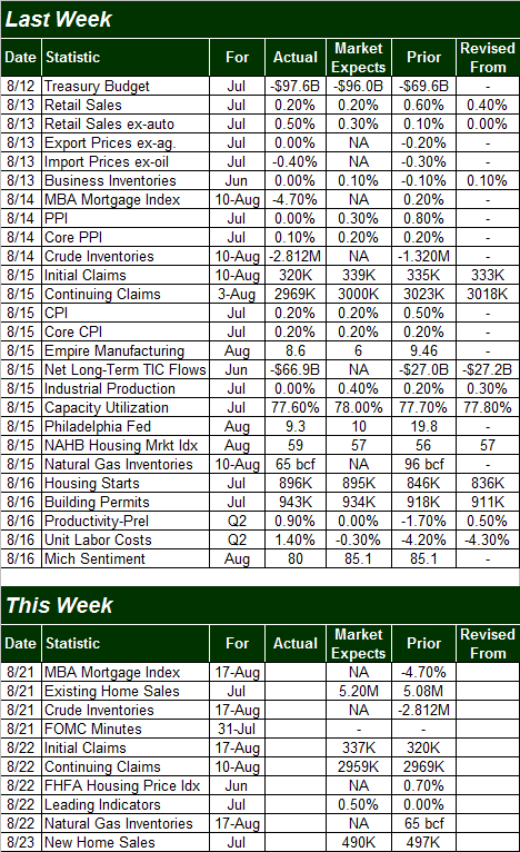 This week is going to be pretty light overall in terms of economic numbers, but we're going to fill in the rest of the blanks on the housing front. On Wednesday we'll hear existing home sales for July, on Thursday we'll get the FHFA Housing Price Index, and on Friday we'll hear about July's new home sales. The forecasts for each paint something of a mixed picture, which jives with the recent tepid housing starts and building permits numbers discussed above.
Home Sales and Prices Chart
This week is going to be pretty light overall in terms of economic numbers, but we're going to fill in the rest of the blanks on the housing front. On Wednesday we'll hear existing home sales for July, on Thursday we'll get the FHFA Housing Price Index, and on Friday we'll hear about July's new home sales. The forecasts for each paint something of a mixed picture, which jives with the recent tepid housing starts and building permits numbers discussed above.
Home Sales and Prices Chart
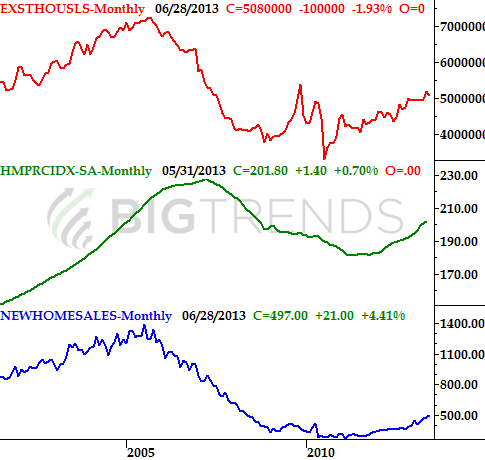 The bottom line is, the housing construction market is not nearly as dead as some are making it out to be, but it's clearly not as hot as it was between two years and six months ago. It's still possible it could resume that strong growth we were seeing just a few months ago, but we don't have a great deal of proof that it's happening yet. The chart of all the housing data above tells the story as well as we could with words.
Stock Market
Just to put things in perspective, the S&P 500 (SPX) (SPY) lost 35.59 points (-2.1%) last week. It was the second weekly loss in a row, which was the first time we've logged back-to-back losses since mid-June. Last week's dip, however, was the biggest weekly drop we've suffered since May of last year. The S&P 500 also fell under a major support line that extends all the way back to the November-2012 low, and the CBOE Volatility Index (VIX) (VXX) now seems poised to snap back from months of hovering at ultra-low levels, that coincide with a market that continues to push its way into more and more of an overbought condition.
Now, as scary as that sounds, it's still possible - though unlikely - the market could find its footing again and rekindle the bigger uptrend. It'll have to play every card right and find a little luck to do so, but it's not out of the realm of possibility.
Let's start with the detailed picture of the S&P 500's daily chart this week, as that will help is make the more important point with the weekly chart in a moment.
As you'll see, when the S&P 500 broke down on Thursday, it really broke down, leaving behind a gap that will throw a wrench in the works this week.
The sheer size of Thursday's dip along with the gap could have (and maybe should have) jump-started a rebound effort on Friday, and it did for a while. By the time Friday's closing bell rang though, the index was underneath the 50-day moving average line.
S&P 500 & VIX - Daily Chart
The bottom line is, the housing construction market is not nearly as dead as some are making it out to be, but it's clearly not as hot as it was between two years and six months ago. It's still possible it could resume that strong growth we were seeing just a few months ago, but we don't have a great deal of proof that it's happening yet. The chart of all the housing data above tells the story as well as we could with words.
Stock Market
Just to put things in perspective, the S&P 500 (SPX) (SPY) lost 35.59 points (-2.1%) last week. It was the second weekly loss in a row, which was the first time we've logged back-to-back losses since mid-June. Last week's dip, however, was the biggest weekly drop we've suffered since May of last year. The S&P 500 also fell under a major support line that extends all the way back to the November-2012 low, and the CBOE Volatility Index (VIX) (VXX) now seems poised to snap back from months of hovering at ultra-low levels, that coincide with a market that continues to push its way into more and more of an overbought condition.
Now, as scary as that sounds, it's still possible - though unlikely - the market could find its footing again and rekindle the bigger uptrend. It'll have to play every card right and find a little luck to do so, but it's not out of the realm of possibility.
Let's start with the detailed picture of the S&P 500's daily chart this week, as that will help is make the more important point with the weekly chart in a moment.
As you'll see, when the S&P 500 broke down on Thursday, it really broke down, leaving behind a gap that will throw a wrench in the works this week.
The sheer size of Thursday's dip along with the gap could have (and maybe should have) jump-started a rebound effort on Friday, and it did for a while. By the time Friday's closing bell rang though, the index was underneath the 50-day moving average line.
S&P 500 & VIX - Daily Chart
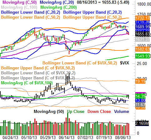 At the same time, after a long slump, the VIX started to perk up last week. It didn't get too far, mind you, being slowed by its 100-day moving average line and ultimately capped by its 50-day moving average line. But, it's the most upward effort we've seen from the VIX in weeks, and now that the ball's rolling it could stay rolling for a while IF the 50-day average line lets it pass. If it does, that could push the stock market itself past the point of no return. On that note....
We mentioned above there was still a smidgen of a chance the index could stave off a serious meltdown. That effort would need to start immediately, however, as in Monday at 9:30 am when the opening bell rings. The S&P 500's 50-day average line (purple) could still arguably be playing a support role, and the VIX's ceiling at its 50-day line (also purple) hasn't actually been broken yet. Thing is, the odds don't favor that kind of luck, especially when you see the weekly chart.
We already discussed above how the weekly chart of the SPX fell under a key support line. It's the lower dashed line plotted on out chart below. Yes, the index fell under that same line briefly back in June, only to roar to record highs less than two months later. This time is a little bit different though. This time, the participation (volume) in the tally was quite anemic, while in June VIX was in relatively (recently, anyway) unfamiliar high territory around 20. This time, the VIX is taking its time moving higher, which suggests a certain degree of calculated, organized logic to the dip thus far. Nobody really seems surprised - the market's almost acting like it was expected. That in itself is scarier than a surprise stumble.
S&P 500 & VIX - Weekly Chart
At the same time, after a long slump, the VIX started to perk up last week. It didn't get too far, mind you, being slowed by its 100-day moving average line and ultimately capped by its 50-day moving average line. But, it's the most upward effort we've seen from the VIX in weeks, and now that the ball's rolling it could stay rolling for a while IF the 50-day average line lets it pass. If it does, that could push the stock market itself past the point of no return. On that note....
We mentioned above there was still a smidgen of a chance the index could stave off a serious meltdown. That effort would need to start immediately, however, as in Monday at 9:30 am when the opening bell rings. The S&P 500's 50-day average line (purple) could still arguably be playing a support role, and the VIX's ceiling at its 50-day line (also purple) hasn't actually been broken yet. Thing is, the odds don't favor that kind of luck, especially when you see the weekly chart.
We already discussed above how the weekly chart of the SPX fell under a key support line. It's the lower dashed line plotted on out chart below. Yes, the index fell under that same line briefly back in June, only to roar to record highs less than two months later. This time is a little bit different though. This time, the participation (volume) in the tally was quite anemic, while in June VIX was in relatively (recently, anyway) unfamiliar high territory around 20. This time, the VIX is taking its time moving higher, which suggests a certain degree of calculated, organized logic to the dip thus far. Nobody really seems surprised - the market's almost acting like it was expected. That in itself is scarier than a surprise stumble.
S&P 500 & VIX - Weekly Chart
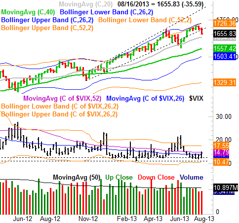 Bottom line? It would be surprising, almost shocking, if we didn't finally get that overdue correction, and even more so given the calendar. August is usually one of the worst months of the year, and September is THE worst month of the year, on average, typically losing about 0.8%. This is not, however, apt to be anything more than a normal corrective move.
Trade Well,
Price Headley
BigTrends.com
1-800-244-8736
Bottom line? It would be surprising, almost shocking, if we didn't finally get that overdue correction, and even more so given the calendar. August is usually one of the worst months of the year, and September is THE worst month of the year, on average, typically losing about 0.8%. This is not, however, apt to be anything more than a normal corrective move.
Trade Well,
Price Headley
BigTrends.com
1-800-244-8736