Is The Market Frothy Here? - Weekly Market Outlook
Is The Market Frothy Here? - Weekly Market Outlook
They may have gotten a slow start, but before the week was over, the bulls were charging again. The indices hit new multi-year highs on Thursday, and for the DJIA(DIA) and the S&P 500 (SPX) (SPY), that was an all-time high too. Both made higher highs and higher closes on Friday too, so we're making history here.
The question everyone's asking here, of course, is how much more upside is there left to enjoy? The good news (for the bulls) is, recent rallies have been able to push past the point of reason. The bad news (for the bulls), there's still a major ceiling right above where each of the indices closed on Friday, and in this fickle market, they could easily spark a pullback for this frothy market.
We'll look at the market's make-or-break levels below, right after examining last week's big change in the employment situation.... which may not have been as big of a change as it was first suggested to be.
Economic Calendar
While last week was loaded with economic numbers from start to finish, there's little doubt that Friday's employment picture was the big gun. Let's just start there.
The basics: The unemployment rate dropped from 7.6% to 7.4% in July. That's good. The Department of Labor reported there were (net) 162,000 payrolls created last month. That's also good in that it's a positive numbers. But, the bulk of the reason the unemployment rate was able to move 20 basis points lower had to do with the fact that the size of the work force shrunk; it can shrink because unemployment benefits have expired, but those people don't necessarily have jobs. In fact, the number of people who are officially "not in the labor force but want a job" grew by 39,000 last month.
The point is, while the employment situation is getting better, it's not getting better anywhere near as quickly as the drastic drop in the unemployment rate would imply.
On other fronts, the GDP growth for Q2 was better than expected. The first of three estimates rolled in at 1.7%, versus expectations of 1.1%. That's a relative victory, but still a tepid number.
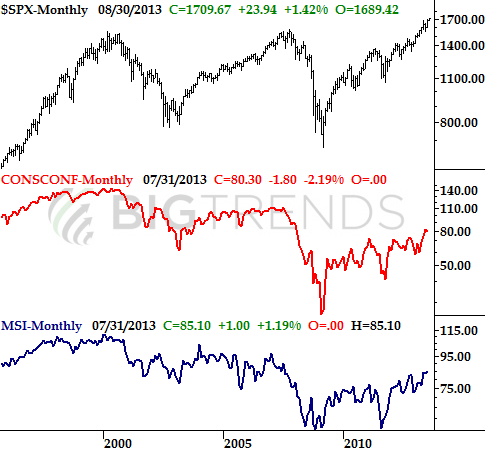
The Conference Board's consumer confidence score fell too, from a score of 82.1 to 80.3. One bad month does not make a trend (or in this case, doesn't snap a bigger uptrend), but it's an interesting slide given how strong the market has been of late. [Note the Michigan Sentiment Index score was still on the rise through July.]
Consumer Confidence & Michigan Consumer Sentiment Chart
 Everything else was rather positive... factory orders were up 1.5% (versus expectations of a 2.2% increase), the Case-Shiller index said home prices grew by 12.2% in May, and the Chicago PMI as well as the ISM Index levels both grew nicely in July.
All in all, July was a pretty good month for the overall economy.
Economic Calendar
Everything else was rather positive... factory orders were up 1.5% (versus expectations of a 2.2% increase), the Case-Shiller index said home prices grew by 12.2% in May, and the Chicago PMI as well as the ISM Index levels both grew nicely in July.
All in all, July was a pretty good month for the overall economy.
Economic Calendar
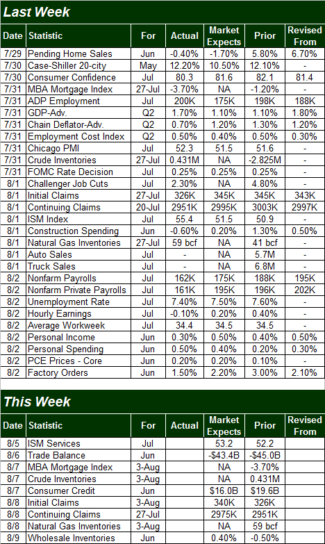 This coming week may be one of the lightest weeks of the year in terms of information about the economy. There are only nine items in the lineup, and none of them are heavy hitters. That's ok though - it'll give traders a chance to start making some real assessments about second quarter's earnings results now that we're more than 2/3 through earnings season.
Stock Market
We're going to focus in on the chart of the S&P 500 this week, as usual, but since we took a look at the NASDAQ Composite (COMP) (QQQ) a couple of weeks ago, we'll start with an update on where that index is. Why? Mostly for perspective.
As you'll immediately see with the NASDAQ, the long-term resistance line (dashed) was broken as of last week. Technically speaking, such breakouts are bullish. After a 57% runup in less than twelve months, though (with no major correction in the meantime), the composite is clearly overbought.
NASDAQ Composite - Weekly Chart
This coming week may be one of the lightest weeks of the year in terms of information about the economy. There are only nine items in the lineup, and none of them are heavy hitters. That's ok though - it'll give traders a chance to start making some real assessments about second quarter's earnings results now that we're more than 2/3 through earnings season.
Stock Market
We're going to focus in on the chart of the S&P 500 this week, as usual, but since we took a look at the NASDAQ Composite (COMP) (QQQ) a couple of weeks ago, we'll start with an update on where that index is. Why? Mostly for perspective.
As you'll immediately see with the NASDAQ, the long-term resistance line (dashed) was broken as of last week. Technically speaking, such breakouts are bullish. After a 57% runup in less than twelve months, though (with no major correction in the meantime), the composite is clearly overbought.
NASDAQ Composite - Weekly Chart
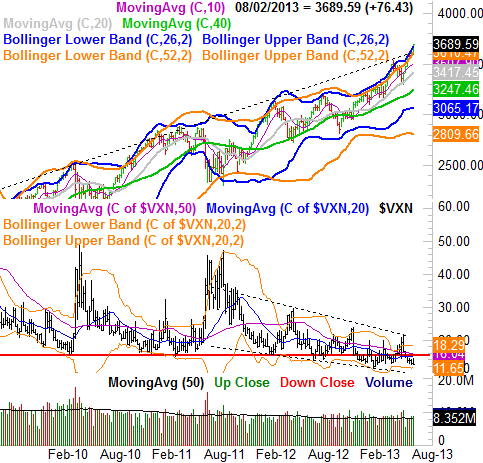 You can also see on the NASDAQ Composite's chart just how low the NASDAQ's Volatility Index is. The trend for the (VXN) is clearly bearish. But, just a tad above multi-year lows as well as a tad above its lower 20-week Bollinger band at 11.65, one has to wonder just how close the VXN is to a major bottom here. The complacency is stunningly high here, which is all too often a recipe for a surprise disaster.
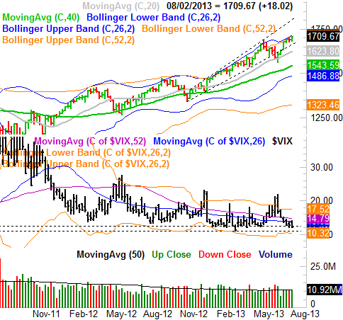
As for the S&P 500, a quick look at its weekly chart shows the same basic thing, though somehow it doesn't look as vulnerable as the NASDAQ Composite does. The SPX is safely tucked away between a rising support and resistance line (dashed), and gently pushing its upper Bollinger bands higher. Point being, the pace of the rally here seems fairly sustainable.
On the flipside, there's still something uncomfortable about the VIX being right on the cusp of a major floor around 12.4. The overall trend is bullish for stocks, but the VIX is right where the market should be hitting a headwind.
S&P 500 & VIX - Weekly Chart
You can also see on the NASDAQ Composite's chart just how low the NASDAQ's Volatility Index is. The trend for the (VXN) is clearly bearish. But, just a tad above multi-year lows as well as a tad above its lower 20-week Bollinger band at 11.65, one has to wonder just how close the VXN is to a major bottom here. The complacency is stunningly high here, which is all too often a recipe for a surprise disaster.
As for the S&P 500, a quick look at its weekly chart shows the same basic thing, though somehow it doesn't look as vulnerable as the NASDAQ Composite does. The SPX is safely tucked away between a rising support and resistance line (dashed), and gently pushing its upper Bollinger bands higher. Point being, the pace of the rally here seems fairly sustainable.
On the flipside, there's still something uncomfortable about the VIX being right on the cusp of a major floor around 12.4. The overall trend is bullish for stocks, but the VIX is right where the market should be hitting a headwind.
S&P 500 & VIX - Weekly Chart
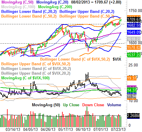
 It's the daily chart of the S&P 500 that really lets us start pin-pointing how we can best play the dichotomous nature of the market right now (momentum versus the risk of a pullback).
On the one hand, the S&P 500 has little trouble working its way into record-high territory. Volume hasn't been bad either, and though few would deny that stocks are a little frothy right now, it's not like there aren't some potential floor falling into place nearby.
One of those floors is 1688, which has been the ceiling until mid-July, and where the 20-day moving average line will be pretty soon. Though they're only minor support lines, they have the potential to stave off any major pullback... if that's what's in the cards here.
Perhaps a more likely floor for any pullback from here is 1649, where the lower 20-day Bollinger band as well as the 50-day moving average line have converged. Though both will be a little higher by the time either could be tested as a floor, that's your most likely "worst case scenario" for the time being.
That's just a hypothetical downside though, largely based on the fact that the CBOE Volatility Index (VIX) (VXX) is alarmingly low. It's possible the bulls could dig in again early this week and blast past the two upper band lines at 1716, as they did in early May.
S&P 500 & VIX - Daily Chart
It's the daily chart of the S&P 500 that really lets us start pin-pointing how we can best play the dichotomous nature of the market right now (momentum versus the risk of a pullback).
On the one hand, the S&P 500 has little trouble working its way into record-high territory. Volume hasn't been bad either, and though few would deny that stocks are a little frothy right now, it's not like there aren't some potential floor falling into place nearby.
One of those floors is 1688, which has been the ceiling until mid-July, and where the 20-day moving average line will be pretty soon. Though they're only minor support lines, they have the potential to stave off any major pullback... if that's what's in the cards here.
Perhaps a more likely floor for any pullback from here is 1649, where the lower 20-day Bollinger band as well as the 50-day moving average line have converged. Though both will be a little higher by the time either could be tested as a floor, that's your most likely "worst case scenario" for the time being.
That's just a hypothetical downside though, largely based on the fact that the CBOE Volatility Index (VIX) (VXX) is alarmingly low. It's possible the bulls could dig in again early this week and blast past the two upper band lines at 1716, as they did in early May.
S&P 500 & VIX - Daily Chart
 So which is it going to be? Great question. We're leaning towards the near-term downside theory, as stocks are overbought... a condition that hasn't lasted very long of late. But, as long as the floor around 1650 holds up - if tested - any hint of a rebound there is a trade-worthy buying opportunity. A tip-toe into the upper Bollinger bands would technically be a bullish clue, though that's a hint to take with a grain of salt.
Either way, just bear in mind that it's been many, many months since we've seen a normal bull market correction of 10%. If the 1650 area is tested and fails to hold the market up, things could get much uglier real fast. We'll have to look at that when and if the time comes though. The VIX will be soaring past its upper band lines if it comes to that.
So which is it going to be? Great question. We're leaning towards the near-term downside theory, as stocks are overbought... a condition that hasn't lasted very long of late. But, as long as the floor around 1650 holds up - if tested - any hint of a rebound there is a trade-worthy buying opportunity. A tip-toe into the upper Bollinger bands would technically be a bullish clue, though that's a hint to take with a grain of salt.
Either way, just bear in mind that it's been many, many months since we've seen a normal bull market correction of 10%. If the 1650 area is tested and fails to hold the market up, things could get much uglier real fast. We'll have to look at that when and if the time comes though. The VIX will be soaring past its upper band lines if it comes to that.