Weekly Market Outlook - Not a Reason to Sweat... Yet
Friday's stumble turned what would have been a winning week into a losing one, which was a disappointment to be sure. But, it's not a reason to panic yet. A little weakness now may ultimately be a good thing, letting stocks catch up with what's been relatively indiscriminate optimism. There's room for a little more selling, in fact, before stocks suffer too much of a blow to reasonably recover.
And yes, that idea certainly blows the whole "sell in May thing" out of the water this year. This is one of those years, however, where expecting history to steer stocks might be a bad strategy.
We'll weigh it all below, as always, but first let's recap last week's major economic announcements and preview what's in the cards for this week.
Economic Data Analysis
What a week! The numbers don't mean a whole lot. The COVID-19-related shutdowns meant weaker economic measures across the board, and guesses as to just how far they'd fall were little better than coin tosses. Still...
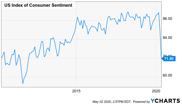
Not surprisingly, consumer confidence tumbled last month, though not quite as much as expected. The Conference Board's score of 86.9 was a little better than the 86.5 that had been modeled, but down from a previous reading of 118.8. That plunge mirrored a similar one suffered by the Michigan Sentiment Index because, just watch five minutes' worth of news.
Michigan Sentiment Index Chart
Source: YCharts
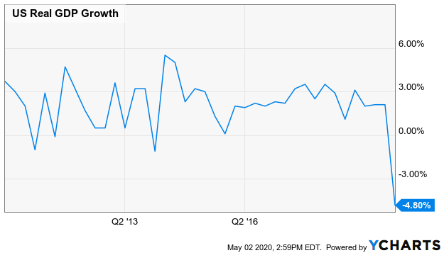
The initial estimate for Q1's GDP was just as ugly, falling 4.8% versus expectations for a 4.3% slide. Again, don't fret. It's not that consumers are unwilling. It's that they're mostly unable. The big question from here is, how long will it take to turn the tide?
GDP Growth Chart
Source: YCharts
That's part of the reason the Federal Reserve decided not to change interest rates last week. Then again, anything less than the current Fed Funds target rate of 0.13% (0.0% -- 0.25% range) is essentially impossible.
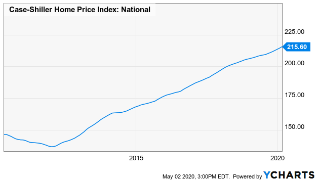
Those super-low interest rates are spurring some home purchases, for those who can actually get loans. And, though fewer buyers are now at the table, sellers are off the market too. That let the S&P Case-Shiller Home Price Index improve 3.5% year over year last month.
Home Price Chart
Source: YCharts
Like GDP, the ISM Manufacturing Index contracted in April, from 49.1 to 41.5. We also started to get car sales data for April on Friday, although it will take a few more days to start compiling the data from each manufacturer that still reports. Like everything else though, it got real weak, real fast.
Everything else is on the grid.
Economic Calendar
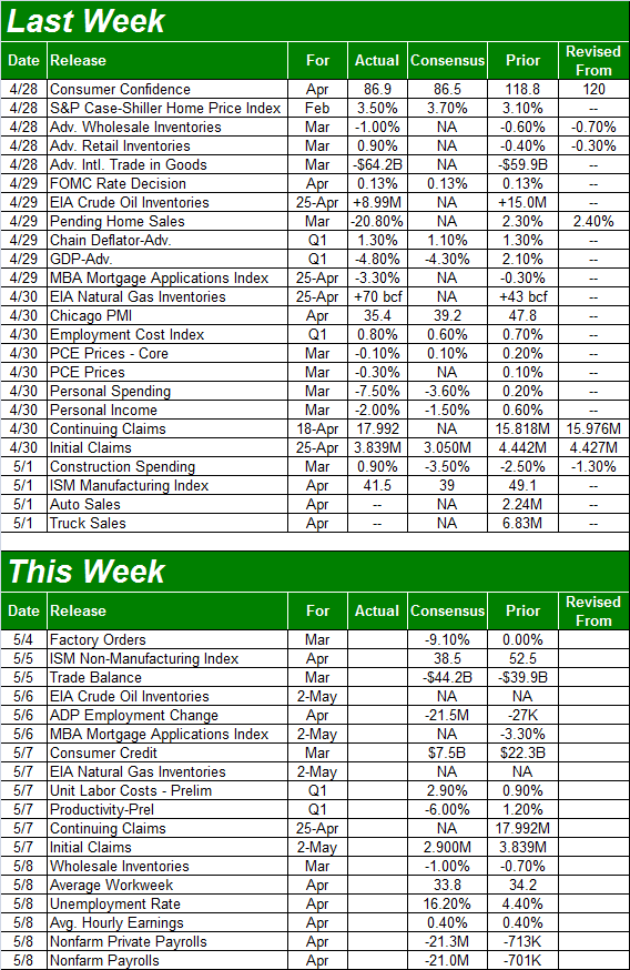
Source: Briefing.com
This week isn't going to be quite as busy, though there's going to be a biggie at the end.... last month's jobs numbers. Given all the coronavirus-related layoffs, it's going to be ugly. The question is just one of how ugly. But, first things first.
On Tuesday we'll get last month's ISM Services report to round out last week's ISM Manufacturing data. The former is expected to fall as well, but again, keep it in perspective.
ISM Index Charts

Source: YCharts
As for jobs, economists think 21.3 million jobs were lost since last month's tally, translating into an unemployment rate of 16.2%. Those are just educated -- and fairly unqualified -- guess though. Just bear in mind that number is going to be wound back relatively quickly now that lockdowns are starting to end.
Unemployment Rate and Payroll Growth Charts
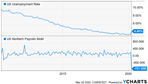
Source: YCharts
Stock Market Index Analysis
The market got off to a great start last week, building on momentum established over the course of the prior two weeks. But, it started to run out of gas on Thursday, and by Friday was crashing. Some tough economic numbers and a couple of earnings red flags torpedoed the advance, shaving off 2.8% of the S&P 500's value on the last trading day of the week.
That's not necessarily the end of the world, however. Take a look at the daily chart of the S&P 500 below. Even with the stumble, the index is still above the 20-day moving average line (blue) and the 50-day moving average line (purple). Also notice that although the selloff on Friday was sizeable, the volume behind the selloff was minimal. That big plunge didn't exactly spook most people out of most of their holdings.
S&P 500 Daily Chart, with VIX and Volume
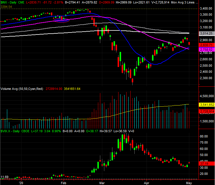
Source: TradeStation
There's something else noteworthy of the daily chart of the S&P 500 as well.... the 200-day moving average line (white) and the 100-day moving average line (gray) are also now both within sight. They've not been touched or tested yet, but even so, this is around the time one would expect to see traders start doubting the advance thus far.
In other words, nothing about last week's stumble should have been seen as a surprise. This is where the real tests should start to take shape.
And for the record, the daily chart of the NASDAQ Composite is telling the same basic story, but with a bit more bullish flare. Specifically, the composite had moved back above the 200-day moving average line (white) a couple of weeks back, and hurdled the 100-day moving average line (gray) last week... at least until Friday.
Even so, there's more technical support below the NASDAQ than there is resistance above it. The 8411 area where the 20-day moving average line is about to move above the 200-day moving average will become a major support level to watch once that happens. (And for the S&P 500, the now-converged 20-day and 50-day moving averages right around 2760 are its big lines in the sand for this week.)
NASDAQ Composite Daily Chart, with VXN
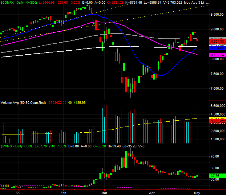
Source: TradeStation
That's the good news. Here's the bad news -- the shape of last week's bar(s) is problematic.
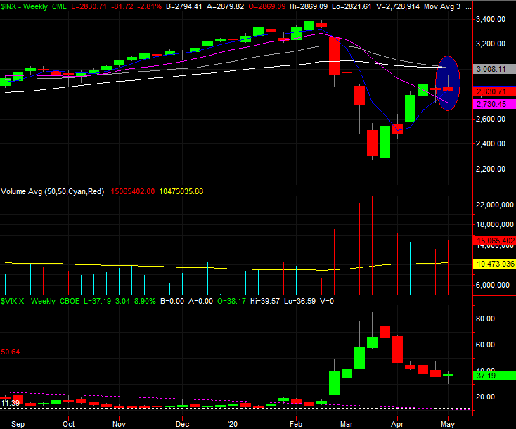
They're gravestone dojis, where the open and low are right around the same level as well as right around the low for the week, and all three are well below the high for the week. It's called a gravestone doji, in fact, because it loosely resembles a gravestone jutting out of the ground. It's a problem simply because the weekly charts both gave us one, and did so after a very big rebound rally from the late-march low. Take a look at the weekly chart of the S&P 500 to see.
S&P 500 Weekly Chart, with VIX and Volume
Source: TradeStation
Also notice the VIX gave is the mirror image of a gravestone doji... a hammer-shaped bar that indicates it's working on a reversal out of a downtrend and into an uptrend, which would be bearish for stocks.
The $64,000 question is, of course, is whether or not Friday's selloff was just a headline-induced stumble that will be shrugged off this week. Or, were traders just waiting for the right headlines to justify doing what they've been wanting to do for a while?
The good news is, there are some key technical lines to watch above and below where we are right now. We could have answers to the question before the end of the week.