This One Simple Tip Could Save You a Ton of Money (and prevent a lot of heartache)
The last several months for the market have been... unusual, to put it mildly. While the election of Donald Trump has certainly played a role in the unfettered rally (for better or worse), if we're being honest, things were gettin' a little weird even before he was voted into the White House. The market can do, and does, strange things no matter who's at the helm of the nation's government.
Either way, while the bullishness that extends all the way back to February of 2016 -- the S&P 500 is up 57% since then - has been allowed to unfurl for far too long without a major correction, it's been fun to watch, and ride. On the other hand, it's been vexing for most traders as the gains have defied the odds, and the clues. All the signals that would have normally predicted a sizable pullback failed. Namely, the VIX has remained "too low" for too long, and breadth and depth signals of bearishness have been promptly overruled for more than two years now. The put/call ratio has also been illogical, in that it's indicated optimism that's historically been dangerous, but hasn't been a problem this time around.
And it's that put/call ratio that we'll focus on today, though the premise applies to other sentiment-based contrarian tools that we sometimes use to figure out when sentiment is at dangerous extremes.
The short version of a long explanation: The put/call ratio compares the number of put options (which are bearish) to the number of call options (which are bullish) on any given day. The theory is, when we see a whole lot more puts being traded than calls, investors are thinking bearishly. When we see a whole lot more calls trading hands than puts, it's because traders are of a bullish mindset.
Most of the time the put/call ratio as well as the moving average of the ratio that we follow isn't telling us much of anything, as it's stuck in the middle ground. It occasionally reaches extremes though - bearish and bullish - which is when we get interested.
The catch? We're bullish when the market is most bearish via the put/call ratio, and we're bearish when the market looks the most bullish based on put and call trading activity.
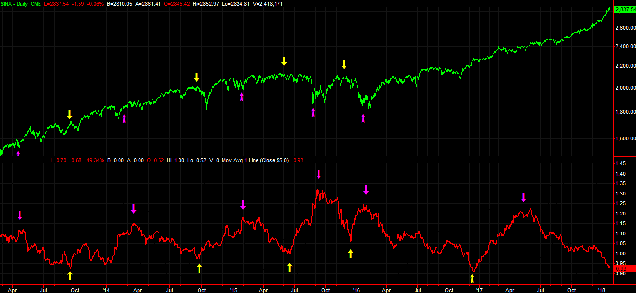
It sounds crazy, but it works to use the data in a contrarian way. The graphic below illustrates why. The moving average of the marketwide put/call ratio hits a major bottom (indicating optimism) at major tops, and the put/call ratio tends to peak right around a major market bottom... bearishness that develops at the exact wrong time.
Perfect? Not in the least. It's still a great tool though. More often than not it would have tipped you off to major market swings.
Problem is, the approach hasn't worked at all since the latter half of 2016. The uber-low put/call ratio from December "should have" coincided with a major market top. It didn't - the market kept going. The put/call spike from May of last year should have kick-started an incredible rally. It didn't.
Granted, the market did rally from May on, but only virtue of continuing the move that was already underway. That that move has accelerated in the meantime as the put/call ratio has fallen, it's still been a very unusual situation.
Is there any way to prevent misreads like this in the future? There are, and they're actually pretty simple. Two lessons stand out above the rest.
The first of those takeaways is simply to embrace that fact that put/call measures are just one tool of many you should lean on. Until the market itself makes a clear hint of a swing, the put/call measures only indicate the potential for a reversal. They've never been a standalone kind of indicator.
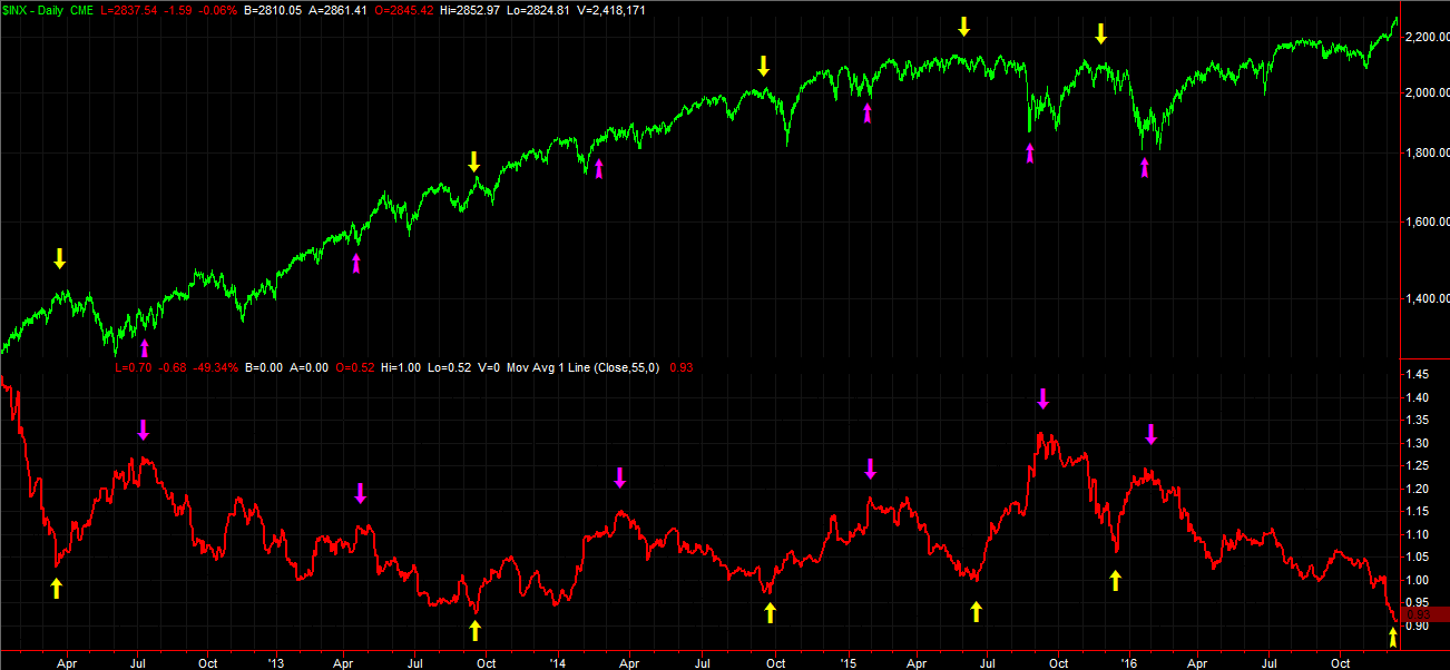
The second of those takeaways is a little less subjective and a little more objective. In simplest terms, an unusually high high or an unusually low low doesn't mean much by itself. The key is to wait for the "turn" or the reversal of the put/call ratio's moving average line. Once that tide turns, it's usually only a matter of time before the market follows that lead. While it feels like doing so may leave you chasing a trend rather than being in front of it (where you generally want to be), a closer look at the way the put/call ratio reading's moving average line took shape between 2012 and 2016 makes it pretty clear the bulk of any major market move didn't materialize until well after the put/call ratio's undertow make a clear change in direction.
Perfect? Again, not in the least. Sometimes waiting for clarity will mean you leave money on the table. Sometimes you'll leave a lot of money on the table. More of than not though, being patient pays off in a big way by letting you find the best entry and exit.
It also can't be stressed enough that the application of this idea is infinitely more powerful when used in conjunction with other indicators. The VIX and the Arms Index (or TRIN) are some specific similar tools that come to mind that might tell you something slightly different.
With that as the backdrop, as much as we'd like to say the market's on the verge of a pullback based on the "too low" put/call ratio, we can't say that simply because that put/call ratio's moving average line is still trending low, meaning the market itself is still riding the wave of growing bullish sentiment.
That's not to say the market won't stumble. It can, and probably will. It's just to say that any stumble will be minor and fairly limited until the put/call ratio moving average makes a clear and decided turn higher.
It's worth noting that other tools are looking a little more predictive of a sizeable pullback in the near future. It's hardly a consensus view though.... obviously. That's a discussion we'll have another time though.