
Disaster is nigh. At least, that's what the headlines would lead you to believe after the S&P 500 made a so-called "death cross" on Friday. Even the name sound foreboding. Never even mind what it means.
What it means, by the way, is a particular chart's 50-day moving average line has crossed below its 200-day moving average line, hinting that the longer-term trend has turned decidedly bearish. If all goes as assumed, that stock or index will be priced uncomfortably lower within... well, that's not clear. While a death cross is bearish, the outcome of the technical event has never been assigned any specifics. It's just bad news, even if non-descript.
What if, however, there was more bark to the worry than actual bite? There is. History proves it.
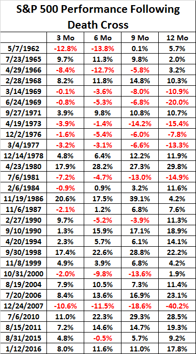
Since the early 1960's the S&P 500 has seen a total of 29 death crosses, with the 29th one being the one that took shape on Friday. Of those 29, only in seven cases was the S&P 500 down twelve months later. Only in twelve cases were stocks lower six months later. That's actually the worst odds among all the key timeframes. Just three months out, the S&P 500 was only down eleven of this times. Nine months following a death cross, the index was lower ten times. And for the record, in two of those 29 cases - 1977 and 1969 - two death crosses were made almost back to back, so their bearishness for one of them all but guaranteed bearish for the other. The track record improves when removing closely-overlapping death crosses. The data is detailed on the table below.
There's more.
Younger investors may not think much of the dates of most of the prior death crosses. But, in 1969 and 1975, then again in 1981, 2000 and 2007, the U.S. economy was in recession. In most of those cases the stock market was in the throes of a bear market... which makes sense. A bear market is a falling market, and death crosses are the result of a falling market. More often than not, though, death crosses were neither part of a bear market nor a long-term warning of trouble ahead.
The key? Death crosses that take shape after a recession has started AND a bear market is underway are the ones you need to worry about. Death crosses seen when the economy is still growing and/or the longer-term market trend remains bullish are actually good buying opportunities.
Numbers and data don't lie, and in this case, there's not a lot of subjective interpretation that's even possible. The odds say this isn't something to worry about, even if the media is suggesting it is.
Don't come to an ironclad conclusion. It's possible this could be the onset of a bear market, and it's possible the economy could roll over from here. A death cross would, and usually does, come at the beginning of a bear market. Stocks usually turn lower before a recession, as investors correctly 'sense' what's around the corner before analysts are able to do the same with their estimates.
That's still the low-odds outcome from this point, though.
So why did the event get so much media attention this time around (as it usually does)? Because the financial media likes to sell fear, and the financial media is quick to connect seemingly logical dots without being sure those dots should be connected. A quick check like the one just completed above would at least let commentators put a death cross in perspective.
But, that's another discussion for another time.