The Kiss of Death? (and a new way of taking the market's temperature)
Did we just see the proverbial kiss of death? OK, "death" might be a bit of a strong word, though "extreme frustration" wouldn't mischaracterize what the market has been doing, and still is doing. Just when it looks like stocks might ready to make a meaningful move, something gets in the way.
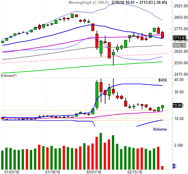
The kiss in this particular case is simply the slight brush the S&P 500 Volatility Index (VIX) made of its 50-day moving average line (purple) on Tuesday, only to follow through on that reversal effort on Wednesday. Though the VIX is supposed to only be a measure of anticipated volatility, in reality it's a fear gauge. When it's rising, it's generally bad for the market... and it's rising.
The good news is, though the S&P 500 was in retreat mode again on Wednesday, there's still a bastion of hope for it. It too has "kissed" its 20-day moving average line (blue) with Wednesday's low, but didn't slide under it. Maybe the bulls will draw a line in the sand there.
We can't count on that, however.
There are several reasons for our doubt, one of which is Tuesday's bar. It completely engulfed, and reversed, Monday's bullishness; the downside follow-through on Wednesday was the clincher. The other concern is that once again we saw fading volume on the way up, but we saw growing volume on the way down with Tuesday's and Wednesday's losses.
It's not just the total volume we saw on Tuesday and Wednesday, however. We also know that the bearish volume (the amount of trading activity in stocks that ultimately lost ground on Wednesday) was far and away greater than the amount of bullish volume we saw.
If you're a regular reader of BigTrends commentaries, than you've seen this chart before. It's a comparison of the S&P 500 to the NYSE's total advancers, total decliners, total up volume, and total down volume for any given day. The histogram bars plot the daily advancer, decliner, and up/down volume. The lines that drift along sideways on top of those histogram bars are moving averages of each data sets daily data. Sometimes (quite often, in fact), it's the smoothed-out trend data that shows us which direction the undertow is pointed.
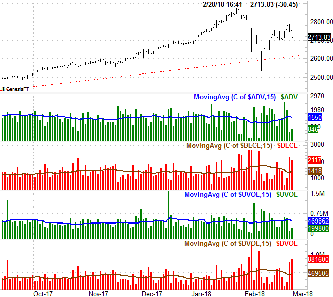
As you can see, it's not been easy to interpret the advancer/decliner and up/down volume data of late, with or without the moving average lines acting as trend indicators. There's more packed into the data than meets the eye though.
Ever heard of the Arms Index? You may have also heard it called the Trading Index, or TRIN, for short. It's a ratio of ratios. It compares the advancers/decliners ratio to the up volume/down volume ratio. The formula is, simply enough, "(advancers / decliners) / (advancing volume / declining volume)."
Don't let the simplicity fool you though. This tool is telling, as it can tell you a whole lot about when the up/down volume (or depth) is mismatched with advancers/decliners (breadth). That is to say, whenever the ratio is wildly away from a value of 1.0 - bearing in mind "wild" is a relative comparison - you can bet something's not quite right about a trend.
Something's not quite right about the current market environment, based on TRIN data.
Just for the record, we don't use the daily data itself. It's far too erratic to interpret from one day to the next. Instead, we use a moving average of the daily data to smooth out the rough edges and determine a directional trend. The moving average line on the bottom of the chart below is a trend indicator of the Arms Index right now. The rise says there are a lot more advancing stocks than there should be compared to the amount of bullish volume. And/or, there are too few declining stocks relative to the volume of stocks that are losing ground. As long as the TRIN's moving average line is rising, it points to bearish undertow EVEN IF THE MARKET ITSELF DOESN'T. See, volume is the first thing to turn, often doing so before stocks themselves do.
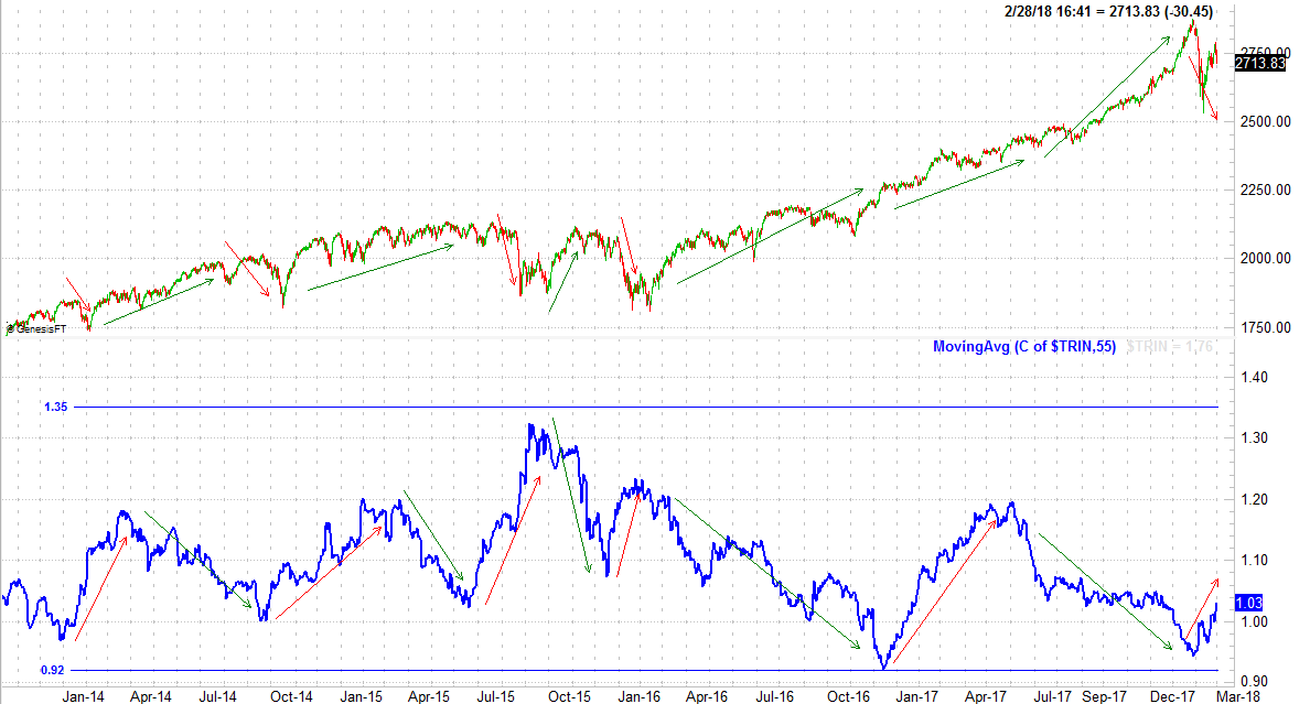
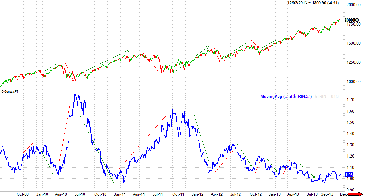
If you're astute, you'll have noticed that the TRIN's moving average line was headed higher during the first half of 2017. It happens. It's not a perfect tool. That was an exception to the norm rather than the norm itself. Generally speaking, when the Arms Index is pointed upward that means the tide is working against the market. Take a look at a couple of other examples in different periods.
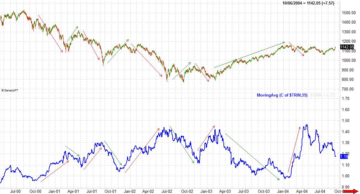
Now all of a sudden that little upward curl of the Arms Index's moving average isn't so little. It could be an omen of a bigger, deeper selloff that's already hinting the masses are taking profits off the table.
It's just a possibility, mind you, and not one you should blindly rely on. While the TRIN tool is useful, it's not precise in terms of timing a top or a bottom. There's also the reality that March is generally a good month for stock. The two truths are not necessarily mutually exclusive. All we can know for sure is that the Arms Index is warning us things may not seem nearly as bullish as they appear.
That won't change until the TRIN moving average line is sloped downward.
Just something to think about as we interpret Wednesday's kisses of some key moving average lines.