The U.S. Dollar vs. U.S. Presidential Terms (Obama's 2nd Term is an Outlier)
On Friday of last week, we looked at how the stock market and U.S. Presidential terms were linked. While the connection was loose, there was a basic, cyclical correlation between the two... even if mostly a psychologically-driven one. That is, the first couple of years of a Presidential were usually lackluster, while the last two were generally good ones for stocks. We also saw how President Obama's current term had bucked this tendency, with solid market gains in the first two year, but what will likely end up being a tepid performance for the last two of the term.
It's not just stocks that can (more or less) move in sync with a President's time in office though. The U.S. dollar also tends to move on tandem with a Presidential term, and does do in a far more reliable pattern than the stock market does.
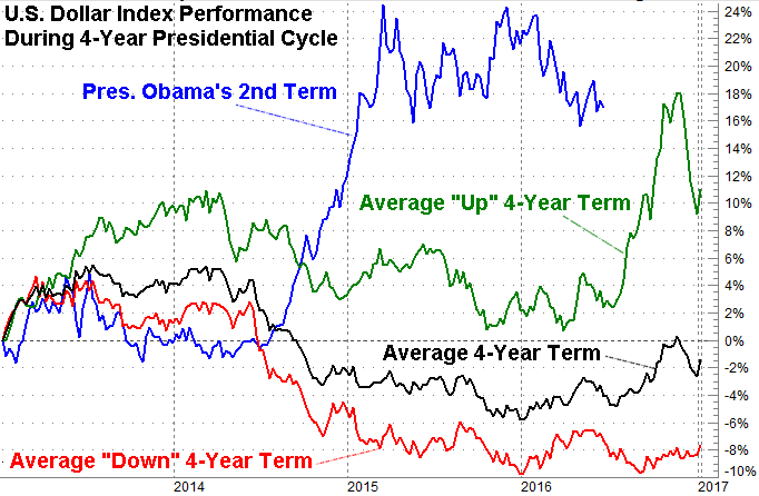
The chart below tells the tale. It plots the value of the U.S. Dollar Index under each four-year term going back to the one beginning in January of 1989 when George H.W. Bush was sworn in as the Commander in Chief. In almost all cases, the greenback started out strong, tapered off in the second year, started to rebound in the third year, and finished the fourth year in recovery mode. This was a tendency observed in nearly every environment.
It's worth exploring now if for no other reason than to appreciate just how radically different the U.S. dollar has behaved so far during President Obama's second term. It started out fairly typically, but in the second year it abruptly turned around and moved into a clime unlike one we'd ever seen before.
That move presents something of a conundrum. That is, will the dollar put up strong year-four numbers as is usually the case (it's behind, if that's what's in the cards), or will the fourth year of Obama's second term bring the U.S. Dollar Index back to its average? If the latter is the case -- and we think the latter is the more likely of the two outcomes -- then the greenback hasn't done anything jaw-dropping yet. Just wait.
It's not an entirely bad thing, of course. An unusually strong dollar has helped contribute to oil's implosion, and it's made things very tough on U.S. companies that rely heavily on sales of goods to overseas customers; U.S. goods have simply been unaffordable to many foreign buyers since 2015. Yes, U.S. consumers have enjoyed greater purchasing power, but it's reasonably safe to say the super-strong dollar has done more harm than good to the global economy, which has had a trickle effect on the U.S. economy.
Whatever the case, the chart is quite telling, if only to see how unusual the last couple of years have been.
