The Basics of Point & Figure Charts
A Primer on Point and Figure Charts
From line charts to candlesticks, most traders are probably familiar with the handful common charting methods popular with the investment world -- but far fewer know how to interpret the Xs and Os that make up point and figure charts.
Because of their major visual differences with more common charting techniques, point and figure charts can provide traders with a unique perspective point on a stock's technicals. That's a significant advantage in this market.
In this Technical Primer, we'll give you a brief introduction to finding trading setups with point and figure charts.
Point and figure charts have a long history on Wall Street, starting off as a shorthand way for floor traders to record tick-by-tick price action on a stock. Ultimately, versions of this charting technique were perfected by some of the most well respected (and profitable) traders of the 20th century, including Richard Wyckoff and Jesse Livermore. While other methods of charting are more prominent today, point and figure charting is clearly a valuable tool in the right hands.
How Point and Figure Charts Work
Point and figure charts aren't just timeless because of their long history -- they're also literally timeless. In other words, they completely ignore time as a component of the chart -- see the S&P 500 Index ETF (SPY) chart below:
The lack of a time axis is one of the most unique aspects of point and figure charting. Instead of measuring time, the horizontal axis measures price reversals.
As a result, half of a point and figure chart could conceivably cover the past year of a stock's price action, while the other half is made up entirely of the past week -- it all comes down to how many reversals the stock sees.
The other axis, the price axis, is essentially the same as a price axis you'd see in a traditional line chart -- the increments by which price moves is known as the chart's "box size."
Time isn't the only thing missing from a point and figure chart; volume is also absent from this charting technique. Instead of looking at actual volume levels, P&F chartists use price action itself as a proxy for a stock's volume.
Another visually unique element of a point and figure chart is the fact that they're made up of vertical columns of Xs and Os. A column of Xs shows pricing that are rising, while Os show falling price action. Columns don't shift to the right (and depict a reversal in price) until prices have reversed by a prescribed amount.
Setting the Reversal and Box Size of a P&F Chart
That prescribed amount is known as the chart's "reversal." Since adding a reversal column requires more substantial price movement than simply adding another box in the direction of the prevailing trend, point and figure charts are able to filter out insignificant whipsaws that add noise to the chart.
In his aptly-named book, The Definitive Guide to Point and Figure, author Jeremy du Plessis calls this feature "an asymmetric filter" for price action. In addition to modifying the reversal size (the number of price boxes that share prices must move in order to shift the column), changing the box size (that unit of price that shares must move in order to add an X or O to the top or bottom of a column) also changes the sensitivity of a point and figure chart.
While there's a bit of a learning curve to the construction of a point and figure chart, spotting trading signals is a bit more straightforward.
P&F Trading Signals
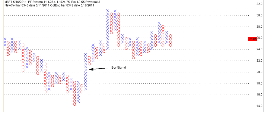
Above is an example, a breakout buy signal in Microsoft (MSFT).
When it comes to trading off of point and figure charts, most of the traditional technical rules apply. Breakouts are the primary producer of trading signals - one of the biggest benefits of point and figure charts is that signals are much more explicit than with other charting methods. In the example chart above, it's clear that shares of Microsoft (MSFT) broke out when the first X was added above the red resistance line that had restrained shares in the past. Sell signals work in much the same way.
Trend lines and price patterns also come into play for point and figure charts.
Because point and figure is based on a square grid, trendlines drawn at 45-degree angles have a special significance for traders. There are a number of price patterns that can be used when trading P&F charts -- while they do have some similarities to traditional bar chart patterns, they're a bit too nuanced to attempt to cover in this primer.
Another big benefit of point and figure charts is their ability to provide explicit price targets to traders who use them. Jeremy du Plessis' book offers an exhaustive look at both price targets and trading patterns.
Where to Find Point and Figure Charts
Now that you know a thing or two about interpreting point and figure charts, you'll need to be able to access them. While a number of charting packages and institutional data platforms (like Bloomberg) have point and figure charting capabilities, an easy and free source of point and figure charts is StockCharts.com -- users can convert any chart to its point and figure equivalent with the click of a button. TradeStation and other charting sources also have this data-intensive format.
Point and figure charts have been regaining popularity among professional and serious amateur traders in recent years -- and because they offer a unique view on a stock's technicals, this charting technique is a valuable tool for any market observer to take on.
Courtesy of Jonas Elmerraji, stockpickr.com


