Strange Days Indeed: Monday's Rotation Isn't Quite What You'd Expect

Most veteran traders understand the rally's been on borrowed time. So, Monday's curious weakness wasn't curious at all. The NASDAQ Composite fell the most, nudging the S&P 500 into the red with it. The Dow actually logged a gain, while the Russell 2000 exploded higher. Makes sense. It looks like investors are swapping out their more aggressive names for seemingly safer ones, and plowing into small caps... which may be a different kind of safe-haven in the event of a major market correction. Regardless, it's a red flag simply because the NASDAQ tends to lead the broad market higher or lower. Its loss on Monday is (another) hint that the market's nearing the edge of the cliff.
Except, a deeper dive into the market's inner dynamics suggests Monday's action isn't quite as intuitive as one might expect. Namely, the wrong sectors are falling, and the wrong ones are rising.
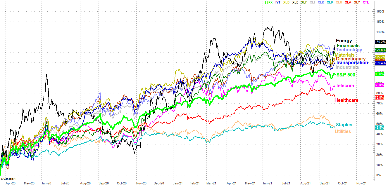
Take a look. The "safe" sectors like utilities, staples, and healthcare last the charge lower. In fact, they were actually the only names that logged losses on Monday. At the other end of the spectrum, energy stocks soared, while discretionary stocks, industrials, materials, transportation, and financial names rallied. These are more aggressive, cyclical names that are also on the risky side of the risk continuum. (Tech stocks, by the way, lost a little ground, so it wasn't a completely wacky session. But, still...)
What gives? The answer (sort of) lies not in the comparison of sectors, but the comparison of market caps and styles.
Actually, that's not the answer at all. Not even a little nit. But, that's the point. Large cap growth stocks lost ground; that much is to be expected, in that most of the major and most popular tech names that dragged the NASDAQ lower are also large cap technology stocks. That was enough to push the S&P 500 as a whole into the red, even though large cap value stocks themselves mustered a modest gain. But, was implied by the Russell 2000's big 1.3% jump, small cap names -- both growth and value -- soared.
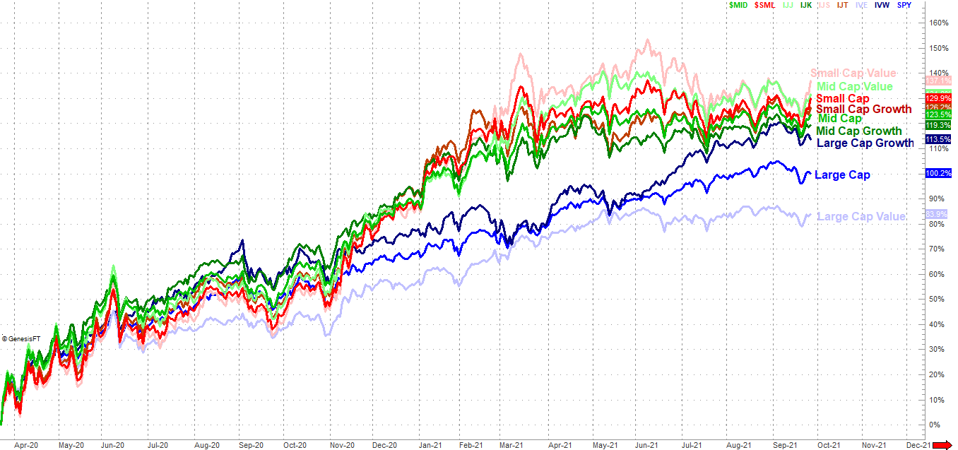
The thing that really stands out on the style/cap performance comparison above is, Monday's action only extends a trend that's been evident since last week. That is to say, small caps have been in rally mode, while large caps (and large-cap growth names in particular) are waning.
This admittedly raises more questions than it answers. Utilities, staples, and healthcare tend to be classified as value stocks, both those three sectors lost ground. Large cap growth stocks lost ground, but those are typically the discretionary and industrial names -- and materials and energy to a lesser degree -- that somehow managed to move higher on Monday anyway. Small caps carry very little weight within any of the sector ETFs we use to make the performance comparison chart above, so it's not possible they could have "overridden" large caps' impact on sector gains and losses.
So again, what gives? That's still a good question, and one we have to leave mostly unanswered for now.
The one thing we can say with some certainty, however, is that we have to assume the current trends are going to persist until it's clear they've reversed course. That ultimately means you really need to do some pinpoint trading in this environment, since there is no "bigger picture" theme or themes to plug into... much more so than usual anyway.
We'll update these charts as necessary.