Weekly Market Outlook – Still Plenty of Technical Support in Place
We warned you a week ago that stocks had rallied too far, too fast. Last week they paid the price. The S&P 500 lost 0.4% of its value over the course of the prior five trading days.
That’s not a lot. In fact, the market reclaimed much of what it had last on Tuesday following an alarming inflation report (more on that in a moment). It’s still a loss though, and with Friday’s lull, it certainly seems traders are entertaining the prospect of more downside. There’s certainly lots of pent-up profits to take. And, there’s plenty of room for stocks to slide before bumping into support. The thing is, that’s exactly why we don’t want to come to any sweeping bearish conclusion just yet.
We’ll take a detailed look at it below. First though, let’s run down last week’s biggest economic reports. There were certainly a lot of them.
Economic Data Analysis
Last week was loaded with economic data, and much of it was not only important, but market-moving. None of it rocked the boat, however, as much as Tuesday’s consumer inflation and Friday’s producer inflation figures for January. In short, the inflation beast has hardly been tamed. While inflation rates continue to dwindle -- mostly -- the pace of decline is slowing. The Fed’s tentative plans to start inching the Fed Funds Rate lower later this year is now in question.
Inflation Rate Charts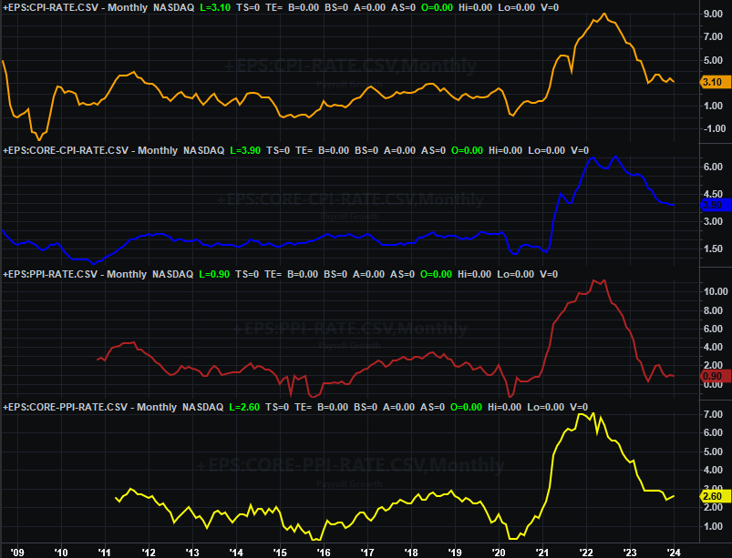
Source: Bureau of Labor Statistics, TradeStation
At the same time inflation’s decline is slowing, retail spending is doing the same. Economists expected Thursday’s look at last month’s retail sales to be less than December’s strong figure. But, these numbers were even markedly worse than anticipated.
Retail Sales Charts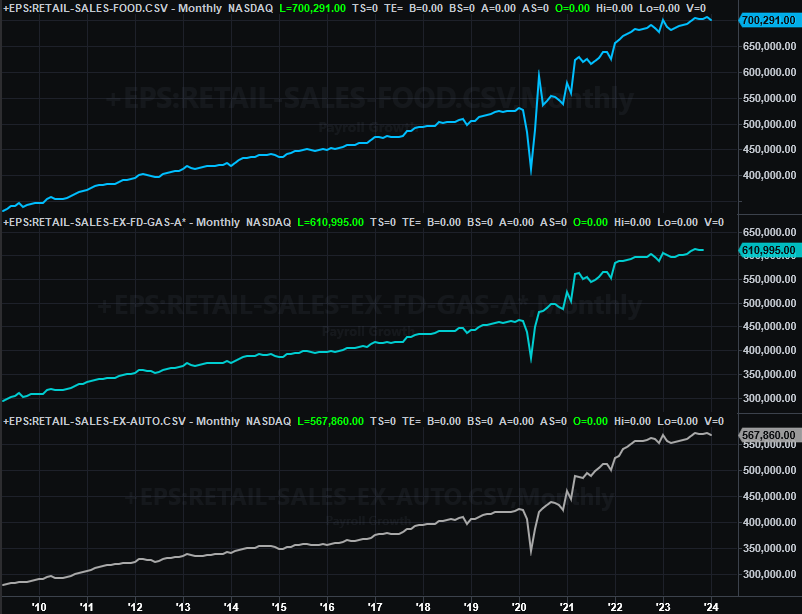
Source: Census Bureau, TradeStation
One month’s lull isn’t the end of the world. Take a closer look at the chart above, however. Retail spending actually stalled several months ago. These adjusted figures could actually indicate were on the cusp of a more pronounced, longer-lived downtrend.
Also on Thursday we heard January’s industrial production and capacity utilization data from the Federal Reserve. Once again forecasters were anticipating a relatively week comparison December’s numbers, and once again the actual numbers were even a little worse than expected. Also notice in this case that the Fed’s key measures of economic activity have been consistently fading from their early 2022 peaks. This suggests the U.S. economy is actually struggling… perhaps more than it seems.
Industrial Production and Capacity Utilization Charts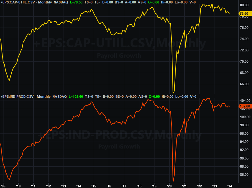
Source: Federal Reserve, TradeStation
Finally, on Friday we got last month’s housing starts and building permits data. Both were down from December’s figures, with a significant drop in starts… a dip much worse than the one forecasted.
Housing Starts and Building Permits Charts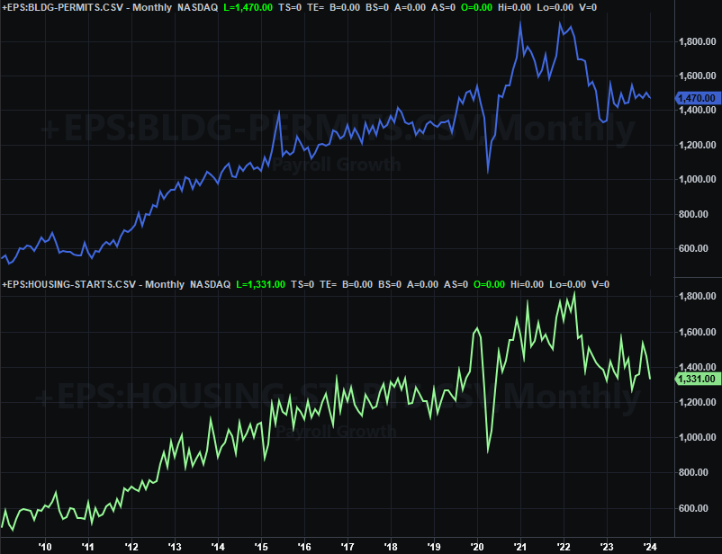
Source: Census Bureau, TradeStation
This is concerning. Sales of homes (new as well as existing) have been subpar, with modest upticks in sales of new homes largely stemming from the simple fact that the housing shortage is still palpable. The starts and permits report suggests this piece of the real estate market isn’t showing any offsetting health despite the second monthly increase in homebuilder confidence this month.
Everything else is on the grid.
Economic Calendar
Source: Briefing.com
There’s only one item of any real interest in the cards this week. That’s Thursday’s report on January’s sales of existing homes. Economists are modeling a measurable increase from December’s levels. Just bear in mind that’s a tiny improvement on terrible numbers, and hardly a sign that the housing market is actually on the mend.
New, Existing Home Sales Charts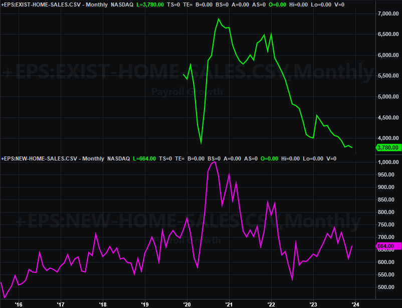
Source: National Association of Realtors, Census Bureau, TradeStation
New home sales numbers for January will be reported on Monday of next week.
Stock Market Index Analysis
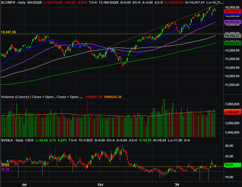
We kick things off this week with a look at the weekly chart of the NASDAQ Composite. We mentioned last week that the index was nearing a key technical ceiling… the 16,175 level, where it peaked in late-2021. As could have been expected, all it took was a kiss of that mark (nearly) to get the profit-taking started. Sure, the inflation report seemed to be the cause. The market was ripe for the move though. A wide range of headlines spun the right way could have -- and likely would have -- up-ended the composite.
NASDAQ Composite Weekly Chart, with VXN and Volume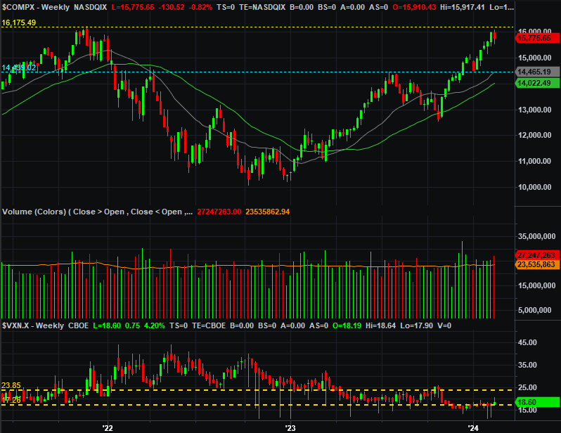
Source: TradeNavigator
Here’s the daily chart of the NASDAQ Composite for a little added detail. You may recall we also pointed out the NASDAQ has also been dancing with a straight-line ceiling connecting all the key highs since October (orange, dashed). Notice that the composite never really pushed past that resistance either. It only ticked a bit above it on Monday before traders started entertaining doubts… right before the inflation numbers were dropped on Tuesday morning.
NASDAQ Composite Daily Chart, with VXN and Volume
Source: TradeNavigator
There are two other details worth pointing out on the daily chart of the NASDAQ Composite. One is bullish, but the other is… well, semi-bearish.
The bearish hint is actually the NASDAQ Volatility Index at the bottom of the chart. Although not in a straight line, it is starting to push its way upward now. The NASDAQ itself isn’t. Nevertheless, the shallow incline of the VXN suggests traders are -- once again -- starting to entertain doubts, by virtue of hedging against a pullback with options. If they’re thinking it, they may well start acting on the worry.
The bullish clue is the fact that even with last week’s dip, the NASDAQ is still above all of its key moving average lines. Any of them could end up acting as a support level in the event of a more serious selloff.
Here’s the S&P 500’s daily chart. It looks about the same as the NASDAQ’s, particularly in the ways that matter the most. Those are, while it’s trapped below a couple of well-established technical ceilings (dashed), it’s also still above all of its key moving averages as well. Like the NASDAQ, any and/or all of these could keep the S&P 500 from taking too big of a hit.
S&P 500 Daily Chart, with VIX and Volume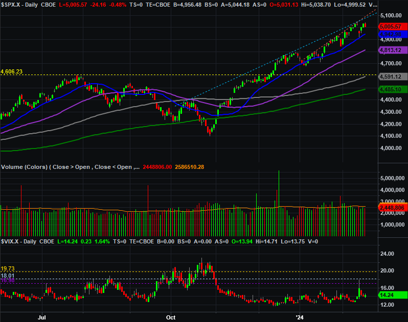
Source: TradeNavigator
On the flipside, it’s starting to look like the S&P 500’s Volatility Index (VIX) may be inching its way higher too. Again, that’s a subtle hint that traders are beginning to worry.
Bottom line? The overall momentum is still bullish, even if capped by technical resistance, and despite last week’s blip. We’ll have to assume the 20-day moving average lines (blue) will hold up as support too until it clearly stops -- if it stops -- doing so. The real red flag here, however, will be the VIX and the VXN. If they both edge their ways above their recent resistance levels, that could be a bigger clue that the market’s true undertow has finally taken a more serious turn for the worse.