
In a perfect world a stock's every ebb and flow would be crystal clear from its onset, and the end of that move would be marked with an equally-convincing clue. We don't trade in a perfect world though. Getting a bead on a chart's true, sustainable trend is a messy business. Even "good" traders fail -- in terms of being right about a chart's future -- about half the time. It's just that they minimize the impact of being wrong, and maximize the upside of being right.
And how does one get good at handicapping charts and placing fruitful trades. Practice. A lot of practice.
In terms of trading, this practical experience can be achieved by simply studying a lot of different charts, not just taking note of the obvious technical clues, but by examining the subtle combination of nuanced combinations of those clues. We've got a look at one such chart today, which combines several different technical cues simultaneously, developing a confluence of clues that (in this case) have accurately spotted a downtrend, and appear to be spotting a second leg of that downtrend.
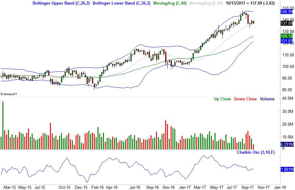
The stock in question is American Tower Corporation (AMT). As the weekly chart shows, it dished out a nice 45% runup between January and last month, but after peaking at $147.98 in early September, has fallen back to the tune of 7%. There's still more downside potential in store though, if AMT just loses a little more ground.
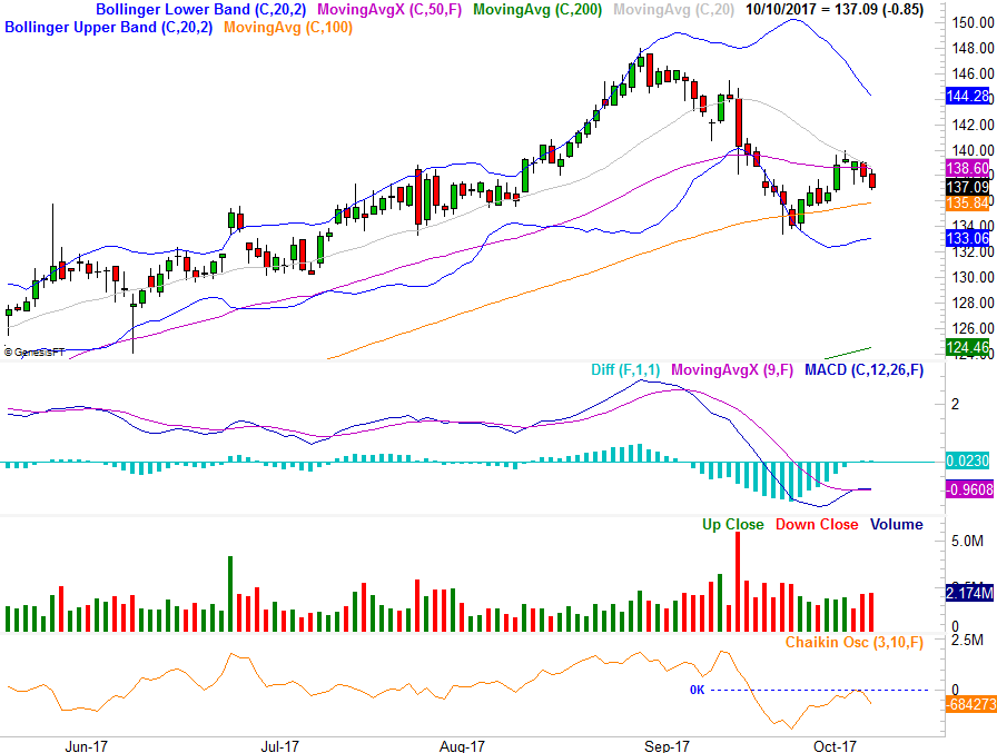
Zooming into a daily chart, with a few more technical indicators added, we can get a better feel for how this pullback took shape, and what may be next. It's this daily chart, in fact, where we get several key red flags all warning us that there's more danger ahead. First and foremost though, understand the context. The bearish undertow stemming from the sheer size of the runup evident on the weekly chart has made any and all bearish clues on the daily chart apt to mean more. To that end...
Beginning in late October when AMT shares reversed their downtrend and started to edge higher again, it would have been easy to see the stock in a bullish light again. Clearly that wasn't the case though, and the astute investor would have recognized the fatal flaw before it had to be proven by the renewed rollover. That is, once American Tower Corporation shares just brushed the 20-day moving average line (gray) -- a line that had been support at least some of the time earlier in the year -- the sellers dug in again. In the meantime, the 20-day moving average line has fallen under the 50-day moving average line (purple), confirming the short-term trend has turned bearish; this isn't just a little volatility.
Thing is, we had more reason to suspect the bounce effort from mid-September wouldn't go anywhere.
Take a look at the volume bars on the daily and the weekly chart again; red bars are bearish and green bars are bullish. Also on the weekly chart, take a look at the accumulation-distribution line, and on the daily chart take a look at the Chaikin oscillator. Both are (in their crudest description) volume-weighted momentum lines. On the weekly chart, though the accumulation-distribution line was rising during the early part of the rally, it was peeling back as of May. On the daily chart, the Chaikin line rolled over in the latter half of September at a rate much steeper than the rise we saw from it at any point since April.
In other words, there were never very many bulls participating in the recent leg of this rally, but the bears came out of the woodwork at the first sign of trouble. In the sense that quantification matters, the fact that the Chaikin line fell under the zero level right around the same time the MACD lines fell under zero which was also right around the time the 50-day moving average line all together indicate a decided turn for the worst. Had any one of these clues materialized on their own, it may not have coincided with a steep, trade-worthy selloff.
It's also the fact that none of those bearish clues from mid-September have yet to be undone that suggests the recent rollover (after bumping into the 20-day moving average line) is indeed a renewal of the bigger downtrend that began to take shape early last month. A move back under the 100-day moving average line (orange) could seal the bearish deal. If we see a new bearish divergence from the MACD lines, that's another confirming bearish clue. The Chaikin line is already pointed lower again, remaining under zero since the initial breakdown move early last month.
The tough part for traders here -- and new traders in particular -- is the multi-faceted nature of the chart's clues. Just as tough to appreciate is the context. AMT started to deteriorate after a huge rally, making it an easy target to take profits on. We wouldn't necessarily get the same outcome from the same technical clues were they from a stock that wasn't as overbought as this one was.
The moral of the story? Aside from the fact that traders think opportunistically and are more apt to buy oversold stocks and more apt to sell overbought ones, one-dimensional technical analysis rarely works. You can and should be using two if not three reliable technical tools, even if one of them is your primary indicator. The best trades are signaled by more than one indicator, while the lesser trades often send mixed signals the more tools you examine.